In the process of making the most of your experimentation efforts and ensuring it yields valuable insights, you might often find yourself conflicted with which A/B testing approach to follow. Should you restrict each A/B test to a single change to measure its individual impact or merge multiple changes and measure their overall impact on the page’s performance?
This problem of whether to iteratively test each change or combine several of them and test a radical change has a rather nuanced solution. In this post, we discuss both these approaches in detail, their respective pros and cons, and how you can select the one more suited for your business.
Download Free: A/B Testing Guide

The origin of the debate
While analyzing your website data, you might come across multiple visitor pain points and roadblocks in your user experience, begging for attention. As you devise solutions for them, you will need to prioritize based on which issue needs to be tackled first and what can wait. However, this sometimes gets tricky as you might want to test multiple changes on a web page on priority.
For example, let’s assume that you analyze your landing page and notice that visitors are not scrolling to the bottom where your CTA resides, the USP of your business is not clearly highlighted, and you have not added any testimonials or social proof. You immediately create a list of ideas to tackle these pressing issues. But, should you combine those changes into one hypothesis to solve all of them at once or test them one by one to understand the impact of each?
The answer lies in understanding which route is better suited for your business.
Factors to consider while deciding whether to test a single change or merge them
Website visitor traffic
While the range depends entirely on the business vertical, the visitor volume of the page you are testing on is one of the biggest factors to consider when deciding whether or not merging changes makes sense for your business.
If you have low footfall on the webpage, it will take a very long time before you receive a large enough sample size for your test to reach statistical significance. In such cases, running A/B tests with a single change will slow you down as you wait for each test to conclude to figure out if there is any improvement in your goals and key metrics.
On the contrary, if your web page receives a high volume of visitor traffic, your tests are likely to be fast-paced, and even testing a single change at a time and running multiple of such experiments can help you drive results quickly as your tests reach conclusion faster.
However, you will also have to take into consideration the fact that while you test one change, you cannot be sure if that one change will lead to a worthwhile impact on the metrics or not. This can be avoided if you test multiple changes as your chances of improving your key metrics increases drastically as you test radically.
The criticality of the web page
No matter what the nature of your business, there are always certain pages that are often termed as the bread and butter of your site. These are extremely critical to your business, and every little change here can have a significant impact on your business’ critical metrics. For example, these could be the cart and checkout pages for an online store, form page for a SaaS business, homepage for media sites, and so on. A considerable amount of your website optimization efforts are directed towards uplifting conversions on these pages, and rightfully so.
Therefore, when A/B testing on such pages, it is advisable to go big and address all issues in a single test so you don’t have to pick and choose issues to be tackled first and ones that can wait. Instead, you can solve all visitor pain points at once and improve the performance of your key pages drastically and observe a substantial impact on your business.
In this case, therefore, you have a lot to gain if you put all your eggs in one basket and merge your changes when testing on such pages. Let me explain this with an example.
The world’s leading manufacturer of innovative lighting solutions, Flos USA, was struggling with a low checkout conversion rate when they decided to partner with VWO to tackle the issue. While the larger challenge at hand was to optimize the entire website and conversion funnel, the first hypothesis devised was to increase visits to the category page as this was an extremely critical page for the business.
To address this issue, the hypothesis was that changing the entire homepage layout to one more focused toward site navigation will help improve products’ visibility and make it easier for shoppers to find what they need. Here’s a look at the control and variation for the test:


The variation emerged as the winner leading to a cumulative uplift of 6.77% in conversion rate. The key takeaway here is that when it comes to pages extremely critical to the business, it often works wonders to go all out, create your hypothesis with multiple changes, and test radically for a notable improvement in key metrics.
Sign up for a free trial and try VWO yourself to A/B test radically on your critical pages and watch your conversion metrics grow.
Metrics you want to influence
Establishing the metrics that you want to influence through the test will help you zero in on the approach that will work best for the business.
For example, let’s assume that your analytics tells you that you need to work on reducing the bounce rate of a particular landing page. Now, this is a scenario where you have lots to work with. You would ideally want to track down everything that is hampering user experience on that page and optimize it as there could be multiple factors contributing to the high bounce rate of the page.
Therefore, in such cases, it makes sense to combine your changes in a single variation and test it against the original to figure out if that actually helps reduce the bounce rate. This way, you have a higher chance of success as you have targeted all possible factors that could be the cause behind the poor performance of the page. Here’s a case study to explain this point in detail.
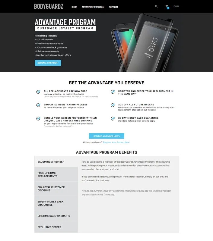
Bodyguardz is an American eCommerce store that offers a variety of mobile phone cases. Their aim was to uplift product registrations from their Advantage Program landing page.
The challenge they were facing was that the original page had too much text in a long scrollable information section, and analysis of their visitor data showed them that not many users scrolled to the bottom of the page. Another issue they noticed was that having multiple CTAs could be confusing for the visitors.
They worked with VWO to design a variation that reduced clutter on the page, removed redundant text and links that could potentially confuse visitors. Here’s a look at the redesigned page:

The result? The test ran for 25 days and achieved a confidence level of 97%, with the variation causing a relative uplift in successful product registrations by 2.34%.
Therefore, in such a situation where the metric you want to influence warrants a rather radical test based on several changes, you should go ahead and test them all at once in order to gain a valuable improvement.
Compare this with a scenario where you found your form abandonment rate to be extremely high. While there are multiple elements to optimize for here as well, but it is obvious that the primary one is optimizing the form fields for a high filling rate. In such cases, testing a single change and studying its impact would definitely make a lot more sense.
Type of issues you want to optimize for
There are broadly two categories of issues that you might want to optimize for – functional and usability issues. Functional issues are commonly referred to as the ones where users are unable to perform a certain action or receive the desired output due to limited or broken functionality of the website.
For example, there are eCommerce stores where shoppers are not able to calculate the shipping amount at the product or cart page and it is directly added at the final step of the checkout. Such hidden and unexpected charges could be a huge cause of friction in the shopping experience and often leads to cart abandonment.
Therefore, you decide to run a test to see if providing an option to calculate shipping on the cart page itself to avoid any surprises helps uplift sales. When running such A/B tests wherein site functional issues are being tackled, the entire focus of the experiment should ideally be on this single change so you can measure its direct impact. So, merging changes definitely doesn’t make sense here.
In collaboration with VWO, Showpo, an Australian fashion eCommerce store, ran a similar test on their product pages. Their hypothesis was that adding a free shipping strip on their product pages would increase the average cart value per customer and ultimately meet the larger goal of uplifting sales.
The strip not only notified the shoppers about the free shipping option but also displayed the balance amount required for the cart to be eligible for free shipping. They created 2 variations for the test (one with and without a pop-up). Here’s a look at the control and variations:


The result of this test declared variation 1 to be the winner with higher visitor count, more upsells, and increased revenue than variation 2 as well as the control. The test was run for 44 days and resulted in a 6.09% uplift in revenue over the control, which translated to $22,080 additional revenue.
Such instances, where the hypothesis is to solve for a particular functional issue, require a dedicated test, and, therefore, you should never merge it with any other changes.
On the other hand are usability issues where visitors are unable to navigate through the site and use it effectively and efficiently. These add up to make for overall poor user experience.
For example, you notice a huge amount of drop-offs on your category page and upon analyzing it, you diagnose a whole bunch of issues, including filters not being highlighted, CTAs not being present for each product listed, quick previews not being available, etc.
Since these changes complement each other and are together targeted towards increasing website usability, it makes sense to test them in a single experiment. You will be able to gauge the impact and overall improvement in the usability and user experience of that page.
Business size
Your business size in terms of revenue, market share, traffic, competition, etc. must play a vital role in crafting your testing strategy.
If your business records hundreds of millions of dollars in revenue and your website has millions in traffic volume, you own a considerable amount of market share, are category leaders, and known and proven in the market, it makes more sense for you to focus on testing one change at a time. This is simply because even a small change on your website could translate into a significant business impact.
Case in point is the iconic test conducted by Google on their links where 41 shades of the color blue were randomly shown to 2.5% of the visitors each to note which one would earn them more clicks.
Since Google is a behemoth in the digital space, it makes sense for them to spend a considerable amount of their resources and time conducting a test that focuses entirely on something as minute as a change of shade of their links as it could lead to an impact of millions of dollars in revenue.
On the contrary, if your website draws fewer visitors a month and is comparatively newer and smaller in the industry, then we would encourage you to merge multiple changes in every test you run. This is because you will need to make drastic changes and test radically to have an impact on your top line, quickly.
Another reason for this is that bigger businesses can even afford to run multiple tests (each with a single change), make them mutually exclusive, and still receive large enough sample size for each. For smaller businesses, this won’t be possible. Hence, it would make sense for them to create tests with multiple changes to be able to drive significant results, faster.
Download Free: A/B Testing Guide
Advantages of merging changes
Higher testing velocity
It goes without saying that if you combine changes and test them, you will end up testing a myriad of ideas within a short span of time, thus significantly improving your testing velocity.
Apart from bringing agility to the process, this approach helps you quickly identify what is working well for your business, double down on it and eliminate low performing changes. You can use Heatmaps, Session Recordings, and Google Analytics to further drill down on how each of your changes has performed against their specific goals and use the data accumulated to decide what is working and what isn’t.
Greater impact on the top line
Testing radically by combining multiple changes in a single experiment enables you to address (and resolve) multiple visitor pain points in a single attempt and therefore, drive comparatively better results in terms of higher impact on leads, sales, and revenue.
Bigger impact on user behavior
As countless elements on your website add up to determine visitor/user behavior, you can expect it to alter significantly once you run a test that modifies more than one of those elements. Therefore, if you are looking to drastically alter user behavior, testing multiple changes in one experiment is the way to go.
Better understanding of user behavior
With each change you plan to test for, you will need to set up individual goals to understand their respective impact on the desired metrics. This will allow you to gain a better understanding of user behavior against each of those goals, and hence receive a comprehensive view of your site performance from multiple standpoints.
Advantages of testing a single change
Better learning from each test
When testing multiple changes on a single page, it can sometimes become difficult to keep track of which change is performing well and which isn’t to be able to streamline your optimization efforts accordingly. Especially in a losing campaign, it becomes difficult to understand whether the entire test was flawed, or was it just one change that impacted the overall performance of the test.
However, if you focus only on a single change at a time, there is naturally zero possibility of any such confusion. You can expect your learnings from the campaign to be unadulterated and give you a clear understanding of the performance of the test and your target audience.
No possibility of contradicting insights
When you combine multiple changes in a single campaign, sometimes two goals tell different stories, and you might be lost in figuring out which one you should get behind. Although this problem can be solved by running a follow-up test for clarity on which one works, such a situation can completely be avoided by sticking to a single change per test.
Conclusion
We hope the above pointers help you solve your dilemma regarding which approach you must pick for your business. The important thing to remember here is that there is no right or wrong; your strategy must be based purely on your business goals and objectives, your target audience, your style, and ideology of testing.
Also, you needn’t entirely stick with one approach. It is advisable to be flexible in terms of switching between the two based on the evolving needs of your business and users or depending on the unique problem at hand.
To get started, devise each hypothesis with multiple changes when aiming to improve user experience on a particular page and target a single change per test to address more tactical and functional issues. Or request a personalized demo from the experimentation experts at VWO to understand how you can leverage the two approaches to grow your business metrics.
Whichever road you take, be sure to consistently record your learnings and use them to improvise and figure out what works best for your business.


