Not happy with your current website? Are customers complaining about the functionality or look of it? Are visitors not converting into customers?
A poorly designed website could be limiting your conversions and revenues. In the digital age, the importance of a website for any business can’t and shouldn’t be underestimated.
But undertaking a website revamp can seem overwhelming considering the time, effort, and energy involved.
Download Free: Website Optimization Guide
Well, it doesn’t have to be that way – if you understand users, plan the key stages, stick to a plan, and follow best practices, you can take your website from zero to hero in one go.
Signs your website needs a revamp
Before we get into the stages of a website redesign, let’s take a look at the signs which indicate that your website needs a revamp:
- A high bounce rate – a consistently high bounce rate is one of the prime warning signs that it’s time to update things. It usually means that the user experience is poor and that visitors are not finding the information, product, or service they are looking for.
- Technical issues – if your site is taking too long to load, looks horrible on mobile devices, or has any other significant technical issues, it is time for a website revamp.
- Conversion rates are down – if the bounce rate is low, but conversion rates are down too, it’s a sign of issues. While there can be many reasons for that (price, missing CTAs, poor copy, etc.), a key reason is often poor UX.
- It’s old – if your website has not seen any major updates in years, it has probably fallen behind the latest best practices, particularly in terms of accessibility and responsive design. It’s time to give it an overhaul, even if the design is the only thing you need to address.
How to improve your website in one revamp
Before you begin putting ideas into action, it’s a good idea to take a closer look at your existing website and customers. This process will help you build a new website that solves known and unknown challenges.
1) Assess your current website
The good news at this point is that you might not have to overhaul everything on your website.
There may be a number of areas that are already working rather well, and which can either be left untouched or just tweaked a little. And chances are you already have a lot of content, which might need tweaking rather than starting from scratch.
However, this is the time to concentrate on things that need to be changed. Start by creating a list of what’s working and what isn’t. To help you figure this out, a good place to start is tools like Google Analytics and dynamic heatmaps.
- Google Analytics (GA) – This powerful, free tool gives you insights into which pages perform better than others, which have higher bounce rates, and which lead to more conversions. GA can also give you an in-depth insight into who your target audience is and how they are finding you online.
- Heatmaps – Heatmap tools are here to give you answers that GA can’t. While GA can tell you where the visitor has come from and how long they stayed on a particular page – it can’t tell you what they were (and weren’t) looking at and how they behaved – but heatmap tools can.

Review your target audience
Target audiences don’t always stay the same.
Now is the time to go back to your buyer personas that identify who your target audiences are today. Do some research and document their needs, pain points, and behaviors. Knowing what they like and dislike will allow you to design a website that gets them interested and engaged with your offering.
Perform a content audit
Content is the lifeblood of the website, so this is a perfect time to perform a content audit. This will give you insights into your best-performing content so that you can decide which type of content to focus on, and which type of content to either drop altogether or at the very least, modify.
A content audit will also highlight your content gaps, which is especially important if you are putting (or plan to put) a lot of effort into content marketing. Tools like BuzzSumo and Quora can help you to understand what kinds of content your audiences are looking for – both for your website and in content marketing.
Perform an SEO audit
Last but not least, it’s important that you conduct an in-depth SEO audit. Since you plan to do a website redesign, it is only logical that you want to end up with an SEO-optimized website. This will ensure your website ranks highly in search engines, attracts organic traffic, and maximizes the chances of referrals from other sources.
2) Completing your website revamp in seven steps
Armed with the data and knowledge gathered from your research, it’s now time to put together a website revamp plan. This is a to-do list based on your analysis of what is and isn’t working
Step 1: Platform or partner?
The biggest decision to make when undertaking a website revamp is whether to partner with a web development freelancer or agency or do it yourself using a platform.
There is a huge range of no-code website platforms such as Squarespace or Wix which provide easy-to-use templates that look great off the shelf while being customizable to your needs. All you do is select a template, add your content, and you’re good to go. These platforms even build in tools and have a myriad of integrations with eCommerce platforms such as Shopify.
However, if you have a more complex website or need it to look unique, engaging a provider such as an agency or freelancer might be the way to go. This is also a good time to consider whether to keep or switch your hosting provider especially if it lacks speed and reliability.
Step 2: Revisit your brand
A key element of your website revamp strategy is brand consistency. If you lose this, you will lose customers as customers look for brands they recognize and can connect to.

Therefore, it is key that typography, logos, color schemes, and images are in place so they can be consistent across all your pages. It’s also important to keep your brand consistent beyond the website too – from email and social media to business cards and brochures.
Remember that your branding doesn’t have to be loud and eye-catching. It can be simpler and understated – as long as it matches the desired brand personality.
Step 3: Plan the user experience
One of the most common reasons a website needs a revamp is that the user experience is poor – be it because the website is cluttered, difficult to navigate, or takes a long time to load. In this step plan how many pages, the Information Architecture, the categorization and navigation of your website, as well as how will users navigate between pages and sections of the website. Make sure you apply web design principles that work.
Some tips on UX:
- Exploit white space in order to make visitors feel more relaxed and at ease
- Organize your pages so that it’s easy for your customers to get from A to B easily
- Use data to optimize CTAs (heat maps can tell you if people are getting distracted by other elements on your page when their attention should be led to the CTA)
Step 4: Create the content
Write the copy or create the imagery that will be on your new website. Good copywriting can be a key driver of conversions. Now is also a good time to create a content marketing strategy that will help you create regular content that boosts your conversions.
You’ve probably well aware of the importance of SEO, so we won’t drill you with that. You know it is important and should be a key consideration in your website revamp. Planning which keywords to focus on, and how best to include these keywords in your content, images, videos, and data will ensure your website ranks highly in search engines and attracts audiences to your website.
Step 5: Pick the right host
Revamping your website into something you can be proud of is a great feeling. However, one technical difficulty is enough to ruin the user experience. Review if part of your current issues is related to your hosting provider.
If that is indeed the case, just switch your hosting – there are plenty of affordable web hosting providers you can choose from.
Download Free: Website Optimization Guide
Step 6: Design and develop
It is time to get to work. Do what you know you can, outsource what you can’t – don’t do things in half measures – you will just end up needing another revamp a year later. Whether using a team or DIY, create the website and apply your designs, and upload content.
Step 7: Test and launch
You could begin with a soft launch and gather some feedback first. However you do it, make sure to test, test, and test before launch. This includes testing site speed using Google PageSpeed Insights, the navigation of your website, all links, and mobile responsive design. Test on different browsers, screens, and devices to check that things work and function.
Ask friends and colleagues to test the website too. It is always a good idea to have some fresh eyes that were not a part of the revamp process.
Step 8: Optimize
Once it’s done, you’ll have a fresh and clean website that attracts leads, instead of turning them away. From now on, it’s just a matter of optimizing your website and consulting your analytics for tweaks that can ensure your website performs better over time.
Watch the webinar to learn more about optimization:

Best practice website revamp examples
Before we go, let’s take a look at a couple of websites to revamp examples to showcase how transformative a good website redesign can be.
Website revamp example #1- Rev
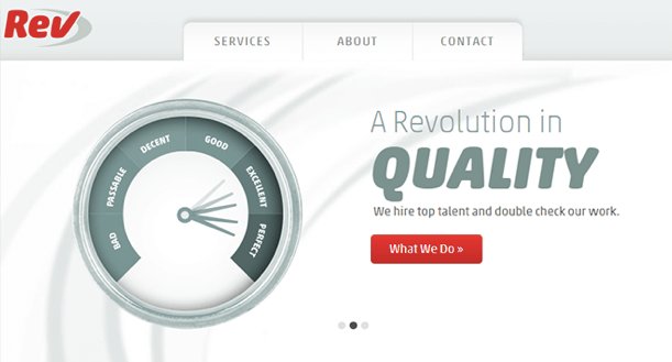
Here’s Rev’s original website:

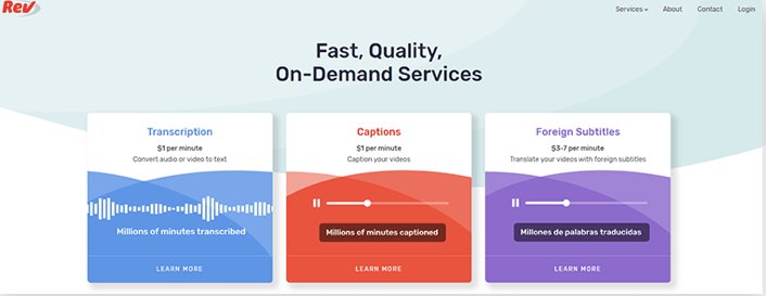
And here’s the new look:

Rev’s original website looked dated with its retro graphics, while the latest version looks modern, crisp, and clean. Rev has replaced vague statements about the company with valuable information about its services, value, and pricing so the user can take action to learn more or sign up straight away. They have also introduced simple animations that give more dynamic to the page, but are low-key enough so as not to distract from the CTAs.
Website revamp example #2 – ATW
Here is ATW’s before website:

And this is their website after the revamp:

In one shift ATW has moved from a very outdated look to a modern, legitimate, and user-friendly website. The user is presented with options to quickly explore the website and take further action. ATW likely used analytics to identify the two most popular pages – FAQs and contact us – and present them both in the center of the page.
Conclusion
A website revamp doesn’t have to be super time-consuming. If you can get the right team on board and procure the right tools you’ll soon be on your way.


![[Gifographic] Better Website Testing – A Simple Guide to Knowing What to Test](https://static.wingify.com/gcp/uploads/sites/3/2021/01/Feature-image_Gifographic-Better-Website-Testing-–-A-Simple-Guide-to-Knowing-What-to-Test.png?tr=h-600)
![[Infographic] Why a Website Redesign Doesn’t Always Work](https://static.wingify.com/gcp/uploads/sites/3/2016/06/Feature-image_Infographic-Why-a-Website-Redesign-Doesnt-Always-Work.png?tr=h-600)


