You’ve added animations, lots of images, engaging carousels, and even personalization to your website.
With all these elements, you must be expecting your website conversions to soar.
But before you get too excited, take a step back and look at usability.
How easy and enjoyable is it for users to interact with your site?
If your site isn’t easy to use and doesn’t help users complete actions, all those flashy features won’t help much.
A strong usability foundation makes sure that all those cool features work seamlessly together to create an exceptional experience.
Don’t just take our word for it.
In this blog, check out the stats on how usability affects visitor behavior and the bottom line for businesses.

Website loading speed
1. 47% of visitors want a webpage to load in less than 2 seconds.
(Source: Forbes)
People are busier than ever and want to consume content quickly. That is why if they land on your website and experience delays in loading, they will be quick to abandon your website for a competitor’s. It is sad to say but you can’t expect user loyalty if you can’t meet their bare minimum expectations. Here are some steps you can take to improve your website loading speed:
- Compress images
- Minify JavaScript and CSS files
- Leverage browser caching
- Limit HTTP requests.
2. Slow-loading websites cost retailers a $2.6 billion loss in annual revenue.
(Source: LinkedIn)
Every user who leaves your website due to slow loading is a lost potential customer. Addressing this basic issue by speeding up your website can positively impact your bottom line. The tips we shared a while back are low-hanging fruit you should seize. Implement them to stop losing users and meet their rightful expectations.
3. 39% of users will simply stop using a site if images won’t load or take too long to load.
(Source: Forbes)
Users quickly lose interest if they experience delays in visual content. First, because images are more engaging. Second, seeing images is crucial for online shoppers who want to experience the feel of an offline store. After all, checking images is the only way to verify the product they decide to buy.
You can take the following steps to fix the issue:
- Ensure images are properly compressed to balance quality and load time.
- Verify that images display correctly across all devices and browsers.
- Add alt text to images for better accessibility and SEO.
- Use lazy loading to load images only when they come into view.
- Ensure images are appropriately sized and placed to enhance user experience.
4. 88% of online consumers are less likely to return to a site after a bad experience.
(Source: Leadpages)
What is a bad experience? It is when you fail to implement even the most basic, proven best practices backed by years of research and data.
This includes issues like non-responsive mobile websites, slow loading speeds, confusing layouts, and glitchy functionality (e.g., clicking on the search bar but being unable to type). If you’re not addressing these fundamental issues, you can’t expect users to stay or return.
Additionally, personalization is becoming an increasingly crucial element for creating a positive user experience. Failing to provide the same will leave a negative impression on your visitors.
So, always follow the best practices and keep testing to ensure you consistently deliver a positive experience.
Leverage VWO to analyze user behavior, run tests, and even launch personalization campaigns—all on one platform. Having these capabilities in one place ensures a seamless approach to enhancing your website’s digital experience.
User interactions and feedback
5. 91% of unhappy customers leave without giving feedback on their user experience.
(Source: Baymard)
That’s harsh! In such scenarios, monitoring user behavior through heatmaps and recordings is crucial. By observing their actions and spotting friction points, you don’t have to rely solely on direct feedback. This approach lets you derive actionable insights for website optimization, ensuring you stay ahead of user needs.
VWO Insights, for example, is a behavioral analytics suite that includes heatmaps, recordings, surveys, forms, and funnels. While surveys help you get direct feedback, heatmaps, and recordings allow you to derive insights by observing user behavior. Take a free trial to see how you can use it for your research work.
The diverse array of qualitative tools integrated into VWO Insight empowers UX researchers to perform comprehensive UX audits, pinpointing areas for improvement and uncovering valuable enhancement opportunities.
6. 94% of first impressions are related to a website’s design.
(Source: CXL)
Seeing takes less cognitive effort than reading. Visual information is processed more quickly and effortlessly by the brain than reading text, which involves decoding words and interpreting their meaning. This is why images, colors, and visual design often create the first impressions. They’re processed instantly and can evoke emotions or set the tone without the need for conscious thought.
Hence, a professional and well-designed site can significantly enhance credibility. Always use high-quality visuals and maintain a consistent branding color scheme to build for consistency.
7. 38% of users will stop interacting with a website if the content/layout is unattractive.
(Source: UserGuiding)
A crowded or inconsistent layout can test users’ patience, making them feel overwhelmed and frustrated. Ensure that content is presented in an engaging and easy-to-read format to keep users interested and interacting with the site.
The layout should have the right visual hierarchy allowing users to focus attention on elements in order of importance. For example, the hero image should not compete with the CTA for attention. The CTA should be given more weightage as it drives action.
8. 75% of website credibility comes from design.
(Source: Wix)
If your site design doesn’t captivate users from the get-go, chances are they’ll bounce from your website.
Put your best foot forward and design your website to be seamless and intuitive, creating a great first impression. Refresh your design according to user feedback and trend benchmarks to keep it compelling and relevant.
9. 80% of customers consider a company’s experience as crucial as its products or services.
(Source: Help Scout)
No, you can’t win over users with great products or services while ignoring user experience. The way users interact with your website must be top-notch as well. After all, how do you expect them to find your products or offers if they struggle with your site? If you fail in this area, the chances of them reaching your products are slim. Further, a poor user experience creates a negative impression right from the start.
Once again, follow best practices, regularly analyze user behavior, and run tests to keep your online experience optimized at all times.
10. 79% of users leave a site and search elsewhere because they didn’t find what they were looking for.
(Source: Think with Google)
Users have high expectations for finding what they need quickly. If they can’t easily locate the information or functionality they’re seeking, they will abandon the site and look for alternatives. This also suggests that the website’s search and navigation are failing to help users find products. Hence, improving usability around product or service discovery on your website is essential.
A case in point –
A Brazilian real estate company, Casa Mineira, aimed to increase lead generation on its website. An in-depth research revealed that visitors wanted to find products more quickly. Based on these insights, the team decided to improve the usability of the search box on the homepage, which had two drop-down menus: one for apartment types and one for locations. Using VWO to test this change, they increased form submissions by 57%.
Try a free trial of VWO and take the first steps toward enhancing UX and boosting conversions.


11. Users form an opinion about your website in approximately 50 milliseconds.
(Source: CXL)
A clean, modern design combined with high-resolution visuals and clear branding helps users quickly understand the purpose of your site and what it offers. And don’t forget, your content and brand messaging should be clear, effective, and crafted to win trust from the first glance.
Mobile experience
12. 67% of users are likely to buy a product or use a service from a mobile-friendly website.
(Source: Forbes)
Implement a mobile-first design approach, ensuring your website is fully responsive and optimized for smaller screens. Testing the mobile experience is crucial for ensuring that your website meets user expectations and functions smoothly across all devices. VWO Testing can help you optimize your mobile site by allowing you to run tests and roll out experiences that resonate with mobile visitors.
A case study –
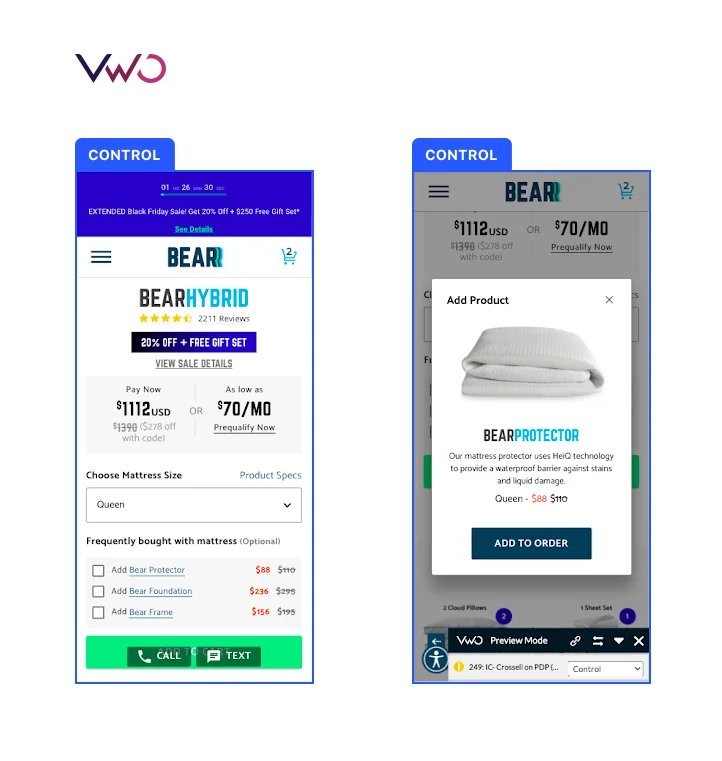
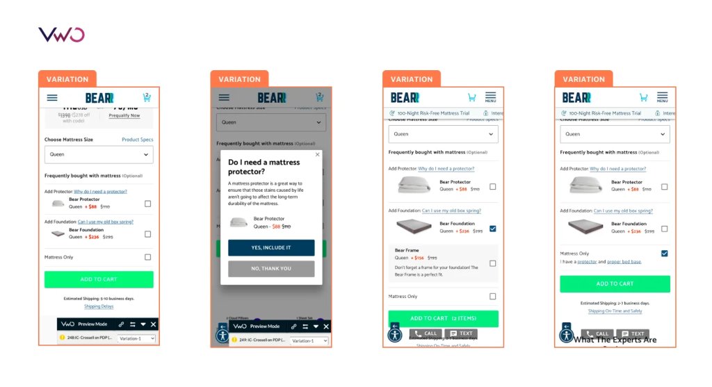
Bear Mattress, a brand specializing in bed mattresses, increased purchases by enhancing the cross-sell flow on its mobile product page. Partnering with the VWO team, they identified minimal user interaction with cross-sell items, missing product images, and a weak copy that failed to engage. For the variation, they revised the copy to be more customer-centric and added thumbnail images for cross-sell products. This 19-day test resulted in a 16% revenue increase.
13. 85 % of adults would like a company’s mobile website to either be as good or better than its desktop website.
(Source: Northern Arizona University)
Isn’t it natural? With mobile devices making the world more accessible than ever, users now expect a mobile experience that matches or exceeds desktop performance. If your website isn’t optimized for mobile, it defeats the purpose of accessibility and convenience.
14. 57% of users won’t recommend a business with a poorly designed mobile site.
(Source: LinkedIn)
If users detest your mobile website, their negative experience won’t be limited to just them. They’re likely to share their frustrations in reviews and discourage others from using the site. This spreads through word of mouth, amplifying the damage, and hampering brand perception.
Ensure your mobile site is visually appealing, easy to navigate, fast-loading, and free of bugs. Focus on conducting usability tests with multiple user groups, along with other user research methods, to continuously refine mobile experiences.
Conversion and ROI
15. The ROI for usability and user experience is 9,900 in 2024.
(Source: UXCam)
When you invest in making your site more user-friendly and enjoyable, it pays off big time. Happy users are more likely to stay longer, engage more, and convert into customers.
Is it hard to believe? Read a real success story to see how improving user experience helped Klickkonzept, a German performance agency, increase revenue by 19%.
16. An enhanced UX design can increase website conversions by 400%.
(Source: UserGuiding)
When users can easily accomplish their goals without frustration, they are more likely to engage, convert, and return to the site. Higher task success also reduces bounce rates, boosts conversions, and fosters customer loyalty, all of which are critical for the long-term success of a website.
17. 80% of users are likely to pay more for a better user experience.
(Source: UXCam)
Users are ready to pay a premium for the convenience and satisfaction they crave. It’s a clear sign of how much they value a positive website experience.
What does this mean for a business? By creating an exceptional user experience, they can not only make their customers happier but also open the door to higher revenue. They gain an edge over competitors who can’t offer the same quality of experience.
18. UX research can reduce project development time by up to 50% by detecting usability issues during the design phase of a project.
(Source: Qualtrics)
Identifying and addressing usability issues early in the design phase can prevent costly changes and problems later in the development process. If UX research seems like a lot of effort and resources now, imagine the challenges you’ll face later if you skip it.
UX research comprises many methodologies like usability testing, user testing, user behavior analytics tools, interview, and more. The best practice is to use a mix of tools to get your hands on comprehensive insights and spot potential problems early on.
19. Problems in development are 10 times more expensive to fix than during design.
(Source: LinkedIn)
Identifying and resolving issues during the development phase is much costlier because changes are more complex and can disrupt the existing code. Addressing problems early in the design phase is more cost-effective and less disruptive.
Hence, invest in thorough design and usability testing before development begins. This proactive approach helps catch and resolve potential issues early, reducing the cost and effort required to fix problems later in the process.
Testing and optimization
20. User testing identifies up to 85% of usability problems.
(Source: Web FX)
Conducting user testing allows you to observe real users interacting with your website and identify usability issues that may not be obvious initially. This can be conducted in either physical set-up or virtually. Based on the qualitative data, you identify the areas where users faced friction and work on improving them.
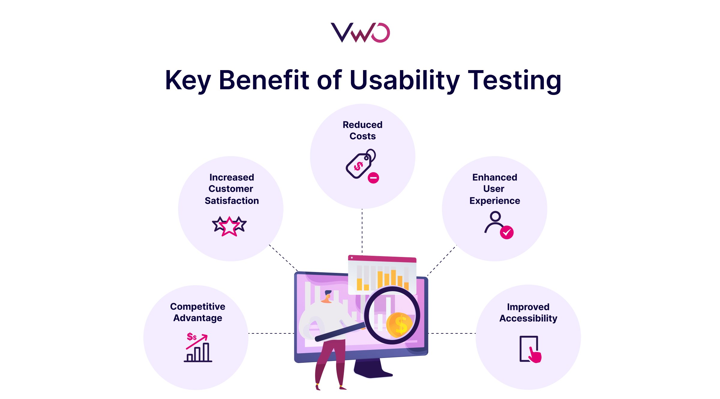
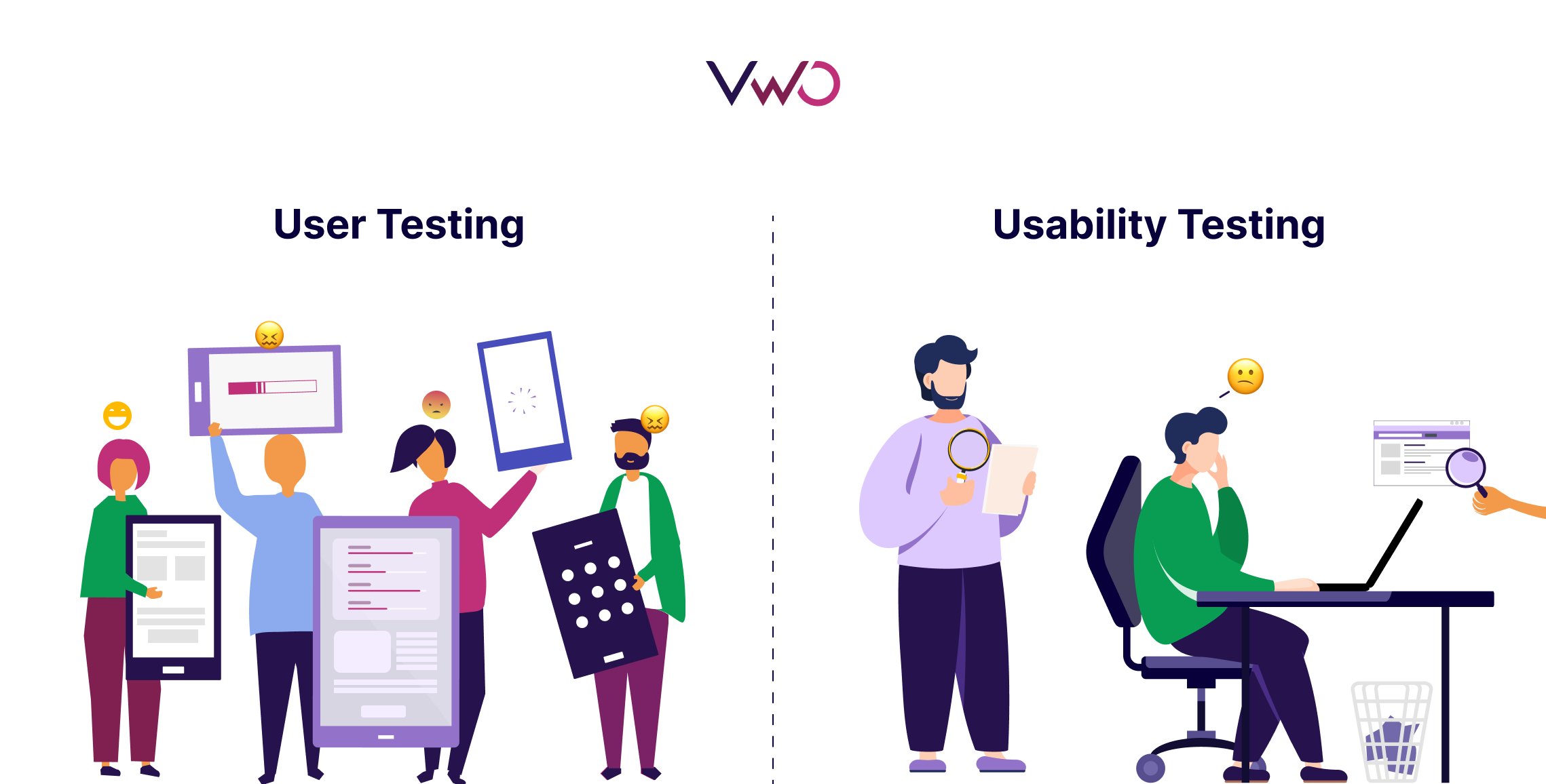
User testing and usability testing are different. The picture below clarifies when to use each.
21. Only 55% of companies conduct any type of online usability testing for their websites.
(Source: UXCam)
As the digital landscape evolves, staying in tune with what users want is no longer optional—it’s essential. Every company, whether big or small, should embrace regular usability testing to remain competitive and meet rising customer expectations. In fact, thanks to great tools out there, remote usability testing with many test participants is also possible now.
Do you have more questions about usability testing methods? Read our detailed guide to learn everything about this research method.
22. 5 users will find 85% of usability problems when testing continuously.
(Source: Nielsen Norman Group)
Jacob Nielsen established this fact long ago that a small, representative sample of users can uncover a significant portion of usability issues. By testing with just a few users, you can find most of the critical issues that may hinder the user experience.
Testing with a large number of users requires more time, resources, and effort to analyze and implement changes. This can slow down the process and divert focus from resolving core usability issues.
23. 70% of small business websites lack a CTA on their homepage.
(Source: Forbes)
CTAs on homepages give visitors a direction to take after landing on a website. Leaving them with only search and navigation bars is not a brilliant idea because most visitors don’t arrive with a firm decision to purchase. They’re more likely to be browsing and gathering information. As such, they need to be properly guided to continue their journeys on websites.
Add a prominent and compelling CTA on your homepage. Make sure it stands out visually and clearly communicates what users should do next.
24. Content sliders don’t work – only 1% of users click on them.
(Source: CXL)
Content sliders, often used to display multiple pieces of content in a single space, tend to be ignored by users. This low engagement rate suggests that users are not effectively interacting with these elements or finding them useful.
What you can consider doing is replacing content sliders with static, well-organized sections that highlight key information. Focus on clear, compelling calls to action and ensure important content is immediately visible to users without requiring additional clicks.
25. 5% people worldwide used ad blockers in Q1 of 2024.
(Source: Backlinko)
Recall any websites you visited where you were bombarded with pop-up ads and spoiled your experience? That happens to countless users every day. No wonder they’re frustrated.
Ad blockers are a solution to menace. Poor user experience makes visitors use ad blockers to avoid intrusive or disruptive ads.
Businesses can leverage non-intrusive methods like native ads, in-feed ads, sponsored content, affiliate links, or personalized recommendations for a seamless user experience.
Conclusion
I hope these stats highlight just how vital usability is for an outstanding user experience. Take a close look at what users feel about interacting with your website and make improvements where needed.
Ensure they can easily find what they’re searching for. Instead of constantly adding new features, focus on perfecting what you already have. The basics are key!
Want to get started? VWO can help you analyze user behavior and run insights-backed tests—all from one powerful platform. Request a demo, and let our team show you how seamlessly our ecosystem integrates with your tech stack.
Don’t miss out; otherwise, you’ll keep wondering what might have been.


