Website copywriting that sells sizzle AND steak is part art, part science. There is a tonne of variables that make or break your copy; your deep understanding (or lack) of buyer personas, a sweeping knowledge of your competitive landscape & your ability to communicate 1:1 despite appealing to many makes website copyrighting paradoxical & hard.
By means of this article, I will try to dissect the many requisites behind copy that sells, engages and delights your visitors. Please note that some points below might require you to add your industry’s unique quirks in your interpretations – no size fits all!
Download Free: Website Optimization Guide

Website Copywriting Essentials: Pro-Conversion Strategies
1) Get Copywriting Ideas from your Target Persona!
Every bit of content you create for your web pages or blog posts must be useful and valuable to your readers in order to boost conversions. The best way to achieve this is by creating high-quality content that users genuinely need.
Remember, marketing fluff is an old school. Content marketing has evolved, and so have the readers. What really works – dig into what interests your readers and cash on those opportunities.
Below mentioned are some smart ways to get website content ideas from your readers:
- Take a look at your customer service records and see what questions your users ask the most. Address those problems in your content.
- Keep track of the time spent on your posts, for example, to understand what type of content readers are most interested in.
- Don’t neglect the comments section. Besides writing useful insights, users also often post questions for you in the comments. And, if possible, in addition to answering them there, use them as topics for your future content.
- Explicitly ask your readers for their suggestions. For example, if you post a how-to guide, you can ask your customers while concluding the article to post requests for more how-to articles on other topics.
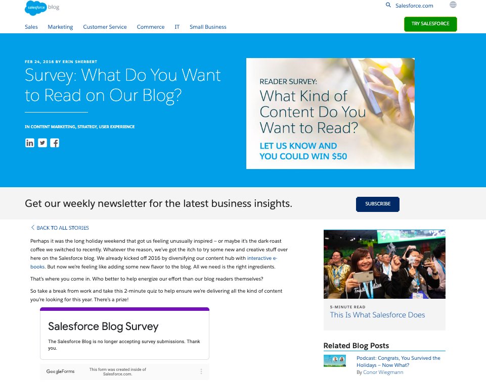
Salesforce does this neatly.
As a healthy activity, they frequently ask their readers to fill out survey forms regarding what they’d like to read.
2) Educate your Readers
To get better conversions from copywriting, look beyond the trending keywords. Write valuable web copies for your readers. Focus on establishing expertise in your field. You do that and your prospects will surely invest their valuable time in your brand and its offerings.
Here are some smart ways to establish your expertise:
- Write insightful e-books and let your readers download them for free
- Make tutorial videos and how-to guides
- Conduct webinars on interesting and engaging topics
- Record podcasts and ensure discoverability
- Publish well-researched white papers with technical and scientific explanations of various topics in your field
VWO has got it just right. It offers a wide spectrum of marketing resources for web swimmers to read and gain industry knowledge.
3) Create Content with Scope for a Two-Way Conversation
Always carve out a content strategy for smart copywriting that is easy to understand and encourages your visitors (and target market) to interact with your brand.
It could be in the form of adding valuable thoughts through comments section on your blog pages, sharing your posts, tweeting about them, or even reaching out to you to know more. Either way, it’s important to ensure that your target audience is able to reciprocate to your content.
4) Follow the 60/40 Content Rule
Once you publish your content, it’s out there. Most marketers don’t take the time to optimize their content based on the initial results — views, time spent, bounce rate, etc., and they move on to work on new content.
Testing, tweaking, and refining is important to maximize the value of the content pieces you publish. If you’re not revisiting and revamping them from time to time (in addition to creating new pieces of content) to maintain their hygiene, you’re literally throwing away some good, traffic attracting content and the leads it can generate.
On the contrary many marketers refrain from refining content pieces from time to time, as they feel it’s a wasteful activity and quite ineffective as well.
To counteract these two extremes, it’s best to adopt the 60/40 split content strategy. According to this rule, you must spend 60% of your time in content creation and the remaining 40% in refining, testing, and tweaking the published content.
Every time you come across an article, a case study, or when writing a blog that has a below-industry-average time spent, ensure to go back and add new and relevant examples, interesting statistics, and update visuals. This not only helps to add a fresh perspective to your content pieces, but test what will work better — in our case, statistics followed by inferences work the best!
“Just remember, great quality, relatively less content and aggressive promotion is the key to high conversions.”
5) Be Crafty About Your Headlines
Since a headline is probably the most viewed element on the page, it makes utmost sense to tweak and test them for positive results. Your headline should tell visitors exactly what they can expect on your website.
i) Convey Benefits, Not Features:
The objective of your headline is not to sell, but to connect with your reader(s). Ensure your headline(s) has the ‘hook’ needed to bind visitors to stay and explore your offerings rather than just skim through and exit. In other words, craft headline(s) that convey value propositions that entice.
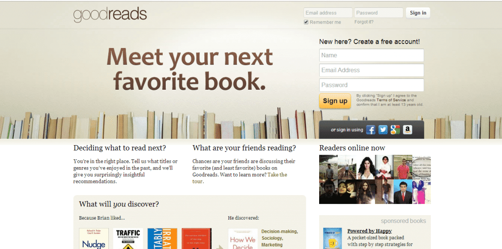
Goodreads does this quite well. Its power-packed headlines always reflect its primary value proposition while compelling visitors to click and take action.
ii) Keep Headlines Simple and Direct:
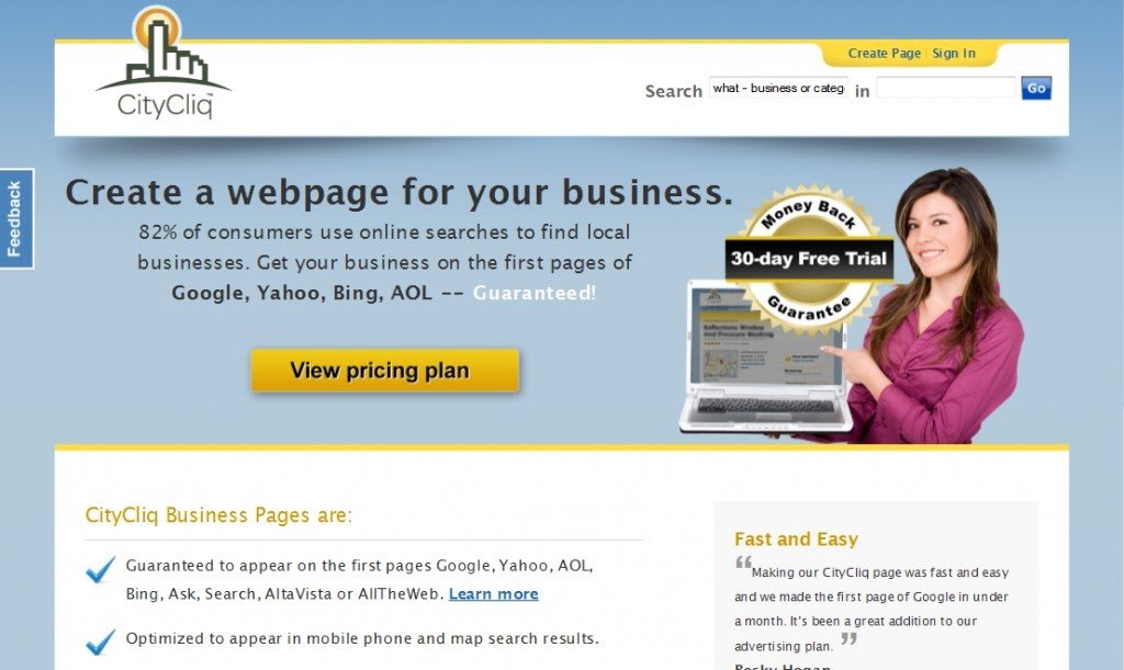
An Eyetracking Study of Web Readers conducted by the NN Group observed that users preferred clear, straightforward headlines to funny or cute ones. CityCliq, a provider of low-cost, search engine optimized web pages for small and large businesses, ran an A/B Test with VWO wherein they tested 4 versions of their headline. The 4 headlines tested were:
- Businesses grow faster online!
- Online advertising that works!
- Get found faster!
- Create a webpage for your business
Not surprisingly, the 4th statement, which represented the most direct, clear representation of the product, came out on top with a 90% increase in conversion rate over the original.
iii) Use Social Proof and Testimonials:
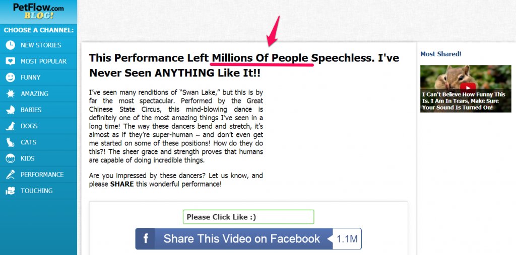
Many studies, including one conducted by the NN Group (as referenced above), state that about 78% of the first three user eye-fixations are on the text, primarily the headlines. Adding social proofs or testimonials to your headlines conveys that the content is authentic and trustworthy.
In fact, LKR Social Media ran an A/B Test with VWO wherein they replaced the question-based headline, “Could you use a free plan for promoting with Social Media?,” with a testimonial headline, “Yours is the only newsletter that I actually read.” They also modified the sub-headline accordingly. Not surprisingly, the variation resulted in a 24.31% increase in signups.
Download Free: Website Optimization Guide
iv) Promise Time-specific Benefit and Use ‘Loss Aversion’ Tactics:
One of the best ways to grab the reader’s attention is to promise time-specific benefits. Visitors visiting your site page(s) typically have two things on their mind, “How will this benefit me?” and “How soon will I get the benefit?.” As a brand, it’s your job to answer these questions smartly and quickly before visitor-flicker-attention kicks in.
The Value Litmus Test, an article at ValueCentricSelling.com, also states that having the timeline at the core of your value proposition brings in more traffic and more conversions. imsider.ru, a VWO customer, increased its lead generation by 9.52% by simply adding a time-specific benefit to their headline. Here’s a comparison of their control and variation page.
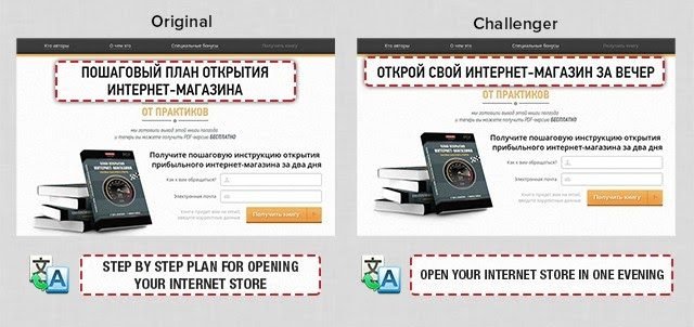
However, ensure the timeline promised through your headline(s) is achievable and realistic. Impracticality is highly judged and can lead to disconnection.
Loss Aversion, on the other hand, is a concept well explained in economics and decision theory. It states that most people prefer avoiding losses to acquiring gains.
For brands, loss aversion means that more people will be attracted to a headline that states, “You’re Missing Out,” “Not Bought Yet? Buy Before the Stock Runs Out.” Such headlines not only instantly grab a reader’s attention, but instigates a feeling of loss or fear of risk.

v) Highlight the Measurable Results:
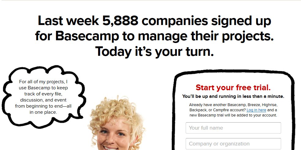
Data is sexy. It adds to your credibility and can help convince your prospects better than anything. Gather convincing data about your product or service, emphasize it in your headline and AB test it. See how Basecamp puts this into action:
Here’s how Basecamp puts this into action:
vi) Create Authority Bias:
People at position with formal authority are often expected to make better decisions and fewer mistakes, and therefore their opinions and contributions are given higher weight. ‘Authority Bias’ is the tendency to take on the opinion of someone who’s seen as an authority on a subject.
Shrewd advertisers and marketers have been employing this cognitive bias for as long as we can remember. Using this tactic for your headlines makes them more compelling and attractive.
6) Lead Generation Form Copy Tweaks
Making people part with their personal information is not an easy job. You need to incentivize them with the right lead magnets strategically placed especially on your lead generation forms. The catch here is not to make your forms text heavy but add elements that improve a visitor’s experience thereby falling into your lead generation trap.
For instance, the addition of privacy lines in your form can help address visitor anxiety concerns and significantly improve conversions. The image below shows how Practical eCommerce does this:
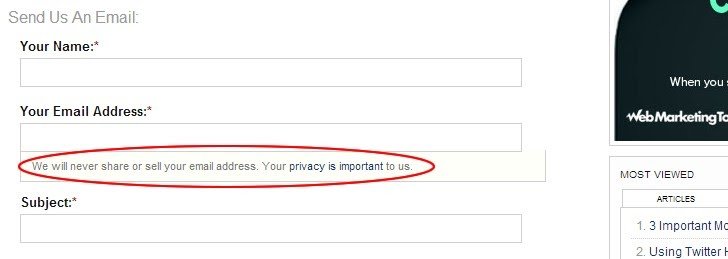
You can even link to your privacy policy from the form like Practical eCommerce did (look closely).
Before you take your heads up on this and add a privacy line to your form, look at this rather important example as well. Michael Aagaard of Content Verve conducted four privacy policy website copy A/B tests for one of his clients. The tests revealed that every time he added the word “spam” to his privacy line, it reduced signups. It doesn’t matter if the word was used in the positive context.
On the other hand, when Michael added the word “guarantee” to say “We guarantee 100% privacy. Your information will not be shared,” it increased conversions by 19.47%.
Apparently, the negative connotation of the word “spam” and the positivity of the word “guarantee” played its role here. So, if you are thinking of saying something like “We hate spam as much as you do,” maybe you shouldn’t.
Also, you can check out this insightful episode from the VWO Podcast where Eden Bidani shares her unique perspective on copywriting and its impact on conversion rates.
7) Use the Right Testimonials
A general testimonial, no matter how awesome it may sound, can never convince your prospects enough. Display a testimonial that talks about 1-2 of your features in detail and explain how it contributed to their success. It would be absolutely awesome if you have a testimonial that emphasizes the value of your value proposition or offer (preferably with measurable data).
For example, a general testimonial like, “I love VWO. It’s the best A/B tool in the market” might not be as convincing as this one:
We have used several testing platforms over the years, and are smitten with VWO for a couple reasons – it’s pretty simple to set up, and reading the results is a breeze. In fact, checking test results is our new favorite addiction. ~ Roger, UNK.com.
8) Communicate Value
Go through your copy and recheck everything once again. Tweak it to communicate what all your customers will get out of the whole deal? What’s their benefit? How? Here are some examples for inspiration:
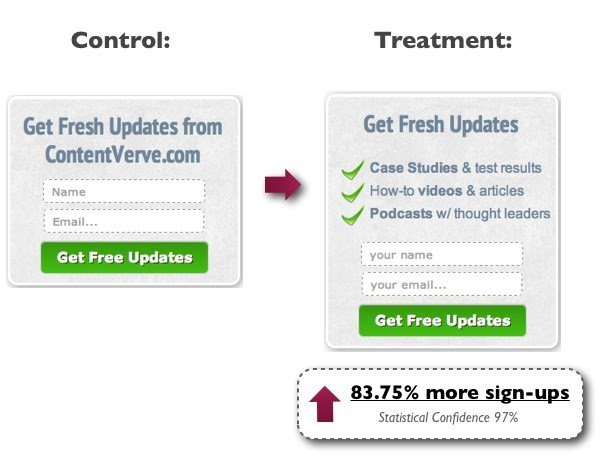
When people know exactly what they will get, it is easier to make them convert. Provide them the necessary details. But don’t overwhelm them.
9) Experiment with Button Text
Your call-to-action text or the text that surrounds it can make a lot of difference to your conversion rate.
Add the word “Free” – Test it out and see if it improves your conversions, like it did for Viadeo.
Control: 14.5% Conversion Rate

Variation: 18.6% Conversion Rate

Address anxiety concerns in the button text. Assures people that it’s a quick signup process and it won’t take much of their time.
To conclude, for any of this to work, it’s important to get your basics of readability right. In case you have never thought about it, we highly recommend that you go through them. They may sound very minor points but there are good chances that you are losing a lot of conversions if you are not following them. And in the end, it all comes down to AB testing. No matter what tweaks you want to try, make sure you test them first.


![7 Best Website Monitoring Tools [2026]: Expert Insights to Help You Pick the Right One](https://static.wingify.com/gcp/uploads/sites/3/2025/02/Feature-image-7-Best-Website-Monitoring-Tools-How-to-Pick-the-Right-One.jpg?tr=h-600)
