How do I optimize my website’s conversion rate?
Should I just try different ideas based on my gut feeling?
Should I optimize the loading speed?
Do I need to refresh the visual identity or rewrite the copy?
What should I A/B test?
Without investigating the root causes that keep your customers from buying, registering, or reaching whatever goal you’ve set, you’ll be just making uneducated guesses.
Download Free: A/B Testing Guide
And if science has taught us anything, it’s that uneducated guesses rarely win.
So, if having a wild guess won’t save your website, what will?
The answer is Conversion Research.
What is conversion research?
Conversion research is the process of investigating the opportunities on your digital properties (website, mobile app, etc.) and gaining a more profound knowledge of your target customers. It’s the starting point that will fuel your conversion optimization ideas.
A thorough investigation would provide you with the knowledge you need to achieve the following goals:
- Write copy that aligns with your customers’ needs, treats their objections, and reduces their fears, uncertainties, and doubts.
- Catch the existing technical and UX problems.
- Understand your users’ behavior (and where the leaks in the funnel are).
- Create a user-friendly design that will help your users reach their desired goals.
To reach all these goals, the conversion research process should contain all the following pillars:
- Heuristic analysis
- Technical analysis
- Behavior analysis
- Qualitative & Voice of Customer (VoC) research
But before diving into these pillars, we need to understand the initial strategy that we’ll be applying at least at the start of the process.

Gathering the low-hanging fruits
While conversion research will enable us to have a large number of insights that we act upon, our first direction should be focused on trying to find any conversion killers that can be implemented right away without having to test them. These could be some bugs in some devices or browsers, serious loading speed issues, mobile responsiveness issues, or design and usability issues. If the issue is not easy to implement, has a low impact on conversions, or has to be tested, then document it and you can get back to it at the end of your research.
To start the process, we conduct a heuristic analysis.
Heuristic analysis
A heuristic analysis is the evaluation of your website based on industry standards and best practices. What makes this different from just an opinion is that it’s based on collective knowledge in different industries. So the more you or your expert knows about these standards and best practices, the less opinionated your review becomes.
Conducting a heuristic analysis means reviewing the website based on:
- Usability principles
- CRO best practices
- General copy principles
- Visual design principles
Usability
The expert evaluating the website could use Jakob Nielsen’s 10 usability heuristics for example. One of the principles, aesthetic and minimalist design, could be used to judge whether the pages contain much more information than the users need or irrelevant content.
Let’s take an example:
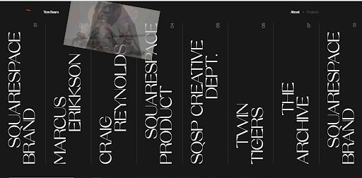
Although this website is being praised and featured on awwwards.com for being visually pleasing, the aesthetics here are interfering with usability. The priority here should be on displaying the content and the functionalities in a user-friendly way.
To evaluate the usability of your website yourself, here’s a checklist you can use:
- Is your website look consistent with the user’s expectation of what a website should look like (the position of the navigation bar, headline or call to action, the shape of a button, etc)
- Are your website elements (buttons, headlines, links, etc) consistent across different sections and pages?
- Are you showing relevant, sufficient information with no excess that could cause the users a cognitive overload (too much information)?
- Are you preventing your users from making any errors such as misunderstanding the function of some elements?
- Is the text on your website readable (size and contrast)?
- Do you have any distractions keeping your users from consuming the content (eg: background videos, useless animations, cookie alerts, pop-ups, other promotions, etc)
- Do your action elements have different states (default, hover, clicked, and active)
CRO best practices
When multiple experts test a certain pattern and find that it’s helpful, a best practice is born. For example, GoodUI has published a pattern called “Gradual reassurance”. The idea is to add relevant and easy questions to your form in the beginning before asking for any personal information.
This pattern has been tested 7 times by different people/brands and has proven to create an average uplift of +21.8% in sales. This pattern doesn’t mean that you’re 100% sure that there will be an uplift. You should A/B test it with VWO. Take an all-inclusive free trial and see how VWO makes A/B testing easy!
However, testing an idea like this will have a higher probability of success than a random idea based on someone’s opinion. Many CRO experts are publishing their wins and we should learn from them and even duplicate them.
The other part of best practices comes from either psychology concepts such as the decoy effect or some lessons we learn from the marketing godfathers like David Ogilvy.
Copy review
Based on research conducted by Unbounce, based on 40k landing pages, a copy is twice as influential as design in conversions. So reviewing your copy should be an important task you should invest in.
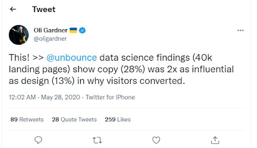
Here’s a checklist you can go through to analyze your pages.
As an exercise, choose an important landing page that you want to optimize and go through the checklist below. Rate each question with a number from 0 to 10.
Note: Reviewing your copy also includes reviewing your offer too. Rewriting your copy is great. Elevating your offer is even greater. That’s why some of the checklist items will be related to reviewing your offer.
- Does the headline explain your product/ service value right away?
- Is your headline language familiar to your target audience?
- Does your above-the-fold copy attract the attention of the users to continue reading beyond the fold?
- Are your claims supported by proof like testimonials, ratings, authority figures’ endorsements, number-based outcomes supporting the transformation after buying your service/product, the total number of customers, etc?
- Are you going through the users’ objections and responding to them?
- Are you offering any incentives (free shipping, money-back guarantee, free trial, etc)
- Are you using any form of urgency as a motivation?
- Do you have only one main call to action?
- Are you going through all the main product/service benefits?
- Can your audience self-identify as the target for your offer?
Visual design principles
To create a visually pleasing user-friendly interface, you need to follow a set of simple but powerful design rules. These will help you:
- Create a great reading experience
- Create a visual hierarchy for your elements to communicate what’s most important
- Get a positive first impression
- Create a professional and coherent look
- Help the user navigate the different elements with ease
- Help create a story with the design that goes hand in hand with your copy
Qualitative & voice of customer research
It’s business/marketing 101 to understand who we’re serving so we can market better. The goal here is to understand the users’ pains, needs, goals, and objections. Qualitative research will enable us not only to document important information about our audience but will also help us understand how they’re framing their needs, objectives, fears, uncertainties, and doubts using their own words. That will be a gold mine when we start experimenting with different copy ideas.
To collect this information, we can:
- Collect your audience quotes from online forums, Reddit, Facebook Groups, and even YouTube comments. This is where users are expressing freely their needs, problems, agitations, goals, or even sharing their wins.
- Conduct user interviews
- Analyze emails and chat transcripts
- Create and analyze surveys
Learn how to capture and action the voice of the customer with a free recording of Ali Good’s webinar.
Technical analysis
The reason your funnels are leaking could be simply technical. It could be bugs, responsiveness problems, loading speed problems, or cross-browser compatibility problems.
An expert could review all these pillars. But in case you want to do this analysis on your own, here’s how you do it:
Cross-device testing
Go through the user journey from the starting point (generally the landing page) to the ending point (generally the thank you page). Start with your device and see if you have some bugs such as unresponsive buttons or any strange behavior. You can start by manually doing that with real devices like your laptop and phone. But since you don’t have tens of devices, different SaaS apps can help you with that. Apps like Browserstack and LambdaTest can give you the ability to test on different devices and different browsers. And that brings us to cross-browser testing.
Cross-browser testing
Not only devices could affect how your website looks and behaves, but browsers matter too. In 2022, cross-browser compatibility has come a long way and it’s in its best state. That said, there are still issues, especially with old browsers. To investigate the priority for each browser, you can explore the report using Google Analytics by going to Audience > Technology > Browser & OS.
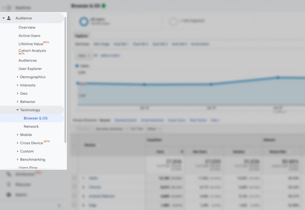
Not only can you see which browser matters most, but you can also explore the conversions per browser.
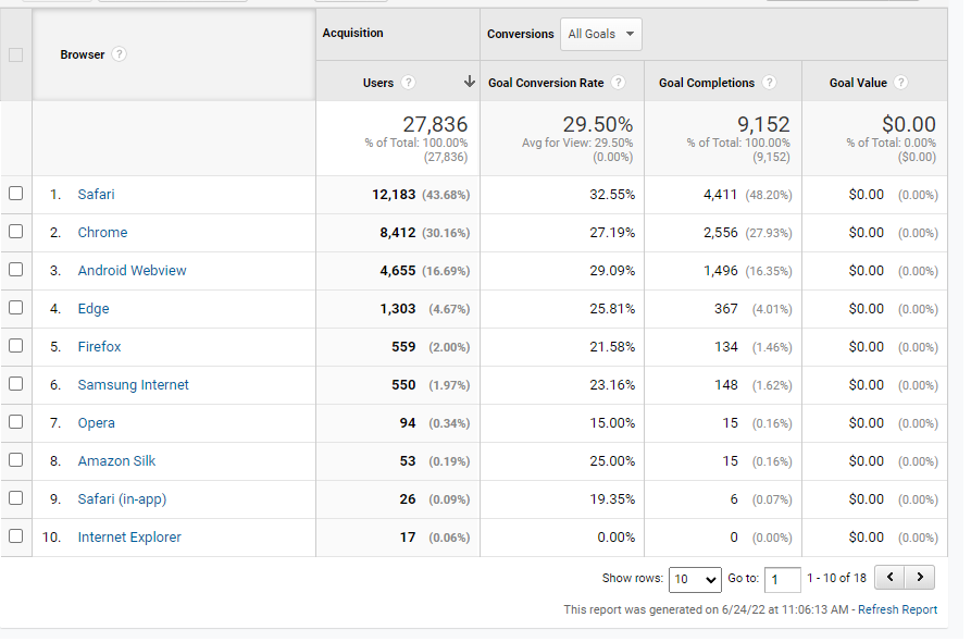
If you notice a suspiciously low conversion rate (which can be 0 sometimes) where the sample size is not that low, it’s time for investigation.
Here’s a scenario:
You notice that IE 10 has a 0.03% conversion rate for a sample size of 3280 sessions. You also notice a 9.34% conversion rate for Opera mini for a sample size of 3040. You check the average conversion rate for all browsers and it’s around 9.5%. With that information, you know that there has to be something broken on IE 10. No big difference for Opera mini though so you can let it off the hook.
You open the website with BrowserStack and conduct a walkthrough. Aha! The call to action doesn’t work somehow. File this issue to your developer and it’s fixed. No need for testing as we fix bugs, we’ve just gathered a low-hanging fruit.
Page speed optimization
This is indeed a domain of its own, but I believe that most of the problems websites have are easily preventable. So before we tackle optimization, let’s see the most common possible problems:
- Non-optimized images. With big images come big opportunities.
- Non bundled CSS and/or Javascript files
- Absence of a lazy loading strategy
- Not using a CDN to serve static assets
- Overloading your website with multiple CSS and Javascript libraries (way too many Shopify apps or WordPress plugins can cause that)
Other problems may affect your page speed but mainly, the mentioned problems have the biggest impact.
But before you start investing in page speed optimization, you need to make sure that the improvement will be worth your investment.
A 10ms improvement could mean a lot for a company like Amazon. Every 100ms in added page load time cost them 1% in sales. So that 10ms improvement in sales means an uplift of $380 million (0.1% of Amazon sales).
For other companies, that 10ms improvement could mean only an additional $1000 or less per year. So depending on your company’s scale and your page loading speed, you can judge whether the optimization is needed or not.
If you find that it’s worth it, make sure that you:
- Eliminate any render-blocking resources. Javascript scripts, CSS files, or images that are not being used in the fold can be deprioritized and lazy-loaded.
- Optimize your images and lazy load them.
- Use a CDN like Amazon S3 to serve your static files.
- Compress your Javascript and CSS
As a rule of thumb, you’d be targeting a loading speed of 1-2 seconds, especially for your key pages.
Download Free: A/B Testing Guide
Behavior analysis
Funnel analysis
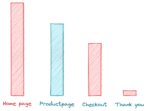
Conversion optimization is not a random process where we can start anywhere on the funnel. We need to understand where our optimization efforts should be focused first. Funnel analysis is one of the best ways to understand not only the user behavior across the different steps but also where should we start the optimization effort. The closer the users are to the checkout, the more impact our efforts will have on conversion.
With VWO, you can easily get a funnel visualization to see where the biggest drop-off is. For example, if you see a suspiciously big drop-off on the checkout page, you can prioritize investigating that as this has a big potential for a conversion rate uplift.
Heatmaps
Heatmaps are a way to visualize the users’ behavior on a certain page. You can answer questions like:
- What attracts the users’ attention most?
- Where do users tend to lose disinterest?
- What important information that the users aren’t reaching?
Not only will a good portion of the insights be pulled from heatmaps, but these visualizations are very useful when presenting your insights to a manager, a stakeholder, or a colleague. It’s very hard to argue with heatmaps and that will make your conversion optimization process much smoother. Opt for an all-inclusive free trial with VWO to experience the benefit of heatmaps.
Session recordings
Before the session recordings concept was invented, experts were using controlled testing environments where they bring people into a lab and hide behind an opaque glass to see how users interact with their products. Or they can even be present which, in either case, will affect the behavior of the users. No to mention that this method is so expensive and far from being scalable. The alternative is session recordings.
This way you can capture the real unfiltered behavior of hundreds of people.
Form analytics
Forms can be hard to optimize. While applying CRO and usability best practices to your forms is important, it’s even more crucial that you understand how your users are interacting with your form. Session recordings are good for this task but an even more important and complementary tool is VWO’s form analytics. This tool can help you understand which fields are causing more friction, where users are leaving, how many people have reached the form, how many people have interacted with it, how many people submitted it, etc.
Get an overview of VWO Forms:
What makes this a better tool than traditional user testing and user recordings (which have their benefits and use cases) is that it quantitatively offers the data. Seeing few users quit after reaching a certain field in user testing is way less accurate than seeing a 65% drop-off rate for a sample size of 9000 people.
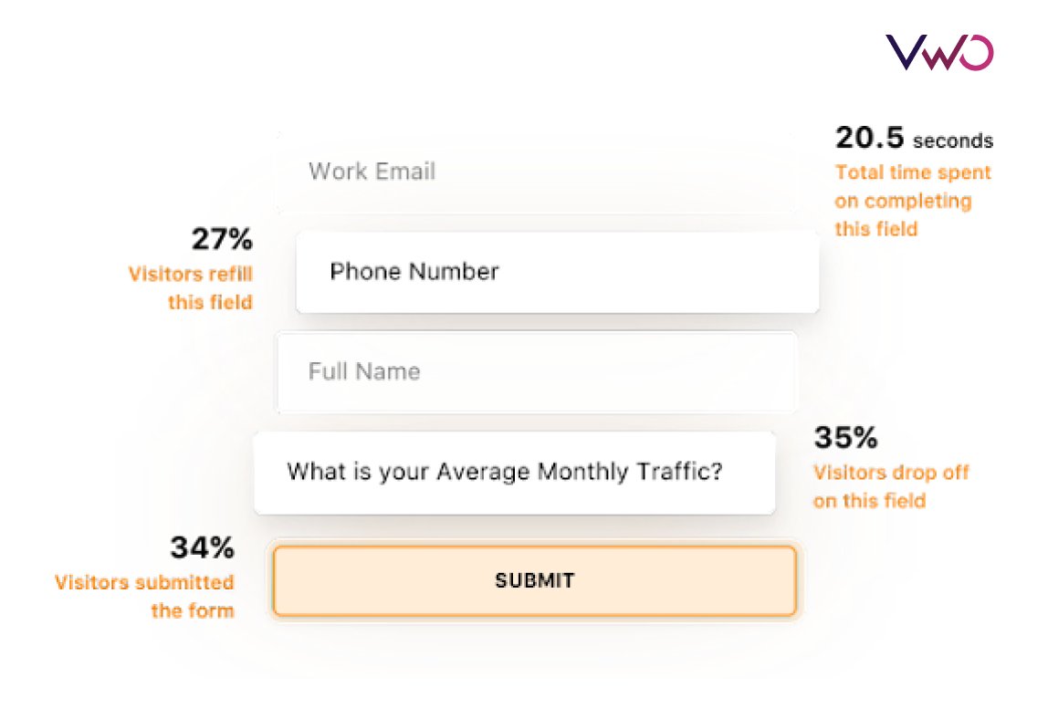
Take a free trial to try it out for yourself and explore its capabilities.
On-page surveys
Tools like Google Analytics are very important to explain what’s happening. For example, if you have a high exit rate on a landing page and you want to understand the reason behind it, Google Analytics or any similar tool won’t give you the answer. It’s your role to investigate that. On-page surveys can help you understand that by asking your customers directly. You can even target different behavior such as an exit once landed, an exit once reached half the offer section, etc. That way, you can get a piece of much more accurate information based on user behavior.
Conclusion
Conversion optimization isn’t just about A/B testing. This is one of the most common misconceptions. A/B testing is a very important pillar. But to have experiment-worthy ideas, we need conversion research. This is how we can generate ideas that have an excellent potential to improve the conversion rate. With different tools and approaches, conversion research will give us not only the information needed to run an experimentation program but can also affect other areas such as product/service design.
Now that you know how to conduct conversion research, it’s time that you understand what comes next: A/B testing.


