Your website is your primary tool for lead generation and most likely your number one customer acquisition tool as well. An appealing site that catches your visitor’s eye is great, but what if that traffic is making zero impact on your bottom line?
It’s a common problem. In fact, the global eCommerce conversion rate, as per the current benchmarks, is a mere 2.58%.
Download Free: Conversion Rate Optimization Guide

So if your business is hovering around this rate, you are not alone. Competition continues to rise, making it even harder for businesses to drive online sales. To help you identify where your conversion rate optimization (CRO) strategy may be failing you and how you can improve this strategy, we’ve narrowed down the best possible methods:
Write compelling content
Most people don’t read most web copy, so that suggestion may come as a surprise. They may skim and absorb the headlines that stand out, but they do not read word-to-word. The reason for this is simple: web content is often poorly written.
Remember the following points to attract readers and boost conversions with your content:
- Voice: Use a unique voice that’s consistent across all of your marketing channels.
- Be provocative: When appropriate, use suggestive headlines and copy that speak to your users about their frustrations and pain points.
- Entertain: Even the driest topics can entertain readers if written well. If a particular page isn’t geared toward informing or educating the reader, it should at least be enjoyable to read.
- Be professional: Avoid exclamation points. If you need to communicate excitement, use verbs.
- Cite sources: It’s frustrating to read content that makes unsupported claims. If you are sharing your own perspective on a matter, cite the original.
Forms are where the conversion happens
The form on your landing page is the most important component of your conversion strategy. It’s the final step an individual takes before becoming a lead or customer. With that in mind, it’s important to consider the following:
Number of fields
The optimal number of fields for your business will depend on your offer, but try to make it as few as possible. Only ask for the details you need from your leads. The more fields on your form, the easier it is for a contact to get overwhelmed with the effort involved and bounce (especially for those who browse on mobile devices).
Placement
As we discussed earlier, people tend to skim web pages and look for key elements. If your conversion opportunity (form) appears below the fold, visitors may not even see it. Make sure it’s visible on all devices upon landing on the page, without the need to scroll, pinch, or zoom.
Form errors
There’s nothing more frustrating than filling out a form three times only to get an unsuccessful error without any indication as to which part of the form was not filled out correctly. Make sure form errors are visible and descriptive.
Run A/B tests on landing pages
By A/B testing two different versions of landing pages at the same time, it’s easier to pinpoint what’s driving conversions and what’s not.
Here are some examples of different elements of your conversion strategy you can A/B test:
- Button color
- Headlines
- Copy
- Forms
- Page layout
- Images
You can track the results of your A/B tests in Google Analytics. However, using tools like VWO or Google Optimize can allow you to manage your experiments a little easier.PRO TIP: Ensure that you are extracting meaningful data from your tests. The A/B test results may show you which call-to-action (CTA) performed better, but what information can you take away from that experiment to help your next CTA?

Establish trust
It doesn’t matter how strong your offer is if your visitors don’t feel they can trust you. This is particularly important for eCommerce businesses. Why would shoppers give you their credit card information if they are the slightest bit apprehensive?
Include these elements on your landing and product pages, where the user is preparing to make a decision:
- Badges: Antivirus, PayPal, Verisign, for example.
- Reviews and seller ratings: Here is a list of the ones that Google recognizes, which means they stand to improve your click-through rate as well.
- Testimonials: Include an image of the customer if possible (get consent first!).
- Dynamic social proof: Yieldify has a tool that shows you how many people viewed a page or product in a given time frame. The same is used in the travel industry when you see “300 people viewed this property today.” The same buyer psychology works for products in eCommerce.
Leverage design best practices
If your website is not responsive (doesn’t adapt to the user’s screen size), this could be the number one reason for your low conversion rates. As desktop browsing continues to give way to mobile, your website needs to be optimized for mobile devices of all sizes.
The look and feel of your website should have character. A common trend in design currently is the minimalistic white look. But what’s memorable about that? Use about 2 to 3 of your brand colors throughout the site and make a side-by-side comparison with your competitor’s site to ensure that yours is unique.
At all costs, avoid using stock photos. These are typically unrelatable and generic. Invest in quality photography of your products, office, and team. You’ll be surprised how effective these images can be in establishing trust. Also, make sure that your UI is such that your users don’t have to struggle to find a way to pay for the items.
Download Free: Conversion Rate Optimization Guide
Incorporate conversion-driving functionality
How can you expect visitors to convert on your website if it takes several seconds to load? People are impatient and can move to the next search engine result if your website loads too slowly. You can optimize your media and check your site load time periodically with Website Grader.
The goal of your website or landing page is to convert visitors, so it’s important to keep them focused. Avoid unnecessary overlays or pop-ups that may be distracting.
Visitor experience on your website plays a key role in their decision to convert. This includes being able to serve your visitors the information that meets their needs, which is where personalization comes in. Website personalization displays content tailored to your visitor characteristics, devices, or actions, facilitated through your CMS and marketing automation platform.
Offer incentives
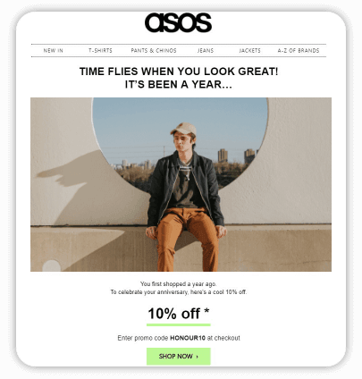
As eCommerce competition continues to grow, shoppers have endless opportunities to search for better deals. Offering an incentive and making it clear how to take advantage of it can be an extremely effective method to drive conversions. Create a page dedicated to promo codes and link to it in your main menu, or share the code directly on the product page.

If visitors don’t see what they are looking for on your site (like a sale or promotion they saw on another channel), they’ll use your search bar. Analyzing the searches on your site is beneficial not only in determining what your visitors are looking for but also in encouraging conversions by allowing visitors to find what they are looking for. Ensure that your search bar is visible on all pages and devices.
Do not underestimate the power of advertising
Another particularly effective type of advertising is remarketing. Remarketing ads are displayed to individuals who have already visited your site.
There are plenty of ways to use remarketing ads to drive conversions and beneficial to re-engage:
- Past visitors
- Individuals who abandoned carts
- Existing customers

Use your data
One of the most important ways to continuously optimize your conversion strategy is to leverage your data. Uncover details about your customers such as, how they are finding your site and how they are engaging with it. You can do so by analyzing the data collected from Google Analytics, your advertising campaigns, social media channels, email efforts, and any other tools that you are using.
Conclusion
Remember, optimizing your conversion strategy should be an ongoing experiment. These tips can guide you in the right direction, but the effort should be that of constantly evolving and improving. Start with goals, test your strategy, analyze results, and make improvements and adjustments accordingly.
Start your 30-day free trial now or request a demo to book a session with our seasoned CRO experts and get optimizing with the VWO platform!
Please Note: This is a guest Post by Peter Dulay. He is a conversion expert with over 10 years of experience in digital advertising and conversion. He has helped many startups and fortune 500 companies to boost their conversion by 400% and more.
Bonus content: Watch a webinar to learn how a good copy can improve conversions.


