eCommerce bounce rate may sound like a familiar problem to many. Visitors land on your site, hang around for a few precious seconds and then bounce without visiting another page. The average bounce rate for eCommerce businesses in 2015 was 57%.
Download Free: Cart Abandonment Guide
If the bounce on your eCommerce site is above this number, you should go through these 14 best practices to increase engagement by A/B testing most of the elements on the website as discussed below.
1) Pay Attention to the Size of the Search Bar
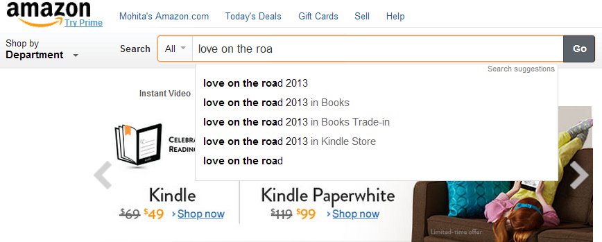
One reason for the high eCommerce bounce rate is that visitors are not able to find what they are looking for. To combat this problem, you have to make your search bar as prominent as possible. As per UX Planet, an ideal search box should be 27-character wide. However, search bars on average are only 18-character-wide. Though you can type long queries in short boxes, the problem is that only a portion of the query will be visible at a time. This makes editing or reviewing the query difficult.
If you can’t devote so much prime real estate to your search bar, you can try making it dynamic like AllRecipes.com. The search box automatically becomes bigger as one starts typing in the box. Another way to optimize your search bar is to make it persistent (or ‘sticky’) like Shopstyle UK. Fix it at the top of the page so that visitors who scroll down the page never lose sight of it.
2) Have a Strong Site-Search Solution
Having an ideal-length search box will not be enough if it doesn’t show up the right results. If you’ve never really considered how site search might be affecting your site experience, then now is the time to do it.
3) Speed is King
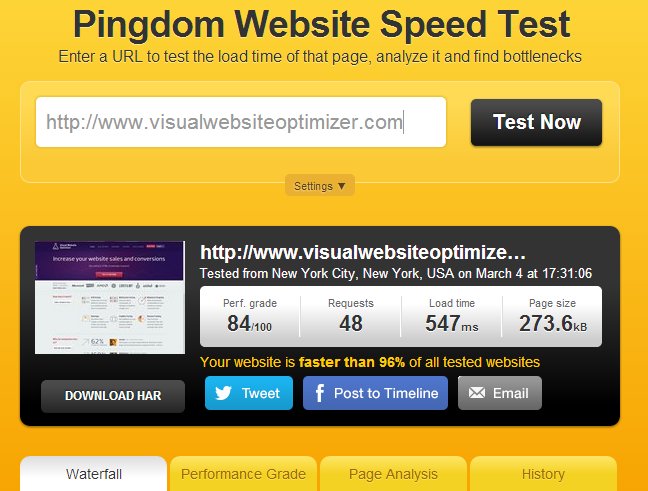
A website that loads at a lethargic pace is what one calls a bounce paradise. For every extra second, your web pages take to load, your conversions can drop.
Decibel Insight’s research on page load time and bounce rate says that slow loaders have a 72% higher bounce rate than fast loaders, and a 38% higher bounce rate than medium loaders. A fast-loading site also scores high on search rankings. Site speed is critical and you should take all possible steps to make yours faster. Here’s a link to Google’s best practices to reduce loading time.
4) Split Test the Timing of Your Modal Box
Imagine you have just entered an apparel store. You are walking at your own unhurried pace when suddenly a burly man runs into you with a feedback form. He asks you what you like in the store, what would make you come back, whether would you recommend the store to a friend, or if would you like to receive their yearly membership card. How would you react? If you possess infinite patience, you might just politely ask him to give you some breathing space — but not before mentally pledging not to enter the store again!
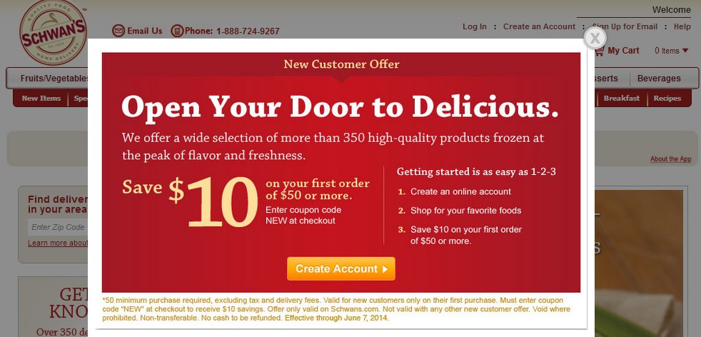
Now think of online shopping and modal boxes. Those theatrical pop-ups are a lot like that burly salesman. However, I won’t completely disregard modal boxes. They can be extremely useful in increasing conversions. The key lies in figuring out how long you should wait before making them pop open. If they pop up too early, you risk strangling the visitor. The time it for a little too late, and the visitor is already off to another tab. Solution? A/B test the popup timing.
5) Display the Top Deals/Discounts/Limited Time Offers
Play the urgency card to get the visitors hooked. Scarcity has been identified as one of the six persuasion principles by Robert Cialdini in his epic book on influence. One way to engage visitors on the homepage is by displaying your best deals and discounts in the banner. See how eBags prominently displays its limited-time offer in the top banner.
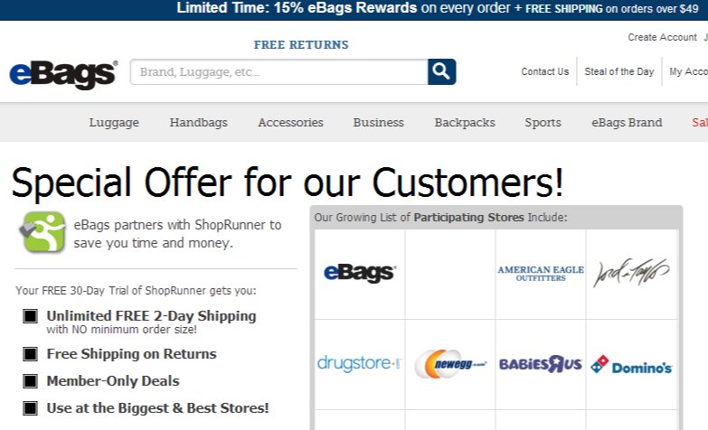
Limited-time discounts catch eyeballs and you will be doing yourself a great injustice if you don’t utilize them to hook the visitors.
6) Eliminate Distractions
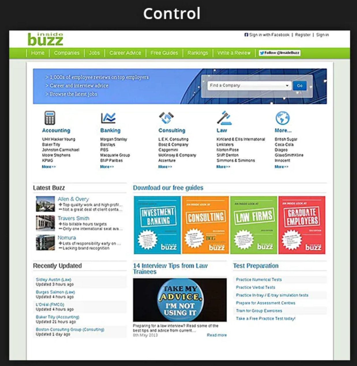
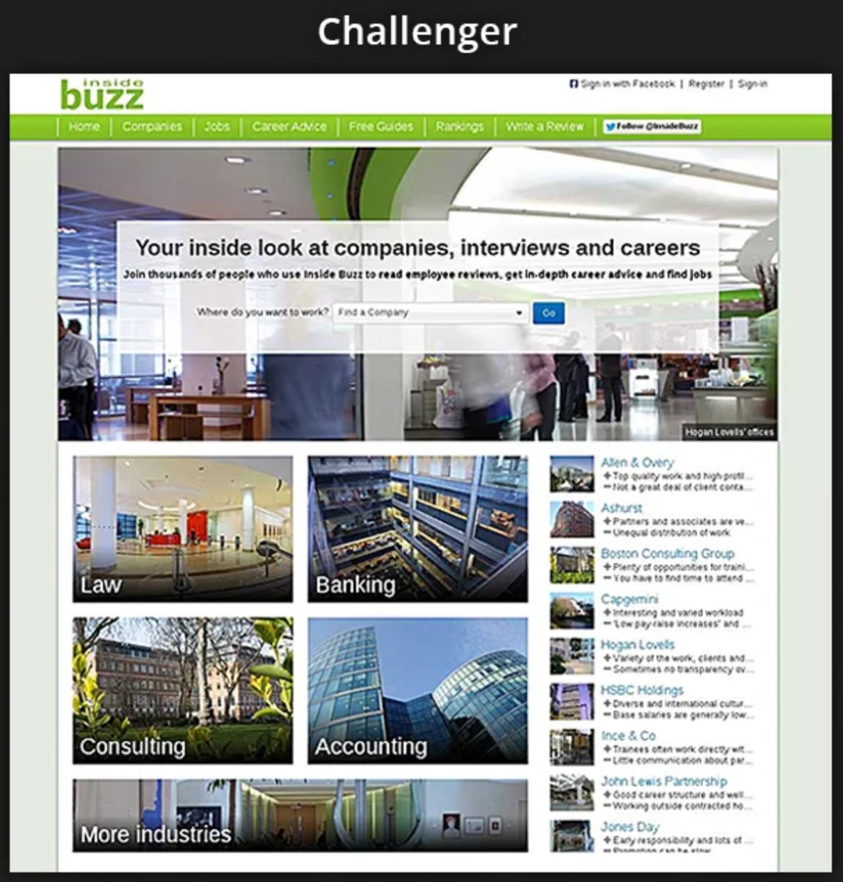
Too many choices often confuse people and impair action. Let there be no bombardment of information on your homepage. Simplify your design and work towards reducing distractions. Inside Buzz, a VWO customer used A/B testing to create a homepage with reduced options. The simplified version increased site engagement by 17.8%.
7) Offer a Live Chat Help
While enhanced product findability and an exhaustive help section will resolve a lot of customer queries, having a 24-hour live chat feature is an even bigger boost. Visitors might get stuck at places you didn’t take into account or they might have questions you never thought existed.
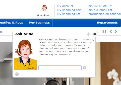
Installing a live chat widget can go a long way in taking care of bounce. A well-trained customer executive not only resolves the query of the prospect but engages them till they get convinced about making the purchase. There are a few smart chat widgets that intuitively pop open when they figure out that a customer might be lost — depending on how they are behaving on a page. The next 3 best practices are specifically for product pages:
8) Let the CTA Stand Out
If the visitors are landing directly on your product pages, it’s important that they easily identify a call to action (CTA) button to get to the next stage of the funnel. Without a prominent CTA, the visitor will feel stranded and may want to leave. RIPT Apparel, a VWO customer, saw a 6.3% increase in sales after it made its CTA stand out against the backdrop.
Download Free: Cart Abandonment Guide
9) Give them the option to Engage Further
It might be the case that the prospect is not yet ready to make a purchase and needs more convincing. In that case, having just a prominent CTA on the product page won’t cut. You have to feed them with extra information by providing links to product manuals, guides, and customer reviews. But make sure there’s a ‘Buy Now’ CTA on all these new links you are making open. The idea is to keep the visitor on the site long enough to make the sale.
10) Turn off Auto-Play
So you have got product videos made and uploaded them on all the product pages to grab a pie of the rich online video market? Great. After all, videos have proven to increase conversions for Zappos and many other companies. But beware my friend. In your jest to increase conversions, don’t annoy the prospects by thrusting a video on their face. Don’t auto-play the videos. Please. Just count how many tabs are open in your browser right now. I bet it’s more than 10. (And if it’s any less, I feel you live a truly blessed life). So coming back to auto-play, it can often be annoying when a robotic voice starts reading a script from a tab you can’t identify (actually now you can — Thanks Google). But seriously, auto-play is one of the easiest ways to make someone run away.
The next 4 best practices are design related:
11) Navigation should be a Cakewalk
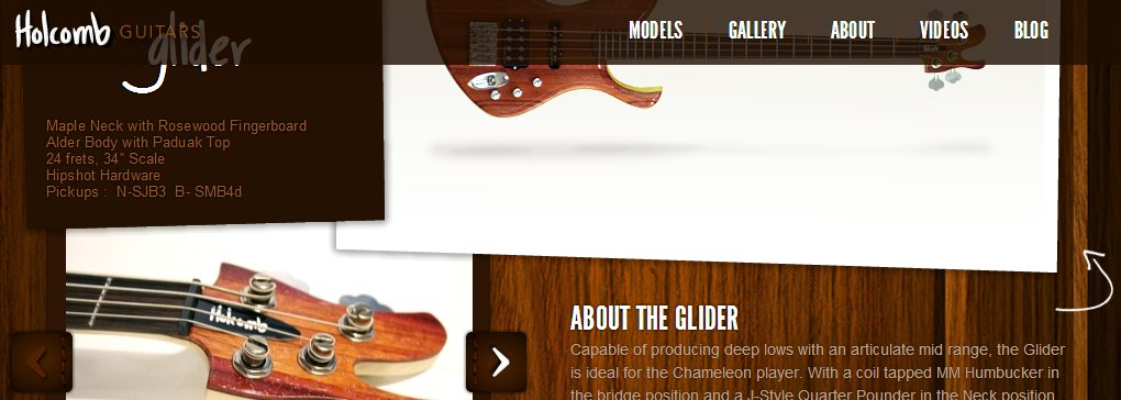
Good navigation requires intuitively finding out how a visitor will search for a particular product. Create a sitemap and provide its link in bold on the homepage. Design a clear navigation menu and place it where visitors automatically look for them — horizontally on top or vertically on left. One position might work better for you than the other. So you should test the placement. The left menu worked better for one of our eCommerce clients when they ran a split test. You could also think about testing bottom navigation for mobile devices.

12) Make Sure the Ads are Not Intrusive
If you have ads running on your website, try and place them in the least intrusive position. Nothing makes visitors want to run away from your website more than when an ad pops over a piece they are trying to read or some product they are checking out. Make sure you are NOT placing the ads where visitors automatically look for information – menu bar, search box or content area. Here’s an excellent post on poorly placed internal ads.
13) Good Design Instills Credibility
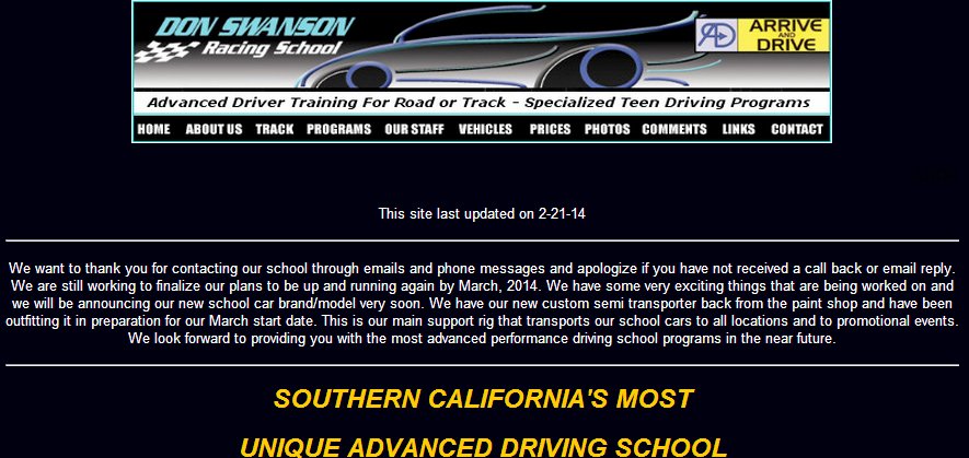
The design here is not exactly pleasing to the eyes
‘Don’t judge a book by its cover might be the popular adage. But when it comes to websites, visitors do judge them by their design. Design plays a big role in influencing people’s perception of a website’s credibility. A good design automatically makes sure you are taken seriously while a bad design breeds distrust. Try to invest in a neat and uncluttered design. Consistency in terms of fonts, colors, and layout is extremely important.
14) Invest in a Responsive Design
Your visitors will be accessing your site either from a laptop, tablet, or smartphone or sometimes use all three devices at different stages of the funnel. Responsive web design provides an optimal viewing experience across different browsers and devices. It ensures the layout is resized so that the text and images don’t break.
Go to Google Analytics and check how much of your traffic comes from tablets and mobile. You should invest in a responsive design even if it’s a nominal percentage compared to your total visitors. Why you ask? Because mobile is the way to go. eCommerce sales from mobiles have been growing at 15% year on year.
The Bounce Arsenal
I would like to create a little list of weapons to combat bounce. Help me with a few suggestions. Tell me what has worked for you in your fight against bounce or what you think might work. I will be glad and all that.
Also, here’s something extra to help you. eCommerce optimization secrets from Craig Smith himself.
Note: We originally had the screenshot of LingsCars.com as an example of a bad design under Point Number 13. Though we still feel there’s scope for improvement on that front, we took the image down since they are widely successful and the design is probably working for them.


![7 Best Website Monitoring Tools [2026]: Expert Insights to Help You Pick the Right One](https://static.wingify.com/gcp/uploads/sites/3/2025/02/Feature-image-7-Best-Website-Monitoring-Tools-How-to-Pick-the-Right-One.jpg?tr=h-600)
