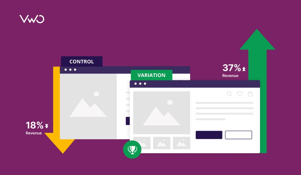
There are umpteen case studies out there that will be no less than a miracle…
‘How we took an A/B test and saw a 200 percent jump in conversions’.
Like all things shiny and bright this one has a dark side. While the sudden boom in conversions and stories that sell you great promises are not unreal or impossible, they are not always feasible. According to a VWO study, 1 in 7 A/B tests are the ones that win you great conversions.
Download Free: A/B Testing Guide
While you wonder what the other six are doing let’s not be too harsh on the tests! It’s not the test that fails. In any situation, the A/B tests are going to give the better variation, the one that will bring you relatively better results. A/B tests are not the solution, they are simply the more conclusive steps to arrive at the solution. Like all tests, they need preparation and the results need analysis.
The ‘make it’ or ‘break it’ lies therein.
Below are 5 common reasons why your A/B tests fail. Read on to learn how to prepare to run a winning A/B test:
#1 You Don’t Know Thy Users
A simple truth, be it an online business or an offline business if you do not understand your customer base you are at a loss. How is this data relevant to A/B testing? Insights come after an overview. This is to have a rough idea of the traffic landing on your page.
A wee bit of consumer profiling and consumer behavior research would give you the conditionals that help in determining the appeal of the page. Extract factors like the targeted age groups, the targeted geography, and the targeted business, then move to the qualitative factors like user intent.
A more expansive method would be to take a consumer survey. Ask pertinent questions as to how the user experience has been, whether would they be coming back, would they suggest your online services/product further.
Apart from helping you tackle the non-design problems to better your service or product, surveys can throw light on faulty or sub-par user experience on your site, helping you construct a solid hypothesis for the test. Conduct the test after you are confident that you have done your best to resolve them.
#2 Your UX is A Puzzle (the user isn’t putting it together for you)
Now that you have a fair idea of your market, put the puzzle pieces together. Mapping the user intent shouldn’t go to waste. Use the extracted gems so that the UX for the variations is more specific and hence deterministic. Shooting arrows in the dark to make a variation is a waste of resources and time. Testing it further is far from judicious. Even after the basics are caught it might take several design attempts to reach a variation that can act as a beta to your control.
Try gauging the psychology of the user instead of making random choices. A button here, a button there, a button everywhere won’t help, a concrete plan and a UX that accommodates it is what you need. It will all come down to User Experience which is based on factors like Usability, Findability, and Accessibility. All of which can be tested with usability tools. Please leave the multiple versions with different color schemes out of the picture.
The elements you add to the variation would also be the deciding factor to the test you want to conduct i.e. an A/B or Multivariate testing or Split testing depending on the combination of the elements that you add to the variation/s.
A button here, a button there, a button everywhere won’t necessarily convert.
#3 You Are Not Testing The Right Elements
As said before STOP playing with the colors alone.
Here’s a couple of questions you ask:
- What are you testing, is it a landing page, a checkout page, or a product page, perhaps?
- What is the purpose of this page — micro-conversions or macro-conversions?
- Which parts of the page are garnering the most attention?
Not sure how to analyze your landing page? Use the Landing Page Analyzer – a free tool from VWO.
Chances are you covered a lot of information when you planned the UX. Use that to your advantage. There is Data Analytics to figure out which pages are getting attention and which pages are not. Digging in further Heat Maps will give you a fair idea of the users’ attention to specific sections on your page.
Different pages have different purposes, a landing page should link the user to the product page, a product page should take the user to a checkout page and a checkout page should get you final conversions. Different elements are to be placed in strategic positions to keep the user engaged in this flow. Be specific in choosing what to test and where.
A little perspective on this before the test would make it foolproof.
That way when you see overwhelming traffic on a conversion page you will not jump to the wrong conclusion and make the right decisions.
Download Free: A/B Testing Guide
#4 Not Setting Yourself A Target
Goodhardt’s law applies:
When a measure becomes a target, it ceases to be a good measure.
If you are looking to achieve a certain amount of traffic on your landing page, set that figure as your target. It has to be realistic and it shouldn’t be compromised on much. Test your variations and compare results against the set target. Why should you do this?
Let’s say as a result of your A/B test you got a winning variation. A win but a marginal win. Chances are you will be biased to that variation slightly. Remember that this is only relative. This can go up a few notches before you settle. If you have a target you are less likely to settle for the one that measures only slightly better. As it happens with checkout pages adding a conversion button to the top and bottom makes more conversions than having it on either of the two. What if you didn’t test such combinations because comparing one against the other gave a slightly better result?
Don’t invest all your expectations in the one variation that came out better. Be adventurous, change it a little more, play around and improvise (based on informed guesses), add some seasoning, and test the new one.
Don’t compromise a lot on the target but there is a catch here; once the test has run for long enough to give you statistically significant results and you see no more to be squeezed out of it, that’s when you stop and move on to bigger things. Accept what cannot be changed.
Related Resource: A/B Split Testing Duration Calculator
#5 Giving Up Too Soon
What if a test fails to obtain the desired results? The key is to test a variation exhaustively. Don’t let results be sabotaged by environmental factors, different times of the day, different days of the week. Your failed tests are what you build successful tests on. Test more (improved) variations if one doesn’t give any statistically significant results. In manual testing, significance will need to be calculated. Here’s the VWO significance calculator for the quick math.
There are lessons to learn from every failure.
‘Why do we fall Bruce?’

Takeaway: A/B testing is not just about running a test or applying an optimizing tool. It’s about the research and hard work you put into one in the preparatory stages. A test never fails. You fail a test. Set yourself realistic goals and track your progress. Miracles happen, some just take more time….like a baby.
The second step to avoiding failing while A/B testing is to ensure that you interpret your results correctly. Keep looking at this space on result analysis and how to extract conversions from them.
Even if you fail, you can leverage the failed test for your gain. Watch a webinar to learn how:


