When it comes to lead generation or customer communication, email marketing is still the preferred medium for a lot of businesses.
And, for good reasons. 60% of marketers report that their email marketing efforts produce healthy ROI.
However, email marketing can only be effective when you know how to draft near-perfect emails; the kind that users love to find in their inbox.
Download Free: A/B Testing Guide
Optimizing every element of an email can present a lot of insights and improvement opportunities to accomplish your business goals.
In this post, we dissect and look at five email components, and find how to create flawless emails. Here are the components of a typical email you’ll find analyzed in this post:
- Subject line
- Sender name
- Images within email
- Email copy
- Call to action
So, let’s begin.
1. Subject line
The subject line of an email is the most important factor for users to open an email. No matter how great your email content is, if the subject line doesn’t push users to open the email, it’s going to waste.
You should spend as much effort in mulling over the subject line of an email as you do while drafting the email itself. Here are some important factors to consider before writing a subject line:
Length of the subject line
Too long a subject line runs the risk of not showing up completely in the user’s inbox. Too short a subject line might fail to communicate what the email has to offer.
While there’s no magic number for the most-effective length of a subject line, some studies give us a point of reference.
An article by MarketingSherpa shows that subject lines with 41-50 characters are the most popular among marketers. It also shows that 61-70 characters deliver the highest read rates.
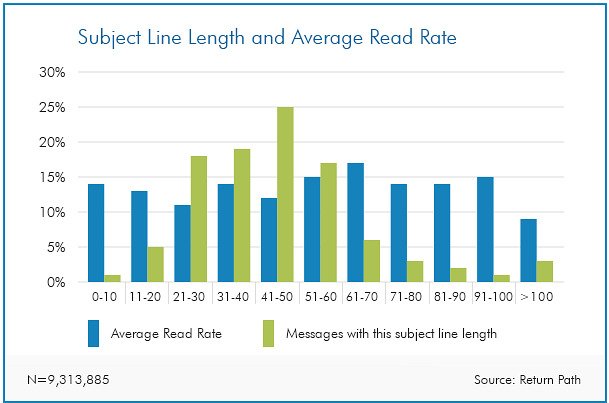
Moreover, 40% of emails are opened on mobile first.
It would be wise to use even shorter subject lines if your users are primarily on mobile. Be aware that the most popular mobile phones let you display only 31-40 characters of a subject line.
Employing psychological elements
Construct subject lines incorporating psychological triggers that influence buyer behavior. For example:
Curiosity
You can build curiosity among users by not entirely revealing what the email has to offer in the subject line. This can impel users to open the email to find what’s inside. But use your discretion. Unless the user has reason to believe the action (opening the email) is going to reveal something worthwhile, your email will remain unread.
Curiosity can work well with your drip email campaigns, as users are aware of your brand and have context to your business.
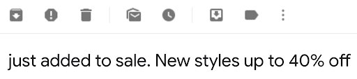
‘40% off on everything’ is a juicy deal This tells the user that the offer is subject to some condition that needs to be met. Following example from Kate Spade gives prospects an enticing reason to open the email and watch out for new additions.
Urgency
You can use urgency in your subject lines to make users open your emails.
Offer lucrative deals to your users, with a limited time validity. Mentioning that on your subject line can compel users to open an email in an attempt to not miss the deal.
Exclusivity
Offer personalized content, discount deals, or other exclusive incentives to some of your users. If the subject line mentions that the email contains something exclusive for users, they’ll feel valued and proceed to see what the exclusive offer is.
Notice how the above email employs exclusivity and urgency together.
Testing different subject lines
You cannot know beforehand about which one of your subject lines will perform the best.
A subject line that worked great for one business might fail for another business’ email. It all depends on your audience and what they crave.
But, you can find out what works best by A/B testing different subject lines for your emails.

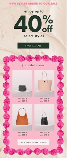
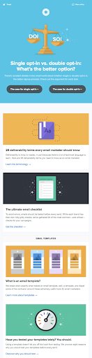
Sometimes, even the most plain subject lines can work wonders. Take a look at Mailchimp’s comparison of the best and the worst performing subject lines.
2. Sender name
Often, businesses use the company name, brand name, product name, name of a person, or simply an email address as the sender name for their emails. Quite apparently, not much thought is given in deciding the sender name. Perhaps, because it occupies much less space in inboxes compared to subject lines.
Ignoring sender names can cost businesses dearly.
The importance of an email’s sender name can be seen from the fact that 43% users report emails as spam just on the basis of their sender names.
The best choice of sender name for your emails should be what your users relate to the closest.
For big companies, using the brand name as the sender name seems to be an obvious choice. But, for smaller companies, using their founder’s name — who presumably has a greater reach — along with the brand name can lead to better email performance.
Take a look at this screenshot.
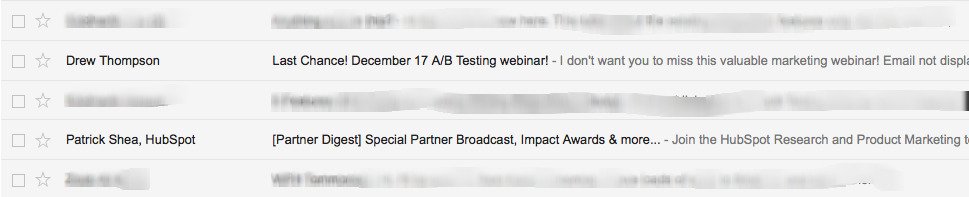
The first email lacks any information about the brand name. The sender name and the subject line (and even the small preview text following it) doesn’t mention it. The email gives little encouragement to users to open it.
In contrast, the second email clearly communicates the brand name (Hubspot) and gives immediate credibility to the email.
3. Images within email
Images have become an essential part of emails today. 65% of users prefer emails that contain mostly images.
However, using images in emails calls for a number of factors that need to be taken into consideration.
Number of images
How many images are too many images? This depends upon the type of the email, and the audience that you’re targeting. By looking at the performance of your previous email campaigns, you can figure out the number of images that your users are most comfortable with.
Nevertheless, Constant Contact reported that emails with three or fewer images delivered the highest clickthrough rates.
Using Alt tags
Many email clients do not show images within an email automatically. They require users to click on a “Display Images” button to show the images. When users don’t do that, they find an empty email devoid of images.
However, HTML alt tags can still help you display information in an email. For instance, “alt text” lets you display text in place of images, whenever the email client does not show images.
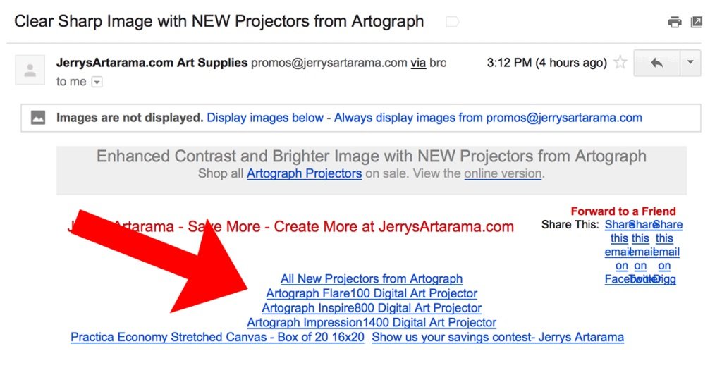
Furthermore, you can use CSS to stylize the alt text to make them look better.
Using different file formats for images
There are a variety of file formats for images that you can use with your emails.
Out of them all, JPEG and PNG file formats are the most used across the internet. Both have their own advantages and drawbacks, and the choice should depend on your requirements.
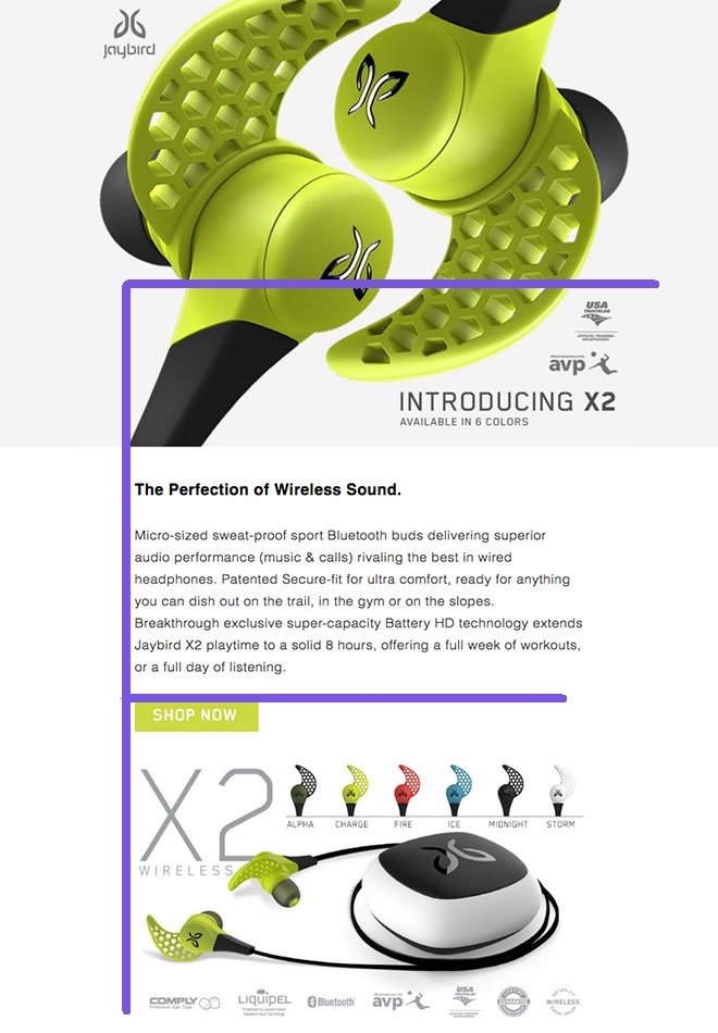
Also, the GIF format of “moving images” is getting popular to make emails more fun. Here’s an example:

Download Free: A/B Testing Guide
4. Email copy
An eye-catching subject line and a few interesting images may deliver increased open rate for an email.
But if the email copy — the actual content — is ineffective, you won’t get click throughs and conversions. Delivering poorly written emails is a guaranteed path to miserable conversion rates.
Here are a few ways to ensure that your email copy is top-notch.
Write scannable copy
It’s well-established that web users don’t read anything on the internet completely. Whether it’s an article or an email, users scan through, trying to identify valuable and snackable bits of content.
Your email copy should have scannable components that users can pick up easily.
- Write short bulleted points.
- Highlight your main content using contrasting colors.
- Use phrases in place of whole sentences (while communicating the intended meaning).
Here’s an example of an email marketing campaign by Jay. If you look closely, its design and placement of image and copy is aligned with the F-reading pattern:
Use headlines with discretion
You don’t want to confuse users with a ton of headlines within a single email.
With multiple headlines, users will find it confusing to understand the hierarchy of information? what’s most important and what’s not. Users won’t know what to focus on. The cursor drifts, and the user is lost.
When your email contains only a few headlines, users’ attention is effectively directed towards them.
Avoid spammy words
There are certain words that can trigger spam filters of email clients, e.g., “free,” “money back guarantee,” etc.
Including such words excessively inside your email copy can send your emails to the dreaded spam folder. Use them sparingly.
Below are a few more spam words for your reference:
- Visit our website
- 50% Off
- Click here
- Call now
- Subscribe
- Bonus
- Discount
- Save up to
- Prizes
- Information you requested
- Important information regarding
- Guarantee, Guaranteed
- Special Promotion
- Great Offer/Deal
- All New
- One Time
- Order Now
Clearly state the benefits
More than the information on your product or service, users are interested in knowing the benefits they’ll receive from it. Your email copy must communicate benefits over features.
Take a look at this newsletter from Litmus:
5. Call to Action
So your users have opened your email and gone through its images and content. What next?
You need them to take some action on the email that translates to a conversion. The conversion can be anything based on your campaign: clickthrough to your website, a resource download, completion of an abandoned order, etc.
You can direct users to take such actions using a Call to Action (CTA) button.
Follow the below practices to make your CTA button stand out.
Minimize number of CTAs
Your emails should have just a single goal to fulfill (else it is an email with no definite purpose), it should contain only one (or at most two) CTA buttons. This helps users easily identify the CTA, increasing the chances of a conversion.
For example, Whirlpool reduced the number of CTAs in one of its emails from four to just one and achieved 42% more click throughs.
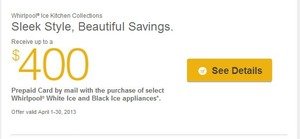
Whirlpool’s email with a single CTA button
Make the CTA visible
Perhaps, the most important attribute of a CTA button is its visibility.
If your CTA button blends in with the background, it is as good as plain text of your email.
Ideally, your CTA button should have sufficient white space around it, and it must carry a contrasting color to the background.
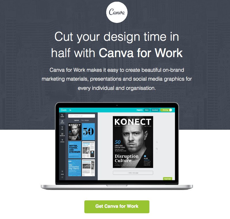
Here’s an example of a clear email CTA button from Canva.
Use actionable and relevant CTA copy
The CTA buttons within your emails must be directly related to your email’s purpose. The CTA copy should effectively communicate the specific action that the email wants users to take. By using an actionable phrase, you can push users to go for that conversion.
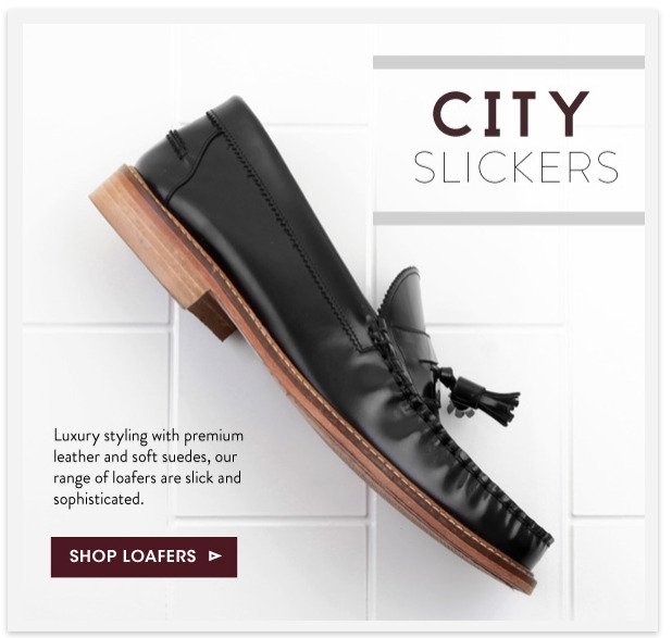
Here is an excellent example. The CTA says ‘Shop Loafers’. Talk about simplicity.
If you wish to understand more about converting users from email campaigns, check out our engaging conversation with Julia Ritter on the VWO Podcast.
Ready to optimize your marketing emails?
Use these tips to optimize your marketing emails and boost conversions. Do not forget to let us know about your success stories by writing to us at marketing@vwo.com.

Categories: