Conversion copywriting is a key part of any website – from headlines and body copy through to CTAs, modal boxes, and buttons. Conversion copywriting is what gets your audience from a ‘maybe’ to a ‘yes’. We’ve curated nine examples of the most effective copywriting used to optimize conversions. Some of them are straightforward, some unconventional, some unapologetically honest, and most of them clever. However, what binds them together is that they are all highly effective in getting the user to take the desired action.
Download Free: Conversion Rate Optimization Guide
1) Make it easy to say yes
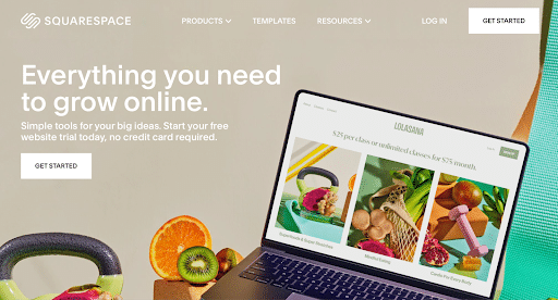
“Everything you need to grow online” is a strong promise Squarespace makes. Added to that is the slick-looking website on display and with zero financial risk – as no credit card is required. This makes for a very compelling proposition to at least test out the platform.
2) Make it difficult to say no

Would you click on “No thanks, I treat all click behavior the same?” Well, you might if you were busy or simply not interested in heatmaps. But not before experiencing that feeling of missing out on something important.
Most modal boxes have a cross button at the top right which closes the box when clicked. But by removing that functionality and instead providing a link to close the box, visitors have to read what’s written there. And once they do, even those who have no knowledge of heatmaps are more likely to at least find out what is being talked about.
3) A Page Not Found is not the end of the world

Every page on your website is an opportunity to delight website visitors, even when things go wrong. The ‘404-Page Not Found’ is no exception.
404s have become cooler and more optimized than ever, and Skype’s 404 page stands out for its awesome copywriting. Firstly, their copy reassures the user in a friendly and clever way. But beyond that, the copy is useful – the navigation menu remains at the top of the page, and they smartly provide the most important links a lost visitor might need — Download page, Feature page, Support, and Homepage.
4) Make a bold promise

Move over Download, Sign Up, Enter, or Click Here, this call to action by StartupBros ups the stakes with a bold claim. While many could think of the CTA text — The best button you’ll ever click — as unabashedly confident or maybe even slightly arrogant, the text goes well with the brand image of StartupBros. Just remember, if you’re going to make bold claims, ensure you can back it up in the product or service your website provides.
5) Making them confront a harsh decision
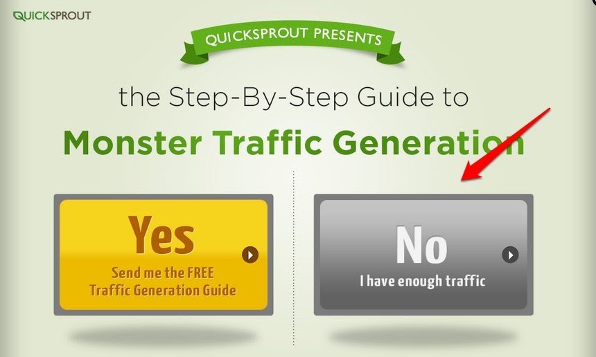
Does your website have enough traffic? That’s a smart question, because what business owner in their right mind doesn’t want to increase their website traffic? Yet again, by giving the visitors this one way to close the box — by clicking on No, I have enough traffic — QuickSprout forces the user to imply that they don’t want more traffic if they select No. This makes clicking Yes the only logical option. In this way, the copy uses visitors’ psychological biases to increase the chance of a conversion. Low website traffic is a common pain point for most online businesses. The visitors will be lying to themselves if they click on that button. Thumbs up for this one.
Download Free: Conversion Rate Optimization Guide
6) A smart way to know where they are coming from

WebEngage uses an extremely useful pop-up on its homepage that asks visitors what they searched for to land on their site. That’s a smart way to get some extremely insightful information from visitors.
What works as well is that the copy gets right to the point. WebEngage is straightforward and honest about what they want to know and also implies that the information will help the user by improving their offering.
7) Get creative with CTAs

If there was ever an award for best product descriptions, Woot would probably be among the top contenders. Their product copy is funny, clever, and rich in details, breaking away from the standard bland descriptions.
And when it comes to CTAs, they do away with the conventional ‘Buy Now’ and ‘Add to Carts’ and instead opt for “I want one”. Would it work for your business? Find that out through an A/B Test. And if you are just about looking at the screenshot above, read the write-up of the day as well (towards the right).
8) Add a compliment to the value proposition

Want to get someone to subscribe to your newsletter or blog? Conveying the value proposition right in the headline is cool. That’s what everyone is doing. But WiderFunnel goes a step further and adds to the value proposition with a little ego boost for the visitor. Note how the word ‘Smart’ appears at all three places — the headline, the sub-head, and the CTA. And by saying You Totally Fit in Here, they are setting rather high mutual standards of intelligence.
A little compliment, after all, never hurt anybody.
9) Making an offer they can’t refuse

This Wunderkind modal box again plays on the fact that people will be reluctant to click on something they know is not true. Rather than just giving the option to close the box, this message cites a reason that most people will be uncomfortable agreeing with. But they go further, linking the conversion to multiple positive outcomes for the user including education, revenue increase, and financial independence from VCs.
Test your copy
These are some examples of highly intelligent copywriting that you can adapt to your website. But you need to figure out what is the right website copy for your audiences and business. What works for another company won’t necessarily work for you. Try A/B testing different CTAs, text, or headlines to see how copywriting can boost your conversions.
If you feel inspired, you might as well sign-up for a free trial of VWO and start testing right away.
Lastly, you can watch Rishi Rawat talk about conversion copywriting in the video below for some great insights on the subject.
Categories:


![7 Best Website Monitoring Tools [2026]: Expert Insights to Help You Pick the Right One](https://static.wingify.com/gcp/uploads/sites/3/2025/02/Feature-image-7-Best-Website-Monitoring-Tools-How-to-Pick-the-Right-One.jpg?tr=h-600)