Disclaimer:
This blog post has been updated with current research and findings.
Give it a fresh read for new insights on how to build trust for your eCommerce website.
Online shoppers often feel concerned when shopping on a website with which they are not familiar. This could mean a loss of sales and customers in the long run, leading to an impact on your conversions.
Is there a way to remove these doubts and build long-term relationships with these reluctant users? So what’s going wrong? This post will talk about customer trust and its impact on e-commerce business.
Consumer Trust and Its Role in E-commerce
As an emotion, trust has various other aspects – social, psychological, economic, and philosophical – as detailed by Wikipedia. Three factors contribute to the state of trust—the chance for gain, a chance for a loss, and uncertainty regarding the matter.
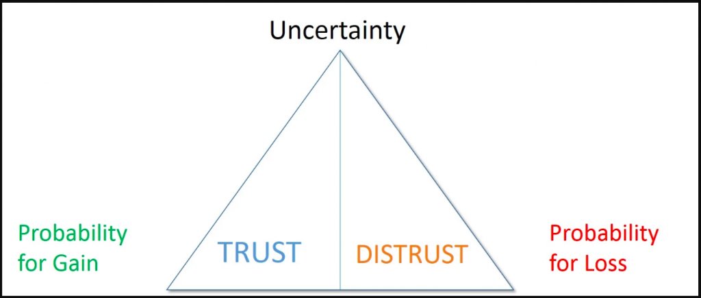
Uncertainty will be the maximum when both probabilities are equal and will reduce if any of these are reduced. An example would be cart abandonment by a prospective customer because of hidden charges reflected at the time of payment. The customer displays trust by being sure about the product and selecting it and shows an almost equal amount of distrust on finding unexpected additional charges added to the product cost.
The probability of gain will be higher if consumer trust is high, leading to low distrust and vice versa. For example, customers who buy products after making the required payment on a website they have been visiting regularly for their purchases.
It’s important to understand that trust is not a choice, but an underlying psychological state that can be influenced.
Economists associate distrust directly with perceived risk. We’ll now talk about the top visitor fears that could be the reason for hidden losses for ecommerce stores:
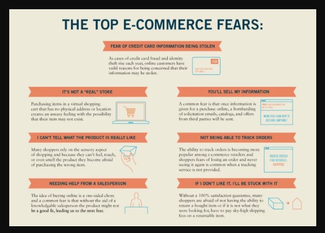
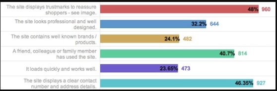
A survey by eConsultancy asked respondents this question:
If you are shopping from an ecommerce website retailer you don’t know well, how would you decide whether to trust the same?
Here’s what they found.
We’ll take up key factors in detail, talk about some others, and then leave you with immediately actionable insights for building trust.
Trust Seals and Security Certificates
According to a 2019 report released by the National Retail Federation, online-only sales have accounted for about 30.2% of the frauds. This adds due importance to trust seals and security certificates.
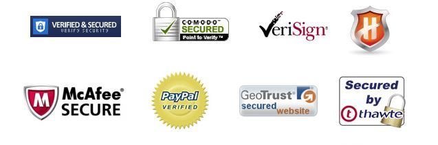
While a trust seal on an ecommerce site is a third-party badge showing that the website is legitimate, SSL certificates serve to show that there is a secure connection between the browser and the web server and they guard against network eavesdropping.
A 2005 study conducted by TNS revealed that:
About 79 percent of online shoppers said that a seal indicates that their information is secure. Only 1 in 5 shoppers did not know what purpose trust seals served.
For more insights, you can read this case study from Express Watches which was able to increase trust and conversions on their ecommerce website after adding a trust badge on their product pages.
Also, just merely flaunting your trust badge on the home page won’t do. According to a report, 83 percent of consumers usually want more assurance that their information is secure. So, you will have to keep assuring the visitors and customers that they are in safe territory throughout the conversion funnel.
A comprehensive and easy-to-understand privacy policy stating that the customers’ personal information will be safeguarded is a must.
See how Slideshop.com used VWO – A/B testing tool to add a line about privacy information on its checkout page and increased sales by 15 percent.
Similarly, in the wake of ensuring data protection rights for EU citizens, VWO was one of the first to comply with the GDPR regulation. Not only was the GDPR Ready logo added to the website, but also a landing page was created to educate and assure the visitors and customers about the confidentiality of their data.
Here’s a brief video talking about the relationship between GDPR and trust.
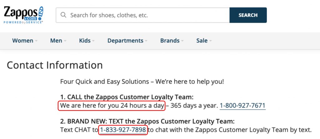
Contact Information
Physical addresses are one of the biggest proofs that you exist and are not operating out of some devil’s armchair. Contact information gives a strong indication that there is a real person at the other end who can be approached should anything go wrong.
Here’s how Zappos, renowned for its customer service, does it.
Social Proof
In the marketing arena, social proof is all about using the idea of human masses and their views, to create positive connections around your brand.
Statistical studies show that when it comes to hearing reviews about a product/service as opposed to a company’s description of the same product and service, consumers are more likely to buy. Here are some prominent categories within social media that we are going to talk about further:
- Product Reviews/Testimonials/Logos
- Displaying Statistics on Product Adoption
- Media Mentions
Product Reviews/Testimonials/Logos
Again, a third-party endorsement in the form of a testimonial can not only add authenticity to your existence but also provide due credibility.
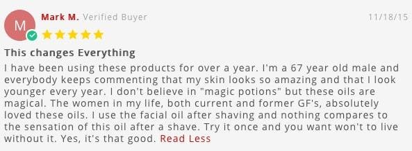
A BrightLocal consumer survey shows that most consumers read an average of 10 online reviews before feeling able to trust a local business. 57% of consumers will only use a business if it has 4 or more stars. Also, 89% of consumers read businesses’ responses to reviews.
In addition, to maintain authenticity, make sure you promote only genuine reviews and not the ones that seem overly promotional. Amazon does a great job at this.
What about negative customer feedback?
A company cannot always have only positive customer feedback.
Negative feedback helps brands improve the quality of customer service.
According to a study, 68% of consumers said that they are inclined to trust more when there are both bad and good reviews. 30% of consumers suspect inauthenticity when they don’t see anything negative.
Here are some actionable tips on using customer feedback:
- Focus both on the quality and quantity of feedback.
- Feature both negative and positive responses; consumers find it authentic and, therefore, more trustworthy.
- Generate feedback from actual users of the product rather than from associations or professional reviewers.
If you’re an enterprise-facing brand, displaying client logos is probably more cut out for you. That lends greater credibility to your work, instead of just focusing on plain numbers.
Brands like to see what other brands are using.
Even if they aren’t your clients, showcasing the fact that you work with them goes a long way in convincing visitors you’re worth investing time and money in. However, each time, make sure you have formal approval/permission from the said company to use their logo as a client/partner.
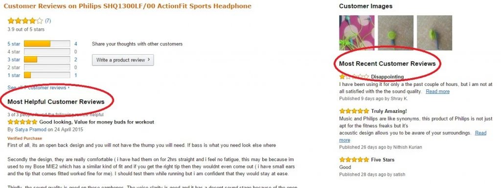
Displaying Statistics on Product Adoption
Social media numbers go a long way—and in the same manner, displaying numbers about your product works wonders. It’s a powerful pointer for other people to see how many people trust your product. Another thing you could try is showcasing how many customers use your product on a regular basis; it builds greater social proof that potential users can trust, sign up, and jump on board.

Media Mentions
Being featured in media publications is a great way to showcase your product, and it also serves as an effective marketing tool for a launch. At the same time, it’s a great way to provide social proof—after all, you’ve been featured in a media outlet and that counts for something, right?
It’s a simple matter of tracking publications that talk about you, and displaying logos linked to those write-ups on your landing page.
It can be as simple as the one below.

Human Photos/Pictures
Using pictures of people can help establish a human connection. Using real images of the people behind a product can also help ease visitor anxiety.
Here’s a snapshot of how Shopify (Partner Page) does it:
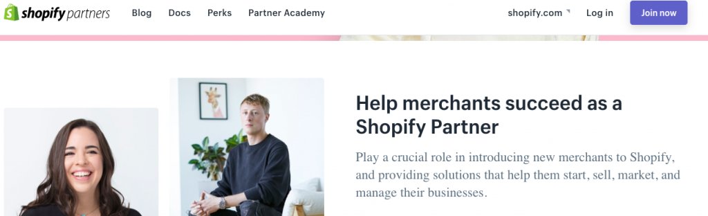
With the images and physical proof, people warm up to your business, because they are able to relate with it. Without it, it’d be just a faceless software product, one of the many out there.
A word of caution, though!
Do note that human photos are not a panacea for all websites.
A better idea is to do A/B testing on our website: photos versus no photos.
In some cases, human photos may actually have a negative impact! To be doubly sure, you should also do a heatmap analysis of the related page to analyze the impact of using photos versus not using them.
24/7 Live Chat
A live chat icon is a massive psychological assurance to clueless customers. It has increased conversions for one of our customers in the past.
Just make sure you’ve got the team set up to keep the promise of 24/7 assistance. Being offline a bit too often is a turn-off.
Product Benefits
Whether you started in a conservative mode or otherwise, ensure that you continue adding customer benefits as your business expands. For example, you can provide cash on delivery options starting with areas near your office address or with areas where you are assured of secure transactions. Another case can be having a detailed returns policy.
List all the benefits of your product on the product page, be it cash on delivery, the stock status, return policy, if any, or any other benefit accompanying that product or for which your brand stands out.
With improved customer service, you can ensure customer loyalty, which can further lead to getting more returning customers.
Discounts with Discretion
If you are new in your product space, the temptation can be to offer mouth-watering discounts, in an effort to better the big players. But hold that thought; offering overly high discounts can create suspicion in the minds of your prospective customers.
Instead, offer discounts that are marginally higher than your competitors’ and wherever possible, give your customers a price comparison chart. This is necessary to ensure that customers trust you and do not doubt your existence.
Vibrant Blog
A blog page is one of the biggest testimonies to a company’s existence. A constantly maintained and updated blog means a lot of effort, so a business that regularly blogs obviously is in for a long term.
You can also have team blogs (here’s ours) to showcase your company culture.
Final Word
The best part about the above techniques and measures is that they are fairly simple to implement. The purpose of these measures is to improve user trust in your business.
However, it’s important to understand that increasing trust needs to be a long-term focus, as it can lead to loyal customers. Also, trust has a self-correcting nature. At the slightest hint of malpractice or incredulity, trust can disappear. Businesses need to earn their users’ trust every day, over and over again.
You can use various features within user insights to test these methods, to ensure that your customers and visitors shopping online provide positive feedback, on the website and through word of mouth digitally.
Did this article resonate with your take on customer trust in eCommerce? Are you aware of more ways to generate trust? Write to us at marketing@vwo.com
FAQs on Trust in eCommerce
According to buySAFE, 81% of online shoppers feel concerned when shopping on a website with which they are not familiar. This could mean loss of sales, and even losing customers in the long run. That’s why trust in ecommerce is important to ensure that the probability of conversion is also higher.
Some of the methods by which an online business can create trust in eCommerce are through the implementation of trust seals and security certificates, strong social proof, and customer testimonials.
In this post, we have shared details about all these methods as well as some more. Read more about them.
Categories: