

One of the things I absolutely love about split testing is its inherent ability to humble the opinions of even the most seasoned marketers. Sometimes even the most well-researched hypotheses fail.
This is the strongest reason why companies must test everything from offer copy to page design, instead of relying on gut instinct or personal preference. In this post, I’ll share success stories that either saw huge opinion disparity among the WhichTestWon community, or whose results absolutely shocked our editorial team and Testing Awards’ judges.
Download Free: A/B Testing Guide
1. Social proof is not necessarily the be-all and end-all
Can you guess which of these two versions of a product page generated more sales for Finland-based eCommerce hardware store Taloon?
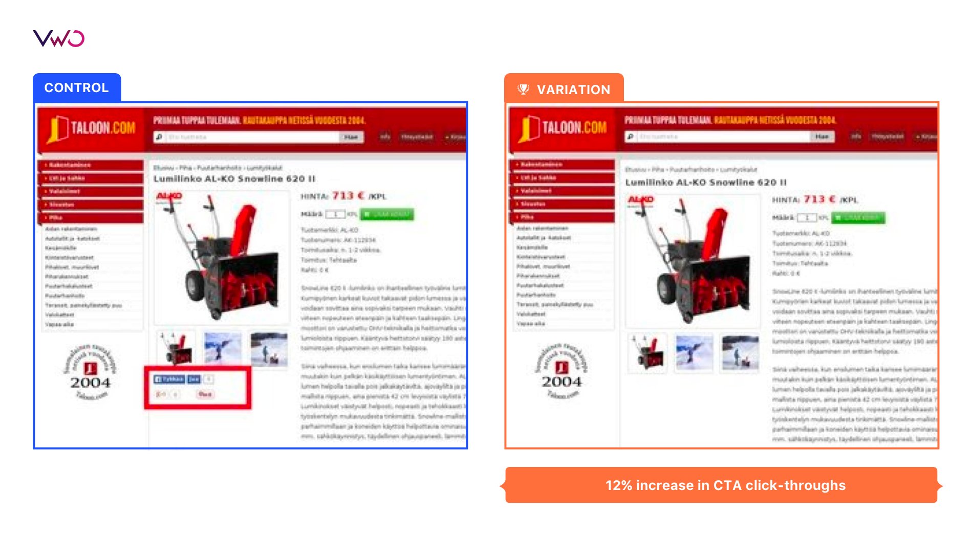
Like many people, you probably would guess the one with the social proof. When I present this kind of comparison to live audiences at conferences, usually 90-95% of attendees pick the social proof version.
However, they’re all wrong. Taloon tested the two versions using VWO Testing, and the variation on the right — without the social proof — saw nearly 12% more purchases than its social proof counterpart.
Normally we see companies just add social proof without testing it because virtually every blog post and ‘social media expert’ has told them it will help conversions. Thankfully the team at this site tested this before implementation, or they would have missed out on a lot of purchases.
Don’t get me wrong, there is a ton of value in social proof. For one, it is great at reducing a visitor’s anxiety and can give your brand a sense of authority. The trick is finding out where it is best to publish your social stats and what exactly is worth sharing. Should you post newsletter subscribers, Facebook likes, awards, or all of the above? Simply put: test it out.
The best part: VWO Testing makes this really simple.
So, never add something blindly; you don’t know how it will impact the bottom line.
2. Icons may be trending, but they might hurt conversions
Icons have been making a major comeback in web design. Overall, icons are incredibly useful, especially when they are used as a replacement for bullets in stylized lists. The team at Build.com wanted to find out whether icons would be a useful navigational tool…the results surprised them.
Here are the two versions of the header they tested, one with icons and one without:
The challenger variation included icons that represented different category pages on the site. The team believed that an increased focus on navigation with their most visited categories would increase interactions and sales. However, the version without the icons saw 21% more product purchases.
Why? We suspect that although the icons provided a sleek navigation pane, overall they likely added more clutter that confused the visitor.
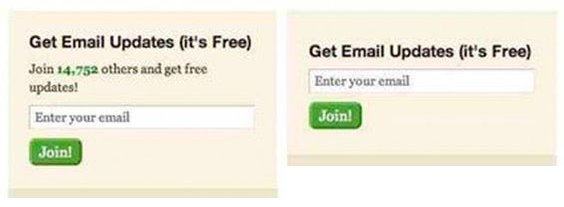
3. Security seal on a lead generation form test
The highest point of friction on any lead generation page is the form itself. You need to identify the optimal number of form fields, choose an intuitive design, and add visible privacy policies and/or security icons to reduce anxiety.
These are well-known best practices that all lead gen marketers understand, and that’s probably why 74% of the WhichTestWon community guessed the wrong winner for this A/B test.
The variation without the TRUSTe logo got 12.6% more completed forms. Yes, the ‘submit’ button did shrink to accommodate the TRUSTe logo; but, we strongly suspect the primary cause for this lift has to do with the logo itself.
Trust seals can be essential to your conversion rate; the real trick is knowing where and when to place them.
In this particular circumstance, the TRUSTe logo was the wrong security seal at the wrong time. Visitors are used to seeing this seal, and others like it, directly in a shopping cart; not on a top-funnel lead generation form. It’s quite likely that many of them suspected, or subconsciously sensed, a payment transaction when they saw the trust seal here.
Instead of using a security seal, the team could have tested providing assurance by adding a simple fine-print text link to the privacy policy.
Remember, context is key!
4. If conversion rates are falling, should you put on a happy face?
CRO specialists and designers love using faces! I get it; faces are the first thing the eye identifies when it looks at a web page. Numerous eye-tracking studies support this claim.
However, sometimes a human face can actually be a distraction from the action you want the user to complete. So, always test when you add faces to your page to make sure they aren’t competing with your important headlines and calls to action (CTAs).
Here’s an example:
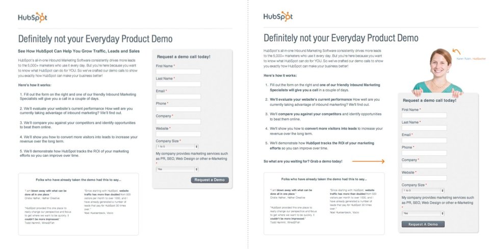
The version without the image won 24% more form completions. This wasn’t a perfectly clean test. There were some slight alterations in the copy but nothing too dramatic. To tell you the truth, I’m more of a fan of the story behind this test than the actual unexpected results. However, it’s not the first or the last test we’ve seen where removing a face increased conversions.
By the way: I am happy that the team used the photo of an actual employee rather than a stock photo. Models and stock photos tend to get even worse conversions than “real” people.
What’s perhaps most amazing is that at the time of this split test HubSpot was about to make it a mandatory practice to include a person’s image on each of their landing pages. On some level this makes sense, as they had found that some of their pages performed better with people’s pictures. However, what’s true for some pages may not always be true for all pages. Luckily, this test cast a seed of doubt and Hubspot changed their design mandate.
Before you create any new landing page or design policies, always test beforehand. You have no idea just how many conversions you could leave on the table.
Download Free: A/B Testing Guide
5. Video icons: product-centric or person-centric?
Here is another case that tests whether using a face is appropriate.
The version of this Autodesk product page that used faces got 50% fewer video clicks. Nothing else on this page changed except for the video preview image. I am not anti-faces on websites; I simply want you to test before you implement!
Needless to say, the testing team was surprised by the results. So they ran a user survey to try to figure it out. The responses showed that Autodesk’s prospective buyers were more interested in seeing how the product worked over individuals talking about the product.
This just comes down to a case of knowing your audience and that best practice is not one-size-fits-all!
In summary
Leaders in the testing field have all been stumped by the unexpected A/B test results before, and will be stumped again in the future. The trick is to understand what to do after your test goes counter to your hypothesis or flat-lines.
Your next steps may include evaluating a litany of things such as your hypothesis, technology, source traffic, device, etc. You need to learn if the test itself was flawed, or if your understanding of what your visitors really want from the page was flawed. Either way, you’ve learned something valuable.
Remember that testing is an evolving process, future iterations are borne from our successes and our failures. Knowledge and insight is built over time.
So keep testing my friends! There are so many variables to consider while running a test, it is no wonder that we often see lifts or losses where we least expect them.
Categories:


