

First established in 2001, Jagex has cultivated a long-standing reputation for crafting some of the world’s best online games services. Its flagship title, RuneScape, was launched 14 years ago and has seen over 240 million player accounts created in that time. Furthermore, Guinness has recognized it as the world’s most prolifically updated massively multiplayer online role-playing game, as well as enjoying the most users of a massively multiplayer online game.
But does it have to stop there? Jagex realized that for such a widely adopted game, there should be areas along the user funnel that can be optimized to further improve conversions.
Download Free: A/B Testing Guide
Before we delve into the test details, let’s also understand the context of the tests.
Context includes the environment of the test — the kind of visitors to the site, what the site offers etc. It’s easy to overlook the importance of context while analyzing changes that yielded great test results. But,
Changes + Context = Meaningful Analysis
Understanding Runescape’s Customer Journey
A user has to visit Runescape.com and create an account to get started. They are then asked to download an executable game file, and after installation a user can start playing for free. The free membership, however, comes with a number of limitations. RuneScape recommends that players upgrade to one of the membership plans to avail of premium features of the game platform — including more missions to play, superior character skills and a loyalty program.
Users can pay to get the benefits of a membership plan.
Jagex conducted a number of tests to optimize conversion on different pages along the customer journey.
We caught up with Robert Marfleet, payment UX Specialist at Jagex, to understand the cases better. Here are the test scenarios, explained case by case.
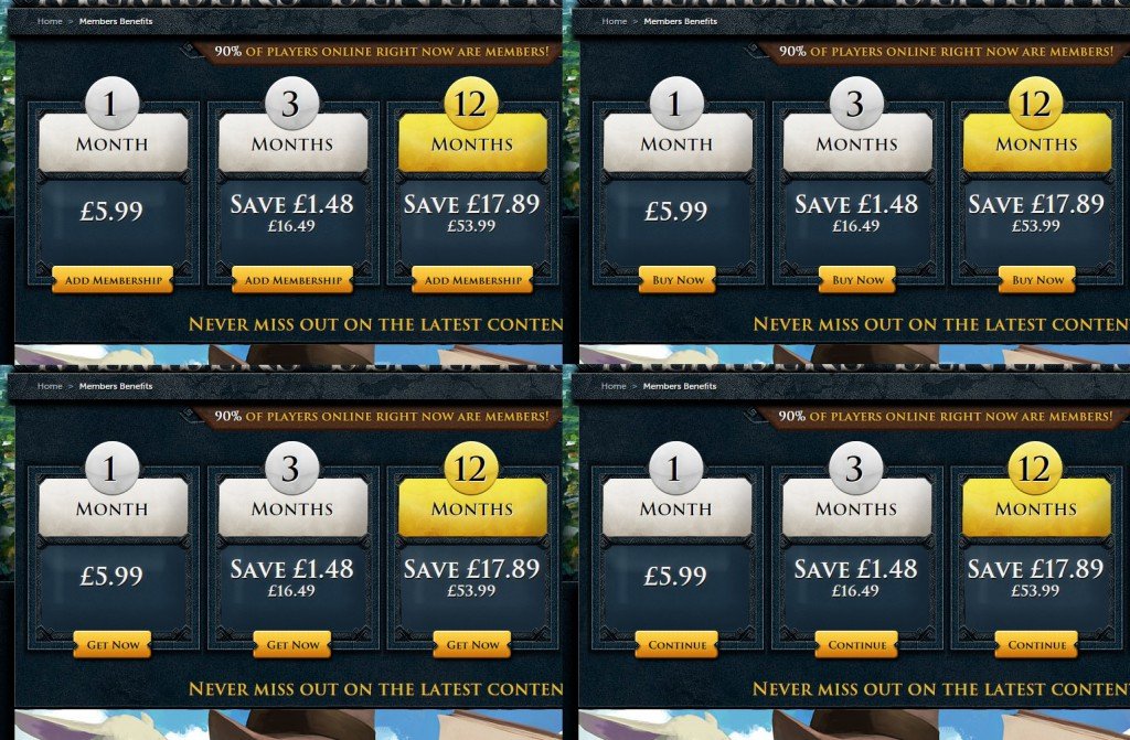
- Test #1 : Changing ‘Buy Now’ to ‘Continue’
- Test #2 : Show All Packages on Billing Page
- Test #3 : Displaying a Recommended Package
- Test #4 : Credit Card/Paypal Re-attempt Options
- Test #5 : Login Name vs Username
A/B Test #1 – Changing ‘Buy Now’ to ‘Continue’
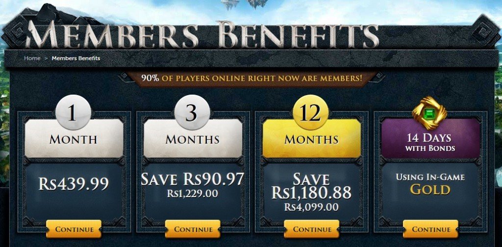
The member benefits page prods users to choose one of the various membership plans — one month, three months or twelve months. On clicking on the CTA button that said ‘Buy Now’, users are taken to the billing page.
Why This Test?
The UK brand had always used the copy ‘Buy Now’ on its CTA. Even though this was performing well enough, they realized there was room to improve. After coming across a case study where a firm increased their conversions by changing the CTA text from ‘Buy’ to ‘Continue’, Jagex decided to test if a similar change could increase conversions from their membership page.
The Goal: The aim of the test was to encourage more users to click through from the membership page and become paying customers.
Test Details: Jagex tested four different variations of the CTA to see which phrase would increase conversions the best.
The test ran for a week with over 16,000 visitors engaged during this time.
The Result: The most successful variation was the CTA with the wording ‘Continue’, with the conversion rate rising from 27.33% to 28.86%.
It is typical to read case studies where firms claim mammoth improvements in click-throughs, but do these micro-conversions translate into actual sales for the company? Organizations need to be most concerned about final conversion numbers like sales, average order value etc. Jagex was cognizant of this.
Validating the test result, the number of users from the membership page that went on to make a purchase increased by 5.6% – a big win.
This is how the current membership page looks:
Result Analysis: Why Did The Test Win?
Most users who begin playing RuneScape start playing it for free. Unless they’ve already researched the game, players only come to learn about membership packages later. Industry studies find that 0.15% of all players account for 50% of all in-game revenue. Shelling out money for in-game purchases is not yet a welcome idea among players.
Still, entrenched players cannot resist the urge of seeing the options available. Most games like RuneScape are built such that players with stock resources (that come with the free account) can only advance so far in the game without resorting to paid resources — like the membership plans that RuneScape offers.
Reassurance versus Anxiety
Players who visit the membership plans page are presumably in the process of considering a purchase. This is where, in the original version, players were greeted by a ‘Buy Now’ CTA. It’s a strong call to action, no doubt, but one that explicitly reminds the player that they are about to make a payment. It causes an alert — a psychological trigger — very likely deterring a considerable percentage of players to drop off before visiting the actual payment page.
By replacing the ‘Buy Now’ text with ‘Continue’, the modified page was instead able to induce curiosity. The ‘Continue’ text gives a positive signal to the player that they are heading in the right direction, and that they are not required to pay yet. By decreasing drop-offs and increasing the number of players that visited the payment page, Jagex could indirectly increase the number of final conversions as well.
Words are powerless without context. Identify your users’ decision stage to frame the right CTA.
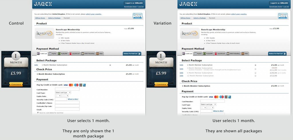
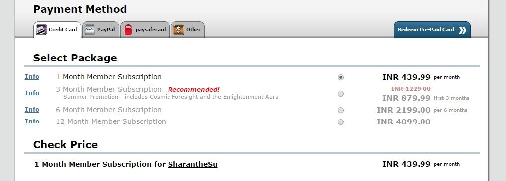
A/B Test #2 – Show All Packages on Billing Page
Once a user selects a membership plan and clicks ‘Continue’ they are taken to the billing page. Originally the billing details section displayed only the selected plan. For instance, if a user selected the one-month plan, only details regarding the one-month plan were displayed. This meant that once a user chose a plan, there was no immediate opportunity to upsell a bigger package e.g. a three-month, nine-month or twelve-month plan.
Related Post: Understanding Upsell and Cross-sell and How To Use It in eCommerce
Why This Test?
The one-month membership plan was the most popular among users. However, a previous VWO test had helped Jagex increase the popularity of the three-month plan, with more users selecting it when encouraged well. Taking the thought further, Jagex suspected that they would be able to upsell the three-month plan to more customers.
The Goal: The gaming firm had been tracking the number of people who selected the one-month package and clicked through to the billing page. The goal was to encourage such users to choose a higher package and increase revenue per visitor.
Test Details: While the control version (original) only displayed details regarding the selected package, the variation carried all the available packages. The objective of this change was to provide users with another opportunity to choose a bigger package.
The test ran for exactly one month with 18,500 visitors passing through the test.
The Result: The hypothesis proved right, and Jagex was able to improve revenue from the target user group — users who select the one-month plan — by six percent.
Result Analysis – Why Did The Variation Win?
On the membership-plans page itself players are shown all the different packages available. Needless to say, a serious player will love to get a bigger plan and the benefits that come with it. However, price is the deterring factor. Most players settle for a small package simply because a three-month package asks for a higher financial commitment.
Clever Upselling
Presumably, a certain percentage of players who choose the one-month plan are likely on the ledge, only waiting to be nudged into choosing a higher package. By providing the option to change their membership package on the payment page, Jagex subtly created the nudge, successfully upselling a higher package to a certain percentage of the players.
Identify places where users are unsure, and offer them something better than what they have.
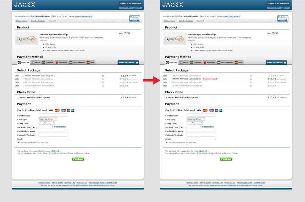
A/B Test #3 – Displaying a ‘Recommended Package’
With the previous A/B test, Jagex confirmed that simply giving the option to change to a different package on the purchase page was enough to influence at least some users to choose a higher membership package. Next, they deliberated on finding a more visible way to entice customers to choose a higher package.
It was hypothesized that adding the phrase “recommended” next to the three-month package would encourage users to choose it over the one-month plan. The pricing of the three-month plan was also kept such that compared to the one-month plan it offered a decent saving calculated over three months.
In summary, the wording ‘recommended’ in an eye-catching red and the obvious monetary benefit would make more users select the three-month plan. For good measure, the three-month plan was made the default selection on the pricing page.
The Goal: Similar to the last test, the goal of this test was to improve overall conversions and revenue conversions from the target user group (users who select the one-month plan).
The Test:
The Result: The test ran for a period of 1 month, involving approximately 30,000 users. With the variation that used the ‘recommended’ phrase, the number of users that chose the three-month package instead of one month increased by 158%.
Macro-conversions saw improvement as well. Overall revenue conversion on the page increased by a staggering 11%. A big win for a small change.
This is how the current purchase page looks:
Result Analysis – Why Did The Variation Win?
If the last test proved that providing an option to choose a higher package even at the last moment works, this test went a little further by attracting players to the higher package explicitly. Using the wording ‘recommended’ in red color, Jagex was able to do two things:
- Attract players to the three-month package
- Provide a psychological cue with the wording ‘recommended’: it tells users that ‘for some reason’, the three-month package is a better choice to make. Depending on the psychological state of the player this could mean a number of things, including, ‘this package is superior to the one-month package in terms of lifting game performance — more resources, superior character skills etc.’; ‘the three-month package is better from a financial perspective — definitely a better idea than renewing membership a month later for a higher per month cost’.
We believe it’s for these reasons that the variation succeeded at converting more players to choose the three-month membership plan.
Download Free: A/B Testing Guide
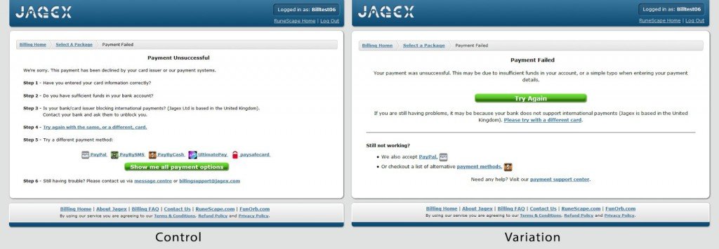
A/B Test #4 – New Credit Card/PayPal Payment Decline Page
The next step of the customer journey after visiting billing page is payment initiation. Jagex realized that there were a number of payment attempts that were getting declined. How could users who visited the ‘payment declined’ page be reclaimed?
Why This Test?
Jagex figured out that 20% of users who visit the Credit Card/PayPal payment declined page went on to make a successful payment within 24 hours. This was in spite of not providing a very visible cue to encourage such users to re-attempt payment. The original page was also considerably cluttered with multiple links to direct the user to either the payment re-attempt page or the payment options page.
The game’s brand hypothesized that de-cluttering the page with a simple call to action to encourage users to re-attempt payment would lead to more sales.
The Goal: The test aimed to increase the number of users who visited the ‘payment declined’ page to re-attempt and make a successful payment.
Test Details:
The Result: The test ran for over 3 months, with 44,000 visitors. The rate of conversion for users hitting this page rose from 43.82% to 44.78%. Considering the value of each conversion at this stage of the conversion funnel, the test resulted in a healthy increase in revenue. The new credit card ‘payment declined’ page successfully increased sales by six percent, whereas the new PayPal ‘payment declined’ page increased sales by 13%.
Another huge win for a low-effort change.
Result Analysis – Why Did The Variation Win?
When a user visits the ‘payment declined’ page, the priority for Jagex is to encourage the user to attempt a repayment. The control version designed for the purpose was comprehensive, providing a step-by-step guide to make a repayment. However, it’s also important to understand a user’s psychological state at this stage. They are frustrated that their payment just got declined, and this provides a window of opportunity for them to reconsider their decision. Second thoughts leap to users’ minds and it takes only about 50 milliseconds for them to form an impression of a page.
Reducing Cognitive Load At a Critical Juncture
At this stage, having to concentrate and read through a multi-step procedure can easily distract users, take their mind off the conversion (payment) and lead them to bounce off, deciding to try repayment at another time or discard the session altogether. Such a step-by-step procedure might do well for a user looking to resolve other operational issues like a faulty sign in. But not a payment troubleshoot.
By replacing the cluttered text with a simple button that said ‘try again’, the user’s cognitive load is reduced considerably. It doesn’t allow the user to rethink their decision, and that worked.
The variation with the single button provides a simple direction to the user, to try the payment again.
A/B Test #5 – Login Name or Username?
We chatted up with Neil Christie, RuneScape Web Producer, and he told us about the circumstance that led to this test.
“We recently launched a new tool that allows users who have forgotten the login name for their account to automatically retrieve it. Our customer support team continued to receive emails about forgotten account names even after we launched the tool, and we found by talking to our users that many were confused by the different terms – “username”, “log in name” and “email address”.
Why This Test?
Jagex decided to run the A/B test to find which variant appeared most intuitive to players. The winning variation should allow more players to get their accounts back and start playing RuneScape instantly, without having to mail the Jagex support team. This would also enable the customer support team to spend more time helping users who have problems that can’t be solved via automated systems like password recovery.
The Goal: Simply put, the goal of this test was to reduce the confusion of players, mirrored by an increase in completion of the forgot-login process. This would in turn result in less time spent advising players on how to complete an automated process, and more time tackling critical issues. And of course, a happier user base translates into increased revenue for the company.
Test Details: As shown in the image below, Jagex came up with two variations for the test and pitted them against the control to see which wording resulted in the least confusion among players.
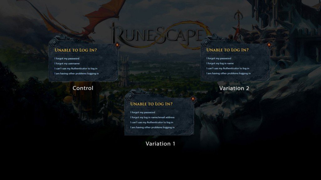
The original version contained the phrase “I forgot my username”, variation 1 contained “I forgot my login name/mail address” and variation 2 carried “I forgot my login name”.
As suspected, variation 1 won hands down.
The Result: The test was run over a period of approx. 100 days with a total of 130k users passing through the variations.
Considering the click-through of the forgotten login process shot from 31.95% of all traffic to 35.69%, roughly 5000 additional users over the same period would require no interaction with support to resolve their account issue.
With this simple change in wording, the test allowed Jagex to save 500 man hours of support time, and got more players actively playing RuneScape and purchasing items and services from the in-game store.
Categories:


