200% – that’s how much uplift you can see on your conversion rates, by simply having a well-designed user interface (UI).
Although marketers and UX designers understand the importance of having a good website design, many business owners often overlook its role in engagement, persuasion, brand perception, and conversion.
In this blog, we’ve compiled a ton of important stats, trends, and insights to give you a complete overview of how web design impacts the end user.
How does web design impact your experimentation program?
Understanding the current trends, behaviors, and top preferences of website visitors is a key step for building a robust experimentation program.
For instance, you might want to run an experiment to completely redesign the above-the-fold content of your landing page to engage first-time visitors.
While this is a good idea, research suggests that 38% of visitors look at the navigational links when they visit a website for the first time.
Connecting these key web design statistics with your experimentation program will help you develop ideas and hypotheses that can better impact the visitor experience and enable you to run better personalization campaigns.
Let’s look at the top web design statistics you must know in 2026.
5 general web design statistics
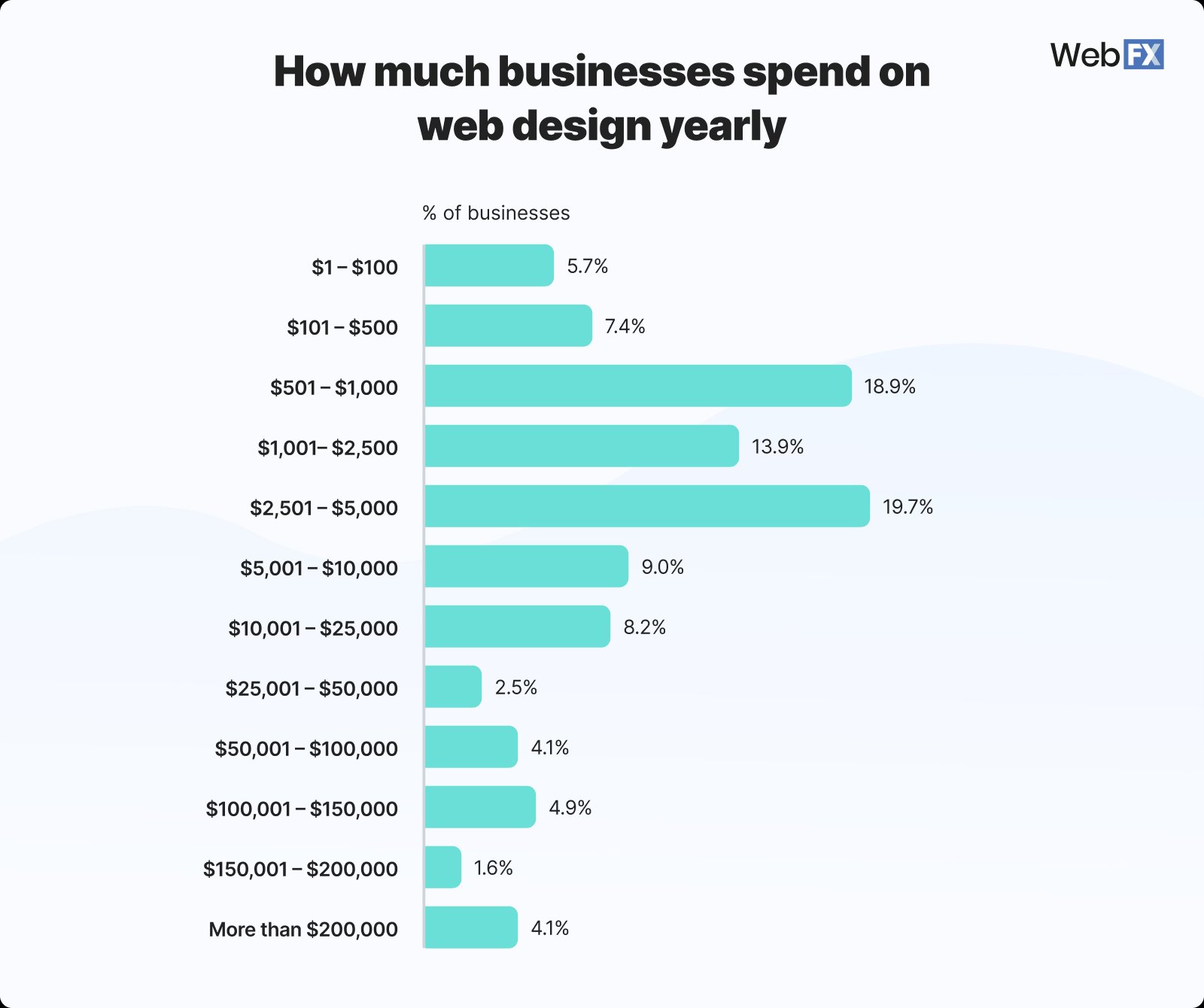
1. Basic website design costs can range from $6500 to $15,000
Source: WebFX
2. Around 42% of web design work is done by in-house teams
Source: WebFX
3. It takes just 0.05 seconds for users to form an opinion about your website as the design of a website influences 94% of first impressions
4. 94% of website feedback is about design, while only 6% is related to the website’s content
Source: CXL
5. The average annual salary for web designers in the USA is $70,000
Source: Talent
10 web design industry statistics
6. In 2022, the global market size of web design grew to USD 58.5 billion
The US alone accounted for an estimated $43.5bn revenue in 2024, making it the world’s biggest market for web design services.
Source: Cognitive Market Research
7. The web design industry is expected to have a market share of USD 100 billion by 2031
North America, Europe, Asia Pacific, and Latin America hold the biggest market shares in web design today.
Source: Cognitive Market Research
8. Freelancers charge between $1500 to $5000 per year for web design tasks
Agencies charge between $1000 to $6000 for web designing, although they also offer SEO, web development, paid marketing, and other useful services.
Source: WebFX
9. The cost of redesigning a website ranges from $3000 to $75000
Redesigning a large website with more than 150 pages can cost around $36,000 to $75,000.
Source: WebFX
10. 64% of freelance web designers in the US prefer working for private companies
Around 19% of freelance web designers in the US are employed with public companies, while the others work in the government or the education sector.
Source: Zippia
11. The number of web design jobs is projected to grow 8% from 2023 to 2033
As of 2023, there are more than 222,600 web designers in the United States.

12. Features and functionality are the main factors impacting web design costs
The other main factors are UI/UX design, mobile responsiveness, and usability of the website.
Source: Colorlib
13. 36.59% of web design agencies prefer having about 11-20 clients to maintain profitability
Around 25% of web design agencies prefer having 21-50 clients while 7% look at having 10 or fewer clients.
Source: Databox
14. Graphic design, wireframing, and prototyping are the most important skills for web designers
Tools like Figma, Sketch, InVision, Framer, and Miro are commonly used by web designers.
Source: GeeksforGeeks
15. Around 95% of designers work remotely, at least partially
69% of designers reported feeling more satisfied than they were before the pandemic.
Source: Figma
16 UI/UX web design statistics
16. For every $1 invested in UX, you get $100 in return
According to a detailed Forrester Research study, a seamless UX has the potential to boost your conversion rate by up to 400%.
Source: Forrester
17. 91% of unsatisfied users will not complain about a bad website experience
Most users who’ve had a bad experience on your website will simply leave without sharing any feedback.
Source: Baymard Institute
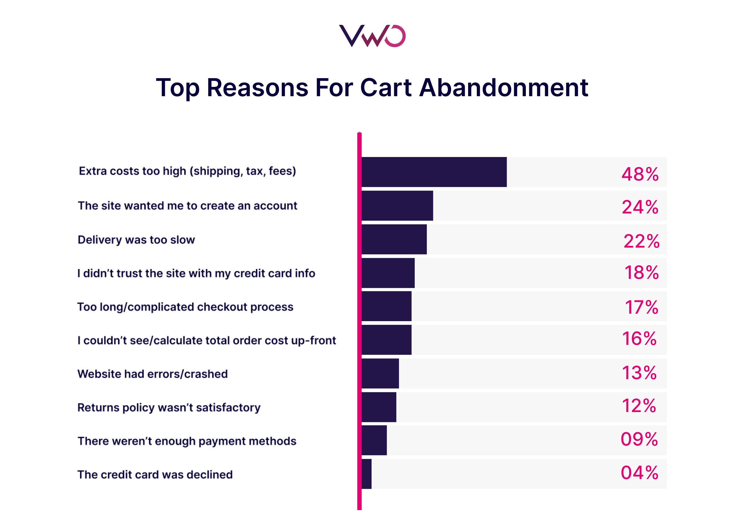
18. The eCommerce industry loses $1.420 trillion due to bad UX with a staggering cart abandonment rate of 75.6%
An estimated $260 billion of purchases are abandoned in the US and EU solely due to unsatisfactory checkout flow & design.
Source: VWO, Amazon AWS
19. 88% of users are less likely to return to a website after a bad experience
Slow load times, non-responsive pages, bad navigation, and outdated design are the top reasons for users to leave a website.
Source: UserGuiding
20. Around 72% of users will tell more than 5 people about a good experience
Research suggests that 13% of customers will tell 15 people or more about a bad UX they encountered.
Source: Help Scout
21. Spending around 10% of your development budget on UX can give you a conversion uplift of 83%
A study revealed that the top 10 companies leading in customer experience outperformed the S&P index with more than 3x returns.
Source: Nielsen Norman Group
22. 81% of customers are willing to pay more for a better user experience
Only 1% of users feel that a business consistently meets their expectations, while 32% of users say they would stop engaging with a brand they loved after one bad experience.
Source: Capgemini
23. 85% of users want a company’s mobile website to be as good or better than their desktop site
Around 96% of users have come across sites that were not optimized for mobile devices.
Source: UserGuiding
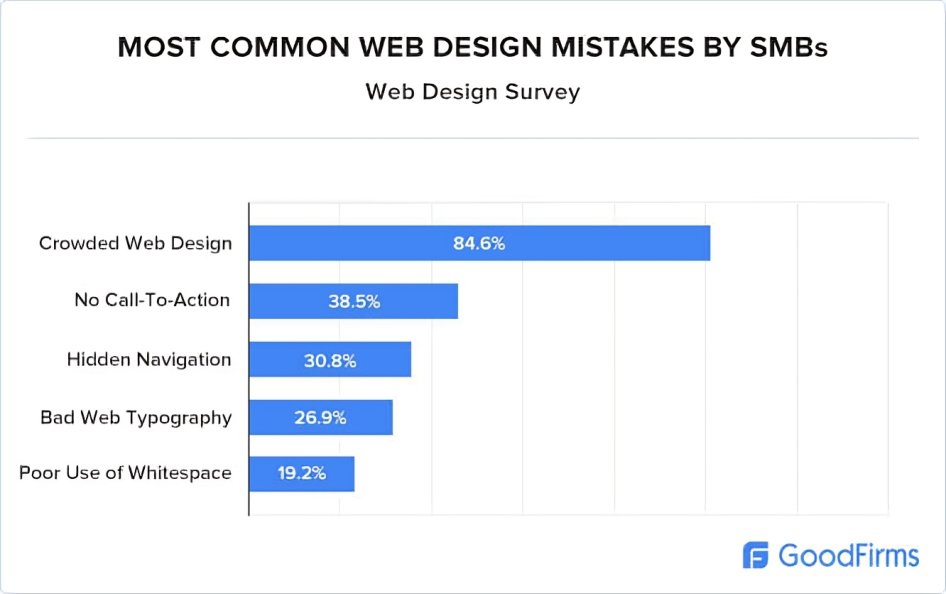
24. 61.5% of web designers believe that bad navigation is the main reason visitors abandon a website
Outdated design, poor content structure, and non-responsive pages are the other top issues that impact UX.
Source: GoodFirms
25. 90% of smartphone users say they will continue shopping if they’re having a positive experience
74% of users are likely to return to a site that offers a good mobile UX.
Source: TechJury
26. Only 50% of Gen Z users are satisfied with current digital experiences
Around 58% of Gen Z folks still use search engines like Google or Bing to find information online, compared to the 46% who rely on social media.
Source: Forbes
27. 66% of users want brands to tailor messaging to their needs
Around 66% of users will abandon a purchase if the UX is not personalized.
Source: McKinsey & Company
28. Users only read about 20% to 30% of a page’s content
Visual hierarchy plays a critical role in dealing with problems like short attention spans and limited reading capacity of users.
Source: Nielsen Norman Group
29. 61.5% of website redesign projects are carried out due to bad UX
A typical web design agency charges around $5,000 to $75,000 for website redesign.
Source: GoodFirms
30. The voice user interface (UI) market size is expected to grow to USD 92.41 billion by 2030
Implementing voice UI on a website can give businesses a competitive edge as users demand more natural and conversational interactions.
Source: Grand View Research
31. Adding videos can increase the average time users spend on your website by 88%
Websites that use video content have an average conversion rate of 4.8%, which drops to 2.9% for the ones that don’t.
Source: Forbes
12 responsive web design statistics
32. Around 83% of mobile users feel that websites should provide a seamless experience across all devices
Source: IMPACT
33. As of 2024, an estimated 90% of websites have implemented responsive web design
Source: Enterprise Apps Today
34. Building a site with responsive design can cost between $3000 to $25000
Source: WebFX
35. As of July 2024, Google has stopped indexing sites that are not accessible on mobile
Source: Google Search Central Blog
36. More than 70% of web designers cite the lack of responsive design as the top reason why visitors leave a website
Source: GoodFirms
37. Responsive websites register 11% higher conversion rates
Source: Hostinger
38. A responsive web design can increase user engagement by 20%
Source: UXCam
39. About 50% of users are more likely to visit a company’s mobile website instead of downloading their app
Source: Think With Google
40. 8 out of 10 users would stop interacting with content that does not display well on their device
Source: Sweor
41. Close to 68% of users are more likely to engage with responsive websites
Source: Linerarity
42. Around 62% of companies reported an increase in sales after designing a responsive mobile website
Source: Ironpaper
43. More than 40% of users require help or support while interacting with non-responsive mobile sites
Source: Linearity
4 mobile web design statistics
44. Mobile-optimized sites can see up to 40% higher conversion rates, compared to non-optimized sites
Around 62% of top-ranking websites on Google are optimized for mobile.
Source: Linearity
45. Around 40% of mobile sites in the US fail to support common gestures like pinch or tap for product images
Tap, swipe, scroll, and pinch are some of the key gestures that are often used on mobile devices.
Source: Baymard Institute
46. By May 2023, Google Lens was being used 12 billion times a month
Google Lens is a visual search tool that uses AI to identify objects, translate text, and provide relevant information. 90.6% of all Google Lens image results come from mobile-friendly websites.
Source: Google
47. About 40% of users will move on to a different search result if the previous one was not mobile-friendly
Businesses must prioritize mobile optimization to capture audience attention, improve engagement, and ultimately, drive sales.
Source: Clique Studios
10 eCommerce web design statistics
48. Around 85% of shoppers cite product images and details as important factors when selecting an eCommerce site for a purchase
Source: Think With Google
49. 22% of eCommerce shoppers abandon a purchase due to a long or complicated checkout process
Source: Baymard Institute
50. After landing on a new product page, 56% of users first explore the product images before even reading the title, or description or scrolling down for more details
Source: Baymard Institute
51. Approximately 77% of users prefer seeing photos shared by other customers instead of professional images displayed by the eCommerce site
Source: Cloudways
52. Easy navigation and good user experience are the most important factors for 69% of regular shoppers
Source: Tidio
53. Around 57% of eCommerce sites don’t allow users to use the “Back” button to return to a previous step during checkout
Source: Baymard Institute
54. More than 90% of eCommerce sites do not indicate or highlight the current location of a user in the main navigation bar
Source: Baymard Institute
55. Around 67% of mobile users consider “buttons and links being too small to click on” as a major obstacle while shopping
Source: Dynamic Yield
56. As many as 78% of users want eCommerce sites to display more product images
Source: Enterprise Apps Today
57. Usability of an online shop is an important design characteristic for 60% of users, while 51% of users rate the search & filter options as important
Source: Statista
4 on-page web design statistics
58. Users spend about 57% of their time on viewing content above the fold
Source: Nielsen Norman Group
59. Center-aligned CTAs attract 682% more clicks as compared to left-aligned CTAs
Source: WiserNotify
60. 1920 x 1080 is the most common screen resolution on desktops worldwide, accounting for 23.27% of the market share
Source: Statcounter
61. Around 58% of landing pages have clickable graphics
Source: KlientBoost
10 statistics for website design elements
62. Nearly 75% of Fortune 500 companies use Sans Serif fonts in their logos
Source: Toner Buzz
63. Around 30% of marketers believe a landing page form with 4 questions achieves the best conversions
Source: Hubspot
64. Personalized CTAs outperform standard CTAs by 202%
Source: Hubspot
65. CTAs placed above the fold are 73% more visible, while visibility drops to just 44% when put below the fold
Source: Think With Google
66. Users spend 80% of their time viewing the left side of a page
Source: Nielsen Norman Group
67. Nearly 39% of users appreciate colors more than any other visual elements on a website
Source: Clutch
68. Around 46% of users favor the color blue for business websites, while about 30% prefer green
Source: Clutch
69. 58% of designers use AI to generate images and other media for websites
Source: Hubspot
70. Realistic and original images drive 20% more engagement than stock photos
Source: Hostinger
71. More than 65% of eCommerce websites use custom fonts for branding purposes
Source: Linearity
Case studies and real-life examples of web design
1. Majestic Wine saw a 201% increase in ‘Enquiry Form’ submissions after redesigning its category page
Majestic Wine is a UK-based wine retailer that wanted to improve conversions by increasing the submissions on their inquiry form.
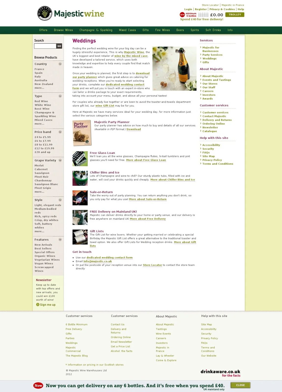
To do so, they first gathered feedback from their customers, in-store staff, and other customer support executives. During these conversations, they realized that the existing category page did not provide the details that their audience was looking for.
Here’s what the original category page looked like.
So, to address this concern, the team came up with a few hypotheses:
- Reducing distractions like outbound links can encourage more people to submit the inquiry form
- Better messaging of their USP would drive more visitors to place orders or at least submit the inquiry form
- Adding an explainer video to address specific concerns can boost conversion rates
Testing these hypotheses required making major changes to the page, so Majestic Wine decided to completely redesign the page. Here’s what they changed during the webpage redesign.
The following main changes were made as part of the redesign:
- Remove clutter and distracting links
- Create a new heading to convey the USP with better clarity
- Add relevant images with better color contrast
- Display the CTAs clearly
- Show a visually appealing video to explain how visitors can proceed
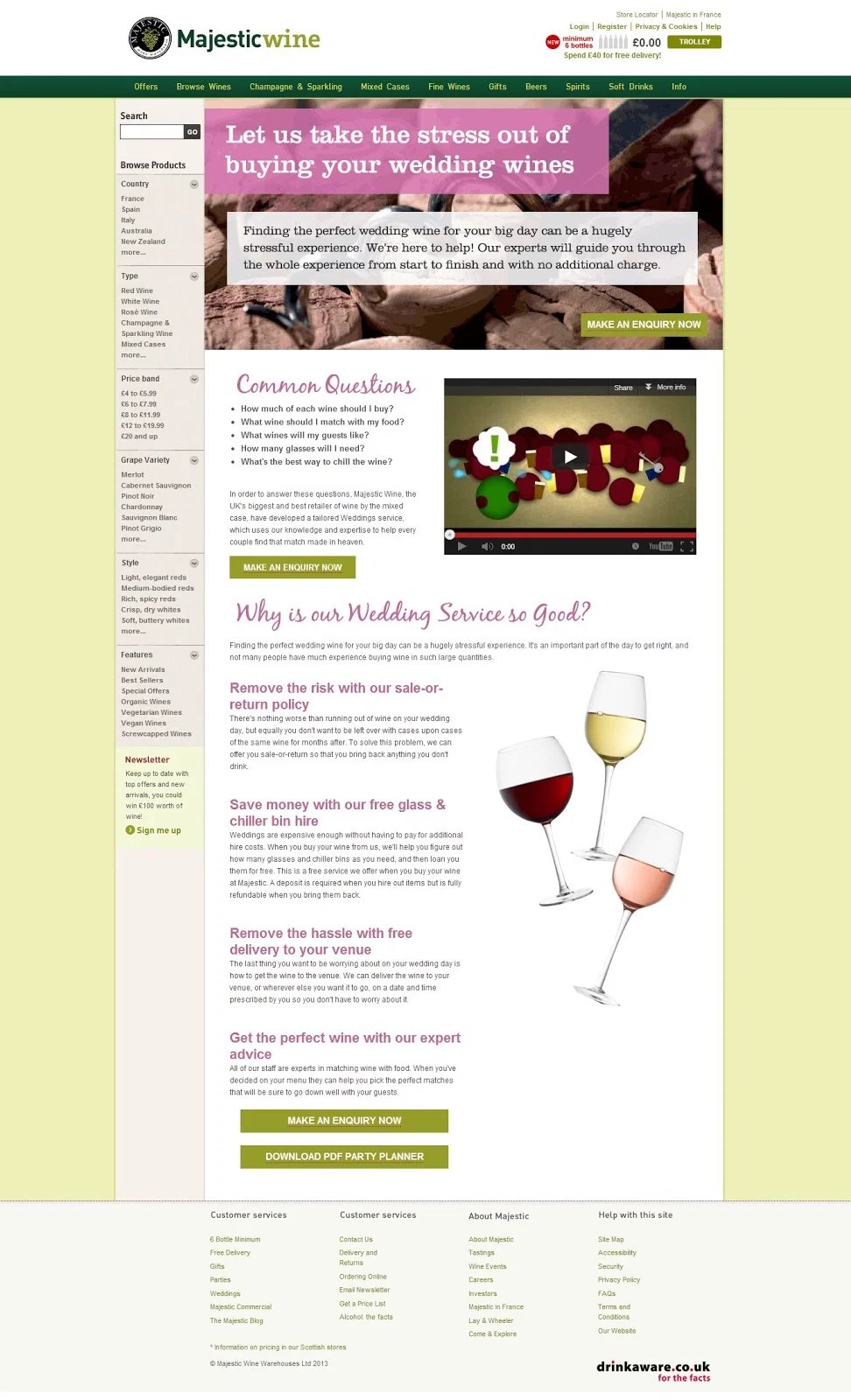
The team ran a test to compare the performance of these two versions, where the variation saw a 201% improvement in form submissions.
2. Beamax registered a 53.13% increase in their CTR by testing a banner and colored links
Based in the Netherlands, Beamax is a popular manufacturer and distributor offering a wide range of projection screens for personal and professional requirements.
The team at Beamax wanted to sell some uncommon items that were taking up space in their warehouse. To do so, they wanted to send visitors from their home page to another site where these ex-demo and one-off items were sold directly to customers.
So, they added a standard link right above the product images on the home page that said, “Great deals on brand new and ex-demo screens here.”
Now, the team created different versions of this link in red, blue, and one with a new banner too.
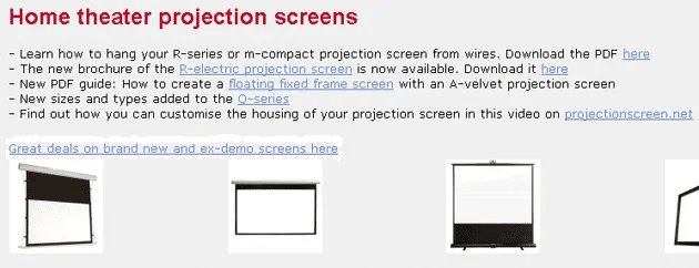
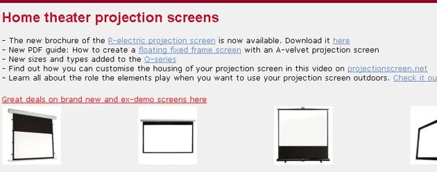
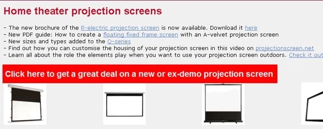
They hypothesized that the banner version would perform be the overall winner, while the red link would perform far better than the blue one.
The initial results matched their expectations as both the red link and the banner outperformed the blue link.
However, as the test continued, the team noticed a 53.13% increase in clicks on the red link, which outperformed the banner as well.
3. ArchiveSocial improved CTR by 101.68% and optimized the website’s UX
ArchiveSocial is a SaaS-based company that helps organizations fulfill their legal requirements and avoid lawsuits on social media.
Here’s what the team wanted to achieve on their home page and ‘Request demo’ page:
- Improve the conversion rate on the pricing page
- Increase conversions on the Homepage banner form
- Improve overall engagement on the website
To do so, the team at ArchiveSocial used VWO to analyze visitor behavior on these pages, and here’s what they observed:
- The email form was displayed at the very bottom of the home page banner and had nothing to differentiate it from the rest of the page
- The funnel from the pricing page to the final conversion page needed improvement
- The ‘Resource’ page hardly received any traffic or engagement
To tackle each of these challenges, the team conducted three different tests.
Test 1: They created a variation of the primary CTA to make it more legible and added it to the first fold, on the right.
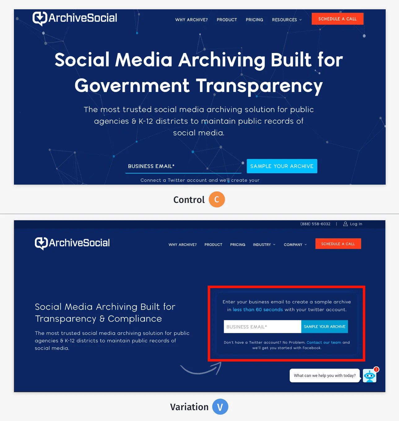
This led to an improvement of 101.68% in clicks on the form field. Also, the team used VWO Scrollmaps to identify that users were now scrolling further beyond the first fold on the variation.
Test 2: The team also redesigned the pricing page to improve CTA clicks and drive more users to the Thank you page.
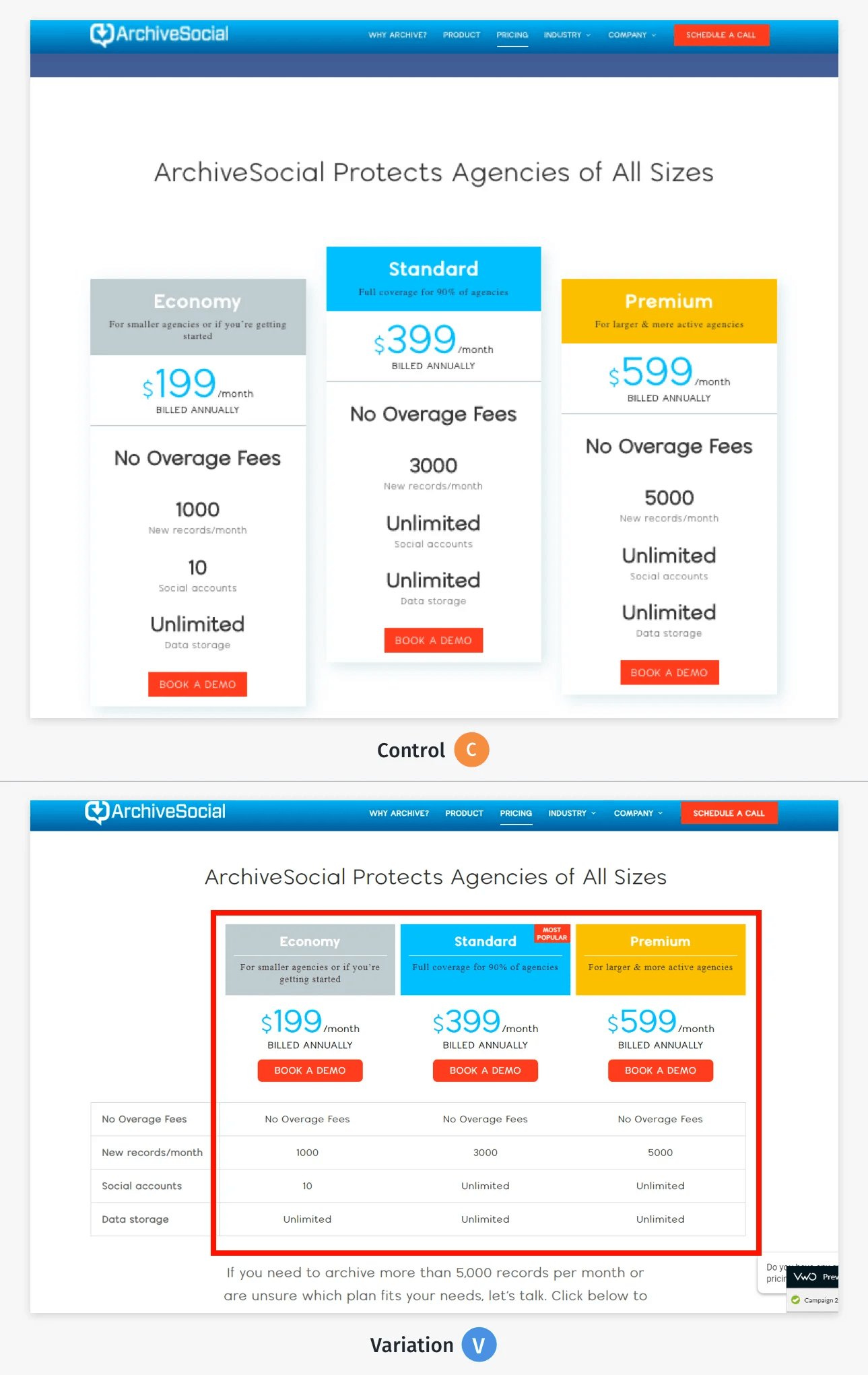
In the new version, the primary CTA button was highlighted and the text explaining the benefits of each of the plans was simplified. Also, they leveraged the principle of ‘anchoring’ (cognitive bias) by highlighting the most popular plan to drive more attention toward it.
The test ran for seven weeks, after which the variation was declared as the winner with the ‘Thank you’ page visits increasing by 64.76%.
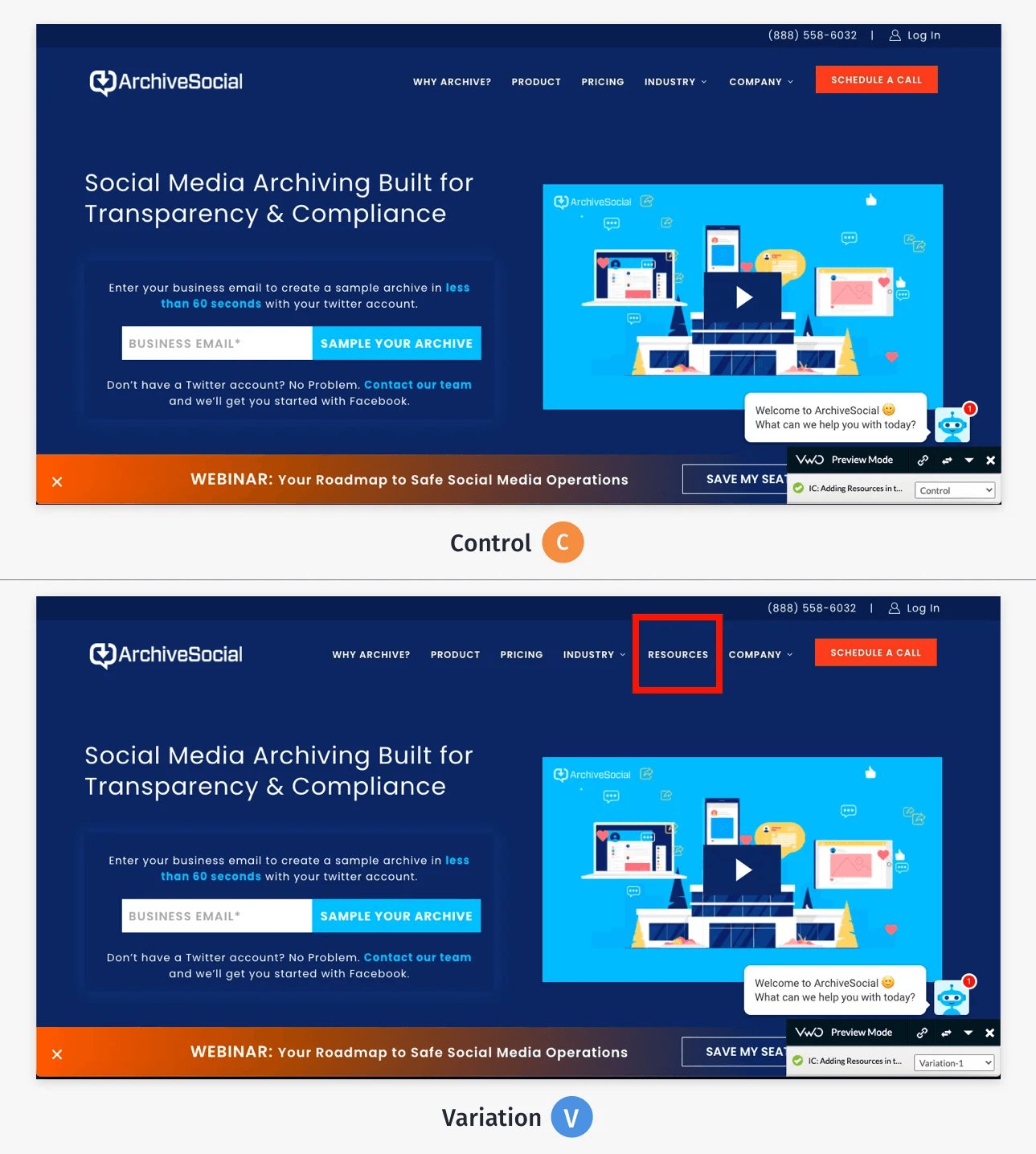
Test 3: A new variation was created where the Resources section was added to the top navigation bar, which made it easier for visitors to find this section.
4. EcoFoil increased purchases by 86% after modifying the layout and design of their home page
As a result, the Resources section registered a 73.30% uplift in traffic via the navigation bar.
EcoFoil offers a wide range of radiant barrier and foil bubble insulation products for different applications.
On its home page, EcoFoil displayed a Help section linking to a virtual map, using which visitors could figure out what product they needed, depending on their requirements.
However, the team wanted to ensure that the section was displayed in the right position to help the visitors in a better way.
In the original version, the section was shown below the fold, which meant users had to scroll down to see it. Moreover, another section was played beside it, making it difficult for users to notice.
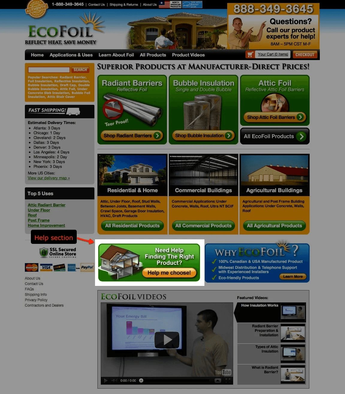
After analyzing the home page layout, the team decided to change its position and improve the visibility of both sections. They created a new version of the home page, where the Help section was placed above the fold so that new visitors could also engage with it immediately.
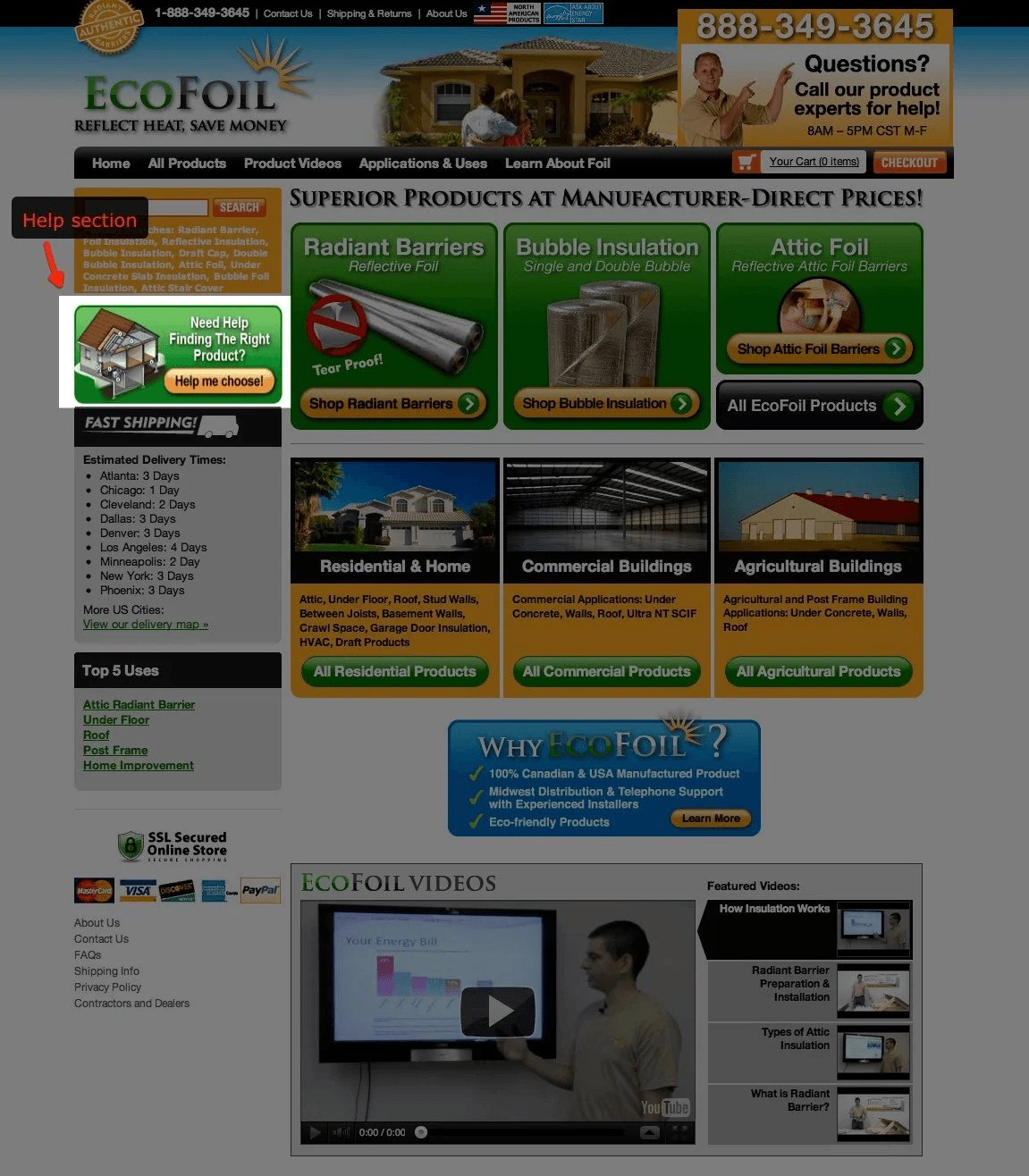
They conducted an A/B test using VWO to see how the new version performs. After the test concluded, the variation was declared as the clear winner, registering an 86% improvement and helping more visitors buy relevant products.
5. Orah increased demo requests by 63.27% after improving the home page layout for new visitors
Orah is an Auckland-based student engagement platform that allows schools and organizations to collect data from various sources, providing a single holistic view of a student.
The team at Orah wanted to optimize the website experience for first-time visitors, helping them to quickly understand what the platform offered and encourage them to opt for a demo.
They used VWO to combine qualitative and quantitative feedback about the website and came up with a solid hypothesis – modifying specific sections on the home page would help the new visitors better understand Orah’s offerings.
After creating a new version of the home page, the team ran an A/B test to confirm their hypothesis. The new version includes the following design changes:
- Reduced the number of menu options in the navigation bar so visitors could easily find the relevant pages
- Added industry-specific terms in the website copy so first-time visitors could derive value, as they are more familiar with industry jargon
- Moved the customer testimonials to the top, making it easier for visitors to notice schools or organizations that were already using the platform
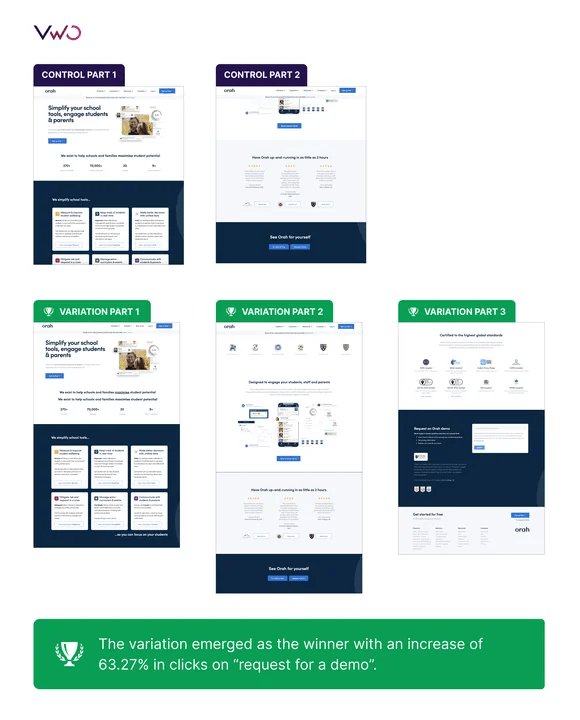
At the end of the test, the variation was declared as the winner with a 63.27% increase in demo request clicks.
Final thoughts
Understanding the current state of website design will give you a clear picture of how visitors are evolving, and the emerging trends that businesses are adopting.
Based on these insights, you can take the necessary steps to optimize your web design, improve the visitor experience, and identify crucial areas that need your attention.
Also, you can use VWO to manage your optimization program in one place. Right from conducting in-depth user research to managing your experimentation needs, VWO helps you optimize experiences across your website and mobile app.
Take a free trial now to explore how you can use VWO to improve visitor experiences and drive conversions.


![[Gifographic] Better Website Testing – A Simple Guide to Knowing What to Test](https://static.wingify.com/gcp/uploads/sites/3/2021/01/Feature-image_Gifographic-Better-Website-Testing-–-A-Simple-Guide-to-Knowing-What-to-Test.png?tr=h-600)
![[Infographic] Why a Website Redesign Doesn’t Always Work](https://static.wingify.com/gcp/uploads/sites/3/2016/06/Feature-image_Infographic-Why-a-Website-Redesign-Doesnt-Always-Work.png?tr=h-600)
