Imagine there’s a cupcake fair in your community and you’re dying to relish a good, heartfelt red velvet cupcake. Of the many counters selling an exotic range, only two of them offer the kind you want—counter A and counter R. While counter A has an animated bunch of customers digging into its delicacies and has a banner saying “last 20 pieces left,” counter R adorns a deathly, almost funereal look.
Download Free: Conversion Rate Optimization Guide
Which one would you go for? If your choice is counter A, you’re not alone.
Human choices are naturally driven by scarcity. The principle of scarcity states that people tend to give more value to objects which are practically scarce as compared to the ones available in abundance. When applied to the field of marketing, scarcity, along with urgency, can make for a potential weapon to significantly increase eCommerce conversion sales and revenue thereafter. Of course, this can only be achieved by eCommerce companies with calibrated and systematic testing efforts and not through random experiments.
Principles of Persuasion – Scarcity and urgency
Below mentioned are some examples of how different eCommerce websites creatively use these principles of persuasion—scarcity, and urgency—to their advantage.
1) Stock scarcity
Displaying your stock meter on the eCommerce product page is always a good conversion practice. Not only does it ensure that there are no last-minute heartbreaks for the customers, but it also speeds up the buying process.
A user might be convinced to make a purchase, but they might not always be willing to buy the items right away. They might want to compare the prices of their selected items on other sites, look for discount coupons, the right payment options or may simply forget about the purchase—thanks to the myriad distractions of the web.
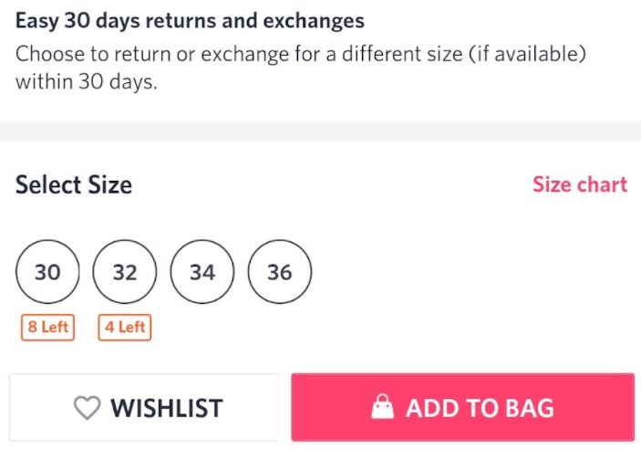
Look how Myntra displays the number of items left as per the size selected on its product pages.
2) Size scarcity
Imagine you head to a shop to buy a pair of denim jeans only to find out that the last piece in your size has just gone out of stock. Old story? Well, if it can happen in the retail stores, it can surely happen online as well.
Informing the buyers when a particular size goes out of stock is similar to killing two birds with one arrow. Not only does this help to inform the online shoppers that a particular product is unavailable, but it also works as positive reinforcement.
See how Myntra, a leading eCommerce site, shows the unavailable size in grey.

Zappos goes a step further and even shows how many items are left in a particular size and color combination.

3) Time-bound purchase for next day shipping
If you are already offering next-day delivery, then ‘time-bound purchase’ won’t cost you any additional resources. You just need to inform your customers how many hours/minutes they have to complete their purchase process to qualify for next-day delivery. Here, you can also offer free shipping schemes as well. Time-bound purchase strategy primarily solves two purposes—it makes customers more proactive towards completing their purchase process within the specified period and eliminates confusion as to when their purchased items will be delivered at their doorstep.
Zappos once had a permanent banner placed on its homepage and landing pages informing its customers that they need to place an order before 1 PM to qualify for next-day delivery.

Amazon, on the other hand, shows the exact number of hours/minutes within which a customer must complete their purchase process to get their order delivered the very next day.
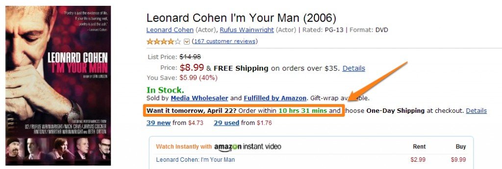
Arguably, it’s one of the best conversion rate optimization tactics as well.
4) Make them see other buyers
Two women fighting over the same item of clothing in a fashion store is not just a devil’s mind’s fictitious construct; it’s actually a trick to prompt sales. People are much more inclined towards buying something when others desire the same thing too.
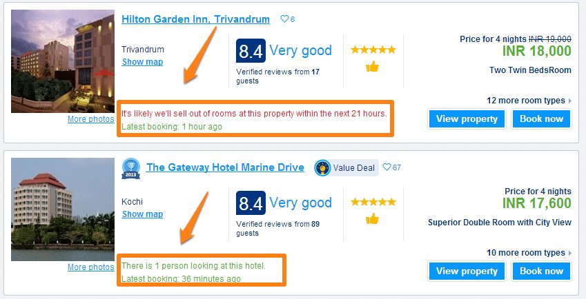
Booking.com is an excellent example to quote here. When you look at a property at Booking.com, it shows exactly how many people are checking out the same property in real-time. Social proof typically helps create a sense of urgency in the minds of shoppers.
Hotels.com even gives you information about how many people are viewing properties in a particular city. A modal box pops up and shows you your virtual competition/companions.
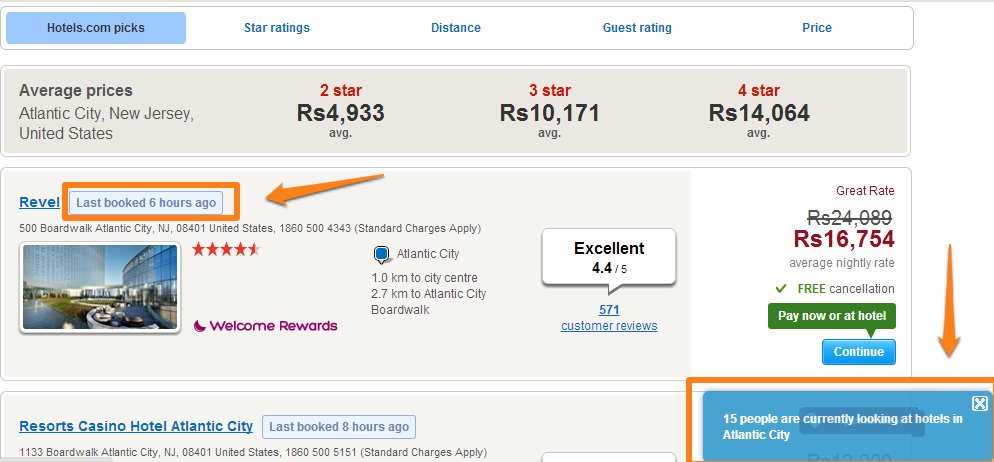
Image source: Hotels.com
Download Free: Conversion Rate Optimization Guide
5) Limited-period offer
The fear of missing out (FOMO) is a legitimate one. It is the anticipated regret of not being able to seize an opportunity. A limited-period offer works precisely the same way. It makes the offer look so tempting and fleeting that one is compelled to take the opportunity before it’s gone.
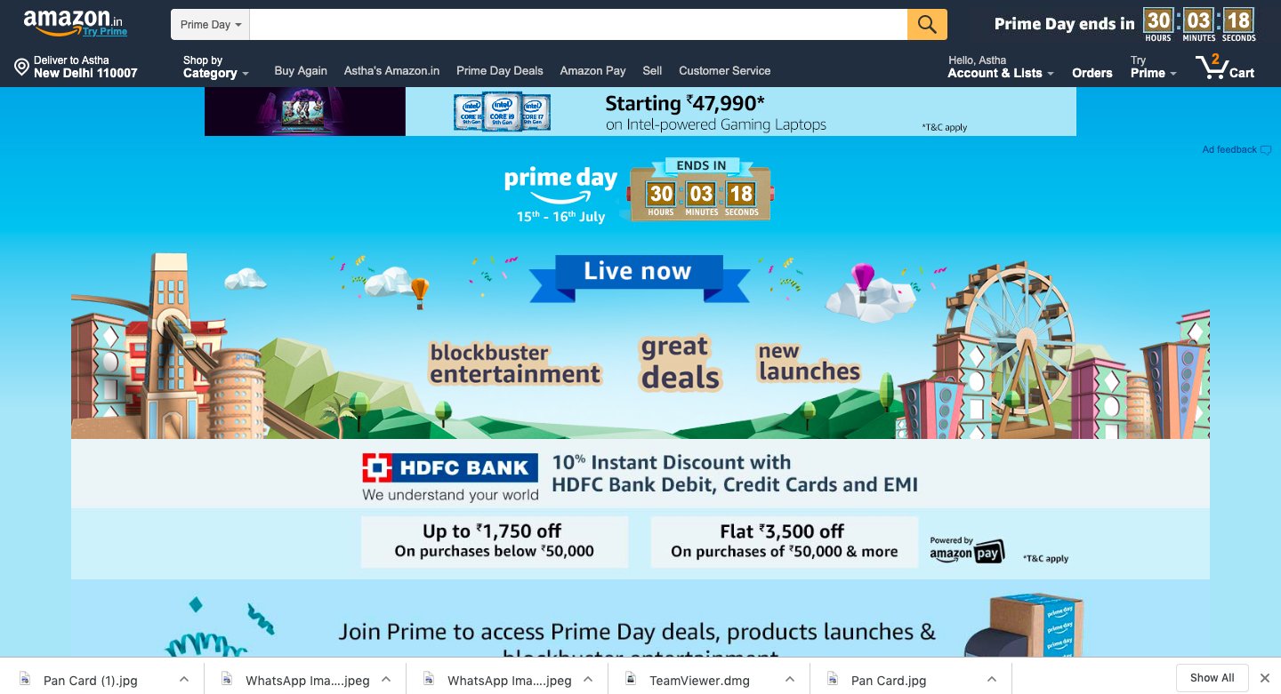
Amazon dramatically uses a running countdown to show how long the sale will last accurately.
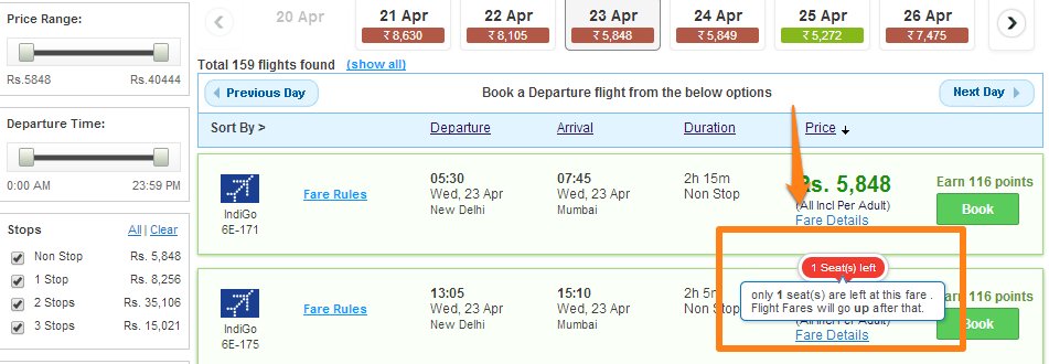
MakeMyTrip.com shows an alert when the last few discounted airline tickets are left in stock. See how they use color psychology here to instill urgency. The use of the red color is not a mere coincidence, it’s associated with energy, increased heart rate, and is often used in clearance sales.
6) Limited-time discount on abandoned cart items
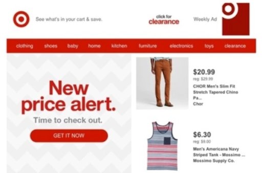
Offering limited-time discounts on abandoned carts is a great way to use the urgency principle to re-market products. However, you need to ensure that it is not overdone. Doing this too often can affect how people perceive your brand and maybe compel them to think twice before buying products from your eCommerce store in the future.
See how Target lures customers back by informing them about a reduction in prices.
7) Shopping cart item–Sold out!
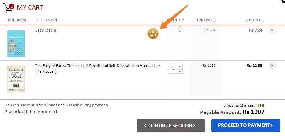
Seeing some items disappear from the cart works as a reality check for users—urging them to buy the rest of their selected products before they too run out of stock. See how Snapdeal shows a ‘Sold Out’ message next to items in the cart to prompt urgency.
8) Limited-period free delivery
Well, this is quite similar to limited-period offers. The desire to avail free delivery and not paying any additional shipping costs can plausibly offset a visitors’ tendency to procrastinate the purchase. This can further aid a good user experience.

9) Special discount hours
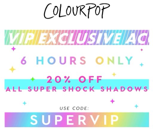
A two-day or a weekend sale has its charm. But, a special discount for a few hours can be more useful in galvanizing excitement. COLOURPOP offers a 6 hour special sale for its visitors.
10) Last chance emails
E-mails informing subscribers about the last day of sale is another great way to grab attention. This is how Myntra makes use of orange color to drive action on its website.
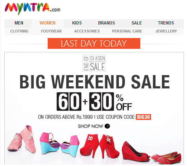
According to color psychology, just like red, orange too has an aggressive feel and creates a sense of urgency to take the desired action and boost ecommerce conversion rate.

Principles of persuasion—Rules beyond scarcity and urgency
Summing up, conversions indeed are all about persuasion. And, they are just not restricted to scarcity and urgency, there’s so much more to explore. Here, in this section, we’ll highlight the other four principles of persuasion and their relationship with eCommerce conversion rate optimization.
Reciprocity
The entire idea of reciprocity states that human beings by nature feel obligated to offer something in return to others for the favors they’ve received from them. They feel that it’s a gesture to show their gratitude—to make others feel special. This is exactly what happens in the world of personalized eCommerce marketing as well.
As an eCommerce site, it’s always a good idea to offer your customers something good such that they’re obligated to offer something in return. It doesn’t have to be anything hefty, but just a discount coupon, early access to a new product, or information that’s highly insightful and useful. In return, your customers may provide something that helps your brand scale up, either in terms of conversion rate enhancement, more product sales, drive traffic to your eCommerce site, and more.
Commitment
This simply defines the concept of selling by involving. Make users feel they’re an integral part of your community. If you give them the liberty to share their thoughts and opinions about your brand, products or services, they’re more likely to become your loyal customers and even advocate your brand on social media platforms.
Start small and you’ll see that once your customers begin committing to your brand, they’ll willingly help you achieve your business goals—increase sales, website traffic, and customer base as well. Commitment, in a nutshell, is nothing but the basis of a loyal relationship with your customer.
Authority
The essence of authority runs on the principle of trusting someone with whom you engage in business with. Meaning, if a person comes to your site, they confide their trust in you—to offer them nothing but the best. For example, if you’re a website that sells baby products, but there’s no certification to show that your products are safe for babies, your visitors are more likely to bounce off. On the other hand, if your website re-assures your visitors by showing them all the necessary certifications, they’ll trust your brand and even make purchases.
The rule here states that if you look confident and successful, people are more likely to pay attention to your brand, engage with it, and even become loyal customers.
Social proof
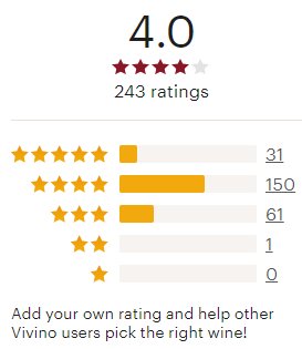
One thing that this principle teaches us is that social proofing has the prowess to skyrocket your sales. All you need to do is figure out smart ways to brand yourself such that people start advocating your brand. Use the right tactics such as showcasing the number of people who’ve bought your products. This gives customers a sense that you’re a brand that they can confide in.
Liking
One of the key elements to the principle of liking is to have something in common with your audience. Meaning, finding the right path to connect with your customers to grab their attention and make them like you in every manner possible.
A smart way to leverage liking in terms of marketing is to point out what your business has in common with its audience. For instance, if you’re an eCommerce site that sells fishing gear, a photo of your company’s CEO wading in a stream can instantly help build a sense of liking among the site visitors.
In its essence, liking is nothing but a way to build a strong relationship with your existing and potential customers, to enhance your eCommerce sales conversions, and grow exponentially.
Also, here’s an interesting conversation we had with Mogens Møller on how you can compete against the big players and make a strong presence in your target market.
Three golden rules to cohere
So, before you set out to use any of the rules as mentioned above, adhere to these three golden rules
1) Don’t expect ‘scarcity’ to create a lot of demand
‘Scarcity’ or ‘urgency’ work as two of the best ways to motivate customers and quicken their buying process. But, they only work wonders if a customer is already convinced to make the purchase. They may be great procrastination killers, but they do not guarantee demand generation. If you go back to the initial example, it’s only when you’ve decided to buy a cupcake that you start considering whether to choose option A or B. If you’re not convinced that it’s red velvet you want to have, you’ll not make an effort to choose any of the options at hand.
2) False urgency can backfire
Urgency is a subtle art and sounds oxymoronic as well. But, don’t go about faking urgency as it can whiff off your customers right away. Be honest. Don’t try to get rid of the stock that won’t move by flashing messages like ‘hurry, only last two pieces left.’ Customers will not only easily catch your bluff, but will also start questioning your genuineness. This can, in turn, also ruin their shopping experience.
3) Don’t overdo it
Even if you’re using the scarcity principle in all earnestness, don’t overdo it. You don’t need to employ all the practices with multiple countdowns breathing down a customer’s neck as you’ll end up being a pushy, shady, and untrustworthy brand in the eyes of your customers. Moderation is the key. However, testing gives you better insights as to what will work best for your brand and enhance eCommerce conversion rate.
Conclusion
eCommerce companies are always on the lookout for ways to maximize conversions. Scarcity and urgency are two of the most important tools that can help in demand generation. However, if overdone or practiced in a random manner, these can backfire and damage the brand. The best way to leverage these powerful principles of persuasion for your eCommerce business is to systematically test your ideas and calibrate them. This can make a decisive difference to your conversion rates while also helping you build a strong brand.
