Zappos, Target and Walmart.
What do these eCommerce giants have in common? They all command massive brand popularity, have a loyal customer base and have the key analytics working in their favor.
You might not have their level of reach, resources, brand name or market share, but that does not stop you from adopting their ecommerce best practices. In this post, we list 10 things the top eCommerce players are doing brilliantly and how you could follow these practices too.
Download Free: Improve Conversions In 60 Days Guide
The only criterion for choosing these eCommerce names is that all of them fall under the top 1,000 sites according to Alexa. Here are the websites with their rankings.
- Zappos (Rank 698)
- Amazon (Rank 11)
- Target (Rank 324)
- ebay (Rank 21)
- Walmart (Rank 181)
- Nordstrom (Rank 679)
- HomeDepot (Rank 476)
- Dell (Rank 378)
- Ikea (Rank 249)
- OverStock (Rank 781)
Now, here’s what you can learn from them:
1) Zappos – Love your customers
Zappos is the first name that comes to mind when one thinks of customer service. It’s their commitment to ‘Deliver Wow through Service’ that makes them the undisputed customer happiness king in the eCommerce world. There have been numerous stories about their staff members going out of their way to strike an emotional chord with customers. In fact, one of the customer representatives has even set a record of taking a 10-hour call with a customer.
The website encourages customers to talk to the support staff (who have been trained for 7 weeks by the way). On the very top of its homepage, Zappos flashes its customer service number and a Live Chat icon. Apart from that, it has a drop down Help menu that lists the different ways a customer can get in touch with them.
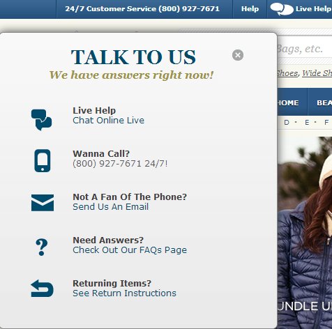
Besides, it has a no-frills attached return policy. It makes no fuss about any returns and actually makes an attempt to spoil its customers by encouraging them to purchase several products in one go, try them out and return some of them later. Don’t believe me? Here’s proof.
How to do it: You can’t possibly apply all these practices in totality as they come at a cost. But you could totally invest in superior customer executives for starters.
2) Amazon – A personalized website for each visitor
Well it’s hard to pick a single brilliant practice when the player you are talking about is the big shark of the eCommerce universe — Amazon. But after much deliberation, I went with Amazon’s personalization strategy.
Each user sees a different variation of the website depending on his/her browsing history. For example, I get to see books related to my browsing history under four different heads on the homepage.
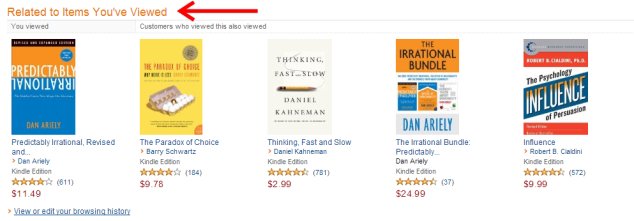
How to do it: There are different tools available to personalize your eCommerce site.
CommerceStack has a free Magento extension called Related Products Manager which uses customer data to generate information on related products, cross-selling or up-selling. Loopit goes a step further and enables your visitors to connect with their friends for advice on the product page. Check out this list of tools to personalize your way to awesome customer experience.
3) Target – Persistent shopping cart
It is almost going to be a month since I flirted with the idea of buying a blazer at Target and it’s still there — intact and mine to be taken. I never signed-in, but it’s there in my shopping cart.

At a time when every eCommerce site is trying super hard to reduce cart abandonment, a persistent shopping cart helps you recover some of the lost revenue.
An abandoned cart doesn’t always mean a lost sale. It could simply mean the visitor has gone off to another website to compare prices, is sleeping over the purchase, is just too busy to fill up that registration form right now or is on a dreamy wish-listing spree. This means the visitor could very well come back to complete the purchase. And how wonderful would it be if they found their cart exactly in the same order!
A ScanAlert study tells us that 28% of shoppers take longer than a day to convert. There’s another SeeWhy report which states that less than 1% of buyers will convert on their first visit.
How to do it: You can drop a long-term cookie for a particular browser/device combination to ensure the contents of the cart remain intact for a set number of days. Magento, on the other hand, has an in-built persistent cart feature.
4) ebay – Use Geo-targeting to deliver the right message
Geo-targeting essentially means delivering specific messages to users based on their IP location.
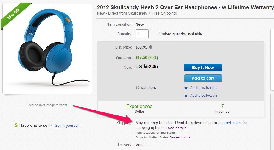
As you can see above that I was checking out a particular pair of headphone on ebay and was told that the item may not be shipped to India. That’s some smart use of geo-targeting. ebay clearly saves its customers a lot of potential heartache there.
How to do it: There are many GeoIP databases available which can be easily integrated in a web application. Maxmind has free and paid versions. There’s also GeoBytes, Neustar, IPligence, Tamo Soft, among others. Some of these databases are free but their accuracy may vary.
But if you are a VWO user, you don’t need to buy any database as you can automatically segment your visitors on the basis of location. In short, you rock!
5) Walmart – Highlight value of the day
Displaying a new offer or deal every day adds a fresh element to the homepage. It both arouses and feeds the curiosity of the users. Once you have got the users hooked, it becomes a habit for them to check out the day’s deal.
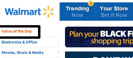
Here, Walmart has ‘Value of the day’ as the first option on its vertical left-hand side navigation bar.
How to do it: Simple coding dear. This won’t require any extra resources. But just don’t jump into it. Offering one new deal every day is a real commitment and you better walk the talk.
Download Free: Improve Conversions In 60 Days Guide
6) Nordstrom – Personalized services

Nordstrom has taken personalized service to a whole new level. Their stylists offer free fashion advice — ranging from helping a customer choose that perfect party dress to completely revamping their wardrobe.
A shopper can book an appointment – with duration ranging from 30 minutes to 2 hours — without any suggested pressure to buy the product later. Now this is a giant leap when it comes to customized service. I am not sure how viable is this strategy, but it definitely ensures a great customer experience.
How to do it: You would want to adopt this strategy only if you categorically offer premium fashion clothing. You will have to invest in a few stylists (depending upon the volume of your business) and a couple of customer care executives.
7) Home Depot – Give detailed shipping info
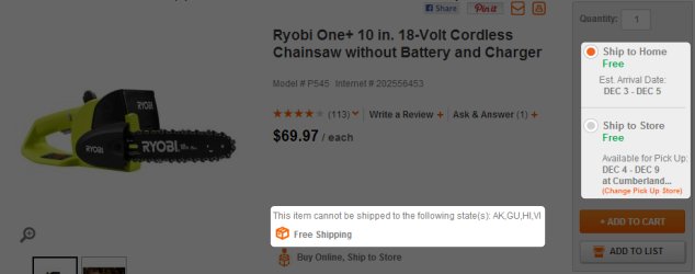
HomeDepot offers comprehensive shipping information. Even before a user puts a particular product in the cart, it tells him whether the order qualifies for free shipping, the estimated arrival date and information about where all the product can’t be shipped.
Telling upfront if the order qualifies for free shipping helps control abandonment rate as ‘being presented with unexpected costs’ is the primary reason for cart abandonment. Giving an estimated arrival date makes sure the customer is better prepared to collect the order.
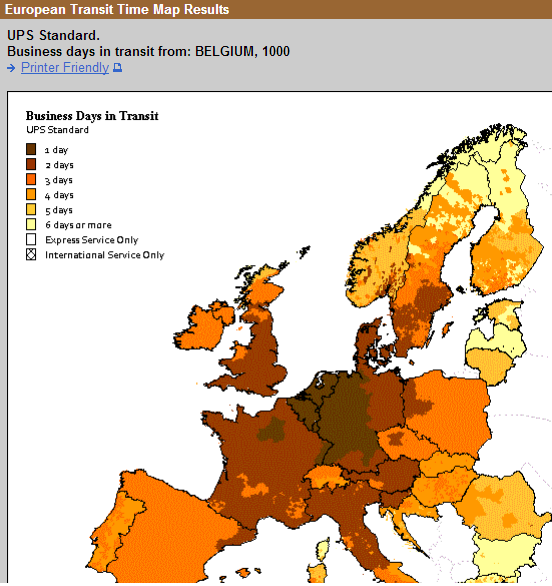
How to do it: Choose a logistics provider which gives you information about time taken to deliver at different zip codes. If you sign up with UPS to take care of your eCommerce logistics needs, then they’ll provide you an interface for this.
For example, following is UPS’ regular delivery schedule for Belgium.
8) Dell – Break analysis paralysis
‘The more the merrier’, goes a popular phrase. But bombarding your customers with more choices might just work against you. This popular jam study tells you how more choices paralyze the mind and how ‘less’ works better.

Dell does the good deed of breaking the choice paralysis of potential customers by displaying its best-selling PC Deals upfront.
How to do it: This is going to depend on the design of your website. But you don’t necessarily need to go the Dell way, A/B test the placement of your best-selling deals.
9) IKEA – Entice with images

I don’t know what this photo did to you but I just felt a little sorry for myself for not having grown up in a room like this. This is what beautiful images do to potential customers. They entice, spell-bound, fascinate or trigger an endorphin-rush (depending on how much gratification they get out of shopping).
Remember that your customers can’t touch, feel or smell the product. Displaying the product in all its glory is your best bet. One of our customers, Hyundai Netherlands, also found this out when it used VWO to run a multivariate test. Using larger products increased requests for test-drives by 62%.
How to do it: Darn simple. Put a freelance product photographer on the job. Test different images and make sure your website can carry the load of heavy photos.
10) Overstock – Ever present search and navigation bar
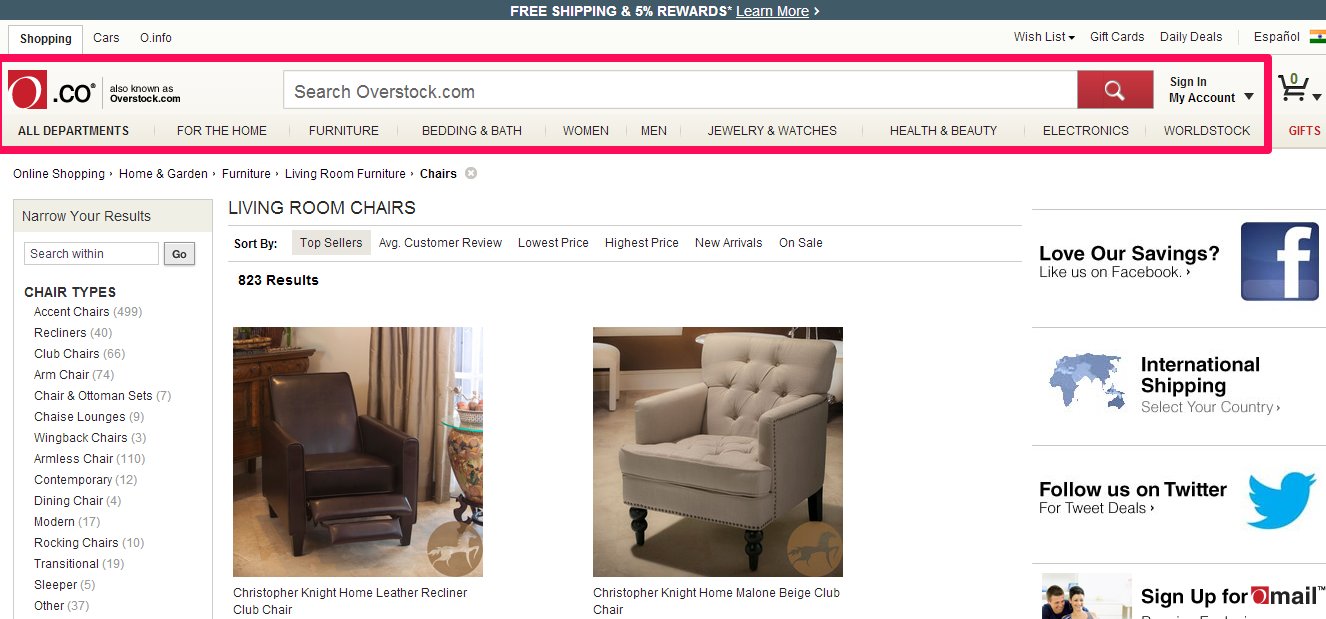
Overstock’s category page scrolled all the way up

The search and navigation bars remain fixed on the top even as we scroll down the page
Search and menu bars are the primary navigation elements on any eCommerce website. Don’t give the customer the trouble of even scrolling up to find that search box. Make the search and navigation bars a consistent feature of the page. When nothing makes sense, they will always know where to go to find their way around the website. Offset that high bounce rate. And here is how to do it: CSS fixed position.
Your top 10
Do you think a particular website deserves to be here?
Let us know your thoughts at marketing@vwo.com


