Typically, a thank you page loads after a conversion has happened on your website, making it a step beyond your conversion funnel. But, have you ever given a thought that even this very page can get you repeat conversions?

Download Free: A/B Testing Guide
For most marketers, a thank you page is nothing more than a means to express their gratitude to their users for making a purchase on their website or subscribe to their newsletters. But, a thank you page has the prowess to encourage visitors and prospects to take many other desired actions on your site than just accepting your acknowledgement. They can give your business countless conversion opportunities and even increase revenues manifold.
If there’s one page that can serve as a goldmine for your website – it’s not your product pages, landing pages or the check out page, rather… it’s the ‘thank you’ page.
In this blog, we’ll walk you through some smart thank you page examples to extend your conversion funnel beyond the thank You page and scale up your conversion rate.
What makes a Thank You page so important
After you’ve done business with someone, what do you usually do? Say thank you for the project? Offer a friendly handshake or a warm smile maybe? It’s a nice way to wrap up your interaction, leaving the door open for future collaborations.
Think of your website’s thank you Page as the digital version of that friendly gesture. And if you ever downplayed its importance or improvement, here’s why you might want to reconsider.
Expressing gratitude:
It’s an opportunity to express gratitude to your users for engaging with your website or taking a desired action. With this simple step, you can foster goodwill and a positive brand image.
Confirming actions:
It might not seem phenomenal but confirming user actions like making a purchase or filling a form provides a positive user experience. It makes users feel good because they don’t have to worry about whether their actions worked or not.
Conversion tracking:
When users land on the thank you page, it signifies a successful conversion, enabling you to assess the performance of your test run, where you’ve tracked visits to the page as a metric.
Reducing bounce rate:
Instead of leaving users on the same page they used for form submission, a thank you page can nudge them toward more action. It can reduce bounce rates by providing additional content or encouraging users to take further action on your website.
Guiding users to next action:
A well-designed thank you page can guide users on what to do next. For example, after making a purchase, it can suggest related products, provide links to valuable resources, or encourage users to explore more of your content, thereby increasing user engagement.
Don’t want to leave your thank you page to luck? If you’re aiming for max sales, check out this video on acing your thank you page optimization strategy.
7 smart ways to use your Thank You page – with examples
Ask for referrals
Getting new business onboard is often an ongoing challenge for most online businesses. But there’s one smart channel which, when utilized properly, can turn into a great source of revenue: referrals. As per a survey conducted by Ogilvy, nearly 74% of people identify word-of-mouth as one of the primary key influencers in their purchasing decision.
Hence, it’s no surprise that most businesses invest a lot in asking customers to refer them to their friends and family. For example, Hubspot uses its thank you page to get more referrals from its customers.
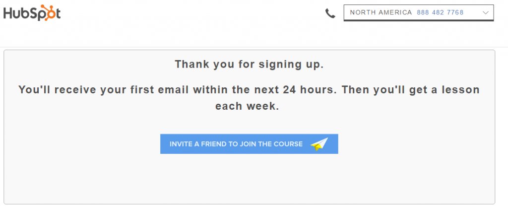
The company believes that when a customer is content with their services and is ready to sign up on their platform, they’ll be more than happy to refer them to their peers.
Increase social media engagement
In addition to referrals, another way to utilize your thank you page is to drive more social media engagement through the page. And, according to a survey, 39% of digital marketers around the world even believe that social sharing is a very effective tool to boost conversions.
Punchbowl’s thank you page is a good example to quote here.
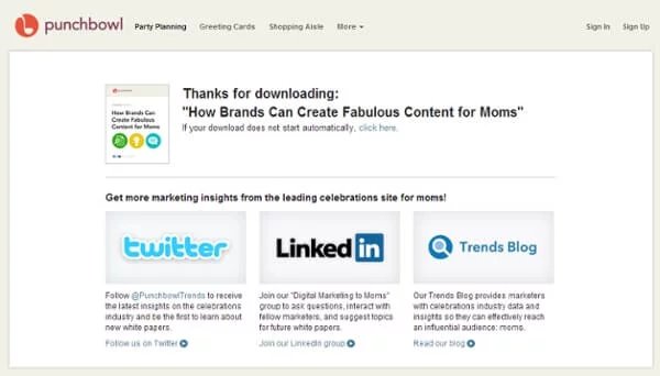
As you can see in the image given above, rather than just placing social media icons on the Thank You page (as done by most brands), Punchbowl takes the time to explain exactly what their target audience can expect by engaging with their brand on Twitter, LinkedIn, and Trends Blog.
Cross-sell your products or services
Although most marketers argue that a checkout page is a perfect page for cross-selling products and services, we believe that the thank you page is a better horse to bet on!
The reason being, when a customer lands on a thank you page after making a purchase or subscribing to a brand’s blog site, they’re in their prime stage. Meaning, this is the time when customers are more likely to convert again than if they come back on your site after a month.
So, use your thank you page to encourage your customers to buy more from you. Lure them by offering coupons or something valid only for the next 48 hours of their purchase, maybe?
Bliss, with its clean page design and crisp content, makes one of the best eCommerce thank you page examples:
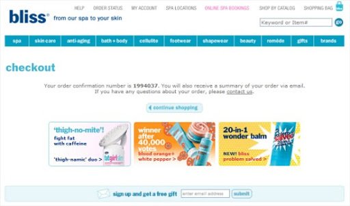
The page showcases the brand’s top-selling products, luring customers to check them out and even consider buying them then and there.
Offer relevant content material
The next amazing way to convert your thank you page into an efficient selling machine is by adding relevant and personalized content recommendation materials on the page. These could be anything – blogs, articles, white papers, product guides, eBooks, free resources, and so on.
Add testimonials
Some customers need more nurturing than others to make them refer your brand to peers or follow you on social media channels. In such cases, use the power of reviews. Make them read through some of your top client testimonials on your thank you page to ensure continuous engagement.
Collect feedback
Using a thank you as a purchase confirmation page is not just a common practice, it’s actually pretty important. However, have you considered harnessing this page’s potential as a valuable source for collecting feedback? It’s a great way to get a sneak peek into your customers’ minds and build a stronger connection with them.
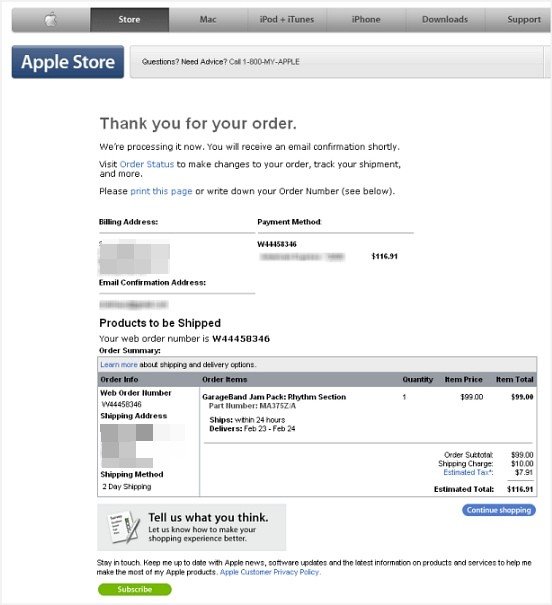
Notice the “Tell us what you think” box pop up at the end of Apple’s thank you page. Now a happy customer may not always click on the box and submit the feedback, but a frustrated customer most probably will. If not anything else, you’ll have some valuable feedback that you can work upon to improve your conversion rates in the future.
Talk money with fully nurtured/returning visitors
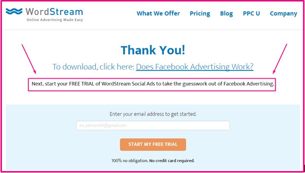
Another great way to utilize your thank you page to talk money with your fully nurtured or returning visitors. For these are the people who trust your brand and are ready to engage with it beyond just attending webinars or reading your site’s blogs. Ask them if they want a sales call or a product demo.
Here’s an example of how WordStream does it for its users who’ve signed up for its “Does Facebook Advertising Work?” free eBook here:
Download Free: A/B Testing Guide
Basic structure of a Thank You page
While there are a plethora of ways in which you can design a thank you page, following a set framework always helps. Below are some basic things an effective thank you page template must have.
- The thank you message,
- Details of the conversion (like ticket details of the theater seat, transaction amount, show timings, etc.)
- Communicate if any further action is required, such as stating any guidelines a user must follow. For instance, a thank you page must state if a user needs to carry an ID proof to collect tickets at the theatre counter, and so on.
- Brand contact details.
- What should the visitor expect next from your side, such as a phone call in one business day, an immediate verification email, SMS, and so on.
- What should the visitor do next? This should define the goal(s) of your thank you page
Do’s and don’ts of a Thank You page
The goal of a thank you page, in addition to expressing gratitude to a person for making a purchase or taking the desired action on your site, is also to push them to the next stage, i.e., increase their chances of converting again. And, there’s no better way to achieve the goal than to keep in mind the following do’s and don’ts along with some best thank you page examples.
Do’s of a Thank You page
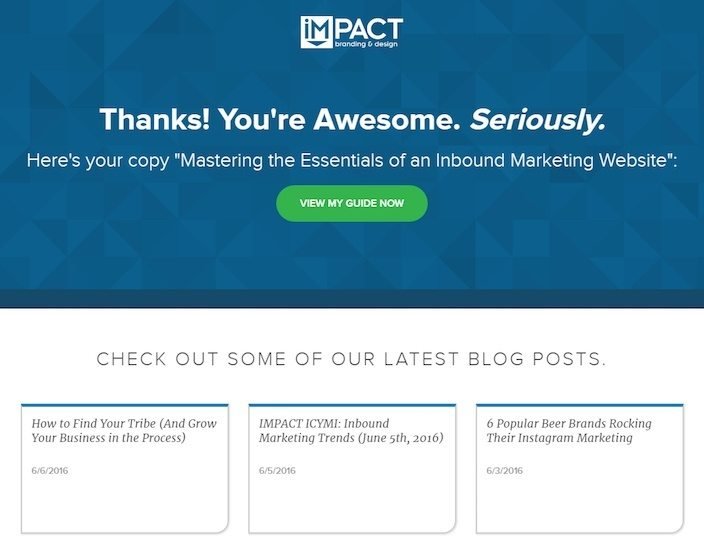
Show some enthusiasm
Don’t be boring! Throw in some power words such as “Congratulations,” “Success,” “Hurray! You’ve Successfully Done It!” which makes a user feel happy and wanted.
Add the human touch
Include a picture of the CEO, the team, video of any team member talking, or a human signature. This will add to the credibility of your website. And people are definitely more convinced to take action when they trust your brand. Don’t hesitate to add social proof if you think it motivate users to take more interest in further exploration of your brand.
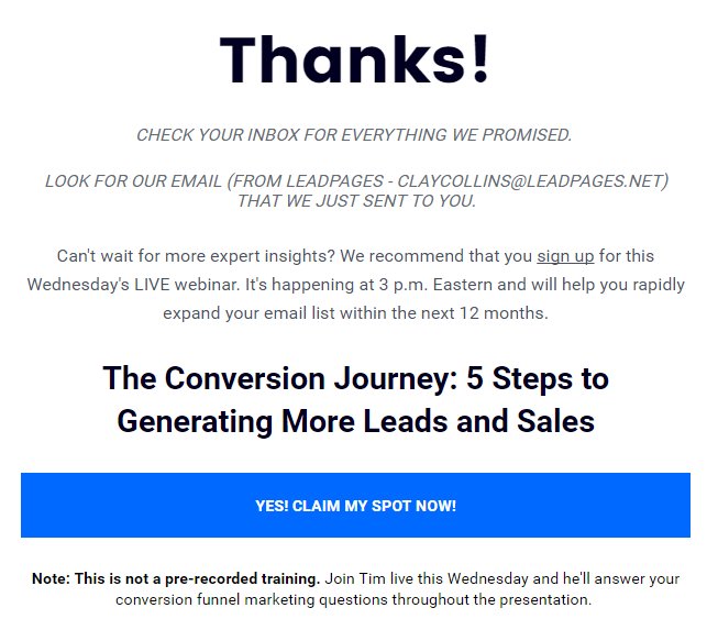
Keep your call to action or text “above the fold”
You only have a few seconds to grab the attention of your customers before they close the tab. So, always add your call to action or important text above the fold. This one of those thank page best practices you can’t compromise on.
Display your ongoing offers and let them share
Showing ongoing offers and social icons to your customers on your thank you page is one of the best ways to push repeat purchases as well as increase social media engagement. But be careful about what you’re displaying on the page. Also, ensure that your products and social icons are correctly hyperlinked to increase engagement and conversions.
Don’ts of a Thank You page
Don’t flood the page with too much content
Never add more than 4 to 5 lines on the thank you page. Unless really necessary, let the page give some breathing space for your site visitors. For it can be overwhelming for them to read long, winding content even on a thank you page. Moreover, minimal content is essential to ensure a strong call to action button can work its magic! So, be minimalist and engage better!
Don’t promise something you can’t deliver
If you’re not sure whether your executives will be able to get back to your customers within the next 24 hours, then don’t make such commitments! Instead, tell them you’ll get back to them shortly. It’s always better to convey what is true to your customers than making false claims and failing at a later stage.
Don’t fail with the page design
No matter if you put a lot of time into perfecting the content, if the page design is not attractive enough, it’s not going to grab anyone’s attention. So, work on your thank you page’ design. Make sure it’s nice-looking and has all the necessary elements to grab a customer’s attention.
Way forward
To conclude, if a particular page has the potential to add value to your conversion goals, then why not leverage it? So what if it’s not a part of the funnel, it can still impact the metrics of the whole site and get more conversions than you could imagine. Now, go ahead and implement these thank you page best practices to make that lasting positive impression on your customers.
Frequently asked questions
A thank you page confirms the user’s action and provides a positive experience, reducing uncertainty. It helps guide users to the next steps, whether it’s related products, more content, or further engagement. Finally, it’s crucial for tracking and measuring the success of marketing, helping businesses assess the effectiveness of their A/B tests run on this page or the preceding page.
A well-crafted thank you page comprises quite a number of key elements. Firstly, it should prominently show a thank you message. It goes a long way in building trust among your users. Secondly, it must provide precise details about the conversion.
So if a customer bought a pair of jeans, the page should show the picture of the item, number of pieces they ordered, the price they paid, expected delivery date, their address and even the brand contact details to facilitate further communication if needed.
More importantly, it should have a call-to-action, guiding the customer on their next steps or encouraging further engagement on other pages of the website.
Thank you pages for making a purchase, registering for a webinar, entering a contest, and subscribing to emails are the most popular examples. If you are looking for more such thank you page examples, read the relevant section in this blog.
We’ve already told you what an ideal thank you page template should contain. Now we tell you what this page should not be like:
Overselling: If you overload the thank you page with too many upsell offers (no matter how relevant), you’re not creating a good impression on users who simply walk away feeling overwhelmed.
Being generic: A thank you page without personalization may fail to connect with a user and make them feel like just another number.
Ambiguity: Not providing clear instructions on what to do next or where to contact in case needed can lead to user confusion. This adversely impacts user experience.
Missing social sharing: Missing an opportunity to encourage users to share their positive experiences with others on social media can reduce potential referrals.
You can leverage behavioral analytics tools like heatmaps and session recordings to understand how users behave on the thank you page. Are they clicking on the links on the page? Are they scrolling down to find something more? Are they clicking something that’s not clickable? Heatmaps will clearly show which elements they are engaging with the most.
Recordings will show you all the clicks, scrolls, and pauses. If you want, you can also set an on-page survey and directly ask your users what they expect to see on the thank you page and make changes accordingly. All of these measures will improve the effectiveness of the page.
Usually, thank you pages should not be indexed by search engines as they serve to confirm conversions, like confirming a purchase or form submission. More importantly, SEO for thank you pages can potentially expose sensitive customer information.
But if you have a thank you page with valuable content or offers and doesn’t duplicate content found on other parts of your website, then you may index it. Overall, consider the user experience and the impact on search results when deciding whether or not to index a thank you page.


![7 Best Website Monitoring Tools [2026]: Expert Insights to Help You Pick the Right One](https://static.wingify.com/gcp/uploads/sites/3/2025/02/Feature-image-7-Best-Website-Monitoring-Tools-How-to-Pick-the-Right-One.jpg?tr=h-600)
