Colors are one of the most powerful visual cues to draw someone’s immediate attention and evoke them to take the desired action. Scientists have long known that colors, when used most appropriately, have the ability to instantly change a person’s mood, behavior, thinking, and perception of a brand.
In fact, did you know that nearly 92% of individuals say that visual dimensions serve as the first influencing factor which affects their purchase decisions? Or that color plays an important role in shaping a brand’s perception and can increase conversions by up to 80%?
Download Free: A/B Testing Guide
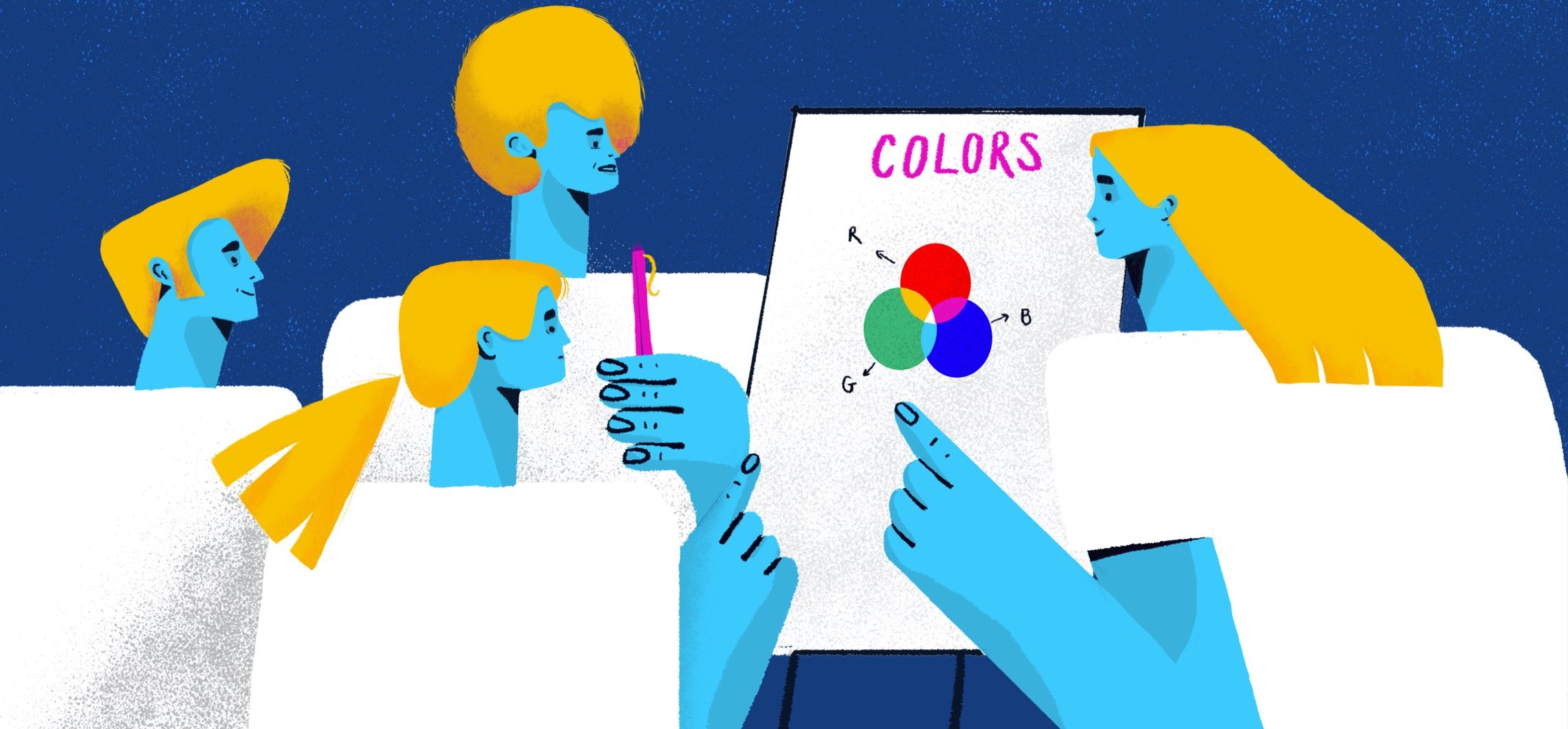
But, how can you use the psychology of colors to improve your brand and marketing? How can you use color as a tool to market your products or services more effectively? Let’s find out!
Colors convey your brand’s personality
Notice carefully, financial institutions like Chase, Citibank, Barclay’s, Bank of America, Prudential, and Merrill Lynch use blue as their primary color. Obviously, it’s not a mere coincidence. Rather, it’s a strategic decision. Blue conveys a plethora of good emotions. It symbolizes trust, loyalty, wisdom, confidence, depth, and stability. Practically everything that we humans expect from a financial institution.

Coca-Cola, on the other hand, uses red as its signature color. Red is known to increase one’s heartbeat and instill excitement. It can also signal anger, which is why Coca-Cola always portrays happy people to offset this possibility.

Colors are not just about capturing a person’s attention. They’re a crucial element that represents your brand’s image and a tool to communicate with your target audience. If you don’t put thought into colors that will represent your brand’s personality, you run the risk of people making assumptions about your business and its offerings which aren’t true. So, the smarter the color choices you make, the better your brand’s image will be, and the higher your chances will be of creating more customers.
Contrasting colors create impact
An average consumer, according to Nielsen Norman, spends 10 to 20 seconds on a web page looking for what they need before bouncing off. And amazingly, color has a huge impact on their experience. Is this surprising? Well, most of the things we see around us are a perfect example of contrasting colors. Let’s again take Coca-Cola as an example.
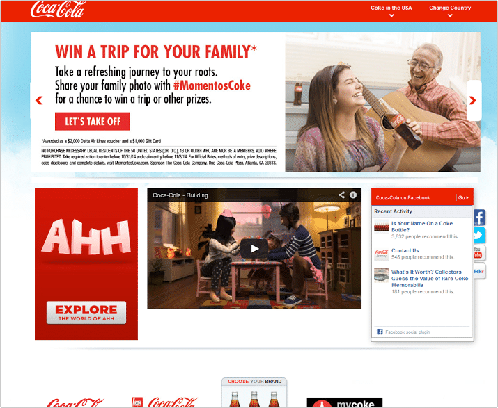
Coca-Cola’s red and white scheme has been a permanent success for the beverage company. Besides using the contrasting color theory combination in its logo, Coca-Cola also uses the same hues in its website copy and CTAs as well. While white is a neutral color, Coca-Cola uses contrasting colors (red and some black) to focus the reader’s attention on the right elements and create impact. .
The principle of ‘conversion-centered design principles’ aptly applies here – design your page elements in a manner that immediately capture the attention of your visitors.

Taking another example here, Apple keeps its website clean, uncluttered, and simple. This creates a sense of sophistication and allows Apple to focus attention on the high converting elements. The choice of primarily black and white with pops of color is purposed to create an impression that Apple’s products are technological marvels, yet easy to understand and operate.
Creating color associations to help orientation
Most people abandon websites that are difficult to navigate. If your site is loaded with a lot of information, use different colors to organize information into logical categories to help the user feel oriented and aide navigation. For instance, VWO offers a plethora of products to our customers across the globe. To enable visitors to process all the information given on the site easily, we allotted different colors to each product category. Take a look:
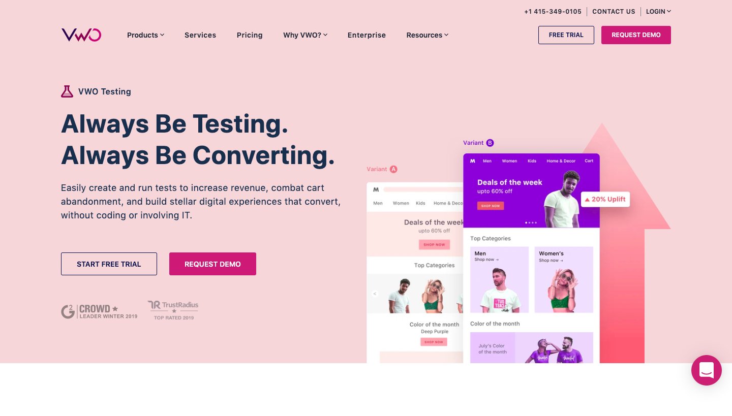
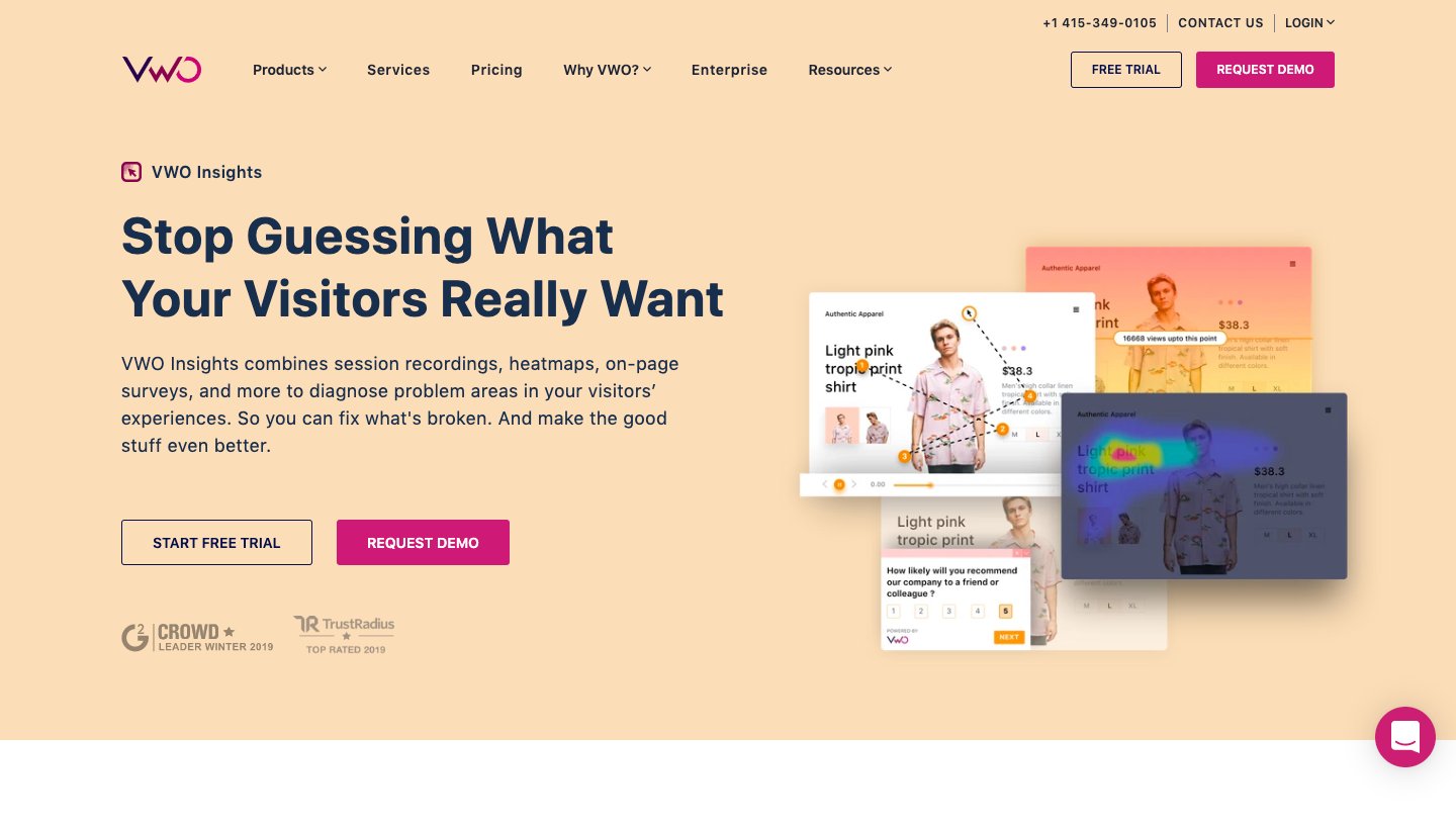
Similar to a binder file with colored tabs, using different colors to differentiate between various sections can make your site look more organized and feel user-friendly, keeping visitors interested and engaged. The Von Restroff effect helps to explain this – items that stand out (owing to their color scheme) are more likely to be remembered than others.
Download Free: A/B Testing Guide
Convincing colors can convert audiences into customers
The next key to colors and conversions is to understand what your target audience expects from your brand. If you’re marketing products mostly to enterprise-level companies, then colors will most likely need to be more conservative than flashy. On the other hand, if you’re marketing your products to startups or youth aged between 18 and 30 years, it may be more effective to use brighter colors to grab their attention and convey a sense of playfulness. Using the color palette to appeal to each target audience segment is important to give relevance, but always keep it aligned to your core brand color scheme.
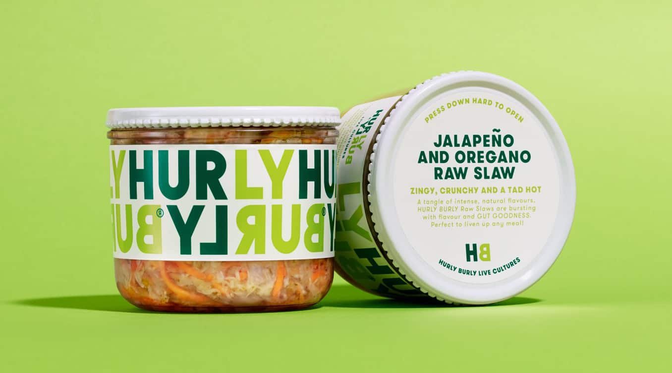
Hurly Burly Live Cultures, for example, is a leading food brand based out of Ipswich, England, that uses bright and playful yet complementary colors to convey a sense of health, wellness and calm. Its color palette centers around green, drawing inspiration from its actual food colors to communicate vitality and goodness.
Asana, a workflow management tool, on the other hand, uses a mix of conservative and colorful gradients to represent its brand motto – clarity with energy. While clarity means being on top of things, energy portrays a feeling of making progress.

As a brand, it’s important to understand that the best way to cultivate a strong emotional connection with your customers is to understand what colors will create the perception you want them to have of your business. Use these colors to your advantage and strike straight to your target audience’s hearts.

Customizing colors to match cultures
As per Professor Ian F. Wilkinson, a Professor at the University of Sydney, the meaning of a specific color changes depending on a specific culture.
For instance, a wedding planning company expanded from the Asian market into the Middle East. They used their native red color scheme in their logo and across the website for the Middle East market because they felt the color red associated with passion and excitement.
Six months later their branches in the Middle East were on the verge of closure, as not many people were engaging with their brand. So, what had gone wrong? What made them fall?
After digging deep, the company found they hadn’t properly contemplated the Middle Eastern cultural context. In Asian countries, the color red is associated with love, passion, joy, and sensitivity. However, Middle Eastern nations equate the color red with danger and caution. This was the key factor in the failure of their expansion.
So understanding the essence of color and its underlying meaning to a specific culture is crucial. Colors can make or break a business. Here, the company should have opted for golden and white to flourish in the Middle East Market which are understood to represent elegance, wealth and purity.
Check out our latest conversation with consumer psychology expert Ben Ambridge on using psychological intelligence to optimize customer behavior.
A/B testing color combinations for best conversion results
So how do you know which colors to use in your marketing? Regularly running A/B tests to ascertain whether or not your chosen color schemes will have a positive impact on your conversions is a highly effective solution.
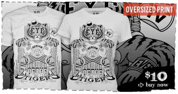
RIPT Apparel, a Chicago-based online retail store, managed to increase their conversion rate by a whopping 6.3% simply by running an A/B test on the color of their CTA button.
They replaced their conventional undefined black CTA button with a defined, prominently visible green CTA button.
Here’s what the control looked like:
Here’s what the change (variation) looked like:

The company understood that it’s not only important to give your CTA buttons a defined structure, prominence and salience, but also to use colors that grab the attention of the website visitors right away.
Making color work for you
Color studies show how effective color choices really are when it comes to influencing the decisions of your target audience. The correct use of colors in the right context goes a long way to capturing and converting site visitors. Take the time to understand color psychology and how color affects your specific audience’s mindset, and test your way to success. This will help you make intelligent branding decisions and, in the end, get more conversions.
