
Q&A with Baymard’s Christian Holst about Checkout Optimization
This is a follow-up post on the VWO webinar, which was conducted on October 29th, 2014.
Since there were many questions that Christian couldn’t address during the webinar from our live audience, he took out time to answer each one of them later and we’re extremely thankful to him for the effort. You can scroll down to see the Q&A.
Download Free: Cart Abandonment Guide
For those of you who couldn’t attend it, here are the quick details of the webinar:
Topic: 8 Checkout Optimization Lessons Based on 5+ Years of Testing

Presented by: Christian Holst, Baymard Institute
Christian Holst is the Co-founder and Research Director at the Baymard Institute. He’s the author of the E-Commerce Checkout Usability and Mobile E-Commerce Usability research reports. He’s a contributor at Smashing Magazine and is also a regular speaker at conferences, like Mobile Commerce World, Smarter Web Strategies, and many others.
Hosted by: Siddharth Deswal, VWO
Q&A from the Webinar
1. What is your opinion about proprietary checkout processes vs companies checkout processes like paypal, worldpay, etc.? Do these experienced payment services boost user confidence vs. in-house developments to accept credit cards?
Christian Holst: There are great regional differences in how users perceive 3rd payment gateways (like paypal or worldpay).
In some countries, such as Denmark, there’s historic and legal reasons causing 95+% of all local e-commerce stores to have their credit card payment page hosted by a 3rd party gateway. So here users have been trained for years that 3rd party is the most secure option – so be aware of any such dispositions on your key markets (typically local payment card enforce such rules).
The practice is changing (embedded fields, but still 3rd party payment processing) and onsite credit card payments is widely used at most major e-commerce sites, especially in the US.
That said, we in particular observe a sub-group of users that prefer 3rd party payment when paying on smaller sites and when purchasing “suspicious products”, in particular while placing international orders (e.g. a US customer buying at a Chinese site). If those cases are not dominant for your site, I’d always recommend an on-site credit card field implementation as it allow for a much more integrated and seamless checkout experience (e.g on handling errors)
2. Where is the best location to place the coupon field?
Christian Holst: During testing, we usually find that users with a coupon will look to apply it before initiating the checkout (i.e. in the cart) or at the payment step (some people see them as a way to bring down the order total, just as a gift certificate). If coupons are frequently used at your site, we recommend placing the coupon link (and never a coupon field, see lesson #2 in the webinar) at both these steps.
3. A lot of commerce sites are introducing credit card camera capture of the number so users don’t have to type in their card number – is there data on the effectiveness of implementing this feature? Do you have any separate data for mobile and desktop?
Christian Holst: We don’t have any data on this. But there are some points you should consider.
It’s important that you always have a text fallback. Some users will always be concern if the image is stored (like”snapchat promised temporary photos, but it turned out it wasn’t entirely true/secure. Will this be any different?”).
Cameras are a very integrated part of mobile, not necessarily on desktop. Many users will figure it out, but some will experience errors and might still require detailed guidance. That said it’s an interesting concept, which may prove effective, just bear in mind it’s still an unconventional concept for the vast majority of “normal” web users Track any implementations very carefully. Sites that target a web/mobile savvy audience may have earlier successful adoption than mass-market sites (Note that many of these points also apply for some of the “one-line credit card fields”).
4. What is you opinion on 1-step checkouts?
Christian Holst: They can be great, but isn’t a guaranteed path to success. It’s more important what you ask users to do and how you ask them (see lesson #1 in the webinar). Also see a detailed answer here and here for accordion checkouts.
5. Do you have any stats or tips on using social login, such as Facebook login, to get users through the checkout faster? Does this Facebook login also create a sense of security?
Christian Holst: I’ll answer for all 3rd party accounts in general. Less typing is always good, but over the course of the next 1-2 years (if not already) the issue of having a clear primary path/button from the shopping cart to the checkout will increase as sites want to support the myriad of 3rd party accounts. Paypal, Google Payment, VISA Checkout, Facebook, Amazon payments, Alipay, Apple Pay, and the list goes on.
We often see sites with 3-6 primary colorful buttons all screaming for users’ attention, competing with the site’s own “Checkout” button. Having a clear and logical flow to the checkout can then be very difficult, especially because some 3rd party services are only for user credentials and address information, others are only for payment information, and some are for all of it. Example, we recently helped a billion dollar e-commerce site that had great issues with the new VISA Checkout (which is account+payment). Users who had VISA credit card though the sites asked them to choose that option. In order to select between the options, users will often have to understand what each means, which is a problem for those new or unfamiliar with any of these. Sites that cater to an Internet savvy audience will see more demand, and less issues.
Lastly, if it’s a new service, note that you’ll loose some users who are intrigued by that “VISA checkout”/”Paypal”/… as they are often forced to sign up for an account at the new 3rd party solution + who “owns” the customer and the customer data can have crucial business implications in the long run (it differs from service to service, so read all of the small print).
6. Does mobile and desktop see different results in regard to the number of checkout steps?
Christian Holst: It’s even more nuanced. The upper limit of steps kick in earlier on mobile. On desktop, we found it to be 7+ checkout steps. On mobile, it’s a bit less but I don’t have an exact number yet as we’re still in the process of compiling a mobile benchmark study.
However, a short mobile checkout can also be problematic. As just a handful of form fields will take up multiple mobile viewports/screens, a 1-2 page mobile checkout will often make each step appear very intimidating (each step maybe 4-8 screens of text and form fields). Also, on mobile, you will often need a separate review step where it’s possible to get a decent overview.
Download Free: Cart Abandonment Guide
7. How do you rate Shopify’s checkout process?
Christian Holst: To remain unbiased, we try to avoid publicizing and test findings from specific vendors or platforms. With that said, I know a few of the people at Shopify and they seem very smart, so I’d be surprised if it was terrible – but I’m not going to comment if their checkout is better than the checkout found on other e-commerce platforms.
More importantly, very small design and form changes can have a tremendous impact on checkout performance (see lesson #2-#8 in the webinar), it’s therefore difficult to evaluate the exact performance of a platform as it depends on the individual site owners customizations of the checkout experience.
When choosing a platform closely inspect how much you can actually change yourself. Even if a vendor have a good checkout flow now, you will be locked to their future decisions of the checkout flow, design and code. If that is a problem, it very much depends on whether you believe you are smarter that the platform designers/developers and how many resources you actually have to make any changes yourself.
The thing with mentioning the shipping price early is potentially missing out on abandonment email sequences if they don’t want to pay in the first place. With abandonment emails we can at least offer them a coupon or free shipping to get them back.
While abandonment emails can be a great supplement tool, it shouldn’t cause you to design a checkout which increase abandonment in the first place (by hiding the total order cost). If you can afford free shipping, offer it the first time around.
8. Do the checkout pages need to be as clean as possible?
Christian Holst: To some extent, yes. We found that surrounding graphics and site-wide navigation cause issues. Although don’t remove everything – we’ve seen checkouts that spooked users who lost confidence in the site as they thought it looked “unfinished,” some even thought the site is “hacked”. It’s important that some of the sites overall look and feel is kept in the checkout, so it doesn’t become too “detached” from the rest of the purchase s´cycle. For more information on users perception of a “detached” checkout experience, read here.
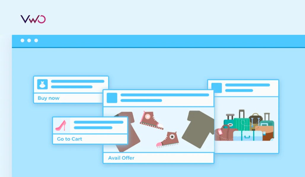
9. What is the best ‘Add to Cart’ action – take customer to cart or display pop up confirmation?
Christian Holst: This is a generally overlooked topic, which is much more complex than it might appear. There’s also a 3rd very popular option and that’s showing a temporary drop-down cart. In our most recent tests, we’ve found that the best solution differs with the site’s specific context, we’re still finalizing those findings (for all of the approaches, the devil is in the detail and it can take multiple attempts to get it right – and was frequently observed to be the direct cause for site abandonment as some users were unable to initiate their checkout process).
10. What is considered a “good” cart conversion rate? Is there a standard benchmark that can be used? Just trying to see if this is the number one place to focus on improvement in overall business returns.
Christian Holst: Note that the cart abandonment/conversion rate also depends on other things than the checkout experience. Some sites can therefore have a very poor checkout experience, but still something that appears to be a decent cart conversion rate, with revealing any untapped potential.
Look at what users will have to do while going through your checkout process, and try to compare it to sites with a great checkout process. See the public part of our checkout usability benchmark database here. This will give you a decent way to gauge if there’s untapped potential before initiating a checkout redesign. Looking into your drop-off rates per checkout step (and even per form field) is also a cheap and effective way to see on which step you might have issues.
11. What could be the reason 6 steps checkout has better score than 4 and 5 steps checkout in your webinar?
Christian Holst: Answered in part during the webinar, although not as clearly as I’d like. First off, what the user is asked for during those steps greatly impacts the performance. Secondly, the graph shows that there’s actually almost no difference. This was not clear at the webinar as I forgot to explain that the difference between the individual sites’ checkout performance can be several hundred points, as you can see if you open the individual sites.
12. What do you think of quick checkouts that ask for only email or phone with stores that offer Cash on Delivery option? Sometimes right after the ‘add to cart,’ the user is provided with a quick checkout option under the ‘add to cart’ button?
Christian Holst: Excluding payment from the checkout process can generally be a good idea. Several countries (in particular in Scandinavia) offer both Cash on Delivery but also simply “invoice/bank transfer 5-14 days after delivery” – this provides an insanely fast checkout. The increase in conversion must offset the amount of payments which the site is not able to collect in the long run.
As far as I recall, the payment company, Klarna, have even specialized in taking on the sites/merchants risk by offering bank transfer after delivery to the customer (in exchange for a percentage cut). This can work well for impulse purchases and product types with only a single product ordered. But “Cash on Delivery” will still require address fields. Would love to test it more throughly in future studies.
13. Is placing a Sign In or Register function in between one of the checkout steps a good practice if it offers the user discounts or points?
Christian Holst: To be clear, you should still offer a guest checkout. Not all users will care about “collecting points”. But describing the benefits of the discount program near the optional password field is a great way to increase voluntary account creations.
14. Where should the shipping price be mentioned, as early as possible in the checkout process?
Christian Holst: Total cost estimate should be in the cart. During testing, most users would expect to know what would be their checkout cost. On sites which didn’t include estimated shipping cost in the cart, they would need to fill 10-20 form fields before being able to see the shipping cost. This is indeed the case at some sites. If you don’t have free or flat rate then give a lowest cost estimation in the cart. “Estimated ground shipping: $6”. You can also geo-target the state based on the users IP and say, “Ground shipping to CA: $7”. Especially sites which allow international order can benefit from including a shipping calculator at the cart step as users who frequently place international orders know that the shipping cost can often be more important than the product cost, and vary greatly from site to site.
15. Did you find any correlation between higher cart abandonment rates and higher cart amounts?
Christian Holst: No, nothing conclusive in general. But there might be site specific conditions. However, one conclusive test observation was that users placing an expensive order were much more through, often go to great lengths in ensuring every thing was correct, and often actually read descriptions and help text if in doubt. For sites with high order values, offering precise and detailed help can be extra important. Even basic fields, selections and information may warrant a tooltip explaining the details further. Also, consider an extra detailed order confirmation step. Note that these users will be extra vulnerable/sensitive to poor error message.
Feedback for the Webinar
I hope this webinar and the Q&A gave you great insights to improve your eCommerce checkout funnel. If you have any suggestions about VWO webinars or want us to cover certain topics in our upcoming webinars, feel free to write to me at marketing [at] vwo [dot] com
In case you missed the webinar, you can access the recording and slides anytime you want. Just click on the link below!