Most of us love weighing our options before making a choice. Keeping this in mind, we reveal to you, Call to Action (CTA) buttons for browser push notifications! This feature works on the Chrome Browser (48 and above) for mobile and desktop. Firefox doesn’t support it yet.
You can expand your playground of desired user actions beyond just clicking on the notification. Your subscribers too, now have the option to click on what action they’d like to take in one push notification itself. This allows the sender to guide the subscriber to three different landing pages with just one notification – one by clicking on the notification itself; the other two by clicking on respective CTA buttons.
Download Free: Push Notifications Guide
You also have these options:
– Use one CTA button instead of two
– Use the same or unique URLs in the notification and CTA
You have the option to use whichever combination of actions you deem fit. However, please note that there’s a character limit of 12 in each of the CTA button text.
You can take different actions when clicking on any of the above three, like downloading a report or browsing through your different products on your website. There are different ways you can make the best of this feature. In this post, we’ll be talking about the benefits of using CTAs in your push notifications. And to help you understand how to use this better, we’ll also give you some use cases that you can implement using these buttons.
How CTA buttons drive user engagement
1. Increases click rate
Push Notifications, as it is, increase your click rate multi-folds. Combine that with Call To Action buttons and you’ll see a unicorn of a click rate. When you make the CTA buttons attractive to your subscribers, be it with lucrative offers or even the language used, you’ll see subscribers clicking your notification a whole lot more! Let’s take a look at two examples from two industries with two different actionable.
BFSI: In the image below, when the customer clicks on the notification body or the first CTA, Try Now, they’ll be directed to the same landing page. This landing page can be about trying out the new feature right away. But if the customer clicks on the second CTA, Tell me More, they’d be taken to another page with more information about this new support feature. This way, customers are likely to be intrigued and click on the actionable.
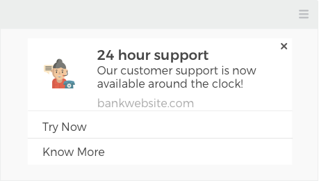
This way, banking, and financial institutions can prevent their customers from leaving and instead, address their pain points. This also demonstrates to your customers that you want to improve their experience with your platform, leading to them becoming loyalists.
Blogger/Publisher: If you’re a blogger or a publisher, you could use the CTA buttons feature to run a contest. One CTA button can say Win Goodies while the other can be More Contests. You’ll see your click rate increasing astoundingly.
2. Boosts your revenue
Your CTA buttons guide your user to take an action. Without it, the user may fumble in trying to figure out what to do next, or where to click. Hence, with a CTA button in place, you can actually give a boost to your revenue through push notifications.
Let’s take the examples below to understand how a CTA button(s) in your push notifications can boost your revenue.
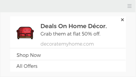
E-commerce: Here, the notification itself and Shop Now button can both lead the customers to the same page, where they can with the offer. Hence, having a CTA and the notification that lead customers to the same page will place emphasis on the “Home Décor Offer” page. The CTA with the All Offers button can take your customers to a page with all your offers.
BFSI: If you have a BFSI platform, you can send a push notification to your customers about any of your products like travel insurance. The notification and the first CTA can lead to the signup page when clicked on. The other CTA can be Tell Me More, leading them to an information page about the insurance and then eventually leading them to sign up.
Download Free: Push Notifications Guide
3. Increases time spent on your website
Adding CTA buttons to your push alerts also ensures that your subscribers spend more time on your website. Additionally, when there are three URLs to land on, your users will feel in control of their choices from the options you’ve given them. In turn, they’ll spend more time on your website.
Blogger/Publisher: You want to tell your users about a new post published on your website. While the users can directly read the post when they click on the notification, you can give one CTA that leads them to the Dating Tips page. The other CTA can lead them to a page with all your categories listed and encourage your users to check out posts from other categories on your website. You’ll see that with these kinds of CTA buttons, the average time spent on your website will increase.
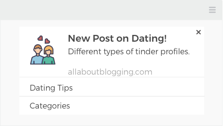
E-commerce: A push notification with CTA buttons is a great way to have your customers spend more time on your website, browsing through your offers and products. Send them a notification about a deal expiring soon, that’ll lead them to that specific deal page upon clicking. One CTA can say, All Deals, while the other CTA can say, Categories. With the range of products you have, they are sure to find those that interest them and make a purchase.
4. Adds value
With the marketplace flooded with breakneck competition, customers are looking for things that will add value to their lives. And the best way to stay above your competition is through personalization. Push notifications allow you to do that. CTA buttons take that to a new level. They give options to your customers, further adding value and giving them the power to choose the action they want to take.
Let’s understand this better with the examples below.
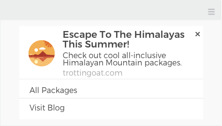
Travel sites: Make your customer happy with a notification about Himalayan destinations they can escape to, from the summer heat. While the notification can take your customers to a specific page with Himalayan packages, one CTA can directly lead them to a page where they can view all packages that you have on offer. The second CTA can take them to your website blog, where they can read posts about different places and then decide which package they’d like to book. Customers will be happy to be able to take a call according to their needs and will come back to your platform for all their travel-related desires.
BFSI: If it’s time to file tax returns, send them a notification with CTAs that lead them to an information page about rules and regulations. The other CTA can lead them to a page where they can check out different schemes and funds for investment that are exempt from taxes. This way, you’ll be resolving your customers’ worries and pain points. They’re bound to come back to you now and then.
5. Great way of promoting a new product, service, or feature
A brilliant way to announce the addition of a new product, service, or feature is through push notifications. They grab attention immediately. Add CTAs to that, and you’ll see traffic pouring in with curious users wanting to know what this is all about.
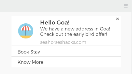
Hotels: If your hotel has a website, then look at the image below. Here, you are telling your customers about the new location added to your hotel chain and the early bird offers they can avail of when they click on the notification. With the first CTA button below, you’re giving them the option to book a room at the new address. The other CTA button can lead them to a page where there’s more information about the new location. It could be about places to visit in the locality, things to do, or facilities available.
BFSI: If your notification is about telling your users about receiving reward points by signing up for the new platinum credit card, your CTAs can say Apply for Credit Card Now and View more Offers. Such CTAs are also likely to receive a higher click rate and even have your users perform the desired actions.


