8 Actionable Steps That Will Help You Increase Your Travel Website Bookings
Do visitors land on your travel website, search for flights and accommodation, and then just leave without completing the booking—almost on a whim?
If your answer is yes for some or many of your visitors, it’s time to optimize your website for customer centricity, web crawlers, and increased conversion rate, as SEO and CRO go hand-in-hand.
Travel eCommerce is one of the trickiest online businesses. Lengthy marketing funnels, complex search parameters, complicated checkout processes, multiple forms, and massive personalization, are all part of the game.
Download Free: Grow Website Traffic Guide
Djoser is a major Dutch travel agency that optimized its website conversions by running A/B tests for 7 weeks and achieved a 33% hike in their online travel bookings.
Similarly, you can always optimize your website by analyzing visitor behavior and running iterative A/B tests to understand your visitors well, thereby converting them into customers.
Below are some best actionable tips you can implement to increase online bookings.
1) Make your ‘site search’ smart and simple
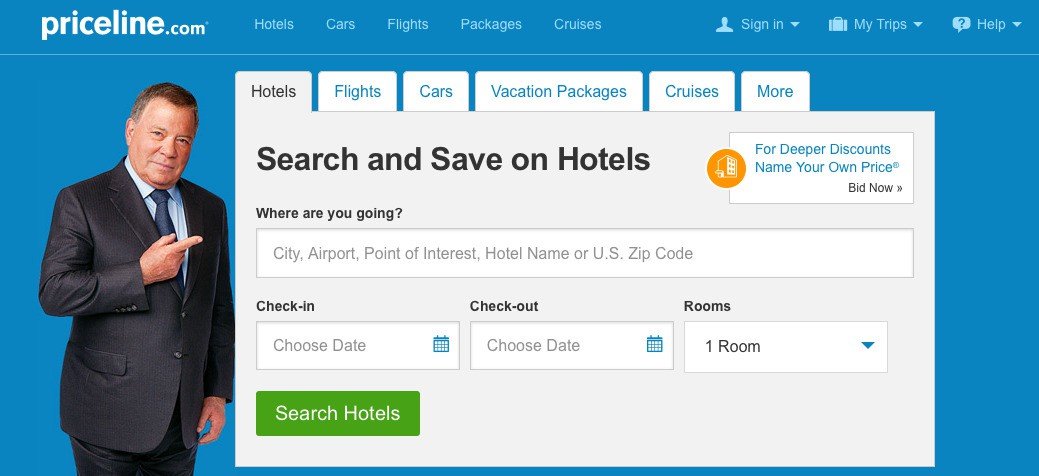
The search function is a critical element for travel websites as compared to other industries. Visitors in this domain typically operate in the ‘browsing and finding’ mode.
Your visitors reach your site’s homepage through different channels such as search engine results pages, social media, and online ads. Only when a visitor selects a location and a date, will s/he find relevant results to make a choice.
A/B test your site for predictive search and auto-completion using VWO’s server-side testing capabilities. With zero performance impact and deep segmentation flexibility, you can build consistent, higher-performing experiences.
Help visitors choose
Most of the time, the results page of a search engine is full of hotels or flights and in some cases destinations, if s/he is planning a vacation, which most visitors haven’t used or explored before. Naturally, it is difficult for them to choose one from the lot. This is where you should help your prospects select the best deal.
Let us understand this with an example:
Destination
In a world where everything is accessible at the click of a button, travel websites also need to understand that their visitors also want instant results to their queries. MakeMyTrip.com is a travel industry giant in India that offers vacation packages besides its popular flight and hotel booking business.
When meandering, confused visitors get a well-curated list of such packages in their budget with beautiful and catchy visuals, day plans, and itineraries. With this in place, MakeMyTrip (MMT) instantly relieves them of their pain points. Such services can not only save a lot of time and energy for your visitors but also encourage them to trust you and form a long-lasting bond with your brand.
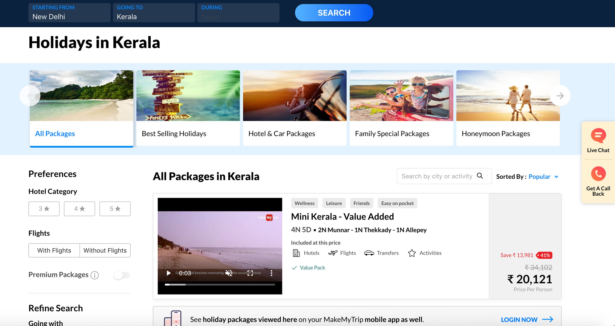
Image source: MakeMyTrip
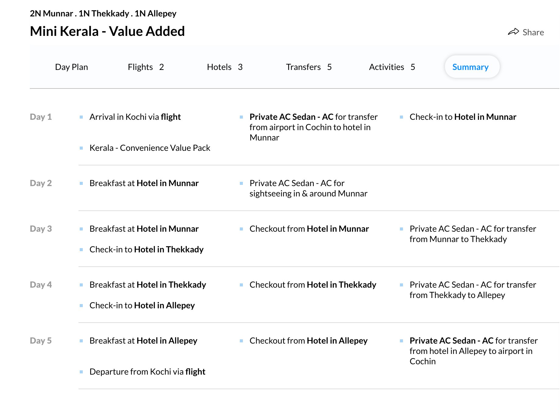
Image source: MakeMyTrip.com
Pricing
Firstly, display your prices prominently. Price is one of the key criteria on which most visitors make their choice. When the price for different service providers is placed without a clear distinction on the results page, the usability of the website suffers.
You can reduce the friction by proposing the one you intend to sell. Therefore, always A/B test your pricing page for multiple pricing options and decoy visitors towards your bestseller for enhancing your revenue.

TravelPass Group which serves its B2C customers by helping them book hotel rooms and its B2B customers with hotel bookings, travel agencies etc., doubled their conversions within the span of a year.
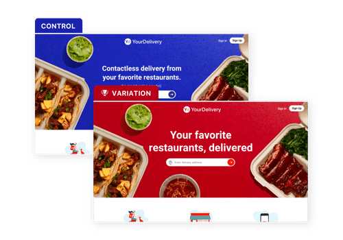
They were able to achieve their conversion goals only by becoming customer-centric. By focusing their efforts on specific elements in the mind of the users, they isolated the types of tests they would run which eventually helped them identify the problem areas, such as placement of a phone call CTA and design in general. Through iterative testing for desktop and mobile interfaces over a year they improved their conversions by working aggressively on their design which looked as shown below in the control and variation, respectively:
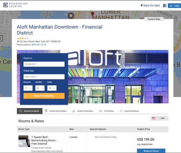
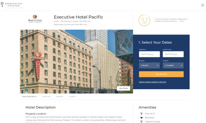
Image source: marketingsherpa
Discount
Also, when you’re offering a discount on a service, mentioning it only in terms of percentage might prove useless to some visitors. It’s always a better option to display the new or discounted price of the service below or after the original price, and the savings which they would make if they choose it.
A/B test to find the best discount format/style you can offer.
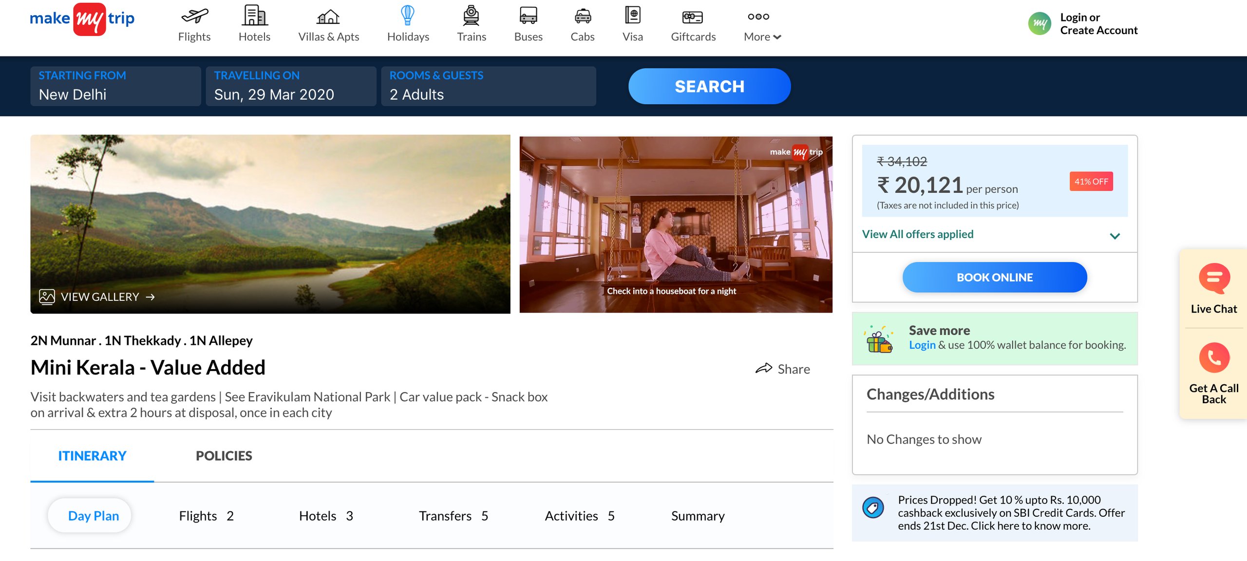
Reviews and ratings
Showing reviews and ratings on your website can be the cherry on top of the cake. Adding them can significantly work towards improving the chances of more conversions on your site.
Why? Because in today’s day and age most individuals trust peer recommendations more than they trust advertising. This is one reason why travel websites like MMT heavily advocate the use of reviews and ratings.
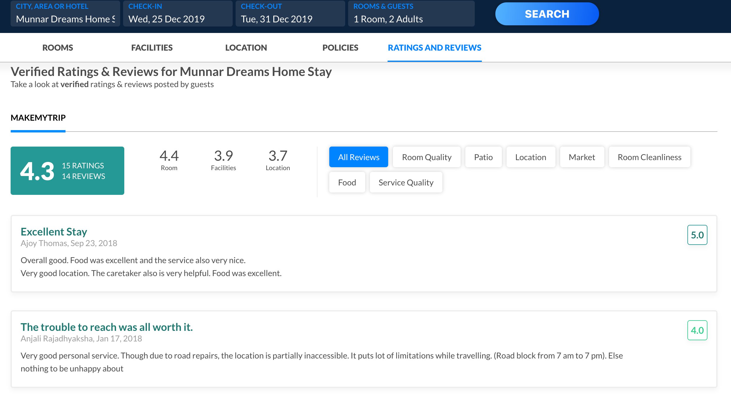
You have to get your visitors’ attention fast and make them act right away in order to score transactions. One of the ways to do so is by using the principles of persuasion—creating a sense of urgency and scarcity in the minds of individuals.
Employ urgency
Urgency is when you ask prospects and customers to act quickly in order to receive an incentive. Many travel industry giants such as Booking, Makemytrip, etc., have been effectively using this strategy to increase their conversions. Learn from them and employ the same strategies on your travel website to reap maximum benefits.
Offer special deals with discounts or incentives to users for a limited period. The incentives that can only be redeemed in a specific time range will push users to buy it before the deal ends.
Moreover, you can also display the number of people viewing a particular listing on the results page to instill urgency among visitors. Such a technique not only increases the listing’s perceived popularity but urges individuals to act fast and grab the deal before someone else does. Here’s how Agoda.com does it:
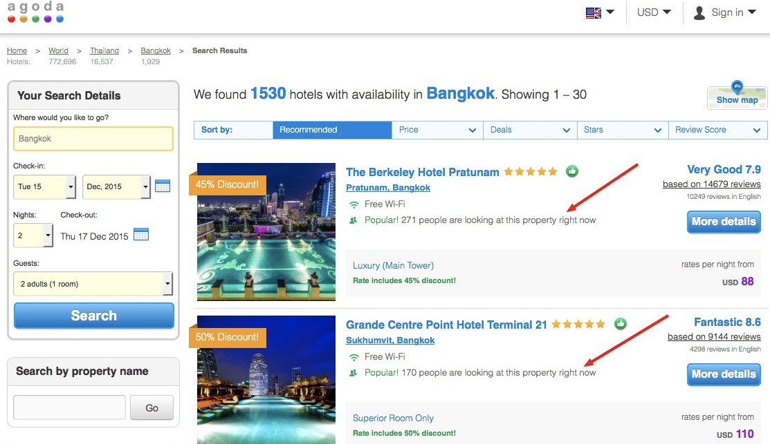
Use scarcity
‘Last few tickets available at a discounted price,’ ‘Book now to get a free hotel upgrade,’ ‘Book in the next one hour to get free wine on arrival,’ ‘Get complimentary breakfast if booked in the next 30 minutes.’
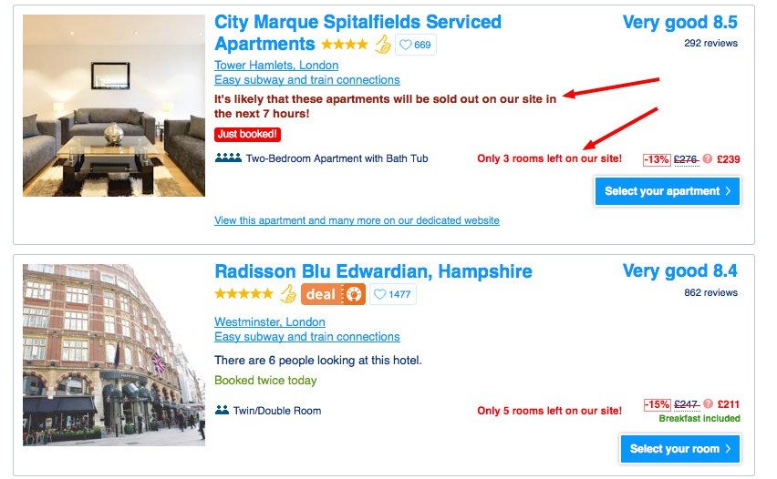
There are endless ways to generate urgency and dissuade visitors from going on a website-hopping spree. However, be reasonable and don’t make a promise you can’t keep because that will just tarnish your reputation. Booking.com constantly updates its booking status to create a sense of scarcity.
Booking form
Form optimization is equally important in your conversion funnel. UK-based travel company Flying Scott increased form submissions by a substantial 35% by testing form fields. When visitors have done all the research and chosen a flight, hotel, or holiday package, you don’t want them to abandon the booking.
Below are a few ways you can optimize your forms:
- Use intelligent forms
- Put as few form-fields as possible
- Test different form layouts
- Use multi-step forms
A good follow-up resource would be to help you know more about form optimization methods and how form analytics works.
2) The progress bar is your lifeboat

Complex booking experiences make travelers switch to higher-cost offline channels. However, it’s extremely difficult to cut down on the amount of information that must be collected during the booking process.
Dividing the process into identifiable steps can make customers’ lives much easier. These identifiable steps serve as road signs — the customer will know what lies ahead after they complete that step.
Also, here’s an insightful conversation we had with Khalid Saleh, CEO of Invesp, on the VWO Podcast. Listen to this episode to learn how the company generated $37 million during holidays for some leading brands.
3) Go mobile
Your users are spending more on the go instead of waiting to reach their computer to make a purchase.
According to a survey conducted by Travelport, the average US leisure traveler uses between seven and eight different apps on his/her mobile. When it comes to hotels, 39% of guests would like to use digital room keys, and 36% would like to check into a hotel via an app.
Investing in a responsive design for a mobile application, and ensuring that it has the same functionality and features as your website could be a smart move. You can also leverage the native features of mobile devices (GPS, click-to-call, etc.) to offer a better user experience.
To ensure you are on the right track, it is necessary that your strategic move should translate into conversions. You can run A/B tests and omnichannel campaigns using VWO FullStack to fuel your conversions on your mobile app.

Download Free: Grow Website Traffic Guide
4) Feature USPs
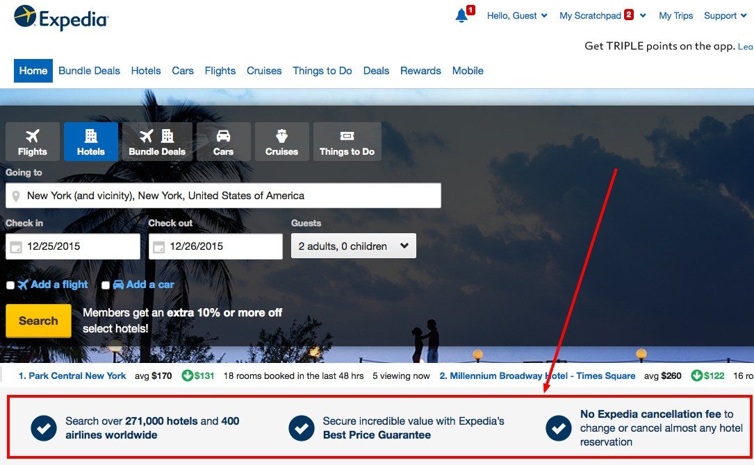
If your company has unique benefits to offer to its visitors, then prominently display them on your homepage. Doing so can not only convince your target audience to use your services but also turn into repeat customers.
Below is a screenshot from Expedia’s homepage, which presents its USPs prominently.
5) Upsell and cross-sell with elan
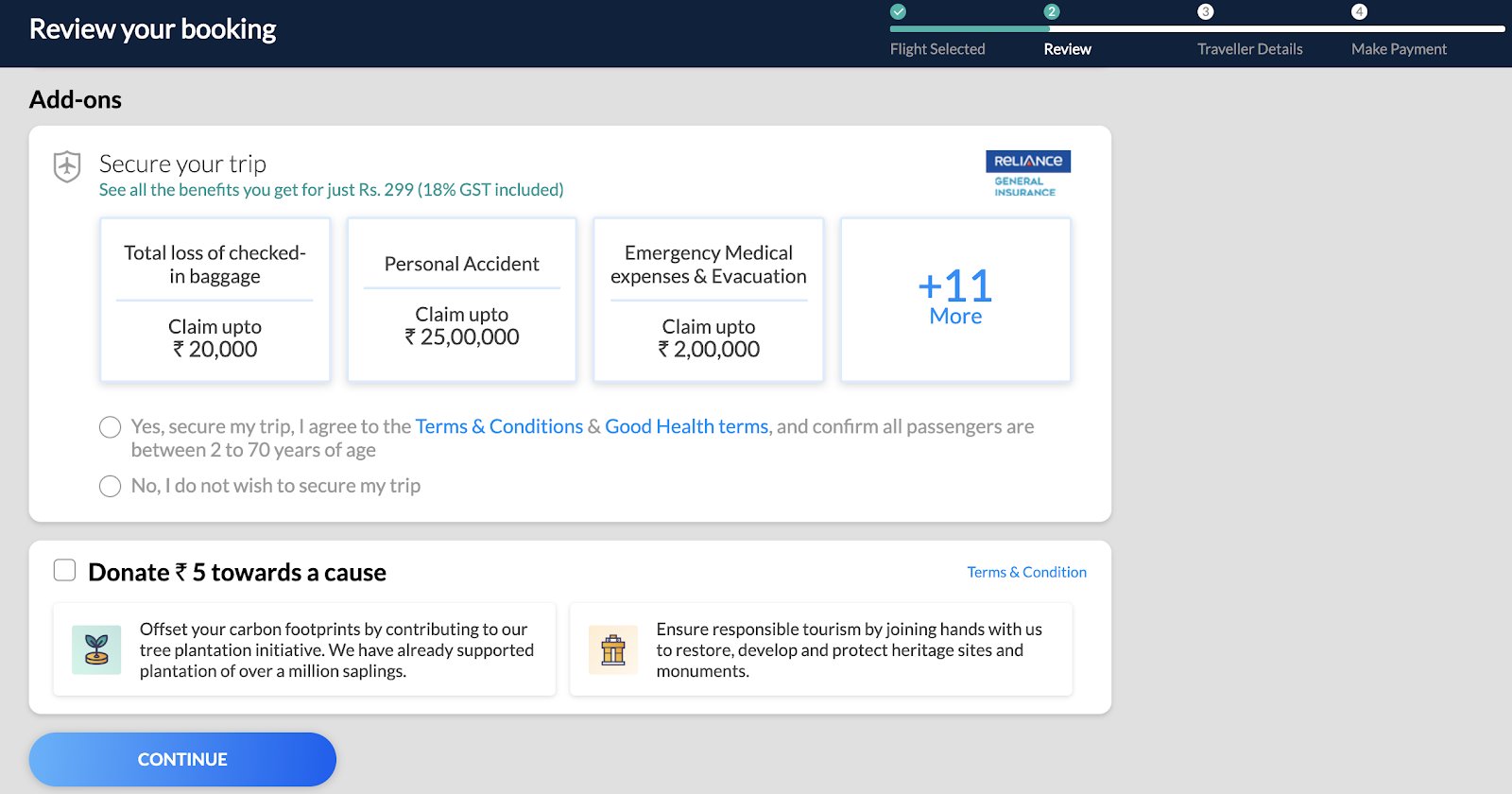
Would they want to add on travel insurance as a package deal? Or perhaps, get flight seats with extra legroom at a little extra cost? Or maybe extend their trip by three days to get a steal of a deal?
The options for add-ons cross-sells, and upsells are immense in the online travel business. Smartness lies in presenting them to your target audience in a manner that they’re lured towards them. Provide offers which compel them to use your services and on the other hand help increase your average order value.
However, ensure to follow best practices when it comes to upselling and cross-selling, and run A/B tests for conversions.
- Don’t offer an upsell option when a visitor is at the checkout stage. Try not to tell them what they don’t have and confuse them when they are about to close the deal.
- Don’t auto-check the add-ons as a customer might not notice them at that point but would get mighty pissed when they see the inflated cost at the checkout.
6) Leave no room for ambiguity
In case of any doubts, A/B test! Any information that is vague and open to a reader’s interpretation is a potential conversion barrier. Multiple steps involved in the booking process are a hindrance to a smooth web experience.
Review all the information throughout the funnel for ambiguities. For example, when you ask the visitors for their age, you might be showing them three options to choose from—kids, adults, and elderly.
Now you might think you have communicated yourself clearly, but what about someone who is 17? They definitely do not think of themselves as kids, and neither are they legally adults. Or what about someone who is 59? An adult or an elderly?
Through a study on their website, Expedia found that many of their visitors were clicking on the booking button but weren’t completing the transaction. They also found that an optional field on the booking form called ‘Company,’ was confusing people.
The visitors thought the field required them to enter their bank name. Having entered the bank name, they then went on to enter their bank address (not home) in the address field. This was causing the credit card transaction to fail. Expedia simply deleted the ‘Company’ field and reaped higher profits.
7) Personalization is the key
Personalization today has become a name synonymous with online shopping. And, that extends to travel websites as well. Irrespective of the fact that if a visitor is a first-timer or a repeat user, everyone expects you to personalize their experience. You must make them feel valued, or else they’ll leave.
The point is, that personalization is the need of the hour. If you’re not encashing on it, you’re automatically losing out on a lot of potential leads.
To build a strong bond with your prospects and customers, you need to put in some extra effort to show some gratitude since they entrusted you with their personal details.
- As soon as a new user gets on board, you can send them a welcome email or push notifications and guide them on the most important sections of your site. The idea should be to make them feel at home. But keep it short, warm, and actionable.
- Some of your users always book a hotel that offers free wifi and complimentary lunch. Whenever they search for a hotel on your website, you can display recommended hotels that offer free wifi and lunch. Such personalized recommendations will help users to choose a hotel of their preference quickly.
- If a traveler has booked with you and if there is a lot of consistency in their booking behavior—sea-facing hotels, family trips, spa, and recreational activities—you can assume they are a leisure traveler and accordingly recommend similar travel experiences.
- Using a personalization strategy to procure travelers’ booking history will help you offer relevant offers the next time they come to your website. The good news is that you could also track their in-session activity to understand their behavior and booking habits, a section covered later in this post.

You can A/B test your landing page offering personalized packages when visitors search for flights for a specific destination.
Watch how VWO Personalize can help you create multiple experiences and target each of them to a different visitor segment in one single campaign.
8) Wear nice shoes
People are judged by the appearance of their shoes. The authenticity of your business is judged by the appearance of your website. So, ensure your website’s UX is compelling and inviting rather than intimidating. A great example of this is Bizztravel which increased its conversions by 21% after redesigning navigation on its website.
Furthermore, online frauds are the order of the day and visitors are ever more cautious about sharing their personal and credit card details online. Hence, it’s very important that your website oozes trust and authenticity.
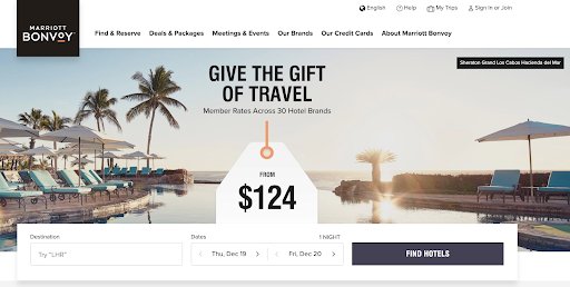
Marriott’s homepage has a minimalist classy design that evokes credibility. When you are asking for their credit card information, display a security seal along with it. Use testimonials, customer reviews, media coverage, and privacy policies to win the trust of your visitors.
Conclusion
The challenge for any online travel enterprise boils down to convincing users persistently on each step of the conversion funnel. Tools such as heatmaps, visitor recordings, and form analytics can help you analyze users’ behavior on websites effectively, which can become instrumental in increasing travel bookings.
So, there is never just one simple solution. You can improve your customer experience only by understanding the users’ pain points and providing them with the best solutions. Hopefully, they are never going to abandon you again.
