A new year demands fresh ideas, resolutions and plans. It’s that time of the year when you pull up your socks and take your conversion optimization strategy a notch higher. Here are 12 A/B testing tips that can prove to be a game-changer:
1) Follow the Scientific Method
A/B testing is nothing short of a laboratory experiment. In fact, the oldest champion of the concept has been the medical fraternity. To get significant results, it’s important that you follow the Scientific Method.
Download Free: A/B Testing Guide
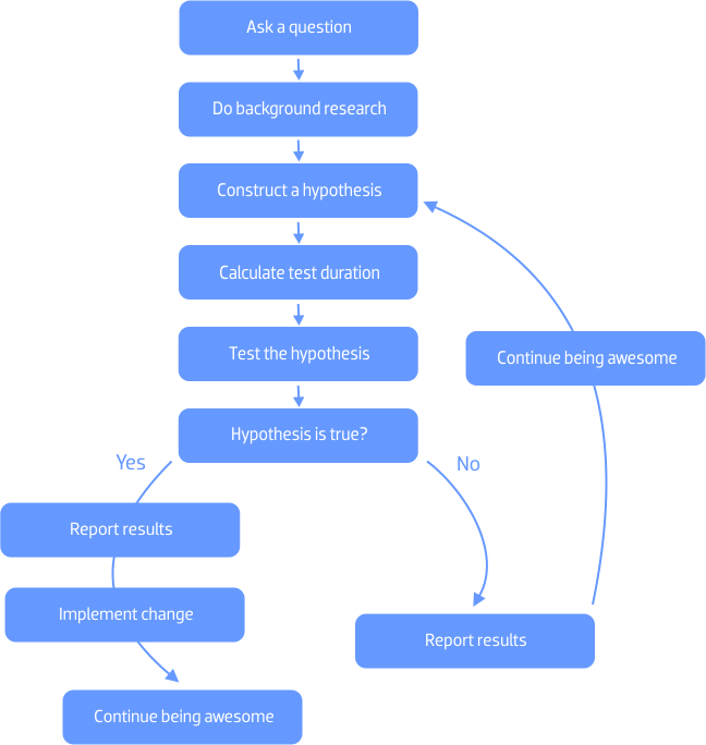
Start the test by first asking yourself a question. Something on the lines of, “Why is the engagement rate of my site lower than that of the competitors”. Then understand your visitors’ behavior by using an analytics tool, construct a hypothesis, figure out the number of visitors/days you need to run the test for, run the test, analyze your data and draw conclusions. Finally, share the insights with others in your department and company.
2) Collect enough data

‘A/B testing sample size’ is a contentious subject. There’s no one single industry benchmark that tells you how much data should be collected before drawing conclusions or stopping the test.
The minimum number of visitors and conversions required for each variation depends on the value of your product and average visitors. If you get 50,000 visitors a month, you can’t base your decision on 100 visitors. Similarly, a heavy machinery firm which records 100 conversions a year will need just 10 odd sales to make a decision but an online apparel store will require a much larger sample size.
It’s also tempting to get influenced by statistical significance (chance to beat the original). A version can achieve a statistical significance of 99% in mere 24 hours but that percentage might nosedive by the end of the week. VWO has its own A/B testing calculator which tells you how long a test needs to run for.
3) Cut the noise
Noise is any outside influence that skews your data. Suppose you launch a free e-book on e-mail marketing and you record 1,000 downloads in a month. You are having a little party in your head when you realize that one-third of the leads are in reality some very thankful students of a certain university. Since they are not part of your core target audience, they are ‘noise’.
Though a lot of these factors are beyond your control, you can do a few things to control noise at your end. In VWO, customers can segment their data. For example, you can exclude visitors coming from certain websites if you feel they come for exploratory reasons alone. You should also take care of seasonal influences while setting up a test. Off seasons or irregular days might not be the best time to run a test.
4) Collect feedback from customers
Collect information about your product from customers before setting up any big test. If you plan to test your tagline, run a quick survey among your customers asking how they would define your product. Give them multiple choices – which will also increase the probability of them answering – and test the ones which get the maximum votes.
Conversion Rate Experts, which ran a massive test for Moz, asked its paying customers these questions:
- What do you like most about Moz’s service?
- What convinced you to sign up?
- How would you describe the service to a friend?
The answers to these questions helped them in creating a new landing page which ultimately raked in $1 million annual revenue. Here’s the full case study.
5) Conduct usability tests
Usability testing is one of the best ways to find out what are the obstacles on your website. Observing actual users walk through your website will give you insights into user flow and the problems they face.
If you have an eCommerce website, you could set up a specific task for users like finding a product. This will give you insights about what keywords visitors use to find a particular product and what they do in case they don’t find it. Does that ‘live chat’ widget pops up just in time? Do they look up your ‘contact us’ page or just reach a dead end?
If your conclusion is that visitors find it difficult to contact you, the hypothesis of your A/B test could be that displaying your phone number more prominently on the homepage will reduce bounce rate.
6) Draw insights from site search
Checking your site search data on Google Analytics will tell you what the visitor is trying to find on your website. If a particular term is being searched repeatedly (for example ‘pricing’), you know your pricing section needs a more prominent display.
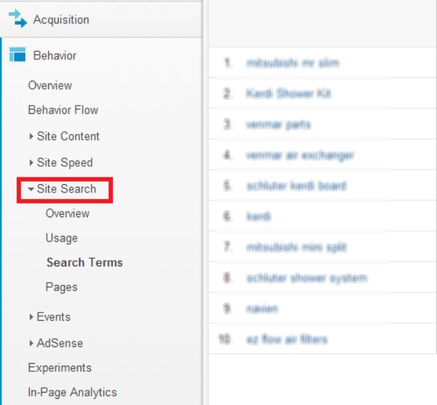
Checking site search data will also give you insights into the language the customer uses. Suppose you offer various kinds of professional training — software training being one of them — and prominently display the services offered on the homepage. You think you are effectively selling your service but the site search data shows that users are anxiously searching for ‘IT courses’. This shows there’s discrepancy between your and the users’ vocabulary.
We recently published a case study in which GreyBox Technologies ran a test on its client’s website PCMBtoday. They changed the CTA text from ‘Add this to my Cart’ to ‘Buy Now’ (more familiar term among Indian audiences) and lifted conversions by 8%.
7) Optimize your most commonly used conversion path
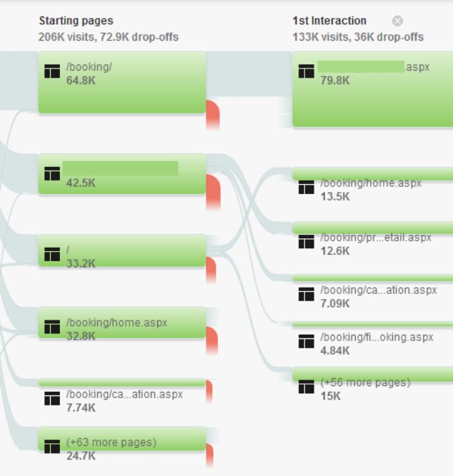
Use an analytics tool like Google Analytics to track the most traversed conversion path on your website. Once you find out the most commonly used route, you can check where the maximum number of visitors are dropping off. Quickly plug the holes by adding CTAs on the pages with high drop-offs. In case there are multiple CTAs on that page, focus on the most important one by making it more prominent.
Download Free: A/B Testing Guide
8) Make changes that significantly alter user behavior
Stuff like changing CTA color, converting a link to CTA, changing a headline and rewriting body text are all very well. These tests are very easy to set up and can result in immediate conversion lift.
But these tests can only take you so far. You need to set up more strategic tests to see significant change in your revenue. I am not talking about making multiple changes at the same time or completely redesigning a page. That way you won’t be able to attribute the reason for the success or failure of a test to a particular change.
The idea is to run a test that significantly alters user behavior. An example would be eliminating the category page of an eCommerce store or changing the free trial duration of a SaaS product. Hiten Shah, co-founder of KISSmetrics, ran a 30-day free trial vs 14-day free trial test on the website. Though the two recorded almost no change in conversions, the second version had massive impact on user behavior. The 14-day version saw significant increase in product usage.
9) Focus on the 20% that will bring you 80% results
If you are not sure where to start optimizing, you could follow the 80-20 rule. Also known as the Pareto principle, the 80-20 rule says focus on those 20% elements that will bring you 80% of the results. So suppose your site has 10 pages and two of these pages are getting 80% of the traffic, then focus on these two pages.
10) Test multiple hypotheses
Instead of pinning all your hopes on that one hypothesis and testing it against the original, test multiple hypotheses. If the goal of your eCommerce store is to increase the clicks to ‘add to cart’ button on the product page, set up various hypotheses. You could show the stock meter to create scarcity, offer free delivery as an incentive, display a trust badge to ward off fear and test all these versions separately to see which one works the best.
Betfair, an online betting platform, used VWO to test three persuasion principles — Social Proof, Reciprocity and Scarcity — on its landing page. One of them increased registrations by 7%
Thinking of multiple hypotheses might also make you think out of the box and ditch the conventional approach. Upworthy’s editor-at-large Adam Mordecai says he tests 25 headlines for each post.

11) Run internal tests for pricing
Pricing is an extremely critical element. Even a small change in your product’s price can have a huge impact on your revenue. Run an internal test to determine the price sensitivity of your customers before actually increasing the price. An internal or a dummy test can be conducted by changing the price on the product page but not on the checkout page. If there’s no change in your ‘add to cart’ or ‘download’ clicks, you can safely implement the real test and reap in extra revenue.
PriceCharting recently used VWO to run a preliminary test to see how the customers behaved before they started a series of tests on the actual prices.
12) Don’t blindly ape others’ success stories
Your worst A/B testing sin would be to blindly emulate others’ success stories. Even if your business model is similar, your circumstances are very different.
Take this case study for example.

Changing the CTA color from green to red increased conversions for Performable. But the same test might not work for you as your website has a different design, target base and business goals. You should try to understand the concept behind each test rather than reducing it to one single magic formula.
Be ingenious and creative when A/B testing. Following the herd mentality or best practices can only take you so far. Best practices are like packaged food. Good enough for a meal when you are terribly short on time, but not so good in the long run.
Think long, think big. Start A/B testing right away for free.


