A/B Testing Case Study: Removing Navigation Menu Increased Conversions By 100%
Usually, navigation menus are common across all pages of a website. But, should you have a navigation menu on a landing page as well? Or, should your landing page be unique in itself and there is no need to include a global navigation menu? This is a perfect case for A/B testing and one of our customers, Yuppiechef, did this test and found out that removing the navigation menu doubled their conversions.

Yuppiechef is a leading online store selling premium kitchen tools throughout South Africa. They are known for their customer service, quirkiness, and passion for getting people excited about eating together and spending time in the kitchen. They used VWO to A/B test the effect of removing the navigation menu from one of their landing pages.
Removing the navigation menu increases signups by 100%
Yuppiechef wanted to increase the rate of Wedding Registry signups (conversion goal) generated from the Wedding Registry landing page on their website. They tested two pages against each other that were identical, save for the main navigation bar at the top of the page. As simple as that. On that landing page, there was a mix of various traffic sources including Google Adwords (Search & Display Network), Facebook, 3rd Party Advertisers, Directories, Organic Search, and Direct traffic. Here’s what the original page looked like:
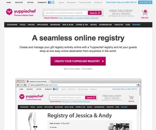
As far as designing the variation is concerned, the hypothesis was that the option without the navigation bar would provide fewer distractions, and help the user focus on the primary reason they had landed on this particular page. Here’s what the variation looked like:
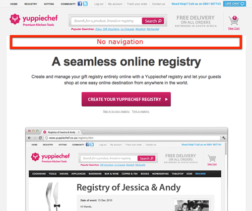
Download Free: A/B Testing Guide
A/B testing results
They were certainly surprised by the results! The new variation of the page without the navigation bar at the top of the page delivered twice as many conversions as the original page! The conversion rate jumped from 3 to 6% with an effective 100% increase in conversions. Who wouldn’t be happy about such results?
This is what they thought about results: “Simpler is better. Try assist the user in focusing on their primary objective by eliminating distractions.“. With regards to A/B testing tool they used, this is what they had to say: “VWO provided an easy and efficient way to implement the test in no time at all. The reporting was also detailed enough to give us the insights we needed to declare the test an unequivocal success.”
Get an overview of VWO Testing:
Hope this case study inspires you to test the navigation menu on your landing pages. We don’t guarantee that you will also increase your conversions by 100% but this test is certainly an easy one to setup. And, who knows, maybe you will significantly increase your conversion rate. The only way to find out is to set up an A/B test.



![7 Best Website Monitoring Tools [2026]: Expert Insights to Help You Pick the Right One](https://static.wingify.com/gcp/uploads/sites/3/2025/02/Feature-image-7-Best-Website-Monitoring-Tools-How-to-Pick-the-Right-One.jpg?tr=h-600)


