If 8 out of 10 people are willing to pay more for a better user experience, then every usability issue on your site is more than a UX design flaw; it’s lost revenue. Users aren’t comparing you only to direct competitors; they’re comparing you to the smoothest, smartest digital experiences they’ve ever had.
That’s why a thorough UX audit is so powerful. It doesn’t just spot visual inconsistencies or clunky navigation; it reveals the hidden frictions that cause people to hesitate, abandon, or never return. It’s the bridge between what your digital product is and what it could be when every click, scroll, and interaction works in the user’s favor.
In this guide, we’ll break down the process of conducting a UX audit, share a step-by-step checklist, highlight key benefits, and provide best practices so that every decision you make is backed by real user insight, not guesswork.

What is a UX audit?
A UX audit involves a structured evaluation of a digital product, such as an eCommerce website, app, or platform, to identify usability issues and opportunities for improvement.
Think of it as a “health check-up” for your user experience: it reveals where your UX design delights users, where it confuses them, and where it outright frustrates them.
Unlike casual feedback or design reviews, a website UX audit is systematic and data-driven. It combines qualitative insights (such as heuristic evaluations, expert reviews, user interviews, and heatmaps) with quantitative data (such as web analytics and conversion metrics) to paint a clear picture of how users are interacting with your digital product.
Analyze your eCommerce website for free
Benefits of conducting a UX audit and the core issues it identifies
A UX audit reveals the problems that have the greatest impact across the user journey. This ensures resources are directed towards areas that yield the most value, resulting in a smoother and more effective digital experience. Some of the key benefits include:
- Improved user satisfaction: When navigation is intuitive and content is clear, users feel more in control and engaged.
- Higher conversion rates: Eliminating friction in key user flows (such as sign-ups, purchases, or form submissions) directly boosts goal completions.
- Better accessibility compliance: Identifying and addressing accessibility barriers ensures inclusivity and reduces legal risks.
- Stronger brand perception: A consistent, well-structured user interface builds credibility and trust.
- Data-driven redesigns: Valuable insights from the audit guide targeted UX improvements, avoiding guesswork and costly redesign missteps.
Core issues a UX audit typically identifies
The most common user pain points revealed by a UX audit are:
- Navigation gaps: Confusing menus, unclear labels, or missing links.
- Poor content structure: Information overload, inconsistent tone, or missing key details.
- Ineffective CTAs: Buttons that are hard to find, vague in wording, or placed in low-visibility areas.
- Design inconsistencies: Mismatched typography, colors, or component styles across the user interface.
- Accessibility barriers: Low color contrast, missing alt text, or design elements that can’t be accessed via keyboard.
- Performance bottlenecks: Slow page loads, unoptimized images, or scripts affecting responsiveness.
- Mobile usability issues: Layouts that break on smaller screens, tap targets that are too small, or missing mobile-friendly interactions.
Understand the boundaries of a UX audit
A UX audit is a diagnostic exercise, not a redesign project; it assesses the current user experience, identifies usability and UX design issues, and recommends actionable improvements. Knowing these boundaries sets realistic expectations, ensuring stakeholders see the audit as a strategic analysis tool that guides design decisions, rather than a quick fix for every UX challenge.

What it includes:
- Reviewing user flows, navigation, and content structure.
- Evaluating design consistency, accessibility, and usability against established standards.
- Analyzing analytics, heatmaps, and user feedback for behavioral insights.
- Benchmarking against competitors through a UX competitive audit.
What it doesn’t include:
- Complete interface redesign or rebranding.
- Development of new features or backend functionality.
- Full-scale content creation or rewriting.
- Implementing the recommended changes (this is a follow-up phase).
When should you conduct a UX audit?
A UX audit is both a safeguard and an accelerator: helping you fix what’s broken today and future-proof the user experience for tomorrow. While you can perform UX audits at any stage, certain moments make it especially valuable from the user’s perspective:
Pre-launch or redesign
- Before going live: Spotting usability issues early means fewer fixes after launch, saving both time and money.
- During a redesign: A UX review of the current experience helps you keep the elements users love while replacing those that cause frustration.
In response to performance issues
- Falling user engagement: Shorter session times, fewer return visits, or growing bounce rates can indicate deeper UX problems.
- Low conversions: If users aren’t completing key actions, such as purchases or sign-ups, an audit can pinpoint exactly where they drop off.
- Technical slowdowns: Laggy pages, broken links, or clumsy navigation can quickly erode trust and should be addressed promptly.
As part of ongoing improvement
- Routine reviews: Conducting UX audits once or twice a year helps maintain quality as user expectations and technology evolve.
- After adding features: New functionalities can unintentionally disrupt existing flows; an audit helps keep the user experience seamless.
- Support feedback spikes: If customer service queries suddenly rise, a UX audit can help identify and resolve the root causes, boosting customer satisfaction.
Strategic moments
- Market benchmarking: Comparing your user experience to competitors through a UX competitive audit can reveal gaps and opportunities.
- Investor or partner readiness: Demonstrating a strong, user-friendly experience can strengthen your business case.
- Adapting to industry change: From new devices to updated accessibility standards, proactive audits keep your product relevant.
Always incorporate some form of voice of the customer analysis when conducting a full audit. Quantitative data from Google Analytics tells you what’s happening with your customers, but not why. Instead of guessing, just ask! Post-purchase surveys are a fantastic place to start. What we also might do is conduct an online survey using tools where we survey non-customers. This can also be helpful when working on designs and prototypes, as you can quickly and easily get feedback within hours.
Source: Ilan Hurwitz, Founder at Clever Conversions (Source)
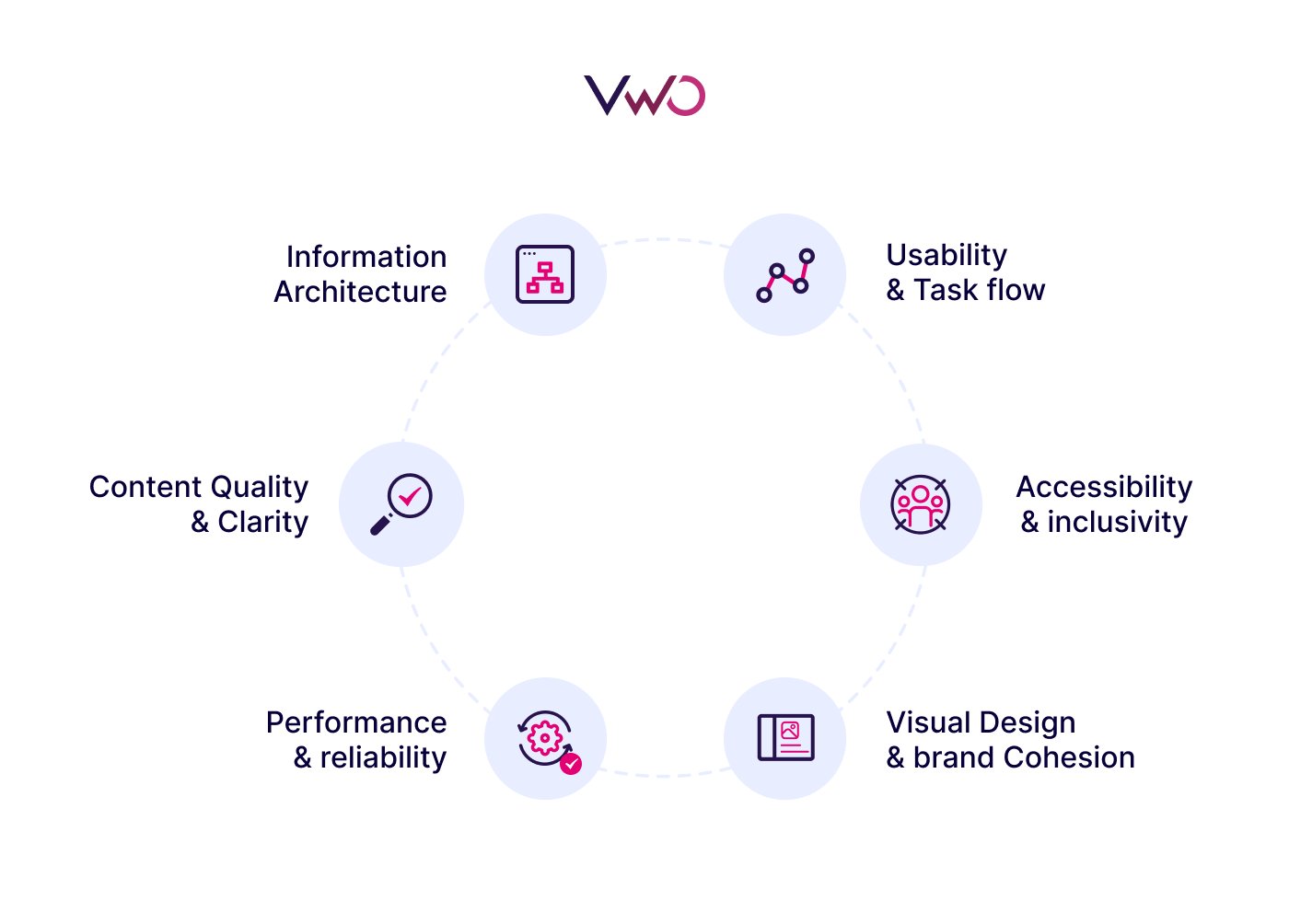
Key areas to evaluate during a UX audit
Below are the core areas for UX review, each with a direct impact on usability and overall satisfaction.

Usability & task flow
This is the heart of a positive user experience: how quickly and intuitively people can achieve what they came for. When every step feels obvious and effortless, users leave happy, come back often, and never think twice about recommending you.
What to evaluate:
- Clarity and consistency of navigation menus.
- Simplicity of forms and data entry, including error handling.
- Efficiency of key user flows (e.g., sign-up, checkout, onboarding).
- Responsiveness of interactive elements and the feedback they provide.
Example: In an online grocery app, the “Add to Cart” button appears only inside the product detail page. Moving it to appear directly in the product list view removes two extra taps per item, making bulk ordering much faster for users.
Accessibility & inclusivity
Your product should deliver a consistent and inclusive experience for all users, whether they have accessibility needs or are browsing across different devices, while staying true to your brand’s identity. Accessible products reach a wider audience, meet legal standards, and create a more equitable digital environment that shows you value inclusivity in every interaction.
What to evaluate:
- Keyboard-only navigation and screen reader compatibility.
- Sufficient color contrast and readable font sizes.
- Accurate alt text for visual elements.
- Clear heading structures and accessible form labels.
Example: An online banking app relies only on color to show account status: green for “active” and red for “suspended.”For users with red–green color blindness, both colors may appear almost identical, making it difficult to distinguish the account status. Adding text labels (“Active” / “Suspended”) or icons alongside the colors ensures that the status is clear to everyone, regardless of visual ability.
Visual design & brand cohesion
Visual design should do more than look good; it should guide attention and reflect brand identity. An aesthetic and minimalist design builds trust, guides attention, and reinforces brand recognition.
What to evaluate:
- Consistency in typography, colors, and UI components.
- Logical visual hierarchy that prioritizes important actions.
- Design choices that reinforce brand values and personality.
Example: On a health-tracking dashboard, the “Log Activity” button (the main task) is visually similar to the “View History” option beside it. Because both look alike, users often misclick. By giving the primary button a distinct color, size, and consistent placement, the interface makes the experience more intuitive.
Information architecture
The way information is structured directly shapes the user journey. Information architecture ensures that content and features are organized logically, helping users find what they need without friction. When information is easy to locate, users feel in control; when it’s buried, they leave. A well-structured system saves time, reduces effort, and keeps people exploring rather than exiting in frustration.
What to evaluate:
- Logical grouping of categories and subcategories.
- Clear and descriptive labels for menus and links.
- Effective search tools, including filters and auto-suggestions.
- No dead ends, broken links, or looping paths.
Example: A government services site hides “Business Registration” under a vague “Resources” tab, forcing entrepreneurs to click through unrelated pages. Placing it directly under “Start a Business” makes it instantly discoverable and speeds up task completion.
Content quality & clarity
Content acts as the voice of your product: if it’s unclear, users will feel lost. Clear, concise, and relevant content builds trust, confidence, and reassures users they’re in the right place and gives them the confidence to take the next step.
What to evaluate:
- Clear, concise, and jargon-free language.
- Consistent tone aligned with brand identity.
- Up-to-date and accurate information.
- Sufficient detail without overwhelming the user.
Example: A SaaS platform’s pricing page lists “Multi-tenant architecture with role-based access control” as a feature. While accurate, it’s meaningless to most buyers. Rewriting it as “Secure accounts for different teams, with custom access levels for each role” makes it clear, relatable, and benefits-driven.
Performance & reliability
Speed and stability aren’t luxuries; they’re expectations. Slow load times and glitches break the user’s flow and trust, often sending them straight to a competitor.
What to evaluate:
- Page load speed on various devices and connections.
- Smooth responsiveness during interactions.
- Stability, with minimal errors or broken functionality.
Example: A lifestyle blog homepage loads 8MB of high-resolution images. Compressing them to 500KB each cuts page load time from 7 seconds to under 2, keeping impatient mobile readers from bouncing.
How to conduct a UX audit: Step-by-step
A successful UX audit follows a structured approach: mixing data, usability principles, and direct user feedback to surface the most impactful UX improvements.
Define business objectives and metrics
Begin by pinpointing exactly what you want to improve, and then link that objective to measurable indicators. For example, if your goal is to reduce checkout abandonment, track cart abandonment rate, or conversion rate at the final step. If you’re looking at onboarding friction, measure time-to-complete onboarding or drop-off rate per step. For mobile forms, metrics like form completion rate, error frequency, or time on task can reveal the current state.
Defining objectives alongside metrics ensures the audit stays focused on business outcomes and gives you a measurable baseline to evaluate improvements against.
Collect qualitative data
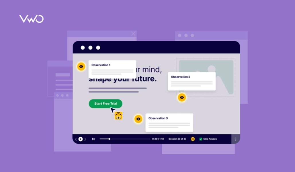
You can’t fix what you can’t see. VWO Insights brings together multiple behavioral analytics tools in one place:
- Session recordings let you watch real user journeys to spot where people hesitate, rage-click, or abandon a process.
- Heatmaps, Scrollmaps & Clickmaps visualize exactly how users interact with pages, where they click most, what they ignore, and how far they scroll.
- Form Analytics reveal where people drop out of form completions, helping you address friction fields.
- Conversion Funnels map the user journey and highlight points of highest abandonment.
- On-site Surveys capture direct feedback at the moment of interaction, with smart triggers (e.g., when a user is about to exit or after a key action).
These combined views replace guesswork with concrete, visual evidence of user behavior.
Perform a heuristic review
Data tells you where problems exist; a qualitative evaluation explains why. Assess the interface against established principles, such as Nielsen’s 10 Usability Heuristics or WCAG accessibility standards. Look for:
- Clear navigation and button labels.
- Minimal visual clutter and logical layouts.
- Obvious feedback for user actions.
- Error messages that explain what went wrong and how to fix it.
Instead of manually digging through recordings or click maps, let VWO Copilot do the heavy lifting. It automatically analyzes heatmaps and session recordings to highlight friction areas and optimization opportunities. By turning raw behavioral data into clear, actionable insights, Copilot saves hours of manual effort and helps you prioritize changes that drive conversions faster.
Conduct usability testing
There’s no substitute for seeing users in action. Whether through moderated or unmoderated usability testing, this step uncovers user pain points that numbers alone can’t reveal. Even short sessions can show you, for example, that users overlook a key CTA because it blends into the page.
Test accessibility & mobile friendliness
Product accessibility for everyone is essential. Check for:
- Compliance with standards like WCAG, keyboard navigation, contrast ratios, alt text, and testing on assistive tools like screen readers.
- Verify the user experience across devices, browsers, and screen sizes.
Spot patterns & prioritize fixes
With all issues documented, the challenge is knowing where to start. Not every problem has the same impact on business outcomes. A structured prioritization approach, such as PIE, provides a simple way to decide what to tackle first:
- Potential: How much improvement could this fix bring to the overall user experience or conversion rate?
- Importance: How critical is the affected area in the user journey (checkout, signup, navigation, etc.)?
- Ease: How simple or resource-intensive is the change to implement?
Scoring issues against these criteria helps you spot the high-impact, quick-win opportunities and plan larger, strategic fixes in a realistic order. Ultimately, prioritizing fixes means knowing what to test first and sequencing changes for maximum value.
Validate improvements through testing
This is where the audit moves from diagnosis to proof. Testing ensures that every change is backed by measurable uplift, not just intuition. With VWO Testing, you can:
- A/B test page layouts, navigation changes, or CTA wording.
- Use VWO FullStack for server-side tests on complex features like search algorithms or personalization without slowing performance.
- Target tests to specific user segments identified during the audit.
- Monitor results in real time using Bayesian statistical reports.
Want to see how predictive insights can take your UX experimentation even further? Check out our webinar:
Share insights & align the team
An audit is only valuable if its insights are implemented. VWO Plan acts as the central hub for your actionable recommendations, experiments, and ongoing tracking. You can store annotated screenshots from Insights, link them to corresponding tests, and assign actions to different teams. This keeps everyone, from UX researchers to marketing, in sync as fixes roll out.
VWO streamlines the UX audit process by bringing behavioral analytics and experimentation together in one seamless platform. Designed for everyone from UX teams and product managers to CRO experts and digital marketers, it enables different functions to work from the same set of user-driven insights.
By turning raw behavioral patterns into testable ideas, VWO makes it easier to uncover usability gaps, understand how users interact with your product, and validate improvements, ensuring every decision is backed by real evidence, not assumptions.
Request a demo to explore all the capabilities that can help with the audit process.
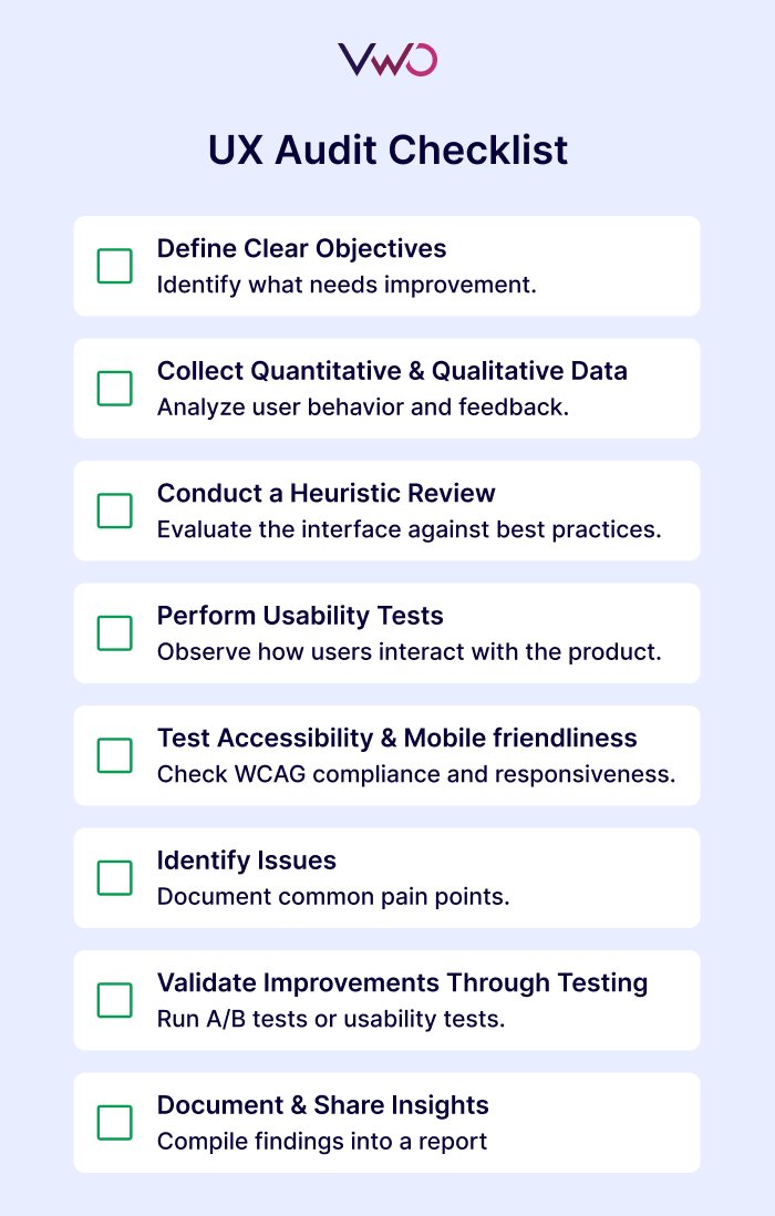
User experience audit checklist
Use this UX audit checklist to guide your audit process and ensure you address every stage from goal-setting to implementation.

FAQs
A UX audit is an evaluation of a product’s user experience to identify usability issues, accessibility gaps, and design improvements, backed by user research, analytics data, and user feedback.
A UX content audit reviews all on-screen text, visuals, and messaging to ensure clarity, consistency, relevance, and tone, removing jargon, aligning with brand voice, and making content more user-friendly.
Follow the steps below:
a. Define clear objectives and metrics.
b. Gather qualitative (user feedback) data.
c. Conduct a heuristic evaluation against usability best practices.
d. Observe real users via usability testing.
e. Check accessibility and mobile responsiveness.
f. Identify and prioritize issues.
g. Validate improvements through testing.
h. Document findings and share with the team.
A UX audit can take anywhere from 1 week to 6 weeks, depending on scope, data availability, and the need for user testing.
A UX audit focuses on the overall user experience: usability, accessibility, content clarity, and interaction design, while a CRO audit focuses specifically on maximizing conversions, such as purchases, sign-ups, or downloads, often using A/B testing and funnel optimization.
A competitive audit analyzes similar products in your market to identify UX strengths, weaknesses, and opportunities, helping you benchmark your user experience and find ways to differentiate.
The cost of a UX audit varies depending on several factors, including the size of your product, the complexity of its workflows, and the level of depth you require. A lightweight heuristic review is usually quicker and more affordable, while a comprehensive, research-driven audit that includes user testing, accessibility checks, and in-depth behavioral analysis will require more resources. In short, the scope and objectives of your audit will determine the investment.


![7 Best Website Monitoring Tools [2026]: Expert Insights to Help You Pick the Right One](https://static.wingify.com/gcp/uploads/sites/3/2025/02/Feature-image-7-Best-Website-Monitoring-Tools-How-to-Pick-the-Right-One.jpg?tr=h-600)


