Lead Generation Landing Pages: Best Practices & Examples
Too many campaigns fail at the last step; not because the audience isn’t interested, but because the landing page doesn’t make it easy to say “yes.”
A lead generation landing page isn’t just a container for your form; it’s the bridge between interest and action, where curiosity meets decision. It’s the one place where your message, design, and offer must work together to earn a visitor’s trust and secure their details. The margin for error is small, but the payoff for getting it right is huge.
In this guide, we’ll break down the essentials and show you how to create lead capture landing pages that deliver new leads, optimize them for better conversions, and share real-world examples worth bookmarking.

What is a lead generation landing page?
A lead generation page is a focused web page built to capture visitor details in exchange for a valuable offer, such as a free trial, guide, or webinar. Unlike multi-purpose pages, every element is tailored to drive one action – converting visitors into high-quality leads.
Visitors typically arrive at landing pages for lead generation through:
- Paid ads (Google Ads, Facebook Ads, LinkedIn, etc.)
- Email campaigns with targeted offers
- Social media promotions
- Content upgrades within blogs or YouTube videos
- QR codes or physical marketing materials (for offline-to-online campaigns)
- Affiliate or influencer promotions
- Call-to-actions on a website or blog driving to a gated offer
For example, a person searching for “best CRM tools” on Google might click on a paid ad that directs them to a lead generation page offering a free CRM comparison guide, but only after they enter their email.
The traffic is intentional. The offer is compelling. The design is distraction-free. That’s what makes lead generation landing pages one of the most effective tools in a marketer’s toolkit.
Why use lead generation landing pages?
Every click costs time, budget, or opportunity. That’s why sending users to a generic homepage or crowded service page rarely delivers meaningful results. Instead, smart marketers rely on lead generation landing pages to capture interest with precision and purpose.
In essence, if you want to drive measurable results from your campaigns, a lead generation strategy is non-negotiable.
Here’s why they matter:
Laser-focused targeting
Unlike broad website pages, a lead gen landing page zeroes in on one specific offer, whether it’s a downloadable guide, a product demo, or a free consultation. This focus helps attract more qualified leads who are already aligned with what you’re offering, boosting both quality and intent.
Crystal clear call-to-action (CTA)
At the heart of every effective lead generation landing page is a standout CTA, one that tells the visitor what to do next. Whether it’s “Get the Free Ebook” or “Book Your Free Audit,” a strong CTA removes ambiguity and drives action.
Structured data collection
These pages are purpose-built to gather valuable customer insights, including names, emails, job roles, and preferences, through short, well-placed lead capture forms. This structured data fuels ongoing marketing efforts, enabling targeted emails, sales follow-ups, and personalized retargeting that keep leads engaged well beyond their first interaction.
Distraction-free experience
Unlike typical web pages cluttered with navigation bars and competing links, landing pages for lead generation are designed to keep visitors focused. No menus. No sidebars. Just the offer, the value, and the form.
Vital for mid-funnel engagement
These pages shine in the middle of the sales funnel, when prospects are no longer just browsing but are exploring solutions. A well-timed offer on a lead-gen landing page can nudge them closer to purchase.
Campaign-level performance insights
Each landing page for lead generation serves as a controlled testing ground. You can monitor traffic sources, form submissions, bounce rates, and conversion metrics, making it easier to track ROI and fine-tune your marketing efforts.
Cost-efficient lead capture
When executed well, lead-gen landing pages attract qualified leads, not random clicks. That means less waste and better returns from your paid ad spend or email outreach, a win-win for performance marketers.
Key elements of lead generation landing pages
Here’s a breakdown of the essential components that make up the best landing pages for lead generation, along with examples and actionable tips:
Message consistency
The landing page should deliver exactly what the visitor was promised in the ad, link, or search snippet that brought them there. Whether from paid search, social, email, or organic results, the offer, visuals, and copy must align perfectly with that initial message to avoid disconnects that break trust and drive visitors away.
Suppose you click an ad that says “Free UX Audit Template – download free” and the landing page mirrors it: same headline, short form, “Get the template” CTA, instant download.
Now imagine the opposite: the ad promises “download free with email,” but the page pushes “Start 14-day trial,” shows a long form, and hides the template behind a demo. This is a classic bait-and-switch that breaks trust and spikes bounce.
Clear value proposition
Your value proposition is the heart of your landing page. It should tell visitors, in just a few seconds, why they should care and why your offer is worth their time and attention.
- Use bold, benefit-focused headlines and subheads.
Keep it direct, not clever; clarity beats creativity when it comes to conversion. - Align your messaging with your ad or email source to maintain continuity of message.
Example:
SproutSocial: “Sprout’s unified social media management platform enables your team to extract real business value, strengthen your market position, and drive revenue, quickly.”
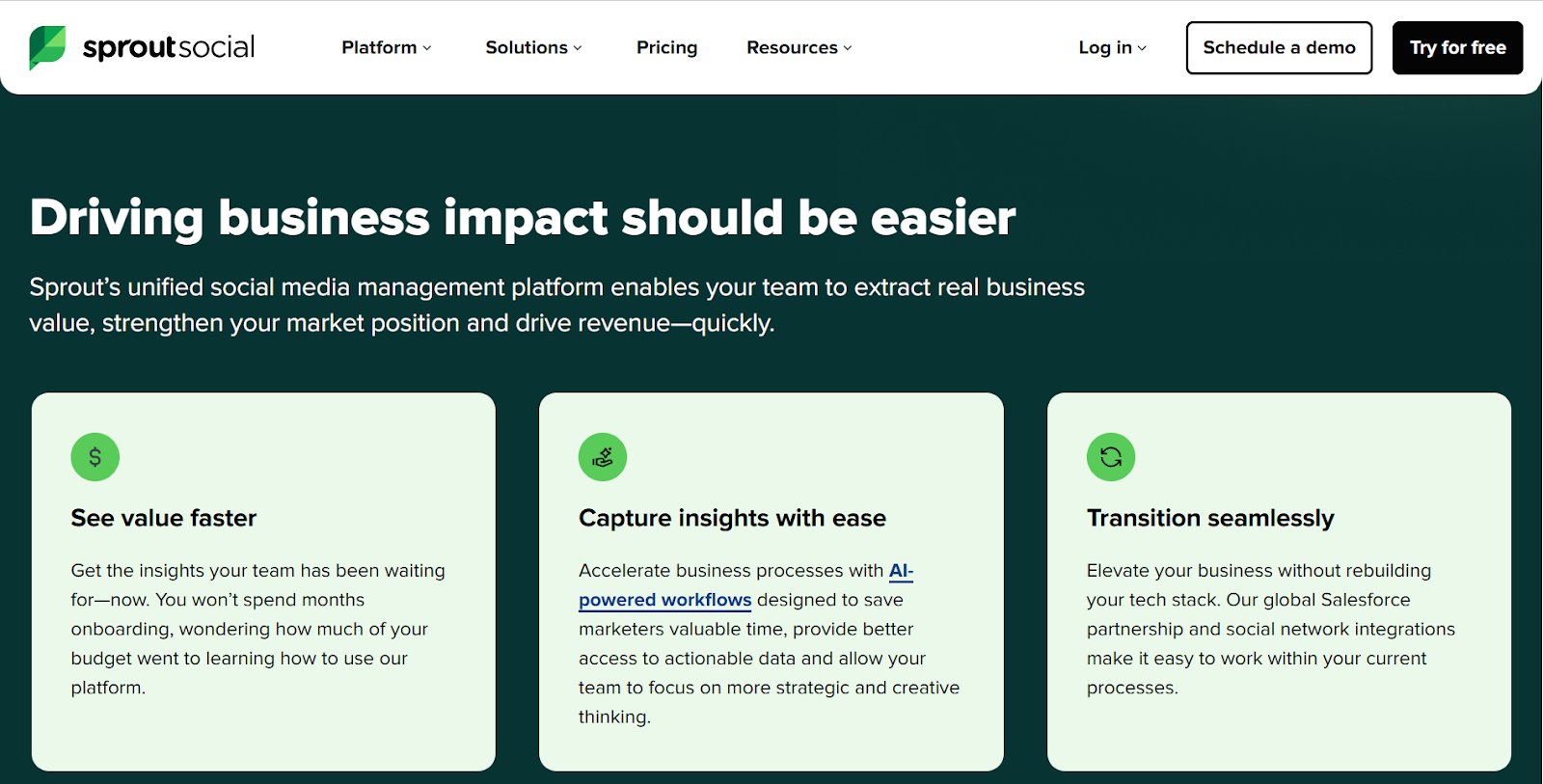
Why it works: This headline clearly states what Sprout Social offers (a unified platform) and directly ties it to meaningful business outcomes (value, market strength, revenue). It’s specific, benefit-led, and reinforces speed, which appeals to decision-makers looking for fast ROI.
Strong hero visual or video
Your hero image or background video should instantly communicate what your offer is about. Avoid bland stock images. Instead, show your product or service in action, or visualize the outcome users can expect.
Think: a real person using your product, a short demo, or a glimpse of transformation.
Example: Mixpanel
Visual: A clean hero section featuring a live product interface demo showing analytics dashboards, charts, and tracking features in action.
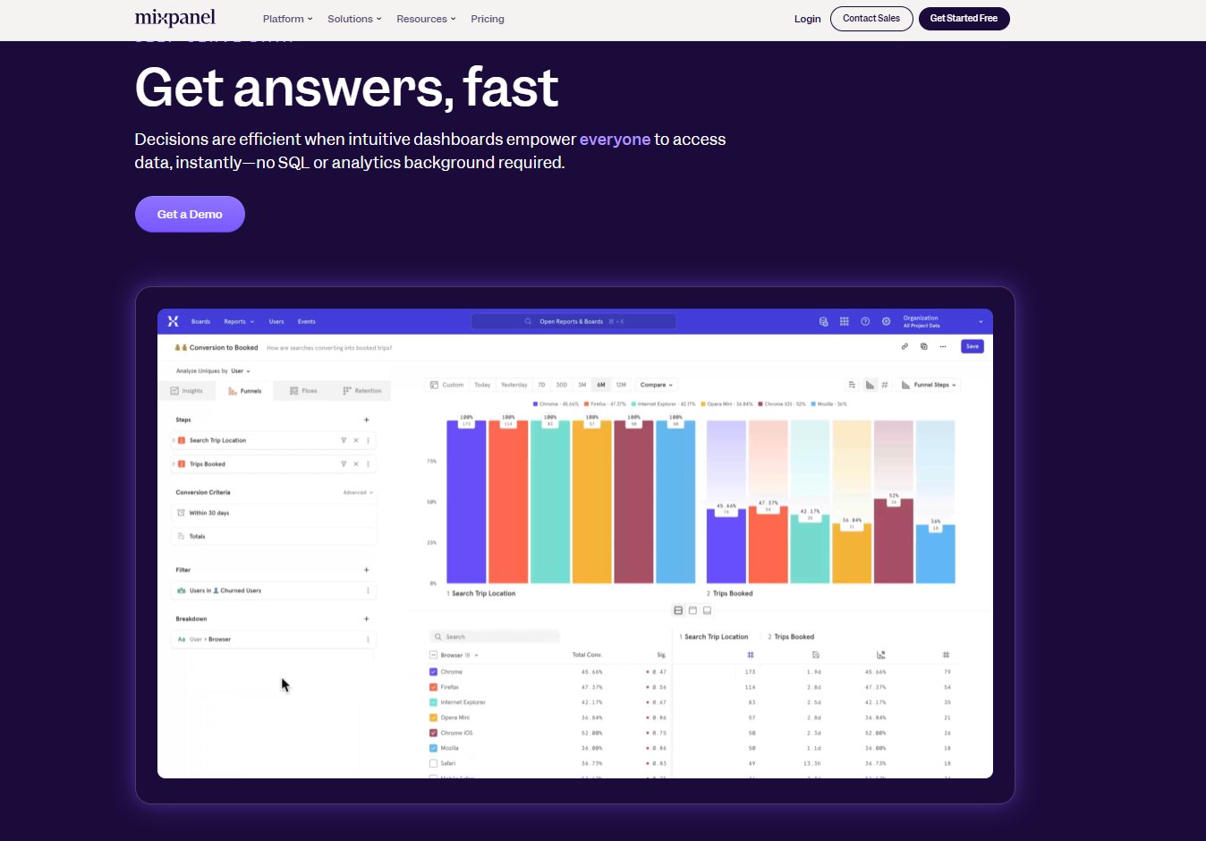
Why it works: Instead of explaining with text, Mixpanel shows potential users the experience. This helps visitors instantly visualize how the platform fits into their workflow.
Minimal, high-converting lead capture form
Your form is your conversion point. Keep it short to reduce friction.
- Ask for only the essentials (usually just name and email).
- Use optional or hidden fields if you want to collect more passive data.
- Include microcopy that reassures (“We’ll never spam you”).
Important tip: If your offer is high-value (like a consultation or audit), longer forms are acceptable, just make sure the value justifies the effort.
Example: VWO
Form type: A Request Demo form with just a few essential fields, positioned above the fold and paired with a customer testimonial plus trust indicators.
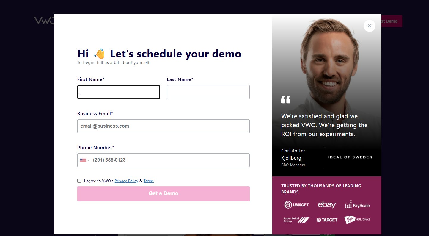
Why it works: The minimal field requirement lowers friction, making it quick for visitors to take the next step. Placing the form alongside social proof reinforces credibility, while trust markers reduce hesitation; a combination that helps capture leads more effectively without overwhelming the user.
Compelling, action-oriented CTA
The call-to-action button is where the decision happens. Make it prominent, persuasive, and personalized.
- Use high-contrast colors and large fonts.
- Avoid generic labels like “Submit”; instead, try:
- “Send Me the Ebook”
- “Get Instant Access”
- “Start My Free Trial”
A well-worded CTA directly impacts your conversion rate. Make it about what the user gets, not what they have to do.
Example: ClickUp Productivity Platform
CTA Button: “Get Started – It’s Free”
Supporting microcopy: “Free forever. No credit card required.”
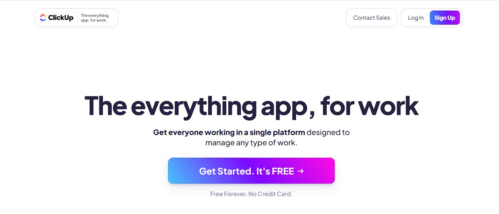
Why it works:
- The action is clear (“Get Started”) and benefit-focused (“It’s Free”).
- The reassurance directly addresses sign-up friction by eliminating cost and commitment fears.
- The CTA stands out visually with a contrasting color and plenty of white space.
Benefit-oriented messaging
Go beyond features. Highlight what your user gains from your offer: time saved, money earned, clarity gained, etc.
- Keep the copy concise and broken into bullets or micro-sections.
- Use “you” language; speak directly to the visitor’s goals or pain points.
- Support benefits with relevant proof points (data, testimonials, or case snippets).
Offer ideas: Webinars, free tools, cheat sheets, strategy sessions, trials, or gated ebooks.
Example: Amplitude’s onboarding landing page invites users to “Get access to robust web analytics”, offering a free account that provides unified insights, including web analytics, session replay, conversion tracking, and KPI dashboards, all activated with a single sign-up.
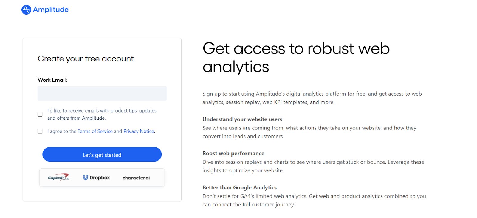
Why it works: The headline leads with the core benefit, and the bullet points make the value concrete. Visitors instantly understand what they’ll get and why it’s worth handing over their details, which reduces friction and boosts sign-ups.
No navigation or external links
Keep users within the “conversion tunnel.” Your lead gen landing page should have one path: no menus, no footers, and no links to other pages that might distract or delay action. Every exit opportunity you leave is a conversion lost.
Example: Airbnb’s host signup landing page removes all traditional navigation and external links, focusing solely on the hosting offer. The page features a localized earnings estimate tool, benefit-driven copy, and a single CTA: “Get Started.”
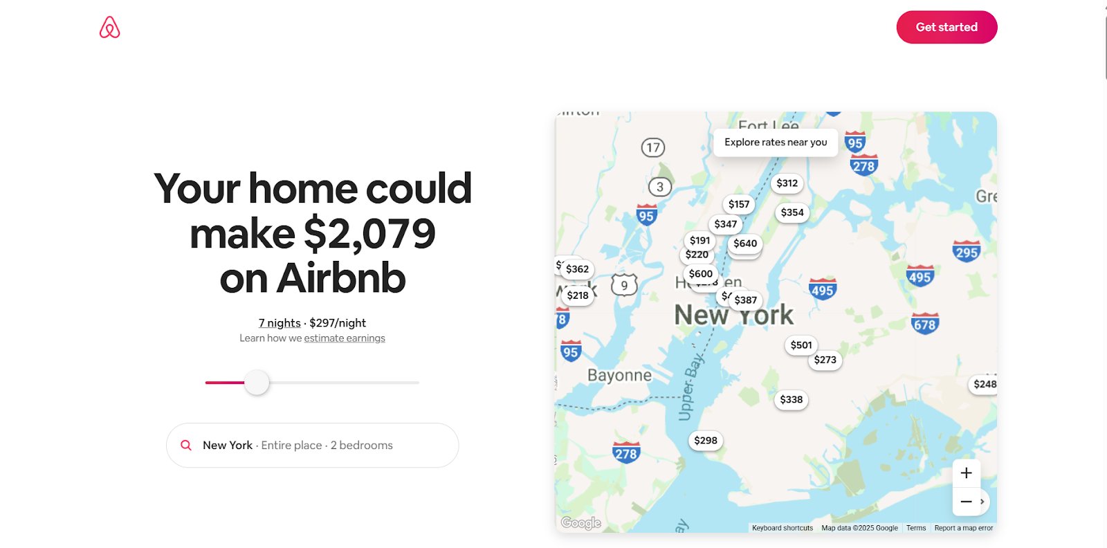
Why it works: By eliminating distractions, the page keeps visitors focused on one clear path, starting the hosting process. The income calculator adds personalization and relevance, making the CTA even more compelling.
Mobile optimization & fast loading
A slow or clunky page loses leads before they even see your offer.
- Compress images and scripts to reduce load time.
- Use a mobile-responsive design: forms and buttons should be easy to use on any device.
- Test across devices and browsers regularly.
According to Google, 53% of mobile users abandon a site if it takes longer than 3 seconds to load.
Example: Shopify’s free trial landing page loads in under two seconds on mobile and adapts perfectly to smaller screens. The form uses large, thumb-friendly input fields, the CTA button is prominent without scrolling, and the page avoids heavy imagery that could slow load time.
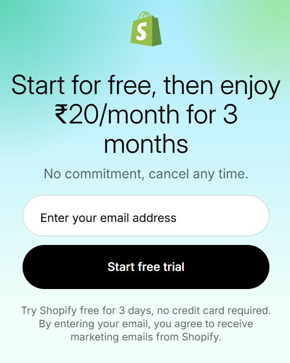
Why it works: Ensures mobile visitors can navigate, view offers, and complete sign-ups without friction, protecting conversion rates on smaller screens.
Social proof and trust signals
Help users feel safe and confident. Add real-world credibility with:
- Testimonials or reviews
- Client logos
- Security badges
- Star ratings or social mentions
Even a simple quote like “Trusted by over 10,000 marketers” can significantly reduce skepticism.
Example: HubSpot’s product demo landing pages feature client logos and review ratings from trusted platforms like G2, all positioned near the signup form.
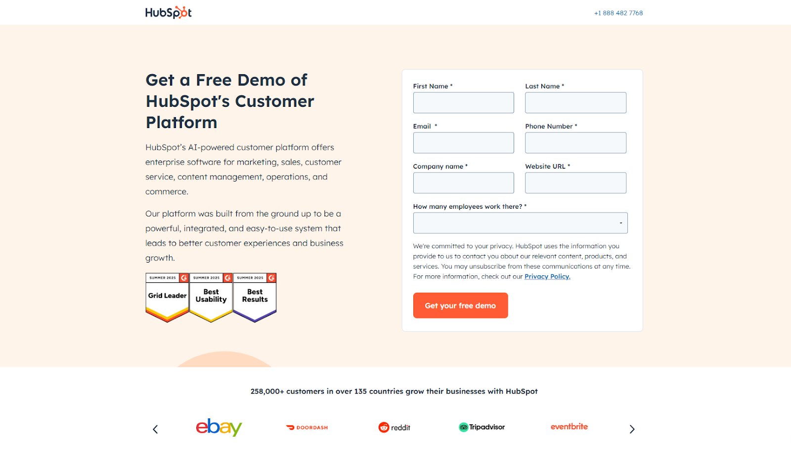
Why it works: These trust badges offer strong, third-party validation that reassures visitors of the platform’s quality before they even submit their essential information. By placing them near the sign-up form, HubSpot reduces hesitation and encourages conversions with tangible social proof.
The most effective landing pages are never “done.” They’re tested, tweaked, and improved continually.
An effective lead generation landing page doesn’t overwhelm or confuse; it guides. When these elements come together with clarity and focus, they don’t just collect emails; they build your pipeline with high-quality, high-intent leads.
How to optimize a landing page for lead generation
To optimize a lead generation landing page, along with the right elements as above, approach it as a structured, continuous improvement process. Instead of guessing, use data to guide every change.
Track the right metrics
Monitor key indicators like:
- Conversion rate: to measure the percentage of visitors completing your primary objective, whether that’s a form submission, newsletter signup, event registration, or content download.
- Bounce rate: to spot the share of visitors leaving without engaging, pointing to relevance, messaging, or load-time issues.
- Form abandonment: to perform granular analysis of individual fields: see where users hesitate, spend more time, or have to refill entries.
These and tracking any other metrics that can be specific to a business will help pinpoint exactly where and why visitors aren’t converting, giving you a clear focus for improvements.
Pair metrics with qualitative insights
Numbers reveal what is happening, but not why. Use heatmaps to visualize click and scroll patterns, session recordings to spot hesitation or confusion, and form analytics to identify which fields cause drop-offs. Together, these tools paint a clearer picture of friction points and opportunities.
Form data-driven hypotheses
Use these insights to pinpoint problem areas and ask specific questions like, “Would shortening the form increase completions?” or “Would a benefit-led headline improve clicks on the CTA?”
Hypotheses ensure you test changes with a clear purpose, avoiding random trial-and-error.
Prepare a pre-launch checklist
Before you launch, lock down these parameters to ensure clean execution and trustworthy results:
- Choose the test type: A/B for single-variable changes; MVT when you have the traffic to detect interaction effects; server-side for performance-critical or logic-heavy changes.
- Mobile usability: Design mobile-first: use correct input types (email/tel), ensure the keyboard doesn’t hide fields, keep tap targets finger-friendly, and prevent sticky CTAs from covering content.
- Set traffic split: 50/50 for speed, or ramp 10→25→50% to control risk.
- Set duration: Span a full business cycle.
- Compute sample needs: Required sample size, MDE, and power.
- Lock rules: Guardrails and stopping rules in advance.
Analyze the result
Don’t just ask “did it win?” Slice-and-dice by device, traffic source/campaign, new vs. returning, and location to see where it worked.
Review guardrails, bounce rate, error rate, and page speed to make sure a higher conversion rate isn’t hiding damage elsewhere. If any guardrail worsens beyond your thresholds, treat the result as unsafe, fix the issue, or iterate before shipping.
Plan to iterate
If you have a winning variation, ship it and push the idea further (stronger benefit, fewer fields, clearer guarantee).
If the result was flat, turn up the contrast or try a different lever: message order, proof, placement, or layout.
If it is a lost test, note what didn’t work, and test an alternative that tackles the friction you saw.
Keep a prioritized backlog and re-test when seasonality or traffic mix changes.
Best examples of lead-generating landing pages
Lead generation landing pages come in many forms, each tailored to a specific type of offer and audience intent. Below are some of the most effective formats to capture high-quality leads:
Newsletter sign-up pages
Ideal for building an owned audience you can engage with regularly. These pages work best when the benefits of subscribing are crystal clear and the sign-up process is quick.
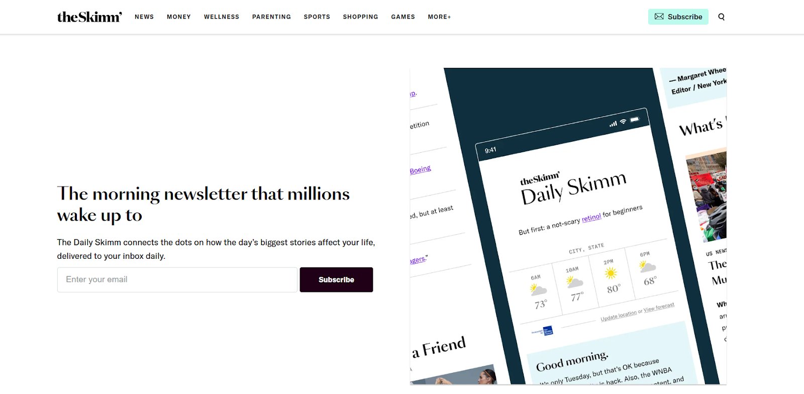
Example: TheSkimm uses a single-field email form, a bold promise (“Making it easier to be smarter”), and social proof showing millions of subscribers, making the value of joining feel instant and obvious.
Ebook or guide download pages
Designed to offer in-depth, exclusive content in exchange for contact details. Success hinges on clearly stating what the reader will gain and keeping the form short.
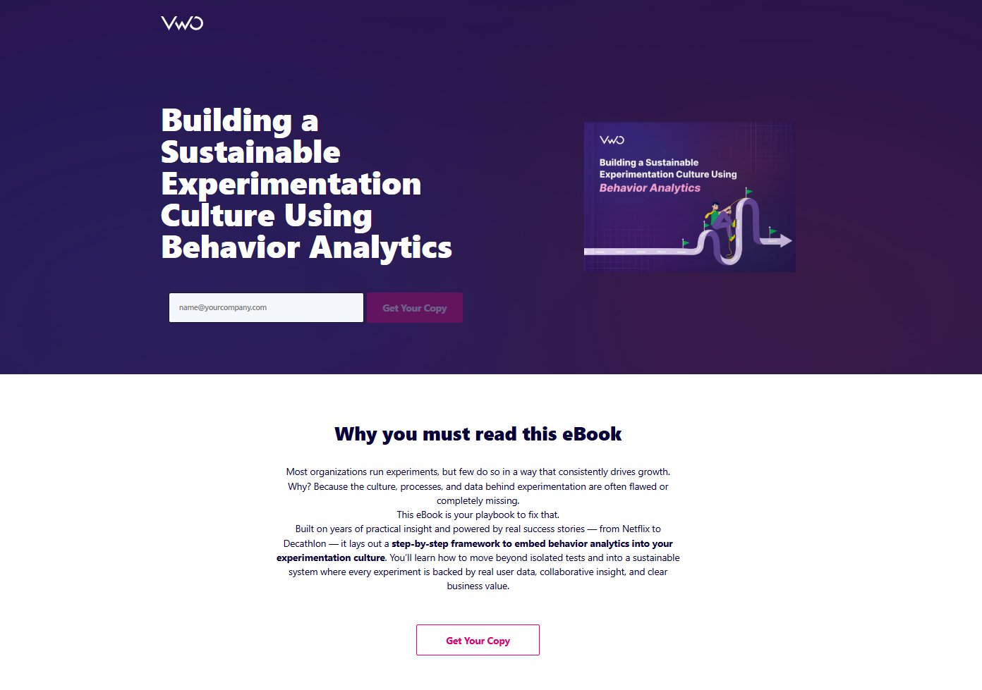
Example: VWO’s ebook page features a short form with essential fields and a clear “Get Your Copy” CTA, backed by outcomes-focused copy and streamlined onboarding, making the value and next step obvious.
Webinar registration pages
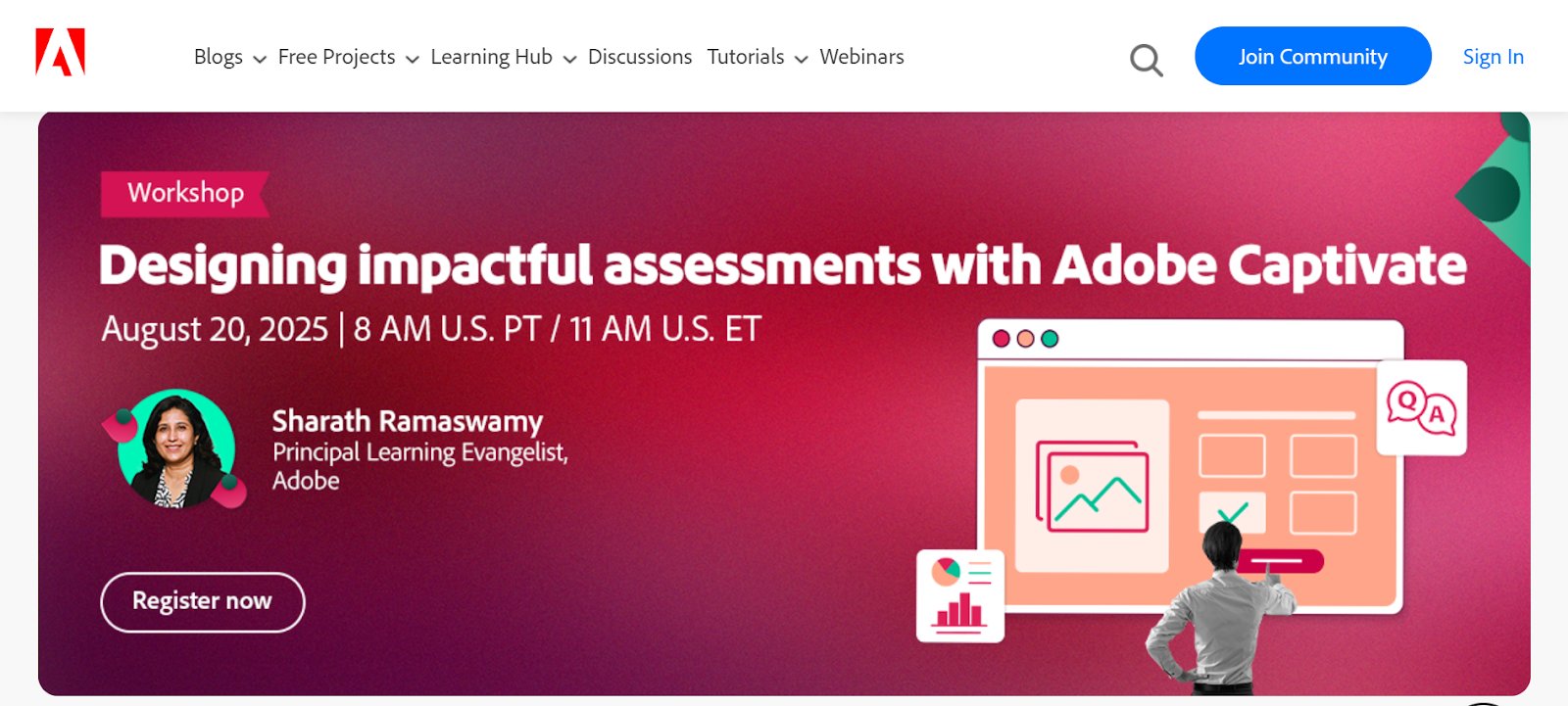
These types of landing pages are perfect for engaging prospects who want live interaction, expert insights, or product training. These pages need to convey event value quickly while making registration effortless.
Example: Adobe’s eLearning webinar pages highlight the topic, date, and speaker details above the fold, paired with a bold “Register Now” CTA. The clean layout, fewer form fields, and focused copy make signing up quick while keeping attention on the value of attending.
Free trial offer pages
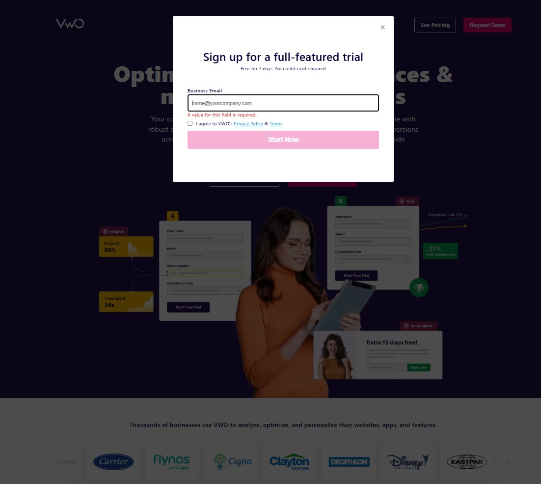
These are best suited for SaaS products that aim to quickly engage prospects in the product experience. The page should reduce perceived risk and highlight what users can achieve during the trial.
Example: VWO’s free trial page keeps the form minimal, reassures visitors with “No credit card required,” and builds confidence with business logos as social proof.
Demo request pages
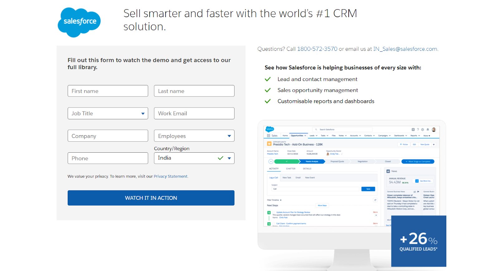
Effective for complex or high-value solutions where prospects want a personalized walkthrough. The page should make it easy to request and clearly state what’s covered in the demo.
Example: Salesforce’s CRM demo page pairs a bold, results-driven headline with a prominently placed form above the fold. Bullet-pointed benefits and proof of performance make the value of requesting a demo clear and immediate.
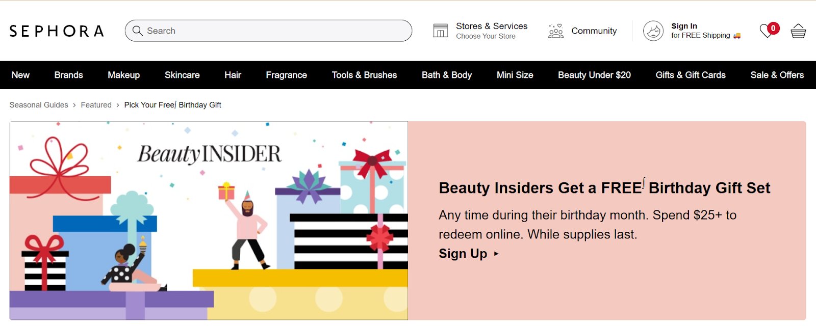
Contest or giveaway entry pages
Ideal for quickly generating large volumes of leads, especially when paired with a desirable prize and urgency messaging. The page should make entering feel simple and exciting.
Example: Sephora’s birthday gift page makes redemption simple with a quick sign-up or login, turning a free, personalized reward into a seamless lead capture opportunity.
Free tool or calculator pages
These offer immediate, tangible value while capturing leads before revealing full results. The best ones make the tool intuitive and show the benefit upfront.
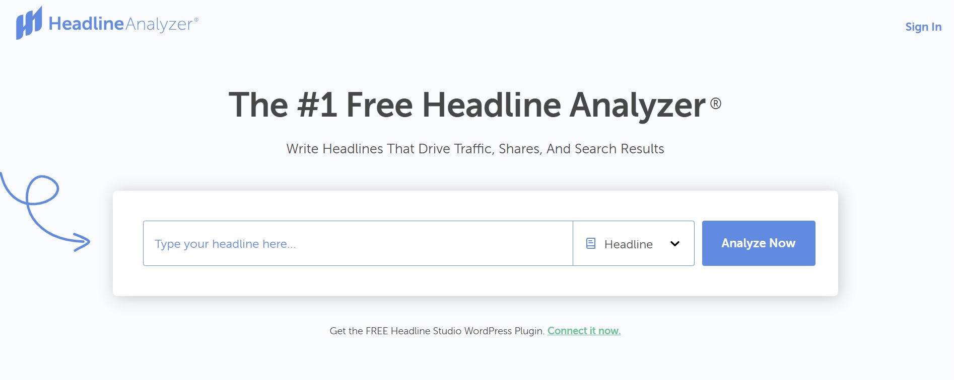
Example: CoSchedule’s Headline Analyzer lets users test headlines instantly but requires an email to save and view full results, making the tool itself the lead magnet.
How VWO helps you build high-converting lead generation landing pages
VWO gives marketers the tools to turn ordinary landing pages into lead-generating powerhouses by combining personalization, unified customer data, and continuous testing. This approach ensures you can spot and fix friction as it appears, deliver experiences tailored to visitor behavior, and continually refine messaging and layout. The result: landing pages that stay relevant, persuasive, and consistently drive the leads you need.
Behavior insights
Every optimization begins with understanding how visitors interact with your page.
VWO Insights uses heatmaps, scroll maps, and session recordings to reveal what captures attention, what gets ignored, and where drop-offs happen.
Surveys capture direct visitor feedback, uncovering the motivations, concerns, and preferences driving their actions.
Form analytics dives into field-level behavior, showing where users hesitate, take longer to fill, or abandon forms, pinpointing exactly what causes friction.
These diagnostics provide the “why” behind your metrics, giving you a clear roadmap for improvement before making any changes.
Spot friction points instantly with VWO Copilot, which automatically analyzes and interprets heatmaps and session recordings, turning raw behavior data into actionable optimization opportunities, no manual analysis required.
A/B, Multivariate, Server-side testing
Armed with behavioral insights, the next step is to validate hypotheses through testing.
- A/B and Multivariate tests: comparing two variations to see which performs better, or make multiple changes in a variation, and assess multiple element changes at once to find the best combination.
See how SafeSoft Solutions used VWO to A/B test adding a visible price next to their PPC campaign’s lead form, resulting in a 100% increase in leads.
- Server-side testing – Run experiments that require backend changes (dynamic form fields, validation/routing logic, field sequencing). Ideal for complex flows, especially landing-page forms, where server rules directly drive completion rates.
Book a demo customized to your business needs and discover how VWO can optimize your landing pages to keep qualified leads coming in.
Content personalization
VWO Personalize enables you to tailor experiences in real time based on visitor segments or in-session behavior.
The built-in Visual Editor allows marketing teams to make these changes directly on the page, adjusting layouts, inserting dynamic text, or swapping modules, without relying on developers.
This ensures that the messaging, offers, and visuals on your lead generation landing page match what the prospect is looking for at that exact moment.
Integrated customer data
Finally, VWO’s Data360 pulls behavioral and contextual data from websites, apps, and other sources to build detailed customer profiles. By segmenting audiences by device, location, browsing habits, or campaign data, you can serve hyper-relevant landing page experiences to drive the right next action, demo requests, trial starts, downloads, or bookings, while attracting better-fit leads..
Use VWO Copilot’s AI-discovered audience segments to identify exactly who engages with your campaigns, then save and reuse these segments to speed up future testing and personalization efforts.
FAQs
A lead generation landing page is a standalone web page designed to capture visitor information, via a form, in exchange for a valuable offer, such as an ebook, webinar, demo, or free trial.
Define your offer and target audience, create a focused message, design a clean layout with one primary CTA, add a short form, include trust signals, and test for mobile and speed performance.
A clear value proposition, compelling headline, strong visuals, a concise lead capture form, a persuasive call-to-action (CTA), benefit-focused copy, social proof, minimal navigation, and fast load speed.
Most lead generation landing pages want visitors to submit their contact information, often by filling out a form to access an offer or resource, thereby becoming a qualified lead for follow-up marketing.
Track key metrics, A/B test headlines, CTAs, and layouts, personalize content based on audience segments, simplify forms, improve mobile responsiveness, and use heatmaps or analytics to refine user experience.
Categories:


![7 Best Sales Funnel Software for Every Business in 2026 [Backed by Expert Reviews]](https://static.wingify.com/gcp/uploads/sites/3/2025/01/Feature-image-7-Essential-Sales-Funnel-Software-for-Every-Business_-Top-Picks-for-Every-Purpose.jpg?tr=h-600)

![7 Top Landing Page Optimization Tools for 2026 [Ranked by Marketers]](https://static.wingify.com/gcp/uploads/sites/3/2024/10/Feature-image-Top-7-Landing-Page-Optimization-Tools-1.jpg?tr=h-600)