Let’s cut right to it. We all suck at conversion. According to E-marketer, 98% of online traffic leaves a site without filling out a form or completing a purchase. That means you have missed a chance to start building a relationship with potential customers. While it’s easy to shrug off a low on-site conversion rate, imagine if you owned a physical store and 100 people walked in… and 98 walked out without interacting with a representative or making a purchase. You’d be pretty sad, right? Yet, that’s what most of us are doing in our online stores and are not able to increase website conversions.
Download Free: Customer Experience Optimization Guide
Why do we do this to ourselves?
For starters, most organizations are thinking about their product far more than they are thinking about conversion. If you’re a publisher, it might be the articles you are producing. If you have an online store, it’s literally the products you are sourcing, merchandising, and selling. If you’re a non-profit, it’s the services you are providing to the world.
They are also likely thinking about how to drive site traffic, whether that is through building a social media presence, paid search, radio, or even print ads. But they often forget the critical piece of the funnel, which is on-site conversion.
From the smaller groups of organizations actively trying to drive conversion, most fall into one of the two camps. They either take a very passive approach to avoid being too salesy or take an overly aggressive approach, with forms coming at a visitor from all angles and blocking the site’s core content. But that’s not what good salespeople do. They take what they know about a prospect (in this case, a site visitor), and they use this information to craft a message.
What we know about site visitors
Through the magic of digital marketing, we know a lot about a site visitor without having to ask. While some people may find this creepy, for marketers, it is an untapped goldmine of messaging opportunities. For example, we can usually answer the question:
- Where did they come from?
- Is this their first visit?
- What page are they on?
- How many pages have they looked at?
- What language do they speak?
- What device are they on?
- How much is in their cart?
What do you do with that information?
While most organizations who have started thinking about conversion might have a simple opt-in pop-up form for visitors on their site, those focused on it can use the information to their advantage to create a better targeted experience for visitors on their site. They can craft different messages based on who they are and what they have done.
CityCliq increased its click-through rate by 90% by rigorously testing the positioning message on its homepage.
Another example to cite here: I’m going to imagine an eCommerce company selling women’s clothing, and I want to offer a 10% discount to new customers who sign up for my email list. While you probably wouldn’t want to hit someone with ALL of these messages, you can see how your core message might change based on what you know about a visitor.
| Question | What We Know | Messaging Strategy |
| Where did they come from? | The visitor clicked on an Instagram ad featuring a specific blue swimsuit. Try featuring the product that they already expressed interest, in within your message. | “Looking for a new swimsuit? Get 10% off your first purchase by entering your email below.” |
| Is this their first visit? | They have visited before but have never bought anything from you. Don’t treat them like a stranger! | “Welcome back to my store! We’ve just launched a new product line. Sign up below to get 10% off your first purchase.” |
| What page are they on? | They are on the “About” page of your site and not actually shopping. Try a “stay in touch” message over a discount. | “Sign up to hear about new products and special offers.” |
| How many pages have they looked at?
AND How much is in their cart? | They have looked at 7 different pages in your store without adding anything to their cart, which means they are browsing but are not yet sold. | “Having trouble finding what you are looking for? Sign up, and we’ll let you know when we launch new products and give you a 10% discount for your first purchase.” |
| What language do they speak? | The visitor’s primary language on their browser is Spanish. | “¡Bienvenidos a mi tienda! Regístrese abajo para obtener un 10% de descuento en su primera compra.” |
| What device category are they on? | The visitor is on a mobile device, which is a great cue to slim down your text. | “Sign up today for a 10% off on your first purchase.” |
How to deliver the message?
When delivering the message to your site visitors, you need to think about two things—timing and format. Let’s look at the format first :
1. Targeted displays
There are three categories of display that drive the most on-site conversions.
– Pop-ups: Pop-ups, also known as lightboxes, are typically displayed in the center of the website or sometimes as “flyouts” in the corner.
– Bars: A full-width bar that typically sits at either the top of your site or the bottom.
– Banners: A more subtle interaction that sits at the top or bottom of a site but starts in a “hidden” state until triggered and then rolls into sight at the desired time.
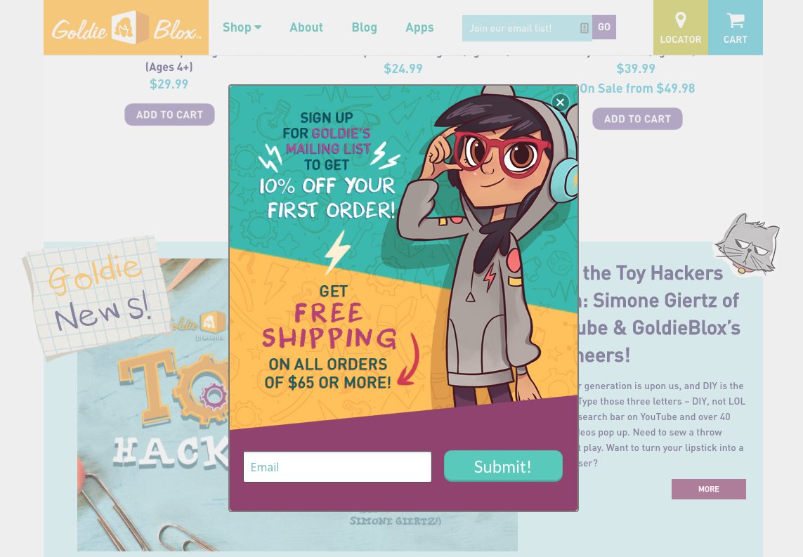
Image source: Goldie Blox
Download Free: Customer Experience Optimization Guide
2. Chat
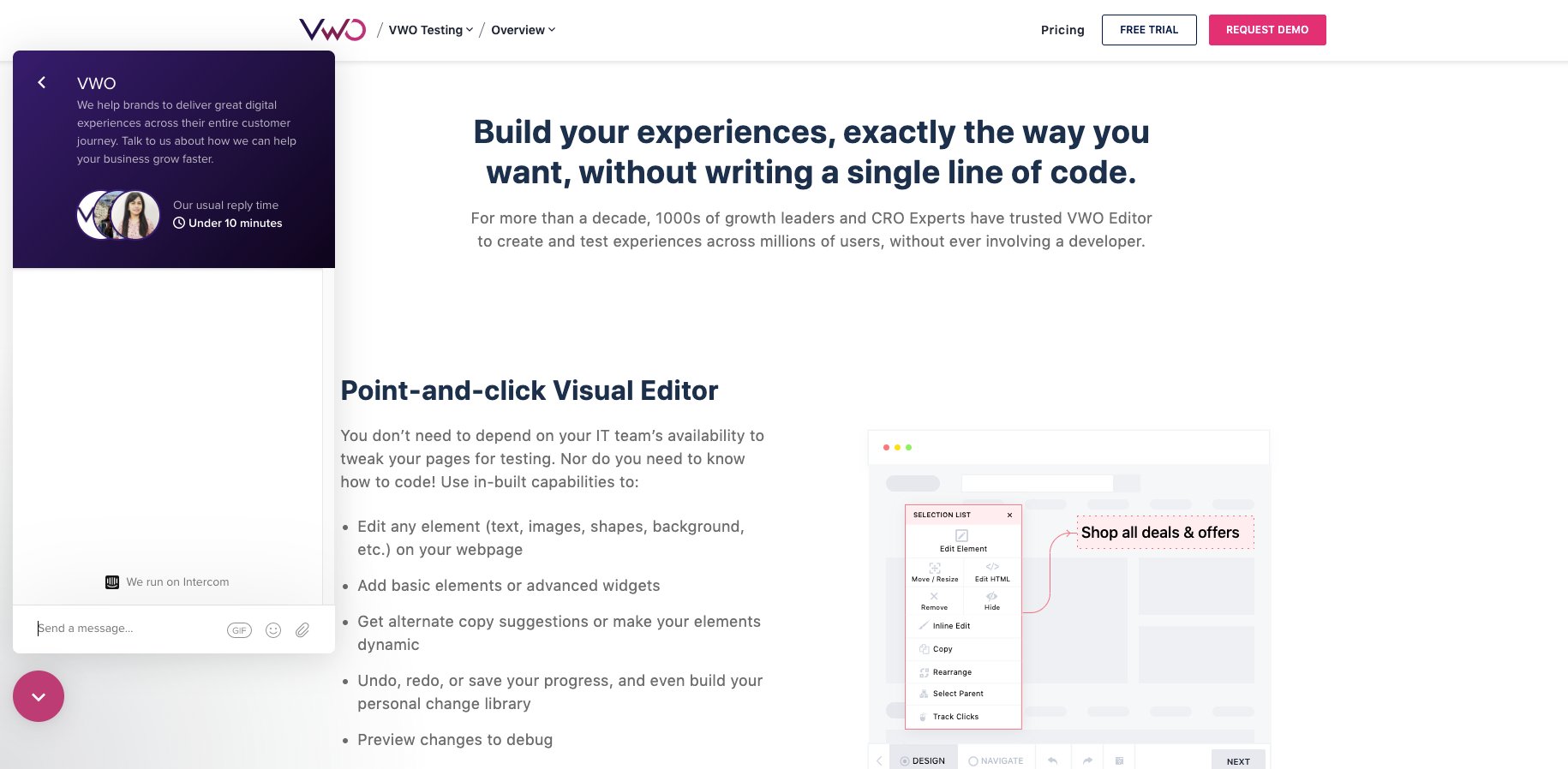
Successful online stores are investing in automated and live chat to help reduce the anxiety that consumers feel before making a purchase from a new retailer. In fact, the availability of a “live” person on your site accomplishes two important goals:
– It allows people to ask any questions ahead of completing a purchase. This inspires confidence, especially for larger ticket items, that they are making the right decision
– It tells them that if something goes wrong with an order, there is a real person they can reach out to for help. The combination of those two factors makes shoppers more likely to hit the buy button.
– The combination of those two factors makes shoppers more likely to click the Buy button.
3. Video
The third way of delivering the message that can have a huge impact on conversion is the use of a video. Unlike static imThe third way of delivering a message that can significantly impact conversion is the use of a video. Unlike static images and text, video helps bring your products to life and gives you a chance to explain why someone should buy and put the product in a real-life context. In others, a video lets you tell a broader story of how the product came to be in the first place. Here’s an example of the one I love (and am desperate to own).
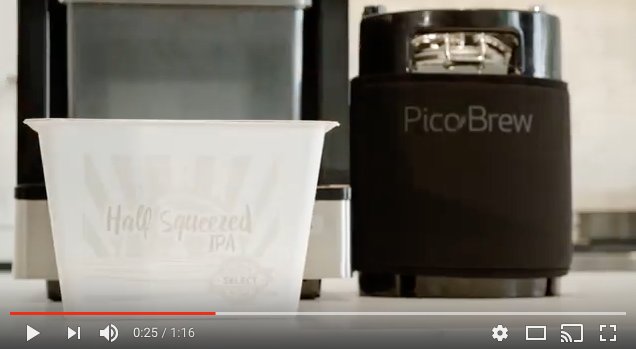
Image source: YouTube
Triggering your messages
The second consideration is deciding when to trigger each of your messages. There are four primary ways you can trigger a campaign to your desired audience.
- Timer: This trigger enables you to determine when to display your campaign, based on how long a visitor has been on your site. It could show immediately when a visitor lands, 10 seconds later, and so on.
- Exit intent: This trigger is growing in popularity. Exit intent tracks your visitors mouse movement, and if the visitor appears to be leaving or “exiting” your site, you can use that as a trigger for your campaign.
- Scroll percentage: Show your campaign when a visitor scrolls down a certain percentage of your page.
- Tabs: Tabs or other visual calls to action can be customized to fit in with your site layout, and when clicked, trigger your campaign to be displayed.
Which converts best?
Ultimately any combination of targeted messaging delivered through displays, videos, and chats will improve your conversion rate. We’ve looked at thousands of campaigns and found that each display type and the trigger can be effective. Because investing in videos can take significant resources (time and money), I recommend starting with display and chat to deliver the right message at the right time. When you have videos on hand, you can embed them on your product pages to level up your product content and add them into your displays to get them in front of shoppers as they browse your site.

In terms of display types, banners are actually the highest converting format largely because they are less subtle than a simple “bar” but less frustrating to visitors than pop-ups that interrupt the browsing experience before a visitor has had a chance to consume any of your content. In addition, we find that triggering a campaign in less than 30 seconds from the time a visitor lands on your site (or a specific page) is most effective in driving conversions.
Setting that data aside for a second, recent trends are showing that among the most impactful things you can do if you operate an online store is actually combining a pop-up with an exit-intent trigger that serves as a “cart saver.” Simply put, if someone is visiting your store and attempts to leave by closing the browser tab or clicking the back button, you can show a message with a special offer that gets them to sign up and continue shopping while giving you permission to market to them in the future.
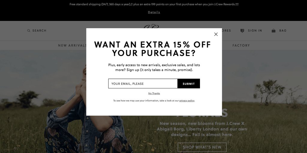
Image source: proof
Walk. Jog. Run.
So, where do you get started? You don’t need to craft custom messages for every audience and every page on your site right out of the gate. We suggest thinking about one or two of your most common audiences and creating targeted offers and messages just for them.
You should be able to track, test, and adapt before rolling out a full on-site conversion program. Getting started is easier than ever with affordable exit-intent options for all businesses.
Bonus content: Watch a webinar on crafting a stellar copy


