You spend hours upon hours planning an A/B test.
Coming up with a solid hypothesis, getting buy-in from stakeholders, creating new designs for the variation, and ensuring everything is in place to execute it.
Finally, you launch the test and eagerly wait to know how visitors interact with it.
The numbers slowly roll in. But it’s not what you hoped.
Test reports indicate that the control ultimately outperformed the variation.
And just like that, all your hard work has led to a possible ‘failed’ test.
This is a recurring scenario for every experimentation team. And when it happens, most of them just scrap the hypothesis and move on to the next one.
But are you missing a crucial stage in this optimization cycle?

Your reports are just numbers
A/B test reports tell you how many visitors were part of your experiment, the number of conversions, and the percentage of uplift or drop your test recorded.
You take one look at the report, and you instantly know whether your test was successful or not.
And that’s about it.
The report does not provide any additional information about why your test performed the way it did.
You don’t know which factors influenced visitor actions, whether any glitch impacted their experience, or if they got distracted by something else on the page.
So, even though reports give you a clear indication of how the test performed, you still won’t know the context or reason for it.
That’s because you are only looking at the numbers or the quantitative side of data.
Use VWO Copilot Editor to instantly generate custom variations for your test. Just select the section you want to tweak, enter a prompt, and let the AI-powered tool create multiple options to test against your control. Skip the tedious process of creating each variation manually, and streamline your workflow in a few clicks.
The ‘What’ vs ‘Why’: A never-ending debate of two data types
When it comes to research and optimization, you usually deal with two types of data.
Quantitative data (The ‘What’)
This data type includes metrics that can be defined by numerical values.
For instance, conversion rate, bounce rate, click-through rate, page views, average order value, and so on.
Based on this quantitative data, you can answer some key questions:
- How many visitors clicked on the banner?
- What is the visitor drop-off rate on a page?
- How many visitors completed a purchase?
In A/B test reports, this data type enables you to track the performance of your tests and helps measure the impact of your changes on a larger scale.
Qualitative data (The ‘Why’)
This data type is more descriptive and observational, as it offers context for the actions that visitors take on a website or app.
With qualitative data, you can get more context around questions like:
- Why did visitors abandon a purchase?
- Where do they click the most on your website?
- Which factors led to them dropping off a page?
This data is collected through various tools and methods, including heatmaps, session recordings, and website surveys.
While quantitative data can highlight a problem area, like low conversion on a specific page, qualitative data is often needed to get to the root of the cause.
With a balanced approach, you can go beyond the numbers to understand why exactly visitors are struggling and drive impactful changes at scale.
Hidden ‘limitations’ of the typical A/B test report
While A/B test reports offer strong insights into visitor actions, such as clicks, drop-offs, and conversions, they fail to reveal the reason for these actions.
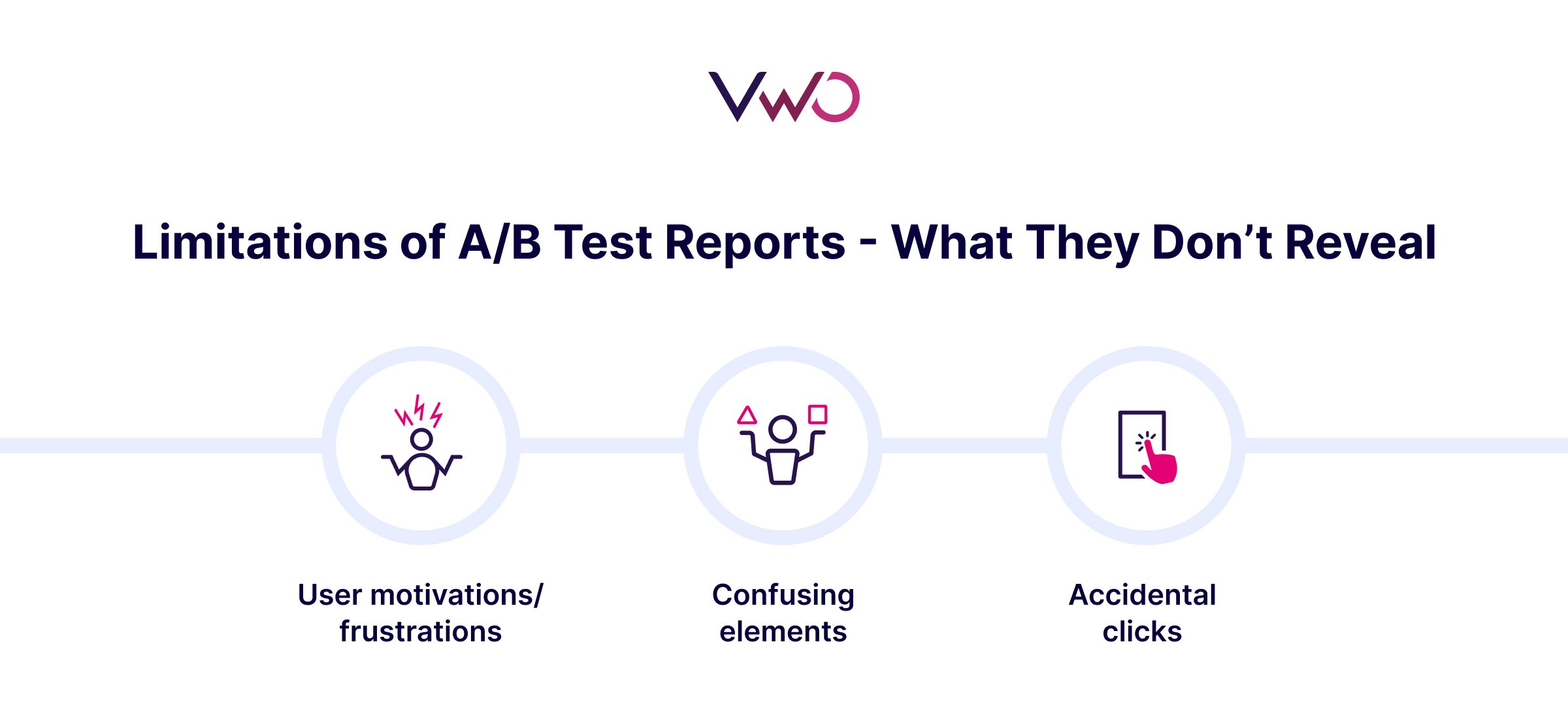
User motivations or frustrations
When it comes to A/B tests, only one out of seven has a winner. This means more often than not, you might end up with an underperforming variation.
While a test report clearly tells you that your variation did not win, there are some crucial questions it does not answer.
- Was the change in the variation noticed by visitors?
- Did it make them feel more confident or more anxious?
- Were they distracted by something else on the page?
These questions reveal the motivations or frustrations that visitors probably face on your website, but don’t show up in quantitative test reports.
And without clearly understanding what was driving visitor behavior, you might either discard a good idea or spend resources on a weaker one.
Confusing UI elements or unexpected friction
Even well-designed pages have minor roadblocks or friction points that quietly derail the visitor experience.
For instance, visitors may struggle to locate a CTA, get confused over the next step in a flow, or miss a key element altogether.
But these problems are not showing up in your test reports.
And without in-depth qualitative analysis, they would probably remain undetected and continue to hurt the user experience.
Accidental clicks or misleading design cues
Not every click is a positive interaction.
In some cases, visitors may click on elements they thought were clickable, like images, icons, or underlined text, only to be met with no response.
For instance, a visually striking banner might get tons of clicks, not because it’s helpful, but because users think it’s a product feature or a next step in the flow.
However, quantitative data just shows ‘more clicks’, failing to convey the misleading cues or confused behaviors that led to it.

Look for the ‘why’ in your test reports
These minor behavioral nuances can directly influence the outcome of your test.
And while a test report offers reliable quantitative data, you must complement it with qualitative analysis to see the bigger picture.
A well-balanced approach can help you identify the hidden insights in test reports, tackle challenges with better ideas, and eliminate guesswork.
In our upcoming posts, we’ll also discuss how you can leverage solutions like heatmaps and session recordings to dive deeper into test reports.

For instance, a heatmap might visually demonstrate high clicks and engagement on a non-clickable banner, indicating some confusion over the design.
Also, watching a session recording could reveal where exactly a visitor hesitates, gets stuck, or drops off during an A/B test.
These ‘hidden’ insights often highlight key usability issues that are not evident in quantitative metrics and are also not a part of your typical test report.
We’ll break down the importance of these tools and discuss how you can seamlessly integrate them into your testing program.
You can also request a demo with VWO to explore how these capabilities can complement your optimization efforts.
Categories: