101 Elements Of A Complete eCommerce Product Page
Is there a concept like ‘a complete product page’?
Chances are if you have ever found yourself on an eCommerce product page you have figured out the basic elements:
- The Headline
- The Product Image
- The Product Specifications
- Pricing
- The Call to Action buttons
- The Payment methods
Download Free: Customer Engagement Guide
Shouldn’t that be enough to make a sale? The user lands on your product page, a self explanatory title to the product he wants finds him, he reads the specifications (color, size, material, make, model, related features), after a glance he starts to look around for the payment methods. He likes it, presses the CTA button and bam! Sold! Works like the good old brick and mortar stores, or not?
The better question is; Is there something like complete shopping experience?
The answer is ‘Yes’. There are 101 elements to put together on a product page to complete that experience. If you are one of the lazy lot like most, there’s a quick checklist to save at the bottom of this page.
To know how these elements work, stay with us..
Put yourself in the customer’s shoes..
- You get into a retail store to buy pasta, you are greeted by the nice security guy at the door. The store manager smiles at you. You are pointed to the right shelf.
- You scan through the variety of pasta (Spaghetti, Fusilli, Penne and Farfalle in tempting packaging). One has a free dip to go with it, you take it.
- On the next shelf you find some dried rosemary, “Why not make it an exotic recipe?” you add it to your cart.
- Now, you are looking for your preferred brand of ketchup, the staff member arranging goods on the shelves tells you they are out of stock.
- A lady, another customer, exchanges greetings, casually mentions she loves the Tabasco and the Sriracha from a particular label. You take a bottle each.
- The sign boards take you to the cash counter.
- The lady at the cash counter wears a reassuring smile. She suggests you buy the fresh herb instead of the dried rosemary and offers to get it quick for you, you oblige.
- A little guilt for overspending creeps in, you cancel one of the exotic sauces “I don’t need Sriracha!”. The friendly lady at the the counter smiles and excludes it.
In analogy, your product page is the retail store. The friendly security guy, the store manager, the staff member, the options, the distractions, the freebies, the branding, the other customer, the sign boards, discount coupons, the reassuring lady at the cash counter who cares about your recipe enough to add fresh herbs to it are all eCommerce product page elements.
Why would you press that button or make a purchase without the complete experience online?
Persuasion: The Reason Your User Will Press the Button
Subtle and not so subtle psychological factors are at play when persuading people to buy. Cialdini’s six principles of influence govern the product page elements on eCommerce as well. Here is a classification of the functional product page elements listed down for your convenience.
Reciprocity (It’s a Give and Take)
In simple terms tell your consumers you care and they’ll care to buy from you.
‘Hey, we want to save you some money, here’s the coupon for this product in your cart.’
‘If you want to talk we have a discussion board.’
Live chats and availability pop ups make your eCommerce site more interactive and human. Who doesn’t like a considerate seller?
The eager to help staff member at the mart and the lady at the counter know this secret. They are doing their job well by being helpful and responsive.
- Add – Ons
- Shipping Information
- Show Speed Of Results
- Industry Feedback
- Tools For Rating Reviews
- Notify When This Item Becomes Available
- Live Chat
- Flag Item
- Contact Us Link
- FAQs
- Feedback
- Benefits/ Freebies
- Discount
- Sorting Feature
- Store Finder
- Track Orders
- DataSheet, Brochure Or Manual
- Coupon Code Box
- Audio
- Discussion board
- Availability (In stock or out of stock)
- Return Policy
- Privacy Policy
- Search Feature
Related Post: How Badly Does Your Online Shop Need Live Chat?
Commitment (We are Creatures of Habit)
We want to belong to a common set of values, actions or belief. The consumer feels a sense of ownership when he sees ‘My Account’, ‘My shopping history’ mentioned on the product page of an eCommerce site. A history or an account is his investment into the website and hence a commitment. This commitment has to be reinforced with warranties and insurances under applicable conditions. Remember, if there is a store you visit often you are more likely to buy from them.
- Usual Payment methods
- Bookmarks
- Wishlists
- User Account Login
- Shopping (Buying) History
- Suggestions Based On Your Shopping (Buying) History
- Opt-in Form Or Subscription Form
- Guarantee
- Add this to cart
- Terms Of Service Agreement
- Insurance
- Credited points / Regular customer points
- Links to E-wallets/ Bitcoins
Download Free: Customer Engagement Guide
Social Proof (Since Everyone I Know is Doing It)

82% of consumers trust a company more if they are involved with social media. Belonging comes with acceptance. After commitment the human tendency is to look for validation. Validation on social and eCommerce sites comes with increased trust. If multiple users give rave reviews about an enlisted product people are more likely to consider buying it. Here other elements may include social share buttons which allow people to share and take an opinion on the enlistments they are interested in. That other lady at the sauce shelf shopping for the exotic sauces is the retail store’s social proof without even knowing it.
The page elements to influence by Social Proof are listed here:
- Graphs And Charts
- Citations and References
- Testimonials
- Industry Accreditation
- Experience
- Proof Of Working
- Track Record
- Proof Of Any Claim Made
- Photos And Videos Of The Product In Use
- Product Ratings
- Product Reviews (and/or Comments)
- Item Followers
- Trustmarks
- Statistics
- Seller Rating
- Follow seller
- Seller Testimonials
- “What’s Hot Now” or “What Is Popular Now”
- Survey
- Approval By Other Organizations
- From the makers/author
- Social Sharing buttons
Related Post: VWO Cart Abandonment Survey: What Makes Shoppers Buy
Authority (We Like being Led)
Authority doesn’t mean you command your users to buy enlisted wares. It means that you create awe around your products or your brand. How to do that? Has the enlisted product been endorsed by an ambassador? Was the product in news recently? Has it won any kind of recognition or awards? If so mention it, the product is more likely to sell; there’s a halo around it. The same applies to your eCommerce portal/brand name. If you have it, flaunt it!
- Formal Expertise
- News
- Tech Specs with special features
- Audio Visual advertisements
- Product Endorsement Links
- Media Coverage
- Brand certification
Likability (Like It…Will Take It!)
Liking makes a strong positive bias. This is not just acceptance this an out and out affirmation of your brand. Liking is an all-encompassing factor. It includes the UX, UI , and product presentations. It also means crazy copywriting that could lure the more adventurous buyers into visiting your website often, thus turning them into the creatures of habit who get committed to buying from you. It could be the underrated convenience that comes with the user interface or the overrated graphics, slides or product videos.
We are not going overboard with the liking factor, Heineken is selling you beer using a ‘pleasantly smiling’ typeface, ever heard of that?
Related Post: The Why And How of Creating ‘Snackable’ Content
Include these product elements to be more likable:
- Product Details Or Specifications
- Size Information
- Color Options
- Product Tags
- Awards
- 360 Degree Views Of Products (Photos And Videos)
- Photos And Videos In Different Situations
- Step by step Explanation Of Usage Of Product – Photos And Videos
- Photos And Videos Of The Product When It Is Working
- Sorting Options For Reviews
- Similar Items
- Options For Gifting This To Someone Else
- Units Converter
- Social Sharing
- Differentiation
- Ability To List Products By Different Criteria
- Blogs
- Certifications
- ‘If You Bought This You May Like’ (Cross-selling)
- Recently viewed products
- Product Description
- Tools To Zoom In On The Product
- Bundling(Customized looks)
- Breadcrumbs
- Free Shipping/Benefits
Scarcity (It’s a Tease)

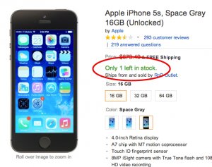
Multiple marketing campaigns promote limited editions to up their sales. The moment you tell your buyers that there are only a few of them left, there is an urge to click that button before anyone else does. ‘We are not telling you to buy this, we are just saying it’s now or never’. Then look at them go for it. But be sure not to create a false sense of urgency, that’s going to hurt your credibility in the longer run.
- Date Added
- Spares
- Urgency
- Discount Timers
- Last date of availability
- Best deals
- Pitch
- Must haves List
- Best Sellers List
Related Post: How to Use Urgency and Scarcity Principles to Increase eCommerce Sales
When you are done adding the elements, don’t forget to test them! Comment if you think we missed any product page elements for eCommerce site, we are happy to improvise.


