


 ChatGPT
 Perplexity
 Gemini
 Claude
 Grok
Grok
Not every user complaint makes it to a support ticket. Sometimes, frustration appears as a silent drop-off, a missed click, or a task abandoned halfway through. These quiet signals often go unnoticed until they start affecting key metrics.
A UX audit helps bring those signals to the surface. It reveals what users are experiencing, not just what the data dashboard says. Whether the goal is to improve usability, reduce friction, or better align features with user expectations and intent, a UX audit provides a structured approach to understanding and enhancing the digital journey.
In this blog, we’ll explore tools that can give you the insights needed to build smoother, more effective digital experiences.

What is a UX audit?
A UX audit systematically evaluates how users experience a digital product, such as a website or app. It uncovers usability issues, identifies friction points, and helps improve design decisions using both expert reviews and real user behavior data.
UX audits typically combine:
- Heuristic evaluations (based on usability best practices).
- Analytics (like heatmaps, session replays, and funnel drop-offs).
- User feedback and accessibility reviews
A UX audit may be required when user engagement is declining, after launching a redesign, or before scaling. But even without visible problems, a periodic UX audit can reveal subtle issues impacting conversions, retention, or customer satisfaction.
Think of it as a health check-up for your digital product; one that ensures users aren’t just arriving, but staying, exploring, and completing their journey with ease.
Analyze your eCommerce website for FREE
How we evaluated these tools
Our evaluation methodology is based entirely on secondary research. Each tool was assessed using official product documentation, publicly available feature information, and third-party user reviews from sources like G2.
The order in which tools appear and the way they are described reflects only what each tool actually offers based on these sources, with no bias toward any particular platform. We recommend taking advantage of free trials wherever available.
Three dimensions guided the evaluation of every tool in this guide:
- Breadth of audit capability: Whether the tool covers behavior analytics, user feedback, product analytics, or experimentation, and how it brings them together in one place.
- Quality of insight generation: How effectively the tool helps teams move from raw data to actionable UX findings through AI summaries.
- Integration into the broader UX workflow: Whether the tool connects audit findings to downstream steps like hypothesis building or A/B testing
Quick picks: Best UX audit tools by use case
Here is a table of the strongest options for each use case based on the 10 tools covered in this guide.
| Category | Tool | Description |
| Best overall | VWO | End-to-end experience optimization platform for enterprises and businesses of all sizes, covering behavior analytics, feedback, experimentation, and personalization in one place |
| Best for behavior analytics | Fullstory | AI-powered behavioral data platform with automatic capture, friction detection, and StoryAI for instant insight generation |
| Best free option | Microsoft Clarity | Permanently free behavior analytics with no traffic limits, AI summaries, and heatmaps |
| Best for mobile UX audits | UXCam | Purpose-built mobile analytics with gesture-aware heatmaps and Tara AI for instant insight generation |
| Best for customer feedback | AskNicely | Real-time AI-powered sentiment tracking and conversational surveys across multiple channels |
10 Best UX audit tools
Best UX audit tools – A quick look
Best UX audit tools – Quick comparison table
| Tool | Core capability | Best for | Free plan | Starting price |
| VWO | Behavior analytics, feedback, experimentation, personalization | End-to-end experience optimization for enterprises and businesses of all sizes | 30-day free trial | Custom pricing |
| Hotjar | Heatmaps, session recordings, surveys, feedback | Quick set-up behavior visualization with a generous free plan | Free plan available | $39/month |
| Microsoft Clarity | Heatmaps, session recordings, AI summaries | Conducting first UX audit | Free forever | Free |
| Fullstory | Behavioral data capture, session replay, AI insights | AI-powered friction detection | Free plan available | Custom pricing |
| Mouseflow | Session replay, heatmaps, friction detection, journey analytics, form analytics | Full audit toolkit without complexity | Free plan available | $31/month |
| UXCam | Mobile session replay, gesture heatmaps, issue analytics, TARA AI | Auditing mobile-first applications | 14-day free trial | Custom pricing |
| Pendo | Product analytics, in-app guides, session replay, AI insights | Connecting behavioral insights to adoption and retention | Free plan available | Custom pricing |
| Intercom | AI support agent, conversation analytics, in-app guidance | Identifying usability issues through support conversation patterns | 14-day free trial | $29/seat/month |
| AskNicely | NPS, CSAT surveys, AI sentiment analysis, real-time dashboards | Multi-location businesses tracking customer sentiment across locations | No free plan | $449/month |
| UserReport | Survey widget, feedback widget, NPS, demographics | Simple, embeddable feedback and survey tool to collect audience demographics and NPS scores | Free plan available | Custom pricing |
Detailed overview
Disclaimer: The pros and cons listed are based on reviews and feedback from third-party sites such as G2, TrustRadius, and other sources.
1. VWO

What it does
VWO is an end-to-end experience optimization platform that supports UX audits as part of a broader, continuous improvement workflow. It combines user behavioral insights, feedback, experimentation, and personalization in one unified system.
Teams can use VWO Insights to discover friction points through behavioral data and user feedback, form hypotheses, and run experiments to validate them. Winning experiences can then be deployed directly within the same platform.
VWO Pulse is the feedback capability within the VWO platform that captures in-the-moment contextual feedback and uses AI to automatically surface clear, actionable insights that teams can act on immediately.
Key features
- Session recordings, heatmaps, scrollmaps, and clickmaps to visualize engagement patterns and pinpoint friction across the user journey
- Conversion funnel tracking and form analytics to identify exactly where users drop off during key flows
- VWO Pulse for in-the-moment contextual surveys with smart targeting triggers, and multilingual support
- Insights Dashboard with an experience score graded from 0 to 100 for every page to surface the highest priority audit targets
- Wandz for AI-powered survey analysis and strategic recommendations from feedback at scale
- VWO Testing for running A/B and multivariate tests to validate UX hypotheses
- VWO Personalize to deliver segment-specific experiences based on UX audit findings
Pros
- The platform is easy to navigate with clear data visualization and detailed segmentation for deeper insights across teams
- VWO Copilot reduces manual analysis effort by automatically surfacing patterns and recommendations
- Exceptional customer support with a 99% CSAT score
Cons
- Best suited for optimizing existing user experiences and may not support early-stage UX tasks like wireframing or initial user research
Best for
UX, product, and CRO teams at enterprises and businesses of all sizes that want a single platform to run end-to-end UX audits. From identifying friction through behavioral data and user feedback to validating fixes through experimentation and tracking improvement over time.
Pricing
Free trial with full access to all features for 30 days with no restrictions. Paid plans are customized based on business requirements. Visit VWO pricing and plans for details.
Customer experience
“It is very nice to have everything, from analysis to testing, in one tool. This also makes it easier to do analysis on specific variants or experiments. The Form Analytics have been the most useful feature for me lately, due to the way we could unveil very specific frustration points and opportunities on one of our most important pages. The suggestions made by VWO to watch recordings or view heatmaps in certain scenarios are also a nice addition.”
– Donny van der Molen,
CRO specialist at Vandebron
Source: VWO Success Stories
Quick note:
Understanding why users behave the way they do in your mobile app is the key to optimization. Watch this webinar to discover how VWO Insights – Mobile App session recordings and heatmaps help you identify pain points, optimize layouts, and turn user behavior data into actionable strategies that improve engagement and conversions.
2. Hotjar
What it does
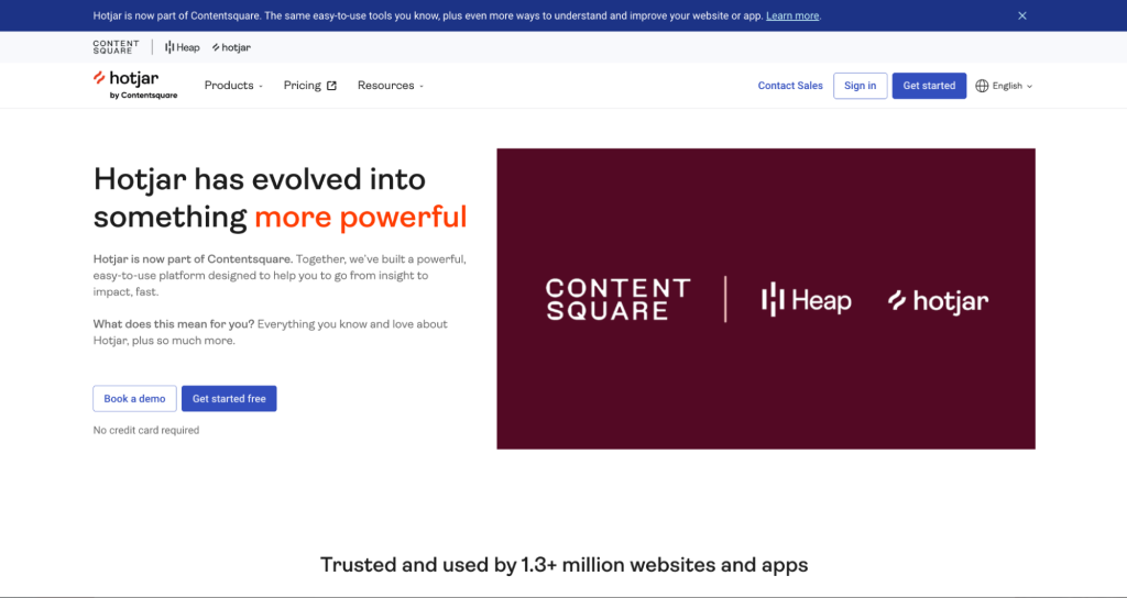
Hotjar is a user experience analytics tool that helps to visualize how users interact with the website through heatmaps and session recordings. It is a part of Contentsquare alongside Heap, and has evolved into a broader experience intelligence platform that combines qualitative behavior data with feedback tools, funnels, and product analytics.
Key features
- Heatmaps including Attention Heatmaps that visualize where visitors spend the most time to help prioritize content and refine layout
- Session replay with 100% data capture and no sampling for complete visibility into real user interactions
- Funnels to visualize step-by-step drop-offs in key journeys like signup and checkout
- On-site surveys and feedback polls to capture user opinions directly on the page
- User interviews and unmoderated tests for in-depth qualitative research
- Sense AI for session replay summaries and conversational insight exploration
- Experience Monitoring to identify JavaScript errors and performance issues before they impact users
Pros
- Conversion funnel analysis helps identify exactly where users abandon key journeys
- Session recordings are detailed and provide valuable context to complement heatmap data
Cons
- Limited depth for form analysis compared to dedicated form analytics tools
Best for
Teams looking for a widely trusted and quick-to-set-up behavior visualization tool with a free plan to get started with heatmaps and session recordings.
Pricing
Paid plans start at $39 per month, billed annually
3. Microsoft Clarity
What it does
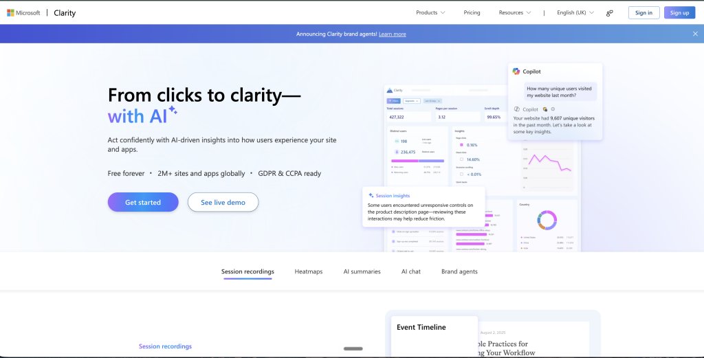
Microsoft Clarity is a free behavior analytics tool from Microsoft. It helps UX teams audit how users experience their website and apps by revealing friction points, drop-offs, and engagement patterns. It includes session recordings, heatmaps, and AI-powered summaries.
Key features
- Session recordings with AI-powered highlights that surface key friction moments from every user journey without manual review
- Heatmaps showing where users click, scroll, and drop off with AI summaries that highlight behavior trends across page versions
- AI chat to ask questions about your behavioral data and get instant, data-backed answers
- AI summaries that reveal where users struggle and what to prioritize next with one click
- Mobile app analytics with lightweight SDK support for Android, iOS, Flutter, and React Native
Pros
- Permanently free with no traffic limits, making it accessible to teams of any size and budget
- Mobile app support allows UX audits to extend beyond web into app experiences
Cons
- Lacks the depth of workflow integration and advanced segmentation
- Limited customization options
Best for
Teams conducting their first UX audit or those who need a no-cost behavior analytics foundation before investing in a paid platform.
Pricing
Free forever with no traffic limits. No paid plans currently available.
4. FullStory
What it does
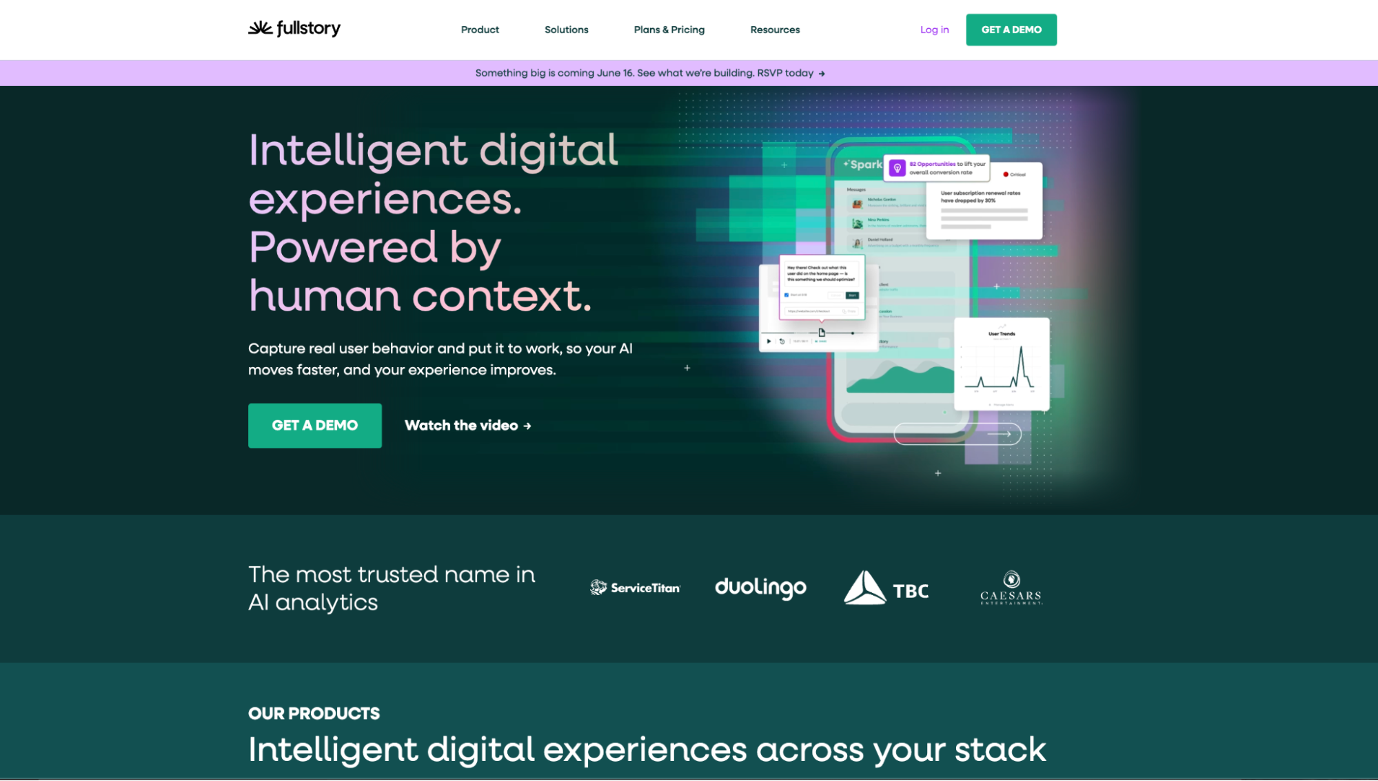
FullStory is a behavioral data and analytics platform that helps uncover friction points, understand users, and take action on those insights across web and mobile experiences.
Its Fullcapture technology automatically collects every user interaction without manual tagging, giving a complete and trustworthy behavioral data foundation from day one.
StoryAI then turns that behavioral data into clear, actionable answers so teams spend less time digging through data and more time fixing experience problems.
Key features
- Fullcapture for automatic, privacy-first capture of every user interaction across platforms
- Session replay to watch real user sessions and understand behavior in context
- Heatmaps, funnel analysis, and journey maps to identify drop-off points and navigation patterns
- StoryAI to turn behavioral data into clear answers about where users struggle and what to prioritize
- Sentiment signals and rage click detection to surface frustration before it impacts retention
- Guides and Surveys for in-product guidance, NPS collection, and contextual feedback at key moments in the user journey
- AI agents that detect friction, flag anomalies, and execute fixes proactively
Pros
- The platform combines high-level analytics with granular session-level insights, making it useful for both strategic and tactical analysis.
- FullStory offers strong filtering, segmentation, and search capabilities that make it easier to isolate specific user journeys or problematic interactions.
- Its web implementation is relatively simple and can be deployed using tags.
Cons
- FullStory can generate a very large volume of data, which can feel overwhelming for users, especially on high-traffic websites
- The mobile or app implementation is more complex compared to the web implementation and may require additional effort and technical expertise
Best for
UX and product teams at mid-market to enterprise companies who need a complete behavioral data platform that goes beyond heatmaps and recordings to deliver AI-powered friction detection and in-product action capabilities.
Pricing
Pricing is not publicly listed. It offers a free plan.
Contact Fullstory for plan details.
5. Mouseflow

What it does
Mouseflow is a digital experience analytics platform that helps teams understand exactly how users interact with a website by combining session replay, six types of heatmaps, journey analytics, friction detection, conversion funnels, form analytics, and feedback surveys in one place.
It automatically scores users from unhappy to happy based on their behavior, making it easy to filter for friction and focus audit efforts where they will have the biggest impact.
Key features
- Data segmentation and custom dashboards for focused UX audit analysis
- Session replay with Mina AI for conversational insight exploration across individual sessions or segments
- Six types of heatmaps including click maps, scroll maps, and attention maps with split-view comparison across page versions
- Journey analytics to see the step-by-step path users take, when they drop off, and which areas to optimize first
- Friction detection that automatically scores users based on behavior so teams can filter for problem sessions instantly
- Conversion funnels with revenue insights to identify the biggest drop-off points and make data-informed decisions
Pros
- Powerful filters let you sort recordings by user actions and engagement, helping you quickly identify UX problems without reviewing every session
- Fast setup and a user-friendly interface make it easy to start gathering insights without a steep learning curve
Cons
- Session recording storage may not be sufficient for high-traffic sites running extensive UX audits
- Pricing flexibility is limited, which can make it difficult for growing businesses to scale without jumping to a significantly higher tier
Best for
UX, CRO, and eCommerce teams that need a full suite of audit tools combining friction detection, journey analytics, and form analysis alongside heatmaps and session replay.
Pricing
- Free trial: 14 days available for the Essential and Advanced plans.
- Free: Includes up to 500 sessions/month.
- Paid:
- Essential plan starts from $31/month, billed annually.
- The Advanced plan starts from $219/month, billed annually.
Customer experience based on G2
Mouseflow has completely transformed our marketing analytics! With features like heatmaps, session replays, and conversion funnels, we gain clear insights into user behavior. This helps us identify issues and enhance engagement.
– Riley McDermott, Digital Content Strategist for OVPR at University of Texas at Austin
6. UXCam
What it does
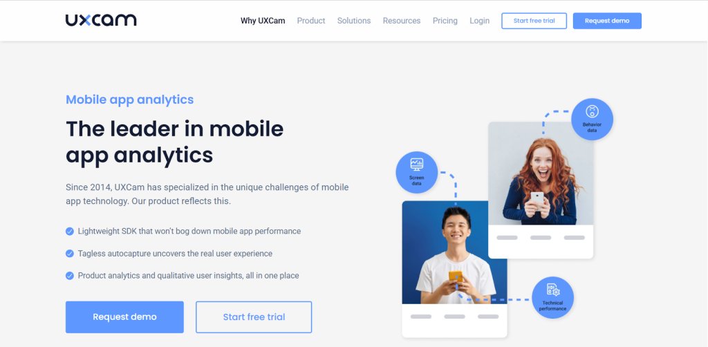
UXCam is a product analytics platform with an integrated AI analyst built for mobile apps and websites. It captures up to 9.4 times more data per session than other platforms.
Key features
- Session replay with Tara AI that analyzes millions of data points and delivers insights in seconds
- Gesture-based heatmaps that capture touch, swipe, and tap patterns specific to mobile interfaces
- User journey analytics to gain full visibility into user flows, find bottlenecks, and optimize conversion and engagement
- Issue analytics to find and fix technical issues
- Funnel analytics and retention analytics for conversion and engagement tracking
- Crash tracking and performance issue detection connected directly to session replays for faster resolution
Pros
- It is great for debugging and crash analysis, as it allows teams to track crashes and reproduce issues based on user session recordings,
- Provides helpful app analysis tools and responsive account manager support.
Cons
- There can be slight delays in loading session replays.
- Tagging could be more intuitive, as some users find it challenging to quickly locate what they’re looking for.
Best for
Product and UX teams working on mobile-first applications who need AI-powered issue detection, gesture-aware heatmaps, and user journey analytics purpose-built for mobile.
Pricing
- Free trial: 14-day access to all Growth plan features.
- Paid: Pricing for different plans can be requested.
7. Pendo
What it does
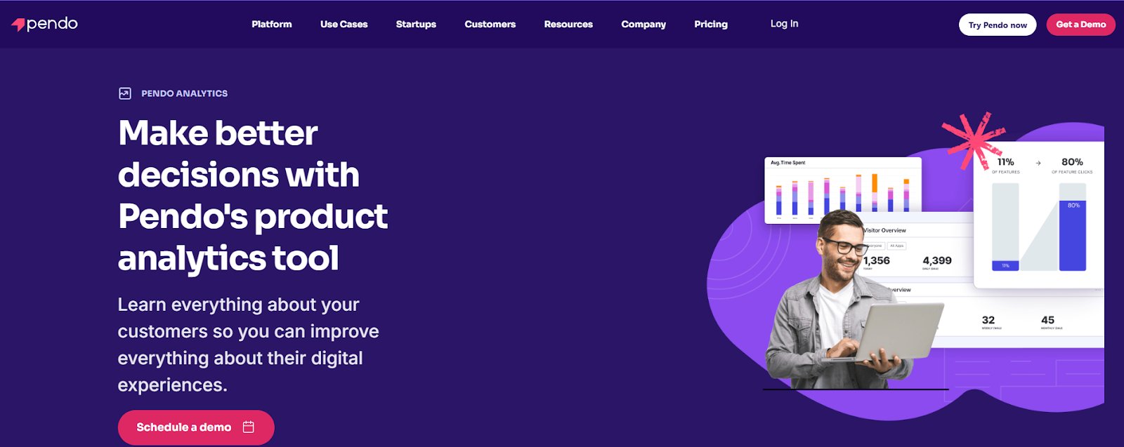
Pendo is a product experience platform that captures user behavior across software and AI agents to give teams clear visibility into how users interact with a product, where they struggle, and which features deliver real value.
It combines product analytics, session replay, in-app guides, feedback tools, and AI-powered recommendations in one platform, helping teams identify friction points, improve adoption, and align product priorities with real user needs.
Key features
- Product analytics with funnel analysis, user paths, retention tracking, and retroactive analytics to understand user behavior
- In-app guides to deliver targeted help and content at the exact moment users need it
- Leo AI for instant natural language answers to product questions without building reports
- Predict to identify churn risks and upsell opportunities before they materialize
- Agent analytics to measure how users interact with AI agents and connect those experiences to outcomes like retention and revenue
- Listen, the feedback agent and Sentiment tools to capture user feedback and understand what users care about
Pros
- In-app guides help deliver targeted help and content, improving the overall user experience.
- Automated analytics and guide features save time and streamline UX efforts.
Cons
- It would be helpful if badges could act as clickable CTAs to launch guides directly.
- Some minor differences in the interface across sections may take a little time to get used to, especially for new users.
Best for
Product and UX teams at mid-market to enterprise companies who need a single platform to audit user behavior, deliver in-app guidance, measure AI agent adoption, and connect behavioral insights to business outcomes like retention and revenue.
Pricing
- Free: Start with up to 500 active users/month.
- Paid: Plans are available on request.
Customer experience based on G2
Pendo provides valuable insights into how users interact with business products and services. The software includes a helpful onboarding guide to assist users with the products they use.
– Samantha Lukina, IT Manager at Altria Theater
8. Intercom

What it does
Intercom supports UX audits by providing deep insights into the customer service experience, which is a key part of the overall user experience. Its AI-powered support agent Fin resolves a large volume of queries instantly.
The conversation histories and help center interactions reveal where users struggle, what they cannot find, and which parts of the product generate the most confusion.
Key features
- Fin AI Agent that resolves customer queries instantly and learns from every conversation to continuously improve
- AI-powered Insights with coverage across all support interactions, including CX Score, Topics Explorer, and Trends to surface what users are asking and how they feel
- Copilot that gives human agents AI assistance, pulling context from past conversations and surfacing instant answers
- Always-on QA monitoring every AI and human conversation in real time with AI-powered scoring against custom standards
Pros
- The conversation management interface is easy to use, and automated workflows help reduce manual effort.
- Offers flexible ways to segment leads and users, making it easier to communicate through the most relevant channels.
Cons
- Some advanced features are limited to higher-tier plans.
- Notifications for new tickets could be more prominent to help improve visibility and response time.
Best for
UX and product teams that want to understand what users are struggling with through customer support interactions rather than just behavioral data like clicks and scrolls. Particularly useful for teams where customer conversations and feedback reveal usability issues that behavioral tools alone would miss.
Pricing
- Free trial: 14-day access to all products and features of the AI-first customer service platform.
- Paid: Starts from $29/per seat/month, billed annually.
9. AskNicely
What it does
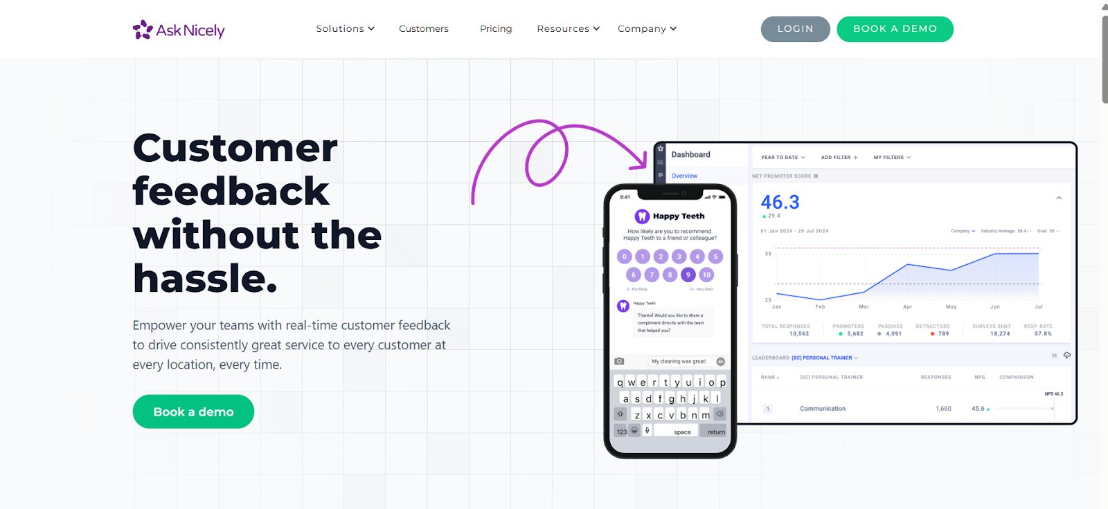
AskNicely is an AI-powered customer experience platform that helps teams stay closely connected to customer sentiment by collecting timely feedback through surveys shared across email, SMS, kiosks, mobile apps, and websites.
Its always-on feedback engine keeps customer sentiment visible in real time, helping teams track trends and identify friction points in the customer experience.
Key features
Pros
- NiceAI for instant sentiment analysis across surveys, reviews, and customer interactions with actionable recommendations
- Conversational AI-powered surveys with logic and branching that dig deeper for richer information and higher response rates
- NPS, CSAT, and five-star survey formats with customizable branding and simple logic options
- Reputation management tools to drive five-star reviews and referrals from satisfied customers
- The user-friendly interface makes it simple to track data, manage cases, and analyze feedback across departments.
- Highlights both negative and positive feedback in real time, making it easy to respond and stay updated.
Cons
- More educational content, like tutorials or webinars, would make it easier to get the most out of reporting features.
- Pricing may feel high for smaller teams or limited use cases.
Best for
Multi-location service businesses and CX teams that need a real-time, AI-powered feedback platform to track customer sentiment across locations, identify experience gaps, and act on insights at every level of the organization.
Pricing
- Paid: Plans start from $449/month when billed annually.
Customer experience based on G2
AskNicely streamlines the process of consolidating customer information. The program allows us to survey or monitor our users through mobile apps, emails, or even websites.
– Ifeoma Ejikeme, Operational Supervisor at Pad Up Creations Limited
10. UserReport
What it does
UserReport is a feedback and analytics tool that helps businesses better understand their audience through two core widgets, a survey widget and a feedback widget.
When integrated into a website or app, it enables direct interaction with users to collect demographics, NPS scores, feature requests, and bug reports in one place.
Key features
- Survey widget for collecting user demographics, NPS scores, and custom survey responses directly on the website or app
- Feedback widget that collects ideas and bug reports from users, with voting functionality
- NPS tracking broken down by user demographics for deeper sentiment analysis
- Audience showcase and campaign validation tools for publishers and brands
Pros
- Helps collect timely feedback, feature requests, and bug reports from customers, which supports continuous improvement.
Cons
- Different features are offered through separate apps, which can add up in cost when used together.
- The user interface could be more intuitive for a smoother experience.
Best for
Simple, embeddable feedback and survey tool to collect audience demographics and NPS scores
Pricing
Free plan available. Paid Premium plan pricing is not publicly listed on the website.
How to do a UX audit?
1. Define the audit goals
Start by identifying what you want to improve. Are users dropping off before checkout? Are onboarding flows too long? A clear goal sets the focus for your audit and ensures your insights lead to relevant actions.
You can follow a structured approach using this detailed UX audit guide to understand the complete process, checklist, and best practices for running effective audits.
2. Gather data
Use both quantitative and qualitative inputs. Analytics tools like GA4 or Mixpanel show where users drop off, while heatmaps and session recordings from Hotjar or FullStory reveal where users hesitate or get stuck. Support logs and qualitative data surveys add context to these patterns.
3. Run a heuristic evaluation
Assess your product using established usability principles, such as Nielsen’s 10 Heuristics.
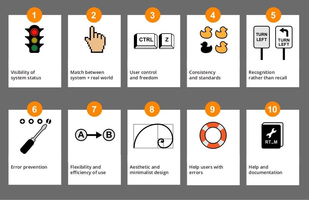
This expert review helps identify usability issues that data alone may not reveal. Focus on aesthetic and minimalist design, intuitive navigation, clarity of buttons and calls-to-action, meaningful error messages, and a clear information hierarchy. The goal is to ensure that every interaction feels logical, consistent, and user-friendly.
For a deeper understanding, this heuristic analysis eBook explains how to combine usability principles with voice-of-customer insights to uncover hidden UX issues.
4. Conduct user testing
Watching real users interact with your product can uncover hidden friction. Remote testing tools like Maze or PlaybookUX make it easy to collect insights quickly. Even five short sessions can reveal common confusion points or overlooked areas, leading to actionable recommendations.
5. Check accessibility and mobile responsiveness
Ensure your product works for everyone. Use tools like WAVE or Deque Axe to test accessibility standards such as contrast, keyboard navigation, and screen reader compatibility. Also, test your product across devices to ensure a consistent mobile experience.
To explore this topic further, check out Abi Hough’s episode on the VWO podcast, where she explores why accessibility is more than a compliance requirement and how it can improve both user experience and conversions.
6. Identify patterns & prioritize fixes
Once issues are documented, group them by impact and frequency. Focus first on high-impact problems that affect critical user journeys. This keeps the fixes realistic and aligned with business goals.
7. Share findings and next steps
Turn your insights into a clear, structured report. Highlight key observations, suggest quick wins, and outline a roadmap for improvements. Make it collaborative; bring in design, development, and product teams to align on priorities.
Ready to put these steps into practice? Get your free UX audit checklist
We have turned these seven steps into a ready-to-use checklist template, so your team can run a structured UX audit without starting from scratch.
Download it, assign owners, and track progress across every stage of your audit.
Download the free UX audit checklist →
What UX audit tools do I need?
Wondering where to start with your UX audit? Here’s a breakdown of the essential tools to uncover, analyze, and improve the user experience at every stage.
1. Behavior analytics tools
These tools give a visual lens into real user actions, helping you move beyond assumptions and see exactly how users interact with your product. From clicks and scrolls to rage clicks and drop-offs, they reveal patterns that show where users are engaged and where they’re getting stuck.
2. User testing & feedback tools
User testing tools bring real voices into your UX audit. They help you observe how users navigate your product, understand their struggles in real time, and gather direct feedback, often uncovering issues that data alone can’t explain.
3. Product analytics tools
These tools track what users do over time, like which features they use, how often they return, and where they churn. Ideal for identifying behavioral trends, they give a bigger picture of user engagement and help measure the impact of design changes.
4. Accessibility & performance tools
Even the best UX fails if users can’t access or load your product properly. These tools audit your site or app for accessibility compliance and technical performance, ensuring that speed, readability, and usability are in place for all users.
5. Experimentation & testing tools
After identifying issues, these tools let you test UX improvements safely, whether through A/B tests, multivariate tests, or controlled rollouts. They ensure that changes are based on real impact, not guesswork, and help scale what works.
The table below maps each tool in this guide against the five core UX audit capability areas, so you can quickly see which tools cover your specific needs and where you might have gaps in your current stack.
| Tool | Behavior Analytics | User Feedback and Testing | Product Analytics | Accessibility and Performance | Experimentation and Testing |
| VWO | Yes | Yes | — | — | Yes |
| Hotjar | Yes | Yes | — | — | — |
| Microsoft Clarity | Yes | — | — | — | — |
| Fullstory | Yes | Yes | Yes | — | — |
| Mouseflow | Yes | Yes | — | — | — |
| UXCam | Yes (mobile) | — | Yes | — | — |
| Pendo | Yes | Yes | Yes | — | — |
| Intercom | — | Yes | — | — | — |
| AskNicely | — | Yes | — | — | — |
| UserReport | — | Yes | — | — | — |
Conclusion
Conducting a regular UX audit is essential for identifying and addressing usability issues that affect user engagement, satisfaction, and ultimately, business performance.
The tools covered in this guide span the full UX audit workflow, from behavior analytics and user feedback to mobile experience analysis and customer sentiment tracking. The right combination depends on where your team is in the audit process and what gaps you are trying to close.
Once the audit is complete and friction points are identified, the real work begins, like forming hypotheses, validating fixes through experimentation, and delivering better experiences to the right audience. This is where VWO stands apart. It brings behavioral insights, user feedback, experimentation, and personalization into one connected system, so teams can move from audit findings to validated improvements without switching platforms.
Start your 30-day free trial or request a demo today to see it in action!
FAQs
Starting with a single tool is a perfectly reasonable approach. Most teams begin with a behavior analytics tool and expand their stack as their audit practice matures. For teams that want to start with one tool and grow from there, VWO is a practical choice because it combines behavioral analytics, user feedback, experimentation, and personalization into a single platform, reducing the need to add separate tools.
A CRO audit focuses on a specific outcome, typically increasing the percentage of users who complete a desired action, such as a purchase or sign-up. A UX audit is broader in scope, examining the overall usability, accessibility, and satisfaction of the digital experience across the entire user journey. The two overlap, and the most effective optimization programs treat them as complementary approaches.
Running a UX audit without a dedicated UX researcher is feasible, and many teams do so successfully. A dedicated researcher brings valuable expertise in methodology and user psychology, but tools today have made UX auditing far more accessible to product managers, marketers, and developers.
Identifying friction is only part of the process. Without a structured way to measure whether a fix genuinely improved the experience, teams risk implementing changes that feel right but do not move the metrics that matter.
The most reliable way to validate a UX fix is through experimentation. A/B testing allows teams to run the original experience alongside the proposed improvement and measure the actual impact on user behavior. Over time, this creates a feedback loop where every UX fix is grounded in evidence. VWO closes this loop by connecting audit findings directly to experimentation.
Support conversations and customer feedback are underused sources of UX insight. They capture exactly where users are confused, and which parts of the product generate the most frustration. Customer feedback from surveys and NPS responses adds sentiment and intent context that heatmaps and session recordings cannot provide on their own.
A UX audit is most valuable when treated as an ongoing practice rather than a one-time project. User behavior shifts, products evolve, and new friction points emerge over time. Many teams run a focused audit quarterly or following significant product changes such as a redesign.
Between formal audits, tools like VWO provide continuous visibility through heatmaps, session recordings, and feedback surveys, so emerging issues surface before they affect key metrics.
Before a redesign is generally the stronger choice. An audit conducted before a redesign surfaces evidence-based direction for what needs to change and why. It also establishes a performance baseline that the redesign can be measured against.
An audit after a redesign is equally important, particularly for validating that the new experience outperforms the old one and identifying any new friction introduced by the changes.
Categories:












![10 Best Product Management Tools [2026]](https://static.wingify.com/gcp/uploads/sites/3/2025/01/Feature-image-10-Best-Product-Management-Tools-2025.jpg?tr=w-300,h-150)


 Analyzing Your Website