How Optimizing Your Checkout Page Is Different From Optimizing Your Landing Page
Your checkout page is undeniably the “holy grail” of your website if that’s where you are monetizing your products or services. It’s the ultimate destination to which every graphic, text box, and CTA on your website should be driving your user traffic. After all, the checkout page is where you (hopefully!) close the sale. Landing pages are also critical since their success depends on whether or not users take the next step to become—hopefully—future customers. Therefore, these pages are among marketers’ top choices for optimization through A/B testing. However, the CRO approach for the two pages varies.
Download Free: Landing Page Optimization Guide
By the time the shopper reaches the checkout page, they have already visited the first stages of the conversion funnel. At the top, you’ve intrigued them with your most impressive features, and helped them see that your company has the right solution for their problem, which leads them to continue their way down to the middle of the funnel. It’s here that you give them rich content that does even more to convince them that they are, indeed, in the right hands.

What, exactly, is the conversion funnel?
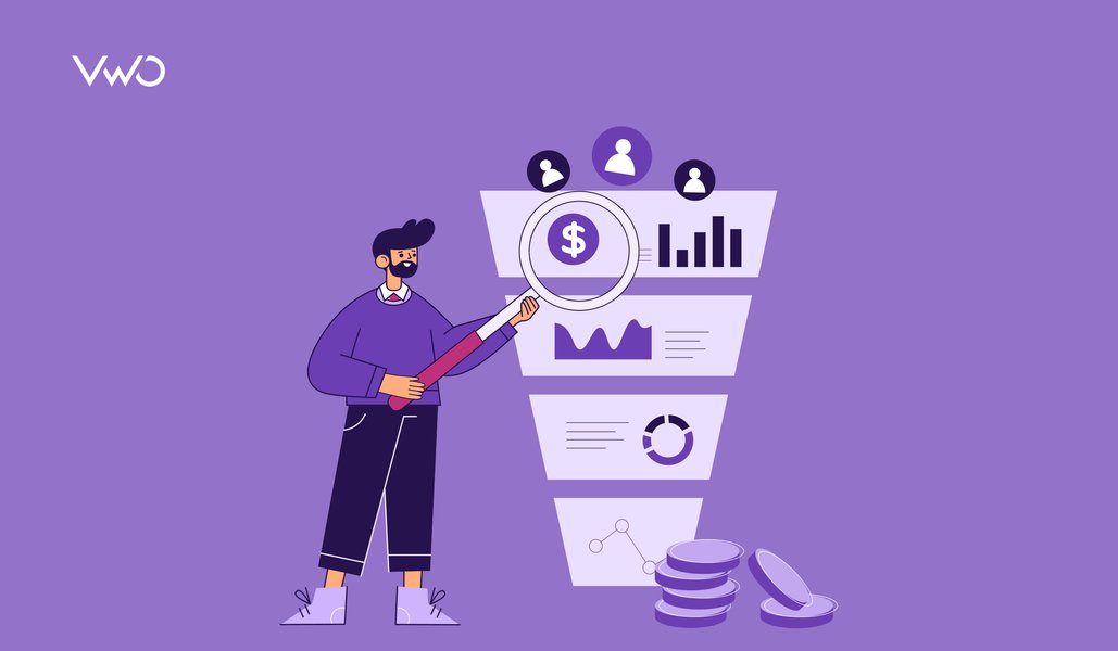
Before we discuss optimizing checkout pages and landing pages, let’s take a look at this funnel’s overall structure in a little more detail:
Top of the Funnel: Awareness
Your shopper is cruising around the internet, seeking a solution to their problem, and they’ve discovered that your company might be able to supply it. This is your chance to show them you’re worth a shot—your CTA highlights your products’ features and provides links to the excellent educational content you have to share. If you play it right, these visitors will be hooked and will want to know more (and will happily move down to the middle of the funnel).
Middle of the Funnel: Consideration
Okay, you’ve made it this far—shoppers are digging deeper and this is your chance to convince them you’re the right partner. The CTA? An abundance of free information like blog posts, webinars, videos, reports, and guides, all sharing the benefits of your product and the outcomes your customers would achieve with it. This is where you show them how your product will solve your customers’ problems, not just detail its features.
Bottom of the Funnel: Conversion
This is the fun part. It’s time to close the sale. Your prospective customers add your product to their shopping carts, type in their payment information, and click “Buy Now.”
Analyze your eCommerce website for FREE
What are landing pages and checkout pages, and where do they fall in the purchase funnel?
The first stage of the conversion funnel is a Landing Page, which gets your leads interested in your product, convinces them that its benefits might merit a purchase, and, most importantly, collects their contact information so they are now a part of their pool of customers.
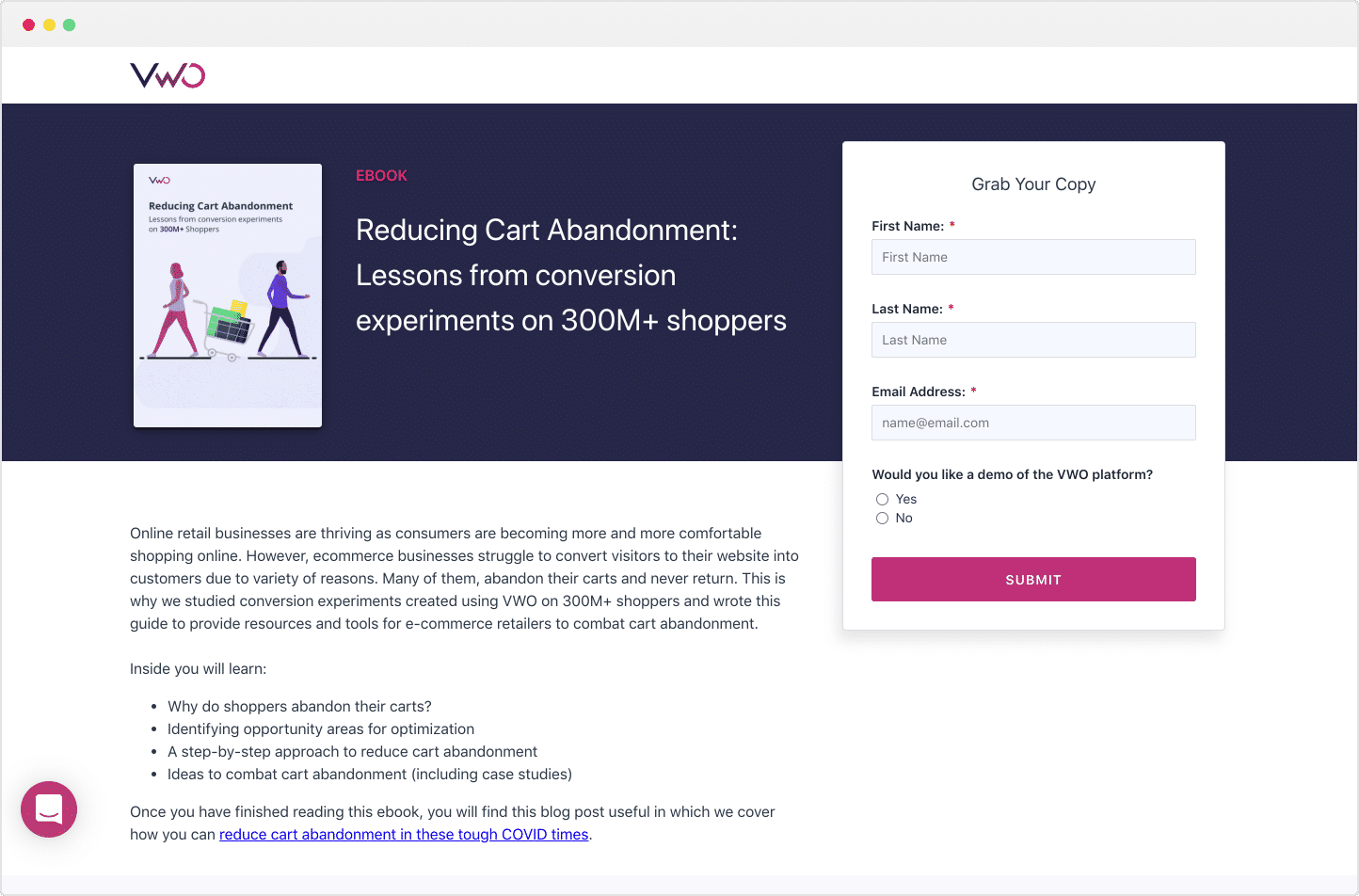
Unlike web pages, these specific landing pages are designed with a single promotion, focus, or goal, known as a call to action (or CTA, for short). Your customers reach the landing page at the top of the funnel, after they click a link in an ad, email, or anywhere else on the web.
There are two types of landing pages, and the key to successful conversions is driving as much traffic to these pages as possible, early in the funnel:
- Lead generation landing pages have a form as their CTA, which usually collects basic info for the customer like name and email address, in return for something free, like an eBook or webinar.
- Click-through landing pages move straight to a sale or subscription, and are often used by eCommerce and SaaS (software-as-a-service) marketers; their CTA is usually a button that sends the customer into the checkout flow to complete the transaction, or to the sign-up page.
The Checkout Page is at the “bottom of the funnel” stage of your conversion funnel. It displays all the products the user has added to the shopping cart and culminates when the customer places, submits, and pays for their order.
Your visitors have only reached your checkout page, the last part of the funnel, because you have successfully convinced them at the top and middle of the funnel that you can solve their problem. All you need is for them to click on that “Buy” button.
As they progress from the top of the funnel, however, they are also more likely to drop off before they make the purchase. Recent research from Baymard Institute revealed some of the interesting statistics:
- 61% of shoppers abandoned carts because the extra costs, including shipping and taxes, were too high.
- 35% of shoppers abandoned carts because the sites wanted them to create accounts to complete orders.
- 27% abandoned carts because the checkout process was too long and/or complicated.
- 18% abandoned carts because they didn’t trust the site with their billing information.
- 8% abandoned carts because their preferred payment method was not accepted.
What can you do to guarantee they won’t abandon the checkout page, despite having reached it? Here is where conversion rate optimization (CRO) comes in.
Why is CRO so important to increase conversions?
Fortunately, with strategic optimizations to your landing pages and, as we will cover in-depth here, your checkout page, you can ensure that more of your customers reach the bottom of the funnel and successfully convert.
CRO can improve the experience on your website for your users, with the end goal to increase your conversions, which may be a product purchase, an event registration, an eBook download, or newsletter signup.
Why is CRO so important? The statistics tell the story. Smart Insights recently shared a useful visual of the average conversion funnel, illustrating how traffic moves through the conversion funnel.
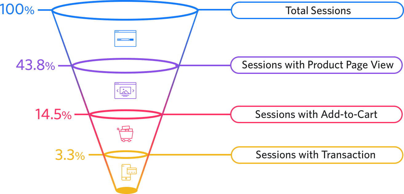
At the top, where users enter your website, you can claim to hold the interest of 100% of them. By the time you look at product page views, further down the funnel, you’re down to 43.8% of the original users. Only 14.5% add products to their cart, and only 3.3% actually make the purchase.
With effective conversion rate optimization (CRO), you can find the deficiencies in your checkout cart, widen those areas of the funnel where you may be losing customers, and improve every stage within the funnel to help guarantee conversions.
How does CRO work?
For both landing pages and checkout pages, the design of the optimization process is the same:
- Objectives/hypothesis. This involves using in-depth research to uncover a combination of issues and opportunities on a website, ranking each in order of their expected impact on the conversion goal(s). Variations of each of these issues is created to be tested against the original.
- Conducting the A/B test (with control and variable). The current version is tested against the variation to see if performance is improved. Some examples of metrics that might be tested would be conversion rate, average order value (AOV), and abandoned checkouts.
- Measuring results. When the results are in, it’s important to compare various segments to make sure that the right changes are being implemented. Data can be segmented, by mobile versus desktop, iPhone versus Android, or paid versus organic, among others.

There are also CRO variations among landing pages and checkout pages.
- Focus – Optimization on the checkout page is more focused, and designed for people who are already interested in the product, so any minor change made will have an impact on the conversion rate.
- Number of elements – As a rule of thumb, elements are added to landing pages to try to increase the conversion rate, while on the checkout page it’s more common to remove elements to increase the conversion rate (including fewer form fields, purchase steps, and time to load).
- Ease of use – For the checkout page, UX takes a more important role, and every step, button, and field must be as easy and intuitive to use as possible.
Download Free: Landing Page Optimization Guide
A/B testing for checkout pages: Why is it important and what should be tested?
The checkout page is, undeniably, the most critical stage of the shopper’s journey, and not even a well-designed website can save a poorly chosen checkout flow. Your A/B testing will be invaluable to help determine what can be optimized to improve conversions, but testing the checkout page is different than testing other website pages.
Your checkout page has many attributes that your shoppers will have distinct preferences about: some may prefer a one-column template over a two-column template; others want fewer fields to fill out, with just email (not street address) and a field that combines first and last name; still others want a review page included in the purchase flow while some don’t want it included.
Consistency on the checkout page is also very important, with product information, price, and branding appearing the same on the checkout page as throughout the funnel.
After you’ve thoroughly reviewed your checkout page, you should have some hypotheses about what some of these customer preferences are and how you can improve them. A good hypothesis includes an “If . . . then” statement to show cause and effect and is linked your customer’s behavior as well as the desired outcome. For example, “By combining the first and last name fields and asking only for an email address, the customer is less likely to feel frustrated and not complete the order.”
Next, you will also need to prioritize these hypotheses and formulate a test plan. You’ll decide how long the testing will go on (15 days or two 7-day business cycles is usually adequate to reach statistical significance with a confidence level of 95%). And, of course, you’ll have your list of things to test. Following are some specific examples of test options:
- Cart flow. One-page (your shoppers land on the billing page having the product options already added to their shopping cart; and one page checkout with review (the shopping cart summary, billing information, and the payment details are all on the same page).
- Cart template and design. Test CTA’s, position of fields and buttons, discounts and offers, and presence of security badges. How many fields need to be filled out, and is auto-fill an option?
- Payment methods. Test offering multiple payment methods, a preselected payment option, and PayPal, where the user is redirected to another site to complete their order.
- Localization. If you are selling at the global level, localization of the checkout may be instrumental in successful conversions. Consistency is key, however; if the checkout page is localized then other stages of the funnel should also be localized (language, currency, logo, colors, and branding).
Metrics to track
Cart abandonment rate, revenue per visitor, loading time, interaction rate (how many users start filling in the payment form), preferred payment method, average time to purchase, checkout page conversion rate, payment fail rate, and authorization rate.
What should be A/B tested for landing pages?
Landing page optimization is defined as a process of improving the performance of various page elements to help ensure that they get your business the highest possible conversions from visitors who arrive on these targeted pages.
Some areas to test
- The headline.
- Your call to action.
- Any images you use.
- The sales copy or product descriptions.
Metrics to track
Page views, bounce rate, average time spent on page, sessions by source, and goal completion.
For a comprehensive guide to A/B testing for landing pages, read VWO’s “Landing Page Optimization” for everything you need to know about making the most of this important piece of the conversion funnel.
Post-testing optimizations to consider
Depending on the results from your A/B testing, there are a number of different optimization tweaks and features you can build into the checkout and/or landing pages, including:
- Build a sense of urgency. Tell the customer how low the product inventory is for the item they’ve chosen or how long a special price will last, or offer free shipping, but only for a short period of time.
- Avoid surprise costs, like taxes and added delivery costs.
- Send abandon cart emails within 24 hours.
- Include multiple payment options.
- Feature security and trust seals prominently, to gain the shopper’s trust.
- Use live chat to answer any questions that might impede a purchase.
- Offer guest checkouts for those who don’t want to fill out a lot of fields.
- Simplify checkout – use an address lookup service to automatically find addresses and zip codes; autofill form data from information stored in a browser or password manager; retain customer information so repeat customers don’t have to enter it again; automatically copy shipping information to the billing information field if they’re the same.
- Optimize the checkout button. Make it stand out, and consider putting checkout buttons both at the top and bottom of the page or cart contents.
- Show the checkout flow with a progress bar, so that users can see their progress and are less likely to get discouraged and abandon the cart.
Also, check out our full-length conversation with Vlad on the VWO Podcast to get a deeper understanding of how you can optimize your checkout page for a global audience.
Conclusion
Conversion rate optimization strategy is the cornerstone of any website, and critical to build your conversion rate and increase revenue. Creating the best conversion funnel to achieve this can be tricky, especially with increasing online competition.
The conversion rate optimization process needs to encompass the entire customer journey, from the first time they find your business via Google search results all the way through to clicking “Buy Now.”
One thing is clear: whether they are concentrating on landing pages or their checkout page, or both, businesses need to continue to research, implement, and test ways to make their customer experience as seamless as possible to increase conversions and build the loyalty of their customer base.

