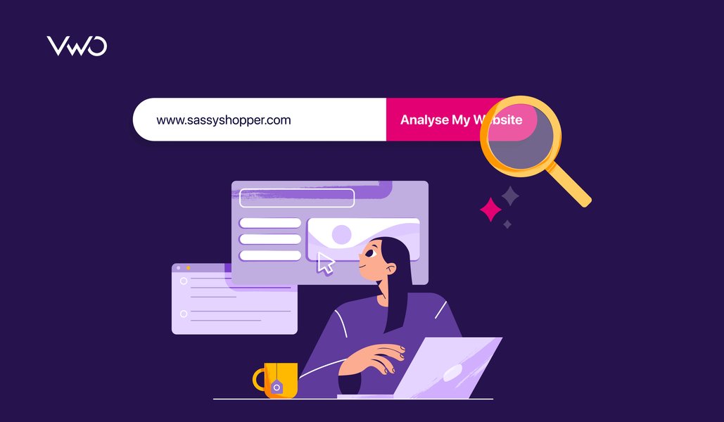
A landing page has one job: to turn attention into action!
You have only a few seconds to convince a visitor to stay before they hit the “back” button. In that brief window, design may catch the eye, but it’s the copy that persuades them to act.
Whether you’re launching a new SaaS product, promoting a lead magnet, or scaling an eCommerce brand, your landing page is where user intent is tested. It’s where your marketing spend either converts into sign-ups, trials, and revenue, or disappears without a measurable return.
Landing page copywriting bridges the gap between interest and action. It clarifies value, removes hesitation, and guides visitors toward a single, intentional outcome. In this step-by-step guide, you’ll learn how to write landing page copy that doesn’t just look good, but drives consistent conversions.
What is landing page copywriting?
Landing page copywriting is the specialized art and science of writing text for a standalone web page designed with one specific goal in mind: conversion.
Unlike a homepage, which encourages exploration, a landing page is built to “land” a visitor, usually from an ad, an email, or a campaign, and persuade them to take a single action, such as signing up for a newsletter, downloading an ebook, or making a purchase.
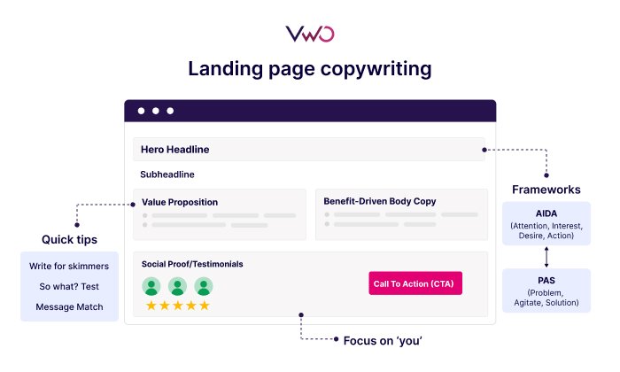
Effective landing page copy is structured, intentional, and outcome-driven. Rather than starting from a blank page, experienced copywriters rely on proven persuasion frameworks such as AIDA (Attention, Interest, Desire, Action):
Attention: Capture interest with a clear, relevant headline
Interest: Build context using a relatable problem or insight
Desire: Show the outcome or “after” state the visitor wants
Action: Direct the visitor toward a specific next step
This framework mirrors how users make decisions, making it especially effective for high-converting landing pages. When applied well, it helps ensure the copy feels logical, focused, and easy to act on, rather than pushy or overwhelming.
Understanding your audience and goal
Before you type a single word of your headline, you must answer two questions: Who am I talking to? and What do I want them to do?
Landing page copywriting is not just about writing “good” sentences; it’s about building a bridge between a person’s specific problem and your specific solution.
1. Understanding your audience
You cannot persuade someone you don’t understand. Professional copywriters use “Personas” to visualize the reader. To get into their heads, you need to look beyond basic demographics (age/location) and focus on their psychographics: motivations, frustrations, objections, and decision triggers.
Example:
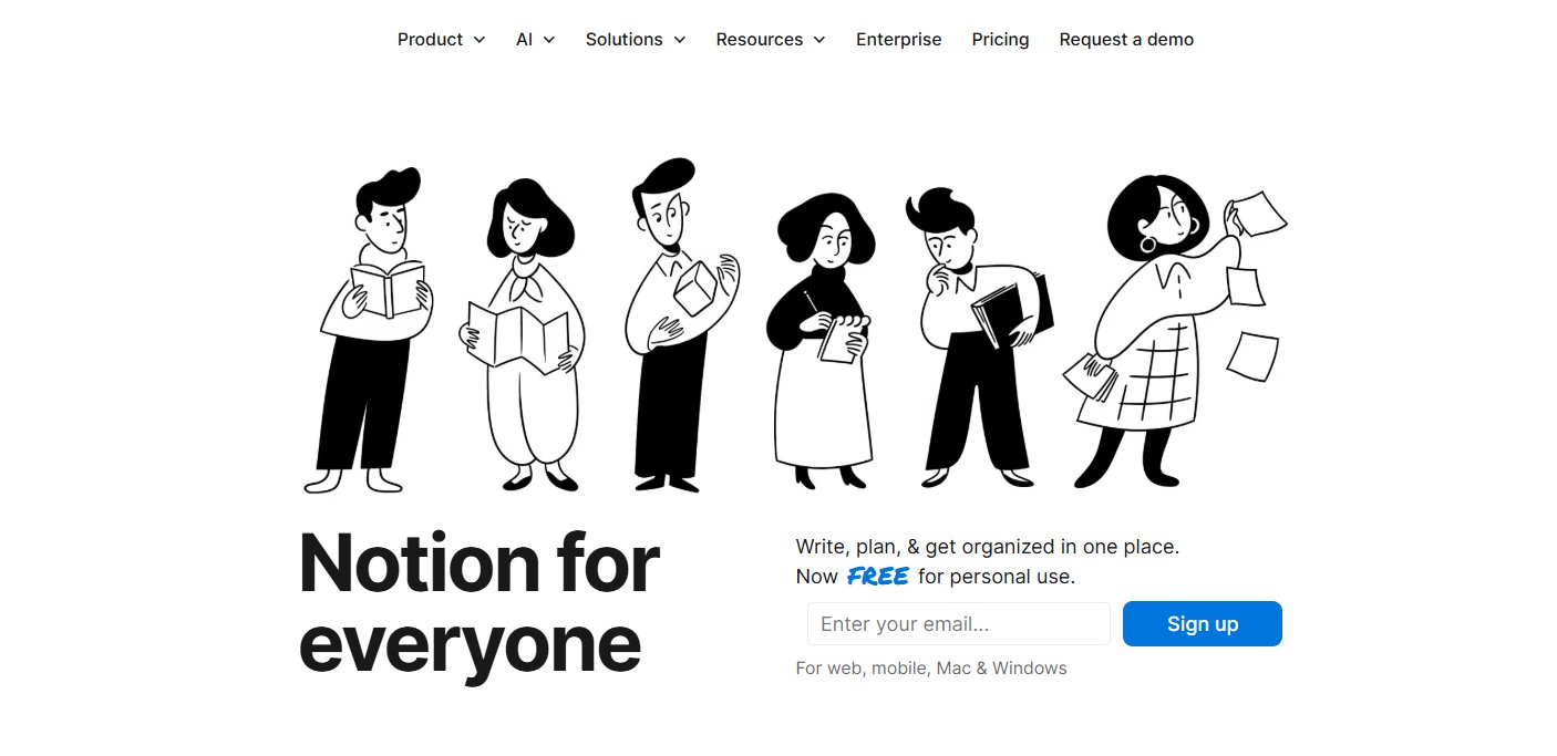
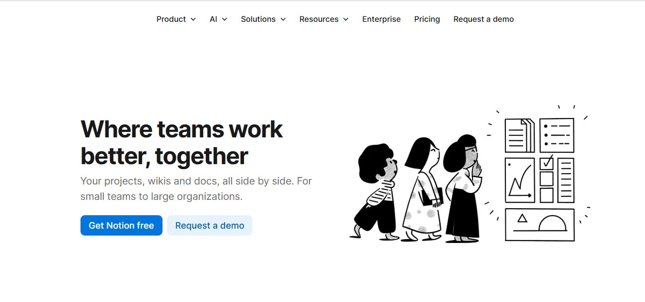
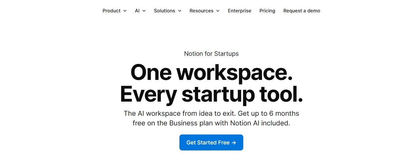
Notion runs different landing pages for teams, startups, and individuals.
Each page speaks directly to that persona’s priorities: team collaboration, speed, or personal organization, rather than using one generic message for everyone.
Voice of Customer (VoC): Scour Reddit, Amazon reviews, G2, or support tickets to understand how users describe their frustrations withyour product category or competing solutions. Look for the exact phrases people use to describe their frustration. Your landing page copy should mirror this language and clearly promise that your product prevents or resolves those challenges. If they say, “I’m sick of clunky software that takes forever to load,” your copy should say, “Fast, lightweight software that won’t slow you down.”
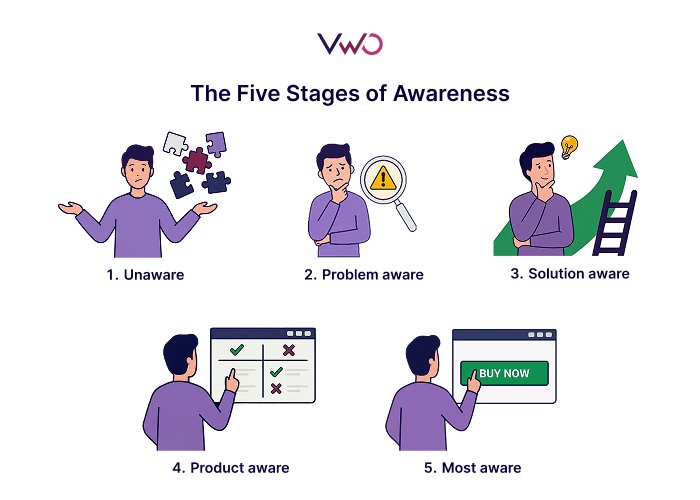
Problem Aware: Feels the pain but doesn’t know a solution exists.
Solution Aware: Knows there are solutions but hasn’t heard of you.
Product Aware: Knows your product but isn’t sure it’s the right fit.
Most Aware: Knows you, wants you, just needs to know the price/offer.
My favorite copywriting principle is mirroring—reflecting the person the reader wants to become. Most effective copy isn’t about psychological tricks; it’s about understanding how people actually behave.
Every high-converting landing page has a Single Conversion Goal. For instance, a SaaS landing page built to drive demo requests should eliminate competing actions. When visitors are asked to sign up for a newsletter, watch a video, and buy a product, they’re far more likely to do none of them.
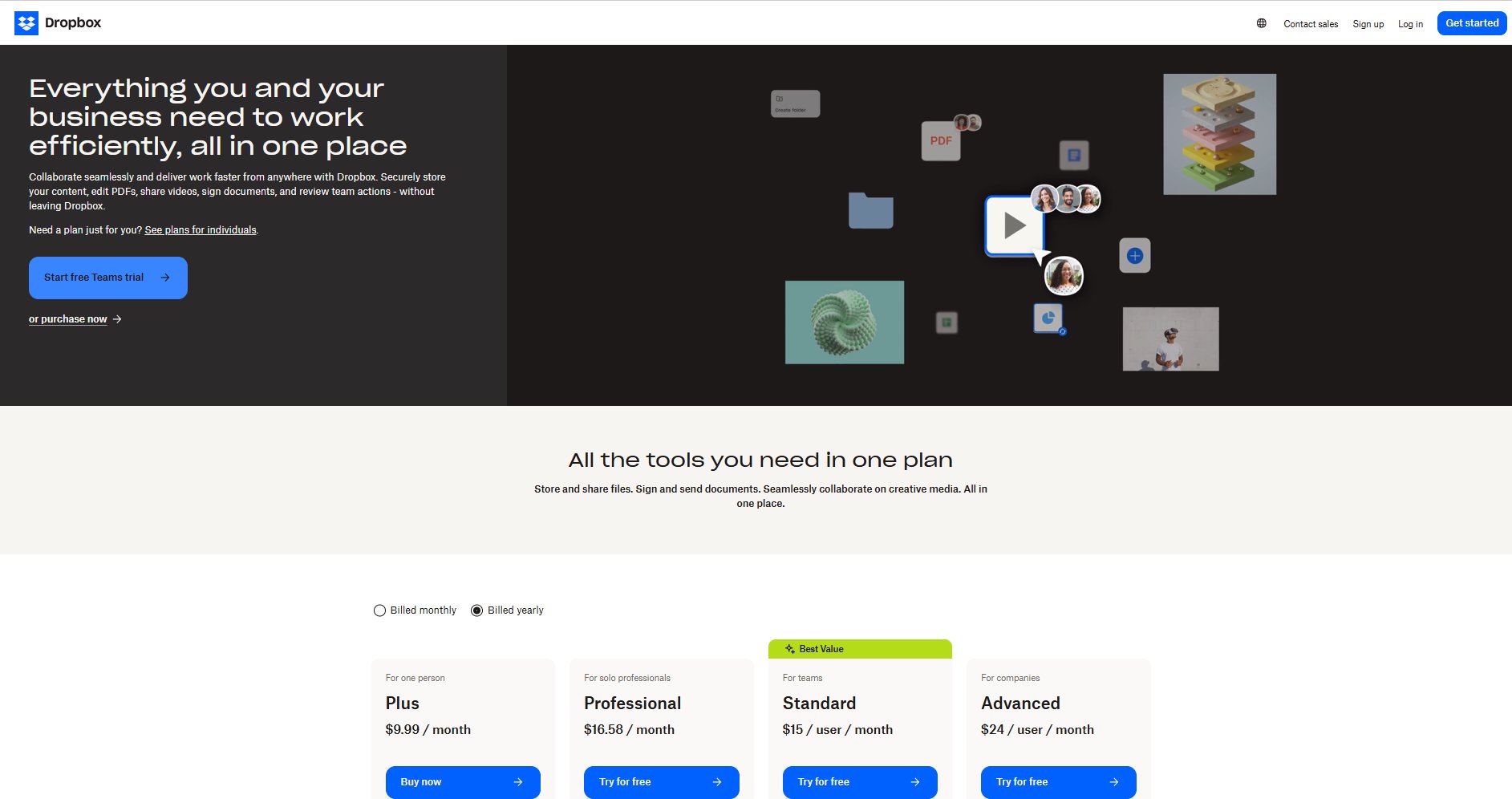
Example:
The Dropbox Teams landing page is built around a single, clear conversion goal: getting business users to start a Teams plan or free trial.
The messaging, layout, and CTAs consistently reinforce that action, with no competing paths or distractions, making it easy for visitors to understand what to do next and why.
To keep your copy focused, follow the Rule of One. A successful landing page should target:
One specific persona.
One big idea (your unique value proposition).
One single offer.
One clear action (the CTA).
If you have two very different audiences (e.g., a “freelancer” and a “corporate manager”), don’t try to speak to both on one page. Create two separate landing pages with copy tailored to each.
Key elements of a high-converting landing page
To maximize landing page conversions, it must be scannable. Most visitors won’t read your page; they will skim it. Use this checklist of essential elements to ensure your copy does the heavy lifting:
1. The headline
Purpose: To grab attention instantly.
Why it works: Your most important sentence. It must grab attention in under 5 seconds and clearly state the primary benefit of your offer to the target audience. It reassures them they’re in the right place and sets expectations within seconds, critical for reducing bounce and maintaining message match.
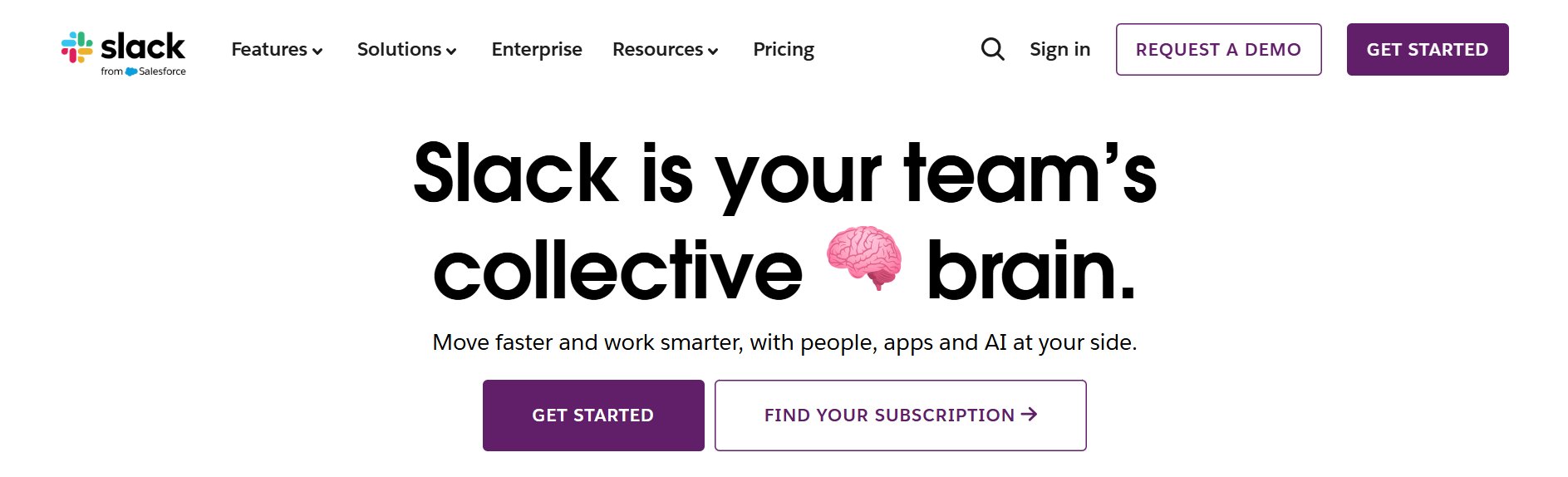
Example: The Slack headline “Slack is your team’s brain ” is short, confident, and benefit-led. It positions Slack as the central hub for collaboration, without relying on feature-heavy explanations.
Purpose: To support the headline with more detail.
Why it works: The subheadline provides clarity by explaining who the product is for or how it delivers the promised value. It bridges curiosity and understanding, encouraging visitors to keep reading.
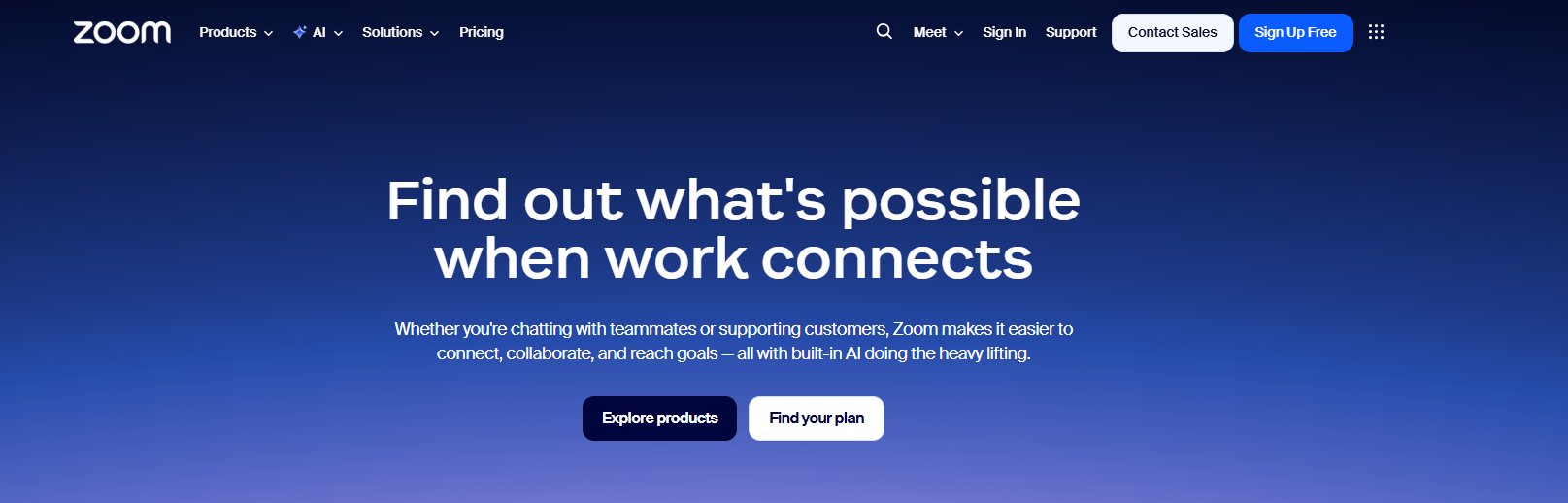
Example: The Zoom subheading expands on the core value by highlighting what Zoom helps people do (connect, collaborate, reach goals) and introduces the added benefit of built-in AI, all in a concise, benefit-focused way that supports the main headline.
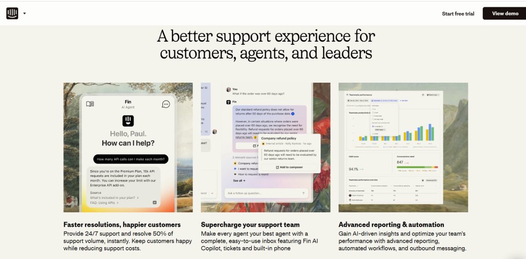
Why it works: Benefits and features work together to communicate value. Features explain what the product does, while benefits explain why those capabilities matter to the user. By translating features into outcomes, visitors can quickly connect the product to their own goals or pain points.
Example: The Intercom page pairs features like AI agents, shared inboxes, and reporting dashboards with clear benefits, such as faster resolution times and more productive support teams, helping visitors quickly see how the product improves the support experience rather than just what it includes.
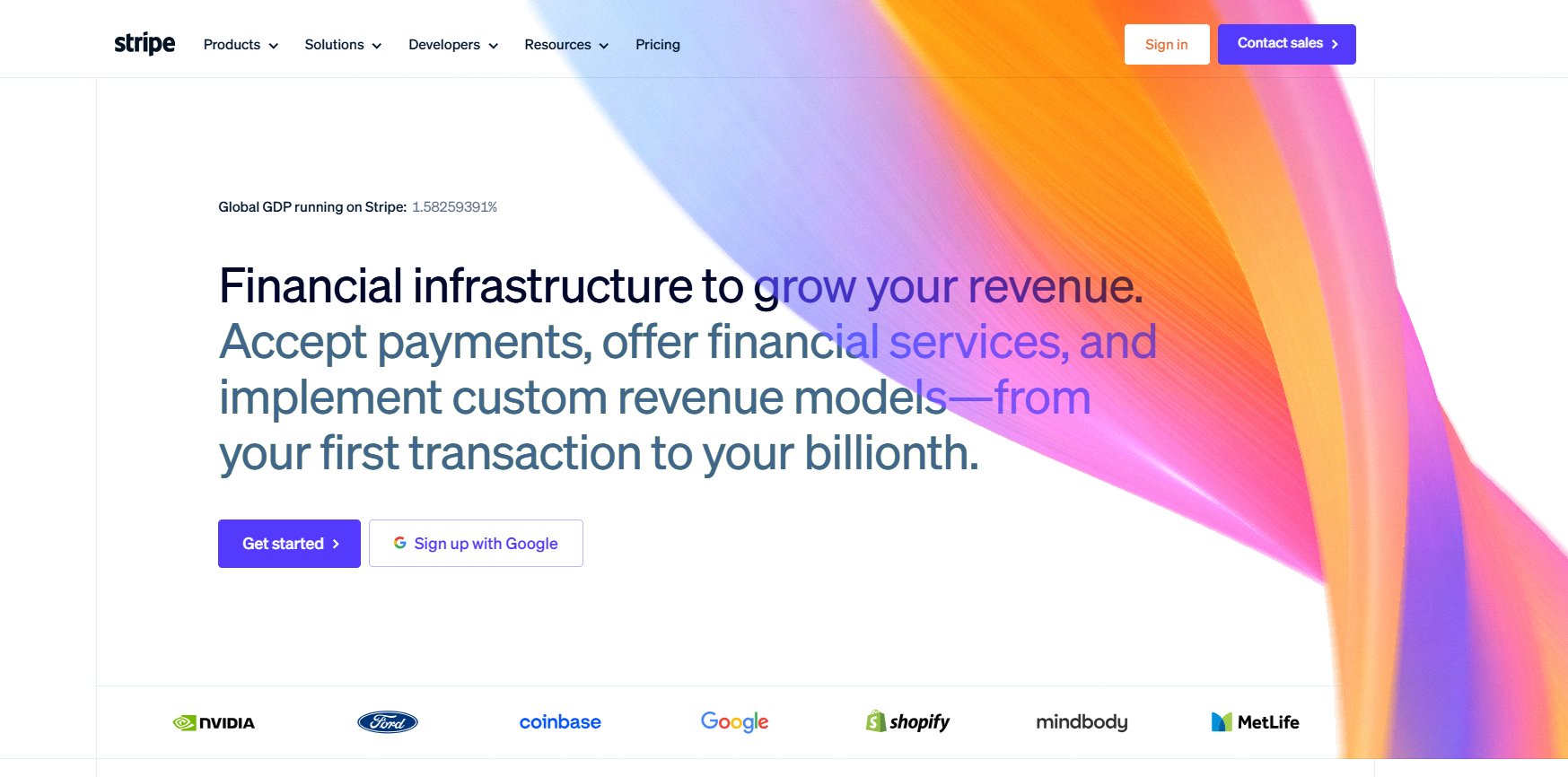
Why it works: Social proof reduces perceived risk by showing that others, especially recognizable brands or peers, have already chosen the product. This validation is especially powerful near decision points.
Example: Stripe’s landing page features a row of recognizable customer logos beneath the hero section, signaling widespread adoption and enterprise credibility without interrupting the main conversion flow.
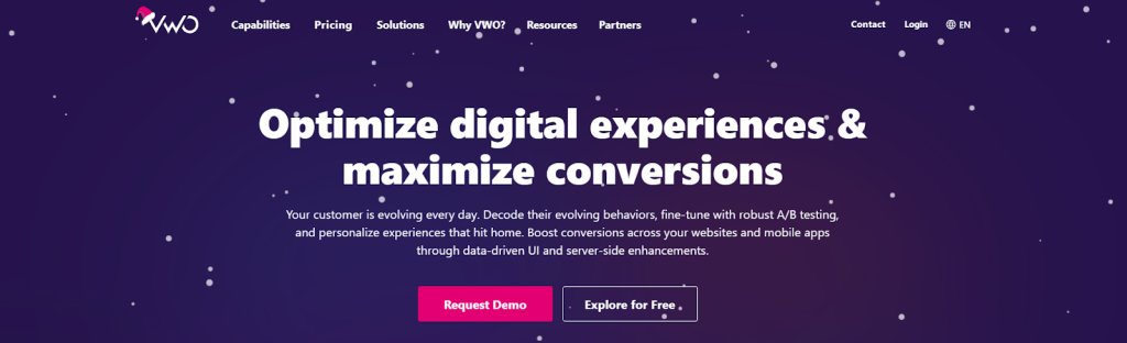
Why it works: A clear, action-oriented CTA removes hesitation by making the next step obvious. When framed around value, it feels helpful rather than pushy.
Example: VWO’s landing page uses two clearly differentiated CTAs: “Request Demo” and “Explore for Free”, to match different levels of user intent. The primary CTA stands out visually, while the secondary option offers a lower-commitment path without diluting the page’s main conversion focus.
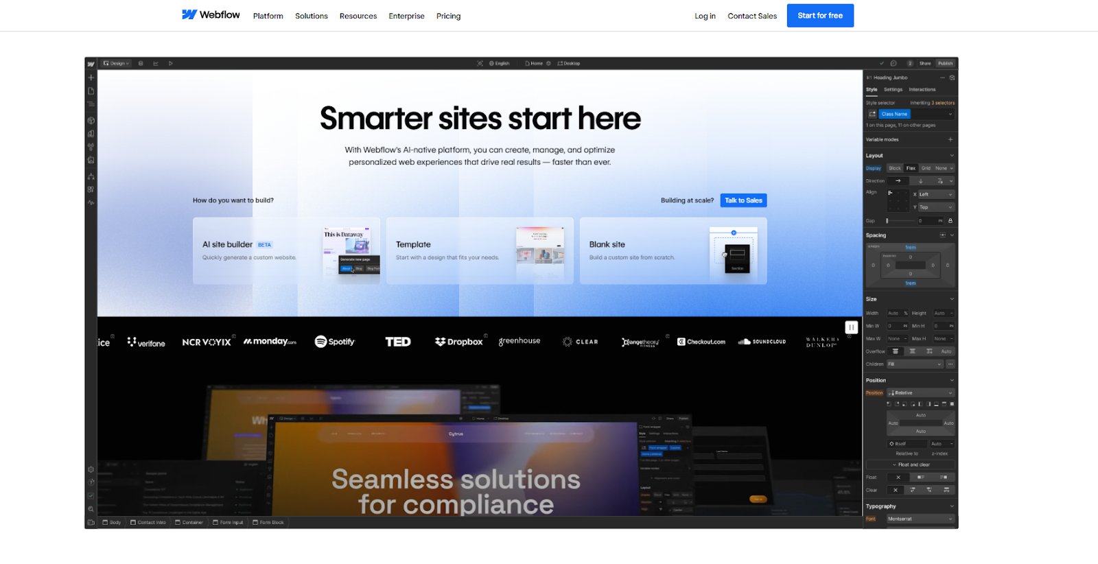
7. Hero visual/video
Purpose: To show the product in context.
Why it works: Visuals help visitors understand the product faster than text alone. Seeing the interface, workflow, or outcome reduces cognitive load and builds confidence in what they’ll experience.
Example: Webflow’s hero section uses a live, in-context product interface as the primary visual, allowing visitors to immediately see how websites are built and managed on the platform. This visual-first approach reduces the need for lengthy explanations and helps users quickly understand the product’s capabilities and use cases.
Key strategies for high-converting landing page copywriting
Follow the strategies below to create a persuasive landing page copy that aligns with user intent, removes friction, and drives consistent conversions.
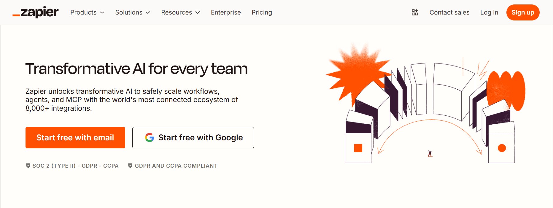
1. Create an irresistible offer
Your offer should feel immediately worthwhile. The perceived value, whether it’s a lead magnet, trial, or product, must clearly outweigh the effort required to convert.
Example: Zapier makes its offer feel irresistible by letting users get started for free with minimal effort, while clearly highlighting the immediate value of automating workflows and saving time within minutes.
Avoid jargon and complex sentence structures. Clarity is your strongest conversion lever; if the value isn’t clear within a few seconds, visitors will move on.
Write for “Skimmers”: Most people don’t read every word. Use bullet points, bold text, visual hierarchy, and plenty of white space so key messages are easy to spot at a glance.
Example:“See where users drop off” instead of “Gain comprehensive insights into user behavioral patterns.”
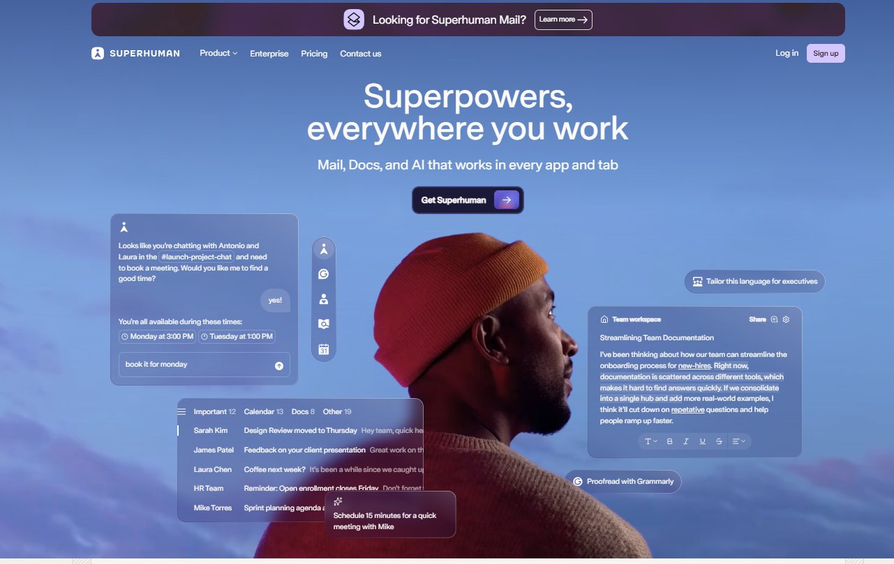
3. Avoid landing page bloat
Remove any copy, image, or link that doesn’t directly support the primary conversion goal. Every additional element introduces friction and increases the chance of distraction.
Example: Superhuman keeps its landing page focused by limiting the message to a single idea and a single primary CTA, and using rich visuals without adding unnecessary sections or distractions.
4. Use personalization and segmentation thoughtfully
Tailor messaging based on visitor context, behavior, or journey stage. A returning visitor should see different cues than someone encountering the page for the first time.
Personalization plays a key role in improving landing page conversions.
Read our guide to learn how to create personalized landing pages that increase relevance and engagement.
5. Maintain perfect message match
The landing page should directly reflect the promise made in the ad, email, or link that drove the visit. Consistent messaging reinforces trust and relevance.
Typography, color, imagery, and tone should feel familiar from click to landing. Visual disconnects create uncertainty, even when the copy itself is strong.
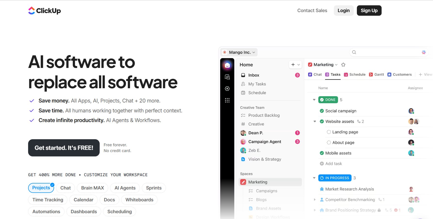
7. Use strong, goal-oriented CTAs
CTAs should clearly communicate the outcome of clicking. Action-oriented language, such as “Get instant access”/ “Start my free trial,” and visual contrast help reduce hesitation and guide the next step.
Example: ClickUp uses CTAs like “Get Started. It’s Free”, combining action with reassurance to reduce hesitation.
Even small delays impact conversion rates. Keep pages lightweight, fast-loading, and designed for effortless mobile interaction with thumb-friendly layouts.
9.Use risk reversal to reduce hesitation
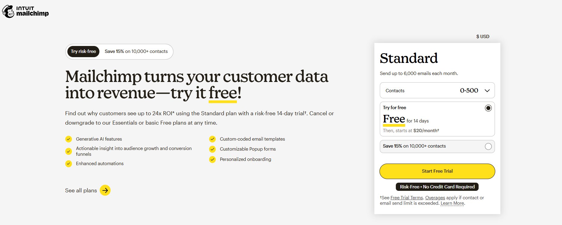
Risk-reversal messaging reassures visitors that taking the next step comes with little or no downside. Free trials, money-back guarantees, and clear cancellation terms help lower psychological barriers, especially for first-time users or those considering high-value offers.
Example: Mailchimp reduces sign-up risk by offering a clearly stated 14-day free trial, transparent post-trial pricing, and the option to cancel or downgrade at any time. By making the trial terms visible upfront, the page reassures visitors that they can try the product without hidden commitments.
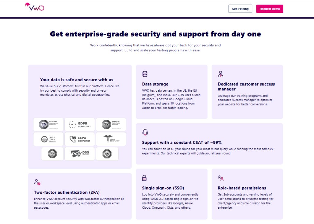
Make privacy policies easy to find and explain how user data is handled. Transparency around GDPR or CCPA compliance builds confidence at the moment of conversion.
Example: VWO makes privacy and legal compliance easy to understand by clearly highlighting security credentials, compliance badges, and data-handling assurances directly on the page, reassuring visitors before they commit or share information.
11. Test and refine continuously
High-performing landing pages are never finished. Regular A/B testing of headlines, offers, and CTAs allows real user behavior to guide optimization decisions.
Learn how successful brands apply landing page optimization strategies through real-world case studies and experiments.
Common landing page copywriting mistakes
Even the most well-designed pages can fail if the copy falls into these common traps. To ensure your conversion rate stays high, watch out for these frequent mistakes:
Jargon overload: Avoid “corporate speak” (such as “synergistic solutions”). If a customer wouldn’t say it in a conversation, don’t use it in your copy.
The “Me, Myself, and I” problem: Don’t focus on your company’s history. Focus on the user’s goals. Swap “We offer…” for “You get…”
Vague headlines: Avoid generic headers like “Welcome” or “Our Services.” Use your headline to make a specific, high-value promise.
Too many choices: Don’t include your main website menu or links to social media. Every extra link is an “exit ramp” that leads the user away from the sale.
Missing evidence: Claims without proof feel like “marketing fluff.” Always back up your statements with real numbers, customer testimonials, or trust badges.
Features without benefits: Don’t just list what your product has. Inform the user about the benefits it provides.
Hidden CTAs: Don’t make users hunt for the “Buy” or “Sign Up” button. Keep it visible and repeat it on long pages.
Conclusion: VWO helps turn landing page strategy into execution
Landing page copywriting strategies are only effective when they’re grounded in real user behavior and validated with data. This is where VWO fits naturally into the workflow, helping teams move from assumptions to evidence-driven decisions.
1. Understand user personas with behavioral insights
Effective copy starts with understanding how users actually behave on your page. VWO Insights enables teams to build behavior-based personas by observing real interactions rather than inferred intent.
Heatmaps, session recordings, and on-page surveys reveal:
where users focus their attention,
what content they skip or ignore,
and which friction points cause hesitation or drop-off.
Together, these insights help teams define personas based on motivations, objections, and decision patterns, making them more accurate, actionable, and directly tied to conversion outcomes.
Pro Tip!
Automatically analyze heatmaps and session recordings with VWO Copilot to eliminate manual data analysis and uncover insights faster.
2. Segment visitors based on intent and context
You can segment visitors by traffic source, device, location, visitor type, and on-page behavior. By grouping users this way, you can see how different audiences respond to your landing page messaging and deliver the most relevant experience, guiding them toward the right action, whether it’s a demo, trial, or booking.
Pro Tip!
Use VWO Copilot’s AI-driven segmentation to identify high-intent user groups engaging with your campaigns, then save and reuse these segments to speed up future testing and personalization efforts.
3. Personalize messaging without guesswork
Once your segments are defined, VWO allows you to move away from the “one-size-fits-all” approach and serve the right message to the right person at the right time.
With the no-code Visual Editor, marketers can create and update personalized page experiences, adjusting layouts, inserting dynamic text, or swapping modules, without relying on developers, so they can iterate faster, test ideas sooner, and keep messaging timely and relevant for each visitor.
4. Validate copy decisions through experimentation
VWO’s testing capabilities support multiple experimentation approaches depending on the complexity of the change.
Teams can test landing page copy changes, such as headlines, value propositions, and CTAs, and measure their impact on conversions. This ensures copy decisions are backed by data, not opinions, and helps teams scale what works with confidence.
Together, these capabilities help teams translate landing page copywriting best practices into measurable conversion gains, without relying on guesswork or static assumptions.
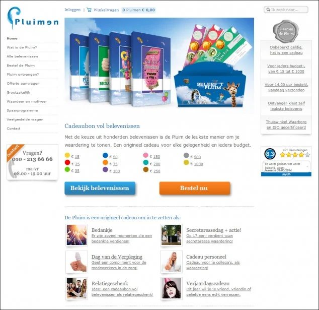
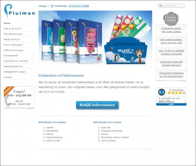
A real-life example in action
Pluimen, a Dutch gift voucher company, simplified its landing page by replacing two CTAs with one primary CTA and reducing unnecessary links. After a 47-day A/B test, the streamlined version delivered a 19.7% revenue increase, along with higher conversions and lower bounce rates, demonstrating how small, focused changes can drive meaningful results.
Control
Variation
Request a demo to explore how VWO helps teams optimize landing pages.
FAQs
What is landing page copywriting?
Landing page copywriting is the practice of writing focused, persuasive content for a standalone page designed to drive one specific action, such as a sign-up, demo request, or purchase.
How to write content for a landing page?
Start by defining your audience and conversion goal, then write clear, benefit-led copy that addresses user pain points, reinforces trust, and guides visitors toward a single, well-defined call to action.
How to write the best landing page copy?
The best landing page copy is simple, relevant, and data-informed. It speaks to one audience, highlights outcomes over features, removes friction with social proof and risk reversal, and is continuously tested and refined based on real user behavior.
Hi, I’m Pratyusha Guha, manager - content marketing at VWO. For the past 6 years, I’ve written B2B content for various brands, but my journey into the world of experimentation began with writing about eCommerce optimization. Since then, I’ve dived deep into A/B testing and conversion rate optimization, translating complex concepts into content that’s clear, actionable, and human. At VWO, I now write extensively about building a culture of experimentation, using data to drive UX decisions, and optimizing digital experiences across industries like SaaS, travel, and e-learning.
Uncover hidden visitor insights to improve their website journey
One of our representatives will get in touch with you shortly.
Awesome! Your meeting is confirmed for at
Thank you, for sharing your details.
, you're all set to experience the VWO demo.
I can't wait to meet you on at
Account Executive
, thank you for sharing the details. Your dedicated VWO representative, will be in touch shortly to set up a time for this demo.
We're satisfied and glad we picked VWO. We're getting the ROI from our experiments.
Christoffer Kjellberg
CRO Manager
VWO has been so helpful in our optimization efforts. Testing opportunities are endless and it has allowed us to easily identify, set up, and run multiple tests at a time.
Elizabeth Levitan
Digital Optimization Specialist
As the project manager for our experimentation process, I love how the functionality of VWO allows us to get up and going quickly but also gives us the flexibility to be more complex with our testing.
Tara Rowe
Marketing Technology Manager
You don't need a website development background to make VWO work for you. The VWO support team is amazing
Elizabeth Romanski
Consumer Marketing & Analytics Manager


![7 Best Sales Funnel Software for Every Business in 2026 [Backed by Expert Reviews]](https://static.wingify.com/gcp/uploads/sites/3/2025/01/Feature-image-7-Essential-Sales-Funnel-Software-for-Every-Business_-Top-Picks-for-Every-Purpose.jpg?tr=h-600)
![7 Top Landing Page Optimization Tools for 2026 [Ranked by Marketers]](https://static.wingify.com/gcp/uploads/sites/3/2024/10/Feature-image-Top-7-Landing-Page-Optimization-Tools-1.jpg?tr=h-600)