5 Reasons Why You Shouldn’t Ignore Flat Design for Epic Conversions
Flat design is easily one of the most popular buzzwords in the current UI/UX space.
Especially in the last few years, flat design has been pushed into the mainstream. Even the biggest companies are now following this design approach.
So what’s the reason for its increasing popularity? Simply put, it works!
Download Free: Website Redesign Guide
Flat design can help improve user experience on websites and apps. This, in turn, can produce a higher number of conversions. However, don’t take our word for it. Use VWO Testing to test landing page versions with split URL testing and deploy only what works for you. Take a 30-day, guided free trial to kickstart your redesign journey.
This post will introduce you to flat design, and the advantages it can offer.
Here we go.
What is flat design?
It is a design approach that involves creating minimalistic two-dimensional (flat) illustrations for web and mobile interfaces.
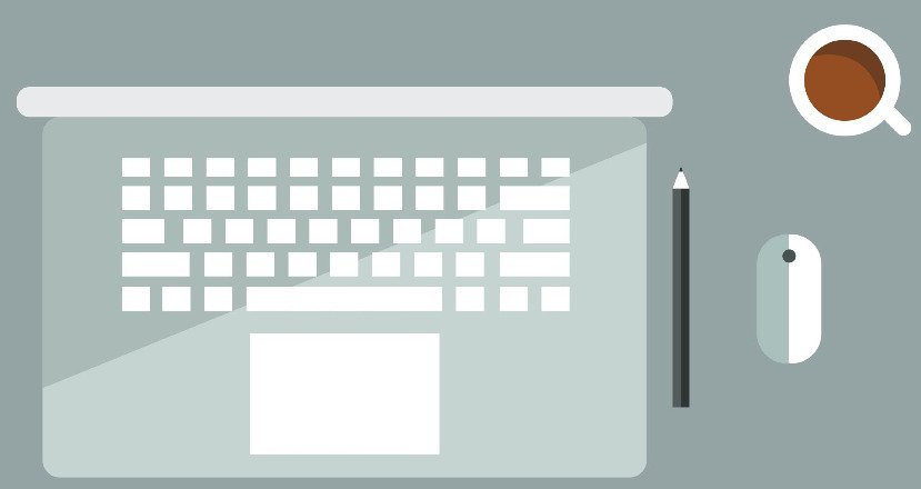
Flat design gets rid of unnecessary styling and elements that give an illusion of three dimensions (such as gradients, textures, and drop shadows). This is in contrast to skeumorphism, another design practice, which involves creating designs that resemble real-life objects.
Flat design is all about crisp shapes, (both) sober and bright colors, and scalable illustrations. Even the fonts used in flat design are mostly sans-serif.
Issues with flat design
In its early days, flat design was related too closely to minimalism and mobile-first design. While both these attributes contribute heavily to a successful flat design, it does have its limitations.
An example can be found with Windows 8 released by Microsoft. Metro design of Windows 8, considered by some as the pioneer of flat design, had some inherent flaws with it.
The NN Group conducted a usability test on Windows 8, and found out that users had difficulty in identifying actionable objects on its interface.
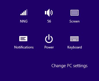
Regarding the OS interface (as seen in the picture above), the study says:
“Where can you click? Everything looks flat, and in fact ‘Change PC settings’ looks more like the label for the icon group than a clickable command. As a result, many users in our testing didn’t click this command when they were trying to access one of the features it hides.”
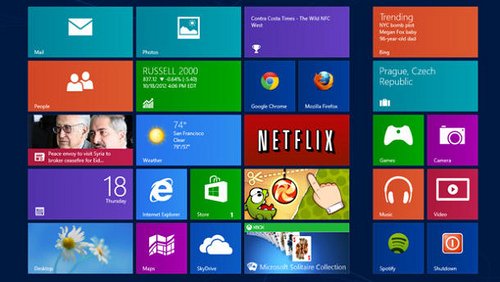
Additionally, the Windows 8 interface was biased towards mobile users. The big colorful rectangular tiles looked sweet on a mobile device. The interface was well-suited for finger gestures on a touch-screen. However, the same tiles on a big desktop monitor looked clumsy. Its usability with the mouse was in question, as well.
Flat design 2.0
Fixing the usability issues associated with it, flat design has evolved over time. It has moved on from being absolute-flat to semi-flat.
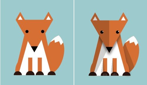
Though the approach of flat design 2.0 is still flat, it employs layers, contrast, and subtle shadows to give a hint of depth in an interface.
Here’s an example (Notice the subtle shadow and layers.):
Now that we are familiar with what flat design is, let’s look at how it helps websites win over users.
#1 Flat design improves readability
One of the cornerstones of flat design is readability.
Flat design allows users to view and understand website content with ease, regardless of whether they are using desktops or mobile devices.
It replaces complex images with simplified (minimalistic) icons and vectors. Flat icons and their accompanying text make it easy for users to grasp any concept.
Moreover, flat design emphasizes clear typography and sans-serif fonts. The text background, too, normally comprises a single contrasting color.
In flat design, content is the focus.
Let’s take an example.
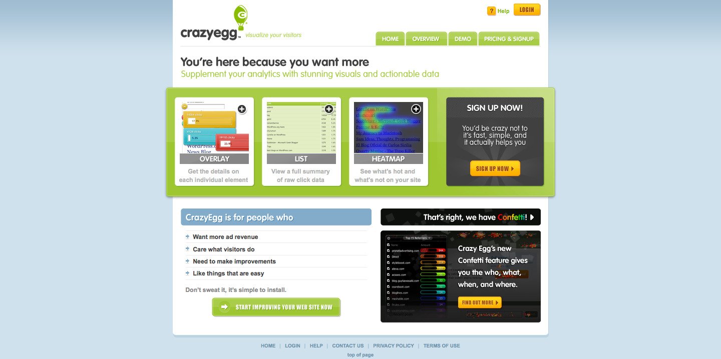
This is the Crazyegg website from the year 2009:
And this is the new, flat look of the website at present:
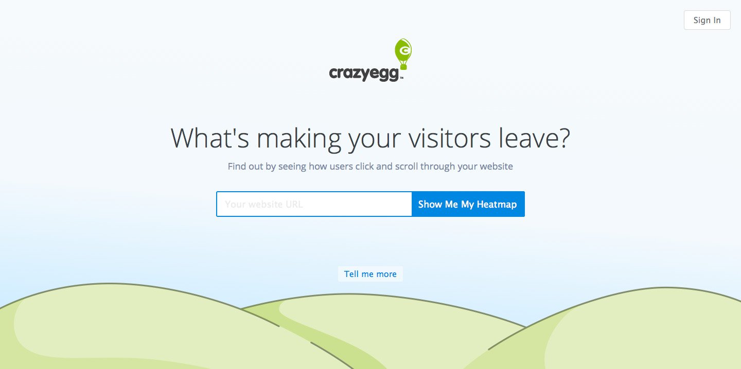
We can observe how the new flat design is able to declutter information and improve readability. The new design establishes Crazyegg’s value proposition clearly, with minimal content.
With flat design, educating users becomes a breeze. And once users know about a product/service better, the chances of them converting increases, too.
Download Free: Website Redesign Guide
#2 Free of distractions
Flat design is all about minimalization.
A flat design lacks embellishments or decorative elements that don’t provide value to users. The aim is to steer users’ attention towards the prime content of a website.
Looking at the CrazyEgg example above, we observe that its new design is free of distractions. The attention of users only goes where the website wants it to go.
This design feature is often referred to as white space.
White space is an integral part of flat design.
Flat design makes it easy to prioritize and highlight content.
Related Read: JellyTelly Found Their Navigation Elements Were a Distraction, Are You Making the Same Mistake?
#3 Decreases page-load time
Slow-loading websites and apps are irritating to use; users bounce away.

When you cannot cut down the content that you need to show to your users, and you still have to keep your website fast, you can either go for low-resolution images and graphics or use flat design. Flat design seems like an obvious choice here.
Compared to websites that use heavy images and graphics, flat design websites load faster. With the absence of gradients, serif fonts, and other skeuomorphic properties, flat design elements are smaller in file size. Web elements with a smaller file size load quicker than elements with a larger file size. Google changed its logo to a sans-serif one to reduce the logo size and ultimately the load time of its homepage.
Even from a developer’s perspective, flat design works quicker. Components of a flat web page are vector or code-based graphics, which further contribute to a reduced page-load time.
A fast-loading website affects the bottom line of a business. It can help increase conversions and revenue for websites.
#4 The SEO advantage
Page loading speed is one of the top factors in SEO for websites. Since flat design decreases load time for websites, it improves websites’ search engine rankings. Graphic-heavy, slow websites, in contrast to websites with flat design, receive negative scores from search engines.
With a greater chance of appearing on top of SERPs, flat design websites can tap high-intent users on search engines. Normally, high-intent users are more inclined to make conversions.
Add-on: Apparently, Google is testing a new feature on its SERP that labels websites as “slow” if they have a high load time.
Take a look at the screenshot below.

#5 Up-to-date look
Web users form an impression about a website in about 50 milliseconds!
It means users have spent only 0.05 seconds on a website when they decide whether they like the website.
So how does this work? Users can’t possibly go through the content of a site in such a short span.
They judge a website based on its look and feel. Users visit a website, look at its design/UI, and form an opinion about the website.
Flat design can help websites shape a favorable first impression on their visitors. When users visit a website or an app, the modern look and feel of flat design influences them positively.
Flat design is arguably the biggest design trend at the moment. Giants of the web and mobile industry, such as Apple, Google, Microsoft, etc., have accepted flat design with open arms. Users can take this as a cue and set flat design as a benchmark for all the websites they visit.
Bonus content: Watch a webinar on the experimentation framework followed at Dell Technologies to offer a superior experience to users.
Analyze your eCommerce website for free
Conclusion
Flat design is the design trend prevailing across the web and mobile space, presently. Although best known for improving user experience, flat design has various other benefits to offer: better readability, reduced page-load time, SEO advantage, etc. We’ve seen industry giants incorporating flat design and tapping those benefits.
If these benefits make sense to you and your business, only then) You too should consider branding your website or app with a flat design. However, instead of opting for rebranding straightaway, we highly recommend A/B testing design options to understand which version resonates best with your audience and converts better.

