Coaxing out every possible dollar: a “Pricing Page” test you can launch today
Following is a guest post by Joanna Wiebe, who is a conversion-focused copywriter and the writer of the copywriting-for-startups ebook series Copy Hackers. Follow her on Twitter @copyhackers.
Okay, so here’s something most web copywriters won’t tell you: copy can only do so much.
Even really amazing copy – like stop-in-your-tracks headlines, clear value propositions, and prominent reasons to believe – won’t squeeze out every possible conversion on your site.
And, of course, conversion rate optimization is all about squeezing more money out of your site.
Download Free: Landing Page Optimization Guide
So let’s say you’ve run a bunch of copy tests, a bunch of design tests, a bunch of flow tests.
You’ve done the research, you’ve crafted the hypotheses, you’ve slaved over test creative, you’ve run tests, you’ve measured results. Great. Good on you.
But what if you could do one test without any research beyond that in this post?
What if you could develop one treatment that uses exactly the same copy as the control?
What if your next test required a couple of hours of your designer’s/dev’s time + VWO?
And what if your next test took place on one of the most critical pages in your conversion funnel – your Plans & Pricing or catalog page – and could help you pull in more revenue per customer?
What if you could log into VWO right after reading this blog post and have a running test with a great hypothesis ASAP?
I Can Hear the Testing Die-Hards Screaming Now
“You can’t just test willy-nilly! You need research.”
“You need to know everything there is to know about your visitors before you run a test!”
Okay, okay – got it. Yes, that’s the ideal way to test. Do surveys, do click-tracking, do user tests. That’s how consultants teach us to test.
(I should know. My hubby and I have been consulting on this stuff for years now.)
But here’s the truth: the average online marketer doesn’t do a lot of research before testing. They should, but they don’t because, in most cases, they’re busy doing the work of 2 people. But they still want to optimize their sites, so they mimic other winning creative treatments in their own tests, or they read books like Cialdini’s “Influence” and develop test creative based on that.
That’s the reality of optimizing websites in most businesses today.
And it’s actually not a terrible approach.
As long as you have a data-driven hypothesis, you have the basis of a quality test.
And if your hypothesis is based on what you’ve learned from smart dudes like Cialdini – whose books are filled with academic research about human decision-making psychology – then your hypothesis is data-driven. So good. Let’s proceed.
The Background of This Test
Chances are good you already know that visitors to your site – like all consumers – use more than just the words and colors on a web page to make a decision about whether to stay or bounce, whether to read or skip, and whether to exit or convert.
People stay on your site, sign up for your newsletter, subscribe to your software, and buy your ebooks based on factors beyond the messages you’re showing them.
Tons of research shows that we use peripheral cues and non-conscious processes on the websites we visit in order to make consumption and purchase decisions. For example:
- We seek out testimonials, Facebook likes, and tweets so we don’t feel like we’re the first ones to try X
- We seek out logos from the media to validate our interest in X
- We seek out starred reviews to keep us from making a mistake we’ll regret
- We seek out photos of bloggers so we feel a positive human connection
- We seek out security logos so we won’t lose our privacy and have our status quo disrupted
Those are the obvious cues.
More subtle cues tap into our implicit decision-making processes and can help you squeeze more money out of those customers who are uncertain as to which of your products to choose.
Meet “primacy effect” and “extremeness aversion”, two uber-nerdy insights into how consumers buy that will drive this test.
- “Primacy effect” simply means that the order in which multiple items are arranged in a list or catalog influences product selection or purchase behavior. So if the item at the top of a vertical list or to the far left of a horizontal list is really cheap, that sets an expectation of the cost of goods on the rest of the list.
- “Extremeness aversion” is all about avoiding one extreme or the other when making a decision. Extreme options are, by and large, less attractive than moderate options. So when looking at a list, the average person would avoid the really cheap items and the really expensive items. In the absence of certainty about which item to choose, they gravitate toward the middle ground.
(This shizzle’s all supported.*)
Download Free: Landing Page Optimization Guide
The Test: Swap the Order of Your Products
The average startup catalog page looks something like this one, by SalesForce:
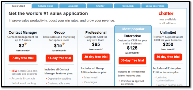
As you can see, the products are organized, left to right, from least expensive to most expensive.
When you look at this page with the primacy effect in mind, you can confidently assume that the average visitor to this site sees $2 first and thus believes that SalesForce products will be relatively inexpensive.
The first-seen price sets the standard.
So what happens when that same visitor’s eyes dance on over to the end of the row… where the massive, quite intimidating $250 pops out?
Based on the primacy effect, s/he should be pretty freakin’ surprised.
We don’t know what SalesForce visitors actually do when they see such variety in pricing, but the primacy effect suggests that they would be less likely to consider the more expensive option(s) simply because their first impression made them believe all SalesForce products would be inexpensive.
Further, when you apply what you know about extremeness aversion, you can hypothesize that most visitors will eliminate the $2 and $250 options as possibilities.
That will leave just the middle three options to choose from: $15, $65, and $125.
So, that understood, what should you do with the treatment you’re going to create?
Start by deciding which product you’d most like to sell – otherwise known as your “lead” product. In this case, the “Most Popular” callout suggests to me that the $125/mo product is their lead product.
Ok, great. Now reorganize the page to make the $125 option look more reasonable. Like so:
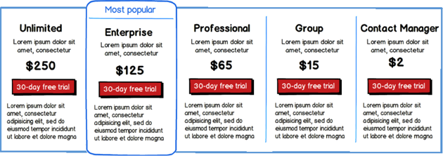
Here’s our hypothesis:
A pricing page that is, by default, organized with the most expensive-priced item to the left of the horizontal list will trigger primacy effect and extremeness aversion, thus increasing average revenue per visitor.
…So test it. Voila.
That’s it.
I’m not guaranteeing that this is a winner! I’m not crazy.
In fact, I have a hunch that SalesForce would still see a lot of $65 signups, not a dramatic spike in $125 signups. The middle-ground options would simply be better explored. I believe that to be true because this test is based on tons of research I’ve pored over* about how people make decisions when presented with options in an ambiguous environment.
How your particular visitors respond to it is the part worth testing. (And that’s also the part where doing your own customer research can help you get a sense for which product to lead with.)
Two things to note:
- This test isn’t trying to get people into products that aren’t a good fit for them. I hope it goes without saying that you still want to be ethical and good to your customers. This test is simply about helping people narrow their options better – so they don’t make rash decisions based on the first elements they see on a page. The effect tends to be higher average revenue per user (ARPU).
- I’ve conducted this very sort of test before, for a Canadian software company. In that test, not only did ARPU increase by 5%, but the recipe that used primacy + extremeness aversion also saw a conversion lift of 8.92%.
These aren’t massive increases, but, again, conversion rate optimization is about squeezing out every penny you can… and testing is about learning from your visitors. You’ll do both with a test like this.
Oh, and in case you’re wondering if anyone else is ordering their solutions this way, yes. In fact, 37signals has been for years. This is their previous solution-ordering for Basecamp:
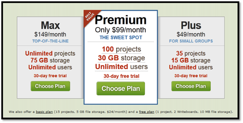
And this is how they order their solutions now:
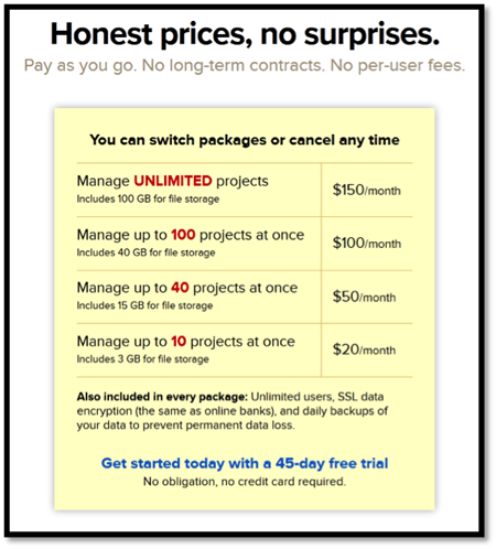
Both lead with the most expensive product. And with 37signals’s testing culture, you can be pretty sure they’re doing it this way because they’ve tested it.
…So, are you ready to give this simple idea a shot in your next split test?
Editor’s note: If you liked this article, you may also want to explore another article on price testing we had posted earlier: Stop guessing! Use A/B testing to determine ideal price for your product
*Interesting Research:
Chernev, A. (2005). Context Effects without a Context: Attribute Balance as a Reason for Choice. Journal of Consumer Research, 32(2), 213-223. Retrieved from Academic Search Complete database.
Chernev, A. (2004). Extremeness Aversion and Attribute-Balance Effects in Choice. Journal of Consumer Research, 31(2), 249-263. Retrieved from Academic Search Complete database.
Mourali, M., Böckenholt, U., & Laroche, M. (2007). Compromise and Attraction Effects under Prevention and Promotion Motivations. Journal of Consumer Research, 34(2), 234-247. Retrieved from Academic Search Complete database.
Simonson, I. (1989). Choice Based on Reasons: The Case of Attraction and Compromise Effects. Journal of Consumer Research, 16(2), 158-174. Retrieved from Academic Search Complete database.
Valley, I., & Chater, N. (2006). Game Relativity: How Context Influences Strategic Decision Making. Journal of Experimental Psychology / Learning, Memory & Cognition, 32(1), 131-149. doi:10.1037/0278-7393.32.1.131.
Wernerfelt, B. (1995, March). A Rational Reconstruction of the Compromise Effect: Using Market Data to Infer Utilities. Journal of Consumer Research, 21(4), 627-633. Retrieved from Academic Search Complete database.
Note: The author owns screenshots used in the blog.

