12 Most Effective Web Form Examples to Explore
Did you know that 67% of users will abandon a form entirely if even one part feels confusing? Web forms may look simple, but they play a crucial role in shaping conversions.
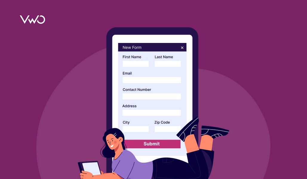
A web form is the structured interface where visitors submit their information, whether it’s signing up, requesting support, or completing a purchase, and it often determines whether they stay engaged or drop off.
In this guide, we’ll explore 12 effective web form examples that show how thoughtful design can turn everyday forms into high-performing conversion drivers.

Why web forms are important
Web forms play a central role in how users interact with a website. They’re how visitors ask for help, express interest, make decisions, or share what they’re looking for.
By bridging the gap between curiosity and action, web forms give businesses a clear way to understand their audience while helping users take the next step with ease and confidence. Here’s why they matter:
Reliable data collection
Forms collect information in a consistent, structured format, ensuring every submission includes the details you need. With predefined fields and validation checks, the data captured is more accurate, complete, and easier for teams to process.
Lead generation and business growth
Every newsletter signup, quote request, or demo inquiry begins with a form. By capturing essential contact details, forms help businesses identify potential customers and nurture them into conversions.
Streamlined user interaction
Web forms provide a clear path for users to take action. Whether someone wants support, wants to book a service, or wants to join a waitlist, forms make these interactions simple and accessible.
Faster and more efficient workflows
Digitized forms eliminate paperwork, save time, and automate routine tasks. They allow businesses to process inquiries, applications, and orders more quickly and consistently.
Improved customer service
Support and contact forms ensure users give the right details upfront, like order numbers, account IDs, or issue categories, making it easier for teams to respond accurately and promptly.
Enhanced user experience
A well-designed form feels intuitive and effortless. Clear form fields, a logical structure, and a smooth submission process create a positive experience, reducing user frustration and increasing completion rates.
Top types of website forms
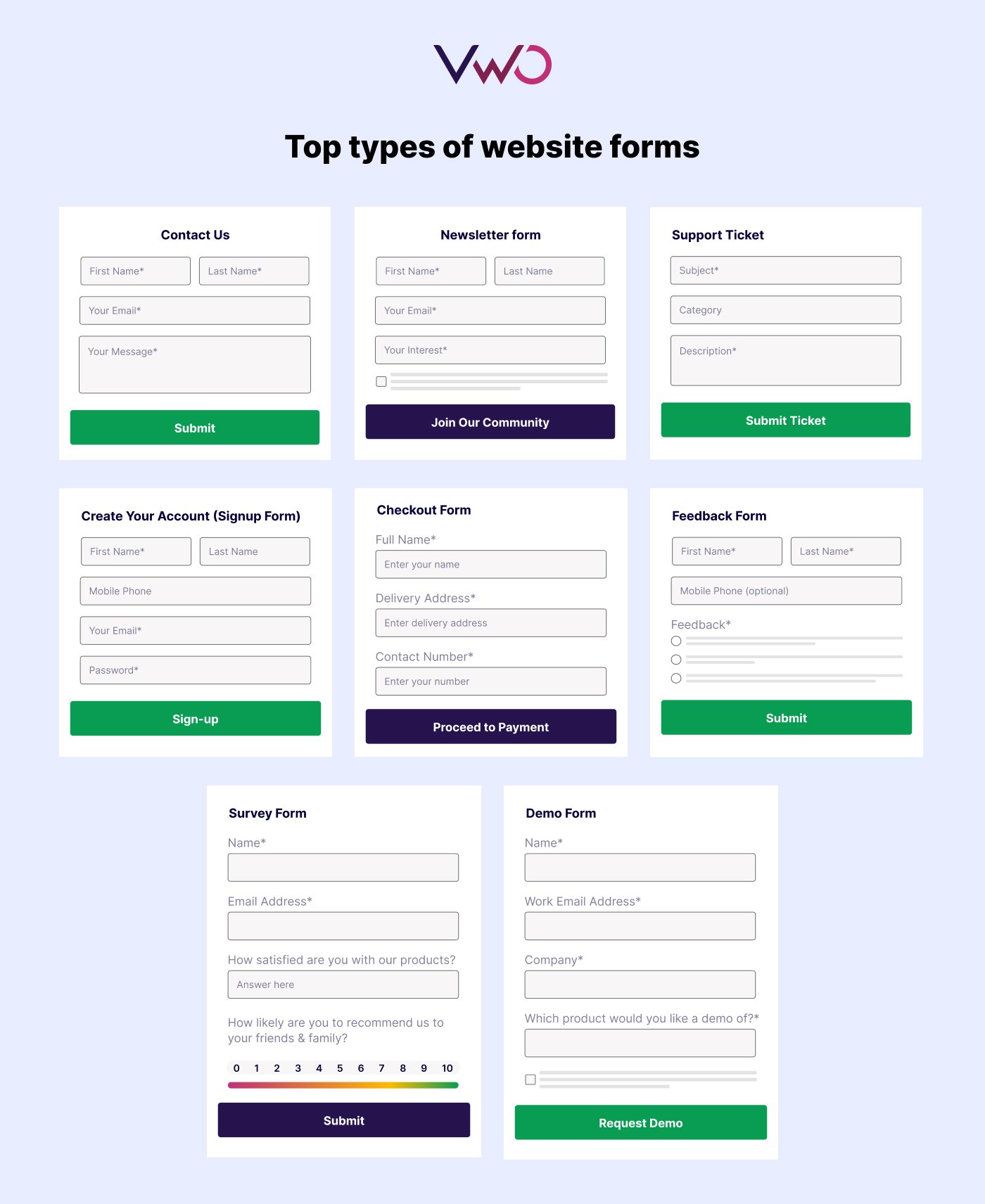
Different forms serve different goals. Here are the most common types you’ll see across websites and what they’re typically used for:
Communication & engagement forms
These forms are essential for initiating contact, building an audience, and generating sales prospects.
- Contact forms: Simple forms (usually Name, Email, Message) that allow visitors to ask questions, raise complaints, or contact the business.
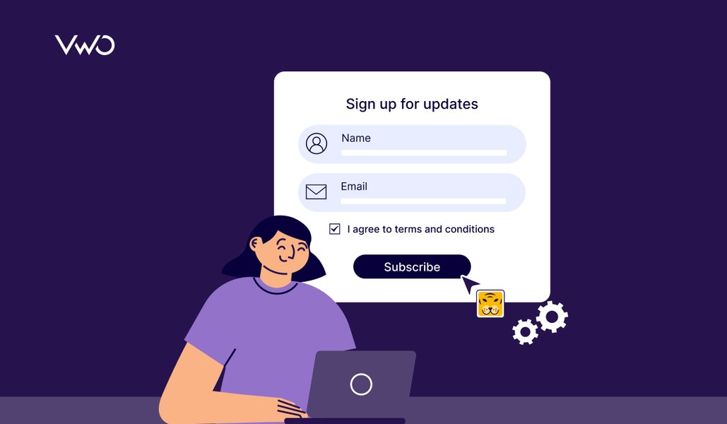
- Newsletter/Subscription forms: Typically very short (often just an email address), designed solely to build an email list for marketing and updates.
- Support or ticketing forms: Specialized forms for users to report issues or request technical support, often including fields for priority and issue category.
Lead capture & conversion forms
- Sign-up/Registration forms: Used to create a user account on a platform or service. They often require an email and a password and are the user’s entry point.
- Lead generation /Demo request forms: These are used to capture potential customer information (leads), often in exchange for something valuable like a free download, a demo, or an exclusive discount. To see what effective lead generation forms look like in practice, explore this collection of 18 high-performing examples.
- Event registration forms: Used to collect attendee details and preferences for webinars, conferences, or workshops.
Transaction & fulfillment forms
- Payment/Checkout forms: Crucial for e-commerce, they securely collect payment and shipping information during the final steps of a transaction.
- Order forms: Designed to facilitate the purchase of products or services, collecting necessary details for fulfillment.
- Booking/Appointment forms: Used to schedule specific services, consultations, or appointments (often featuring date/time pickers).
- Quote or inquiry forms: Used by service-based or B2B companies to allow users to request specific pricing or custom estimates.
Data collection & feedback forms
- Feedback/Survey forms: Indispensable for gathering customer insights, suggestions, and measuring satisfaction with a product or service.
- Application forms: Used to standardize processes for things like job applications, membership sign-ups, or applying for a service.
- Product inquiry forms: Used specifically for customers to ask detailed questions about product specifications, availability, or customization options.
10 Real-world web form examples from top brands
Contact us form- Pixpa
Pixpa uses a straightforward layout with clearly labeled fields for name, email, subject, category, and message. The form is simple enough for quick communication yet structured enough to help the support team route inquiries efficiently. The minimal design, generous spacing, and clear placeholder text make it easy for users to fill out without confusion.

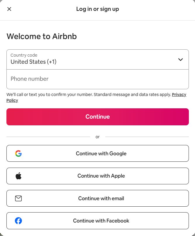
Signup form – Airbnb
This Airbnb sign-up form keeps things simple with a quick phone number entry and multiple social login options. The bold CTA and clean layout make the registration process fast and friction-free.
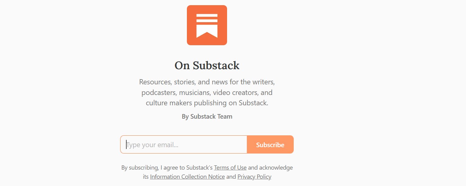
Subscription form – Substack
This Substack subscription form keeps the experience simple with a single email field and a clear “Subscribe” button. The centered layout and brief description highlight the newsletter’s value without adding friction. It’s a minimalist, high-conversion design that focuses on clarity and ease.
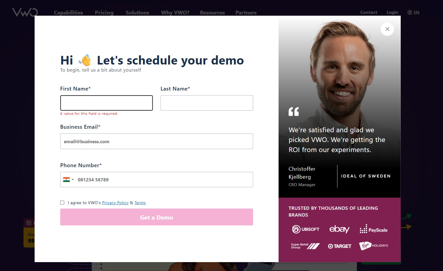
Lead generation/Demo form – VWO
This VWO demo request form captures high-quality leads by collecting essential fields such as name, business email, and phone number. The clean layout is paired with social proof on the right, reinforcing trust and increasing conversions. Its structured, professional design makes it ideal for B2B lead generation.
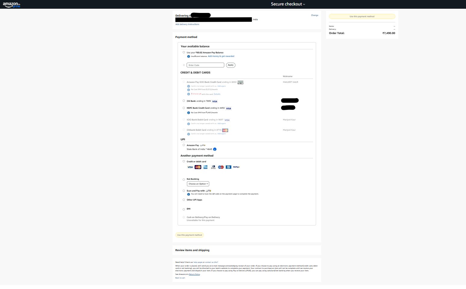
Payment / Checkout forms – Amazon
This Amazon checkout form organizes multiple payment methods in a clear, easy-to-scan layout, with the order summary fixed on the right. The streamlined design helps users review details and complete their purchase confidently.
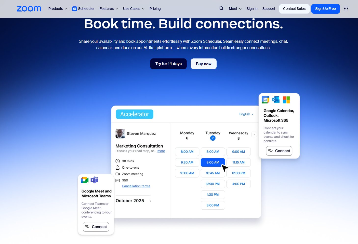
Booking / Appointment forms – Zoom
The Zoom Scheduler form lets users pick a date, choose from available time slots, and book a consultation with just a few clicks. The layout is clean and visual, combining the calendar view with clear appointment options. It’s a strong example of a modern, intuitive scheduling experience.
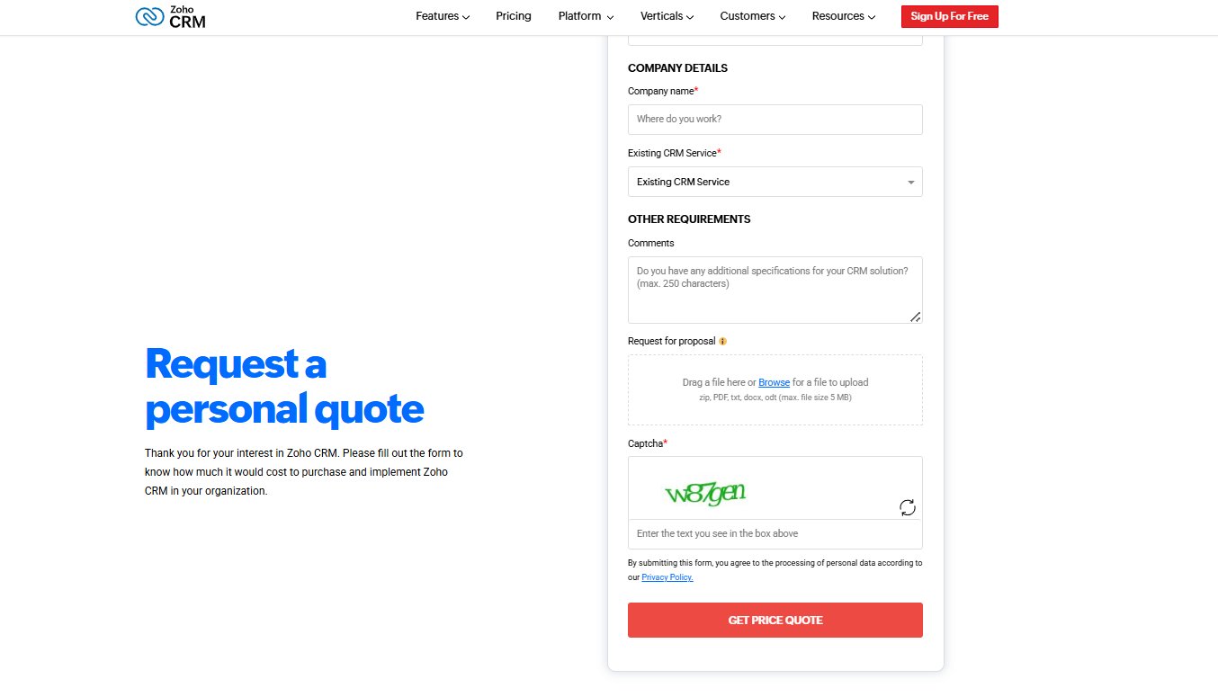
Quote or Inquiry Forms – Zoho
The Zoho CRM quote form gathers key details like industry, team size, and contact info to generate a tailored estimate. Optional fields for comments and file uploads help users share specific needs. It’s a clear, business-focused layout built for precise inquiries.

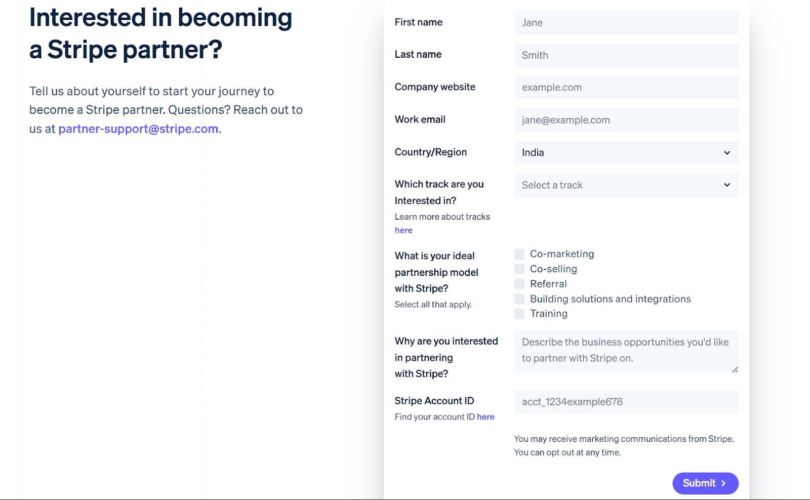
Application form – Stripe
This Stripe partner application form gathers essential company details, preferred partnership track, and collaboration preferences in a clean, structured layout. With simple fields and checkboxes, it makes submitting a complete application quick and straightforward.
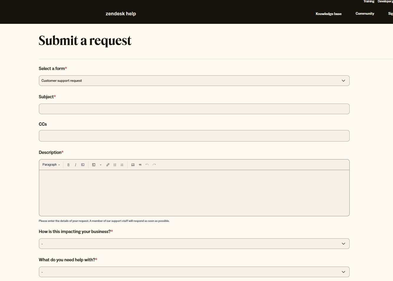
Support/Ticketing form – Zendesk
This Zendesk support request form lets users choose their issue type, add details, and upload attachments in a clean, structured layout. The large description box and simple dropdowns make it easy to submit clear, organized requests.

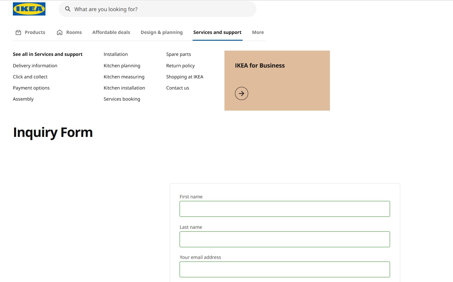
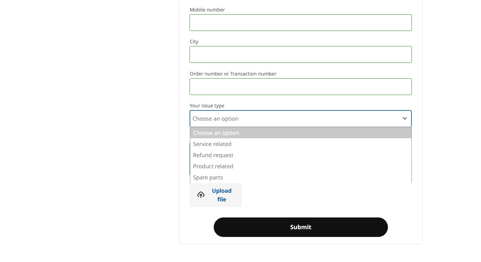
Product inquiry form – Ikea
This IKEA inquiry form collects key details like contact info, order number, and issue type to help customers get quick answers. A simple layout and optional file upload make it easy to explain product concerns clearly.
Best practices for web form design
A well-designed form can be the difference between a completed submission and an abandoned task. By focusing on clarity, simplicity, and ease of use, you can create forms that guide users smoothly from start to finish. Below is a list of best practices to keep handy:
Structure & layout
The layout of your form dictates how easy it is for users to mentally process the task ahead.
- Keep it concise: Only ask for the information you absolutely need right now. Fewer fields mean more completions. Trimming a form from four fields to just three can lead to almost a 50% jump in conversions.
- Use a single-column layout: Line up all fields vertically (one under the other) to guide the user’s eye straight down.
- Group related fields logically: Put similar fields together (e.g., Shipping Info) and use clear titles to separate groups.
- Order fields logically: Start with easy questions (Name, Email) and move to harder or more sensitive ones later (Payment, details).
- Use multi-step forms for long forms: Break very long forms into small, manageable pages. Always include a clear progress bar.
Labels & instructions
Clear and consistent labeling prevents confusion and ensures the user enters the data correctly the first time.
- Use clear, persistent labels: Put field labels above the box so they don’t disappear when the user starts typing.
- Differentiate required vs. optional: Only mark the fields that are optional. Assume all others are required.
- Provide helper text judiciously: Use a short sentence under the label to explain why you need the information or how to format it.
- Use the right input element: Use radio buttons for short lists where only one choice is possible. Use checkboxes for choices where multiple selections are allowed.
Validation & feedback
Effective validation provides immediate feedback, helping users correct mistakes without frustration or losing their progress.
- Use inline validation: Show a success or error message right away as the user moves from one field to the next.
- Communicate errors clearly: Error messages must be specific; say what is wrong and how to fix it (e.g., “Email is missing the ‘@’ symbol.” rather than “Error 404”)
- Set user expectations: Give the form a clear title so the user knows exactly what they will get (e.g., “Sign Up for Free Trial”).
- Provide submission confirmation: After the user hits the button, show a clear message saying it was successful and what to do next.
Effort reduction
These techniques minimize typing and thought, making the form as quick and seamless as possible.
- Leverage autofill: Make sure browsers can automatically fill in common information (like Name and Address).
- Use smart defaults: Pre-select the most common choice (like the user’s country) to save them a click.
- Use task-specific CTA buttons: The button should say what the user is doing (e.g., “Get Quote” or “Place Order”), not just “Submit.”
- Simplify input types for mobile: Use the correct settings so mobile phones show the right keyboard (numbers for phone fields, etc.)
Conclusion: Optimize web forms with VWO
Designing a form according to best practices is a critical first step, but the real business impact comes from continuous optimization. A form is not a static element; it is a dynamic touchpoint where friction means a lost lead or missed revenue.
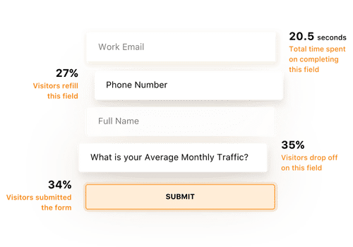
Go far beyond simple submission rates with VWO Form Analytics. It provides granular, field-level data to uncover why drop-offs occur. You can track total time taken, hesitation time, refilled fields, and exact drop-off points, revealing friction at the source and empowering you to fix the weakest links.
Watch the VWO webinar on using Form Analysis to turn form friction into conversion wins.
Pair these with behavior insights: heatmaps, scroll maps, session recordings, and on-page feedback, and you not only see what users do, but why they do it.
Use VWO Copilot to analyze and summarize behavioral insights from heatmaps and session recordings, helping you spot user friction without manually searching for patterns. You also get optimization recommendations to try out in your next tests.
Once friction points are identified, VWO Personalize can tailor form experiences based on behavior, for example, simplifying fields for new visitors or auto-prefilling details for returning ones, and VWO Testing validates which variations work best.
SafeSoft Solutions unlocked a 100% improvement in lead generation simply by testing visible pricing on their PPC form with VWO. Discover how in the full case study here.
Request a demo to learn how VWO’s suite of tools can streamline your lead generation forms and turn more visitors into qualified leads.
FAQs
Forms are interactive fields that let users submit information, such as their name, email, preferences, queries, or orders, directly through the website. They are essential for communication, transactions, and data collection.
Start by defining the purpose of the form, then ask only for necessary information. Use clear labels, group related fields, choose the right input types, and provide helpful microcopy. Test your form for clarity, mobile-friendliness, and ease of completion before publishing.
Examples include contact us forms, account sign-up forms, checkout forms, demo request forms, job application forms, subscription forms, quote request forms, and customer feedback or survey forms.
A good web form is clear, concise, and easy to complete. It uses simple labels, asks only for essential information, provides real-time validation, works well on mobile, and guides users with a logical, one-column layout. Minimal friction = higher completions.
Commonly used web forms include contact forms, sign-up/registration forms, newsletter subscription forms, lead generation forms, checkout/payment forms, booking or appointment forms, feedback/survey forms, application forms, and event registration forms.
Categories: