Opt-In Form Examples: Types, Best Practices & More
Growing an audience today isn’t just about numbers; it’s about building meaningful relationships.
Opt-in forms make that possible by inviting visitors to share their details willingly in exchange for value they care about.
This small moment of consent is the start of a connection: you earn permission, they receive something useful, and together you open a channel for ongoing trust and engagement.
In this article, we’ll walk through the most common email opt-in form types, share real-world examples, and highlight best practices to help you design experiences that thrive on trust and value.

What are opt-in forms?
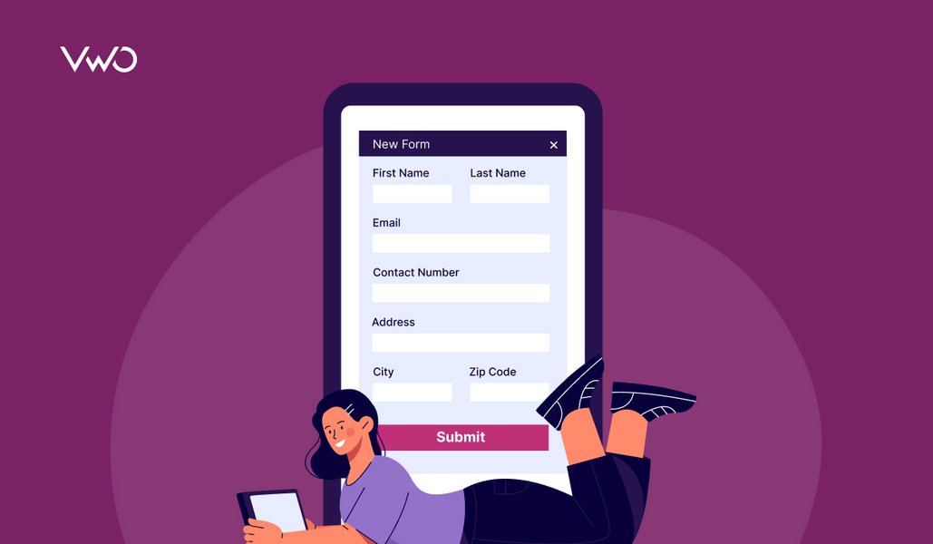
An opt-in form is placed on a website or landing page that lets visitors voluntarily share details, most often an email address, but sometimes also a first name, phone number, or other information in exchange for something valuable, such as a newsletter, discount code, free guide, or early access.
At its core, an opt-in form is about permission marketing. Instead of pushing unwanted messages, you invite people to choose to hear from your brand. This consent-based approach makes the communication channel more personal, trustworthy, and effective.
Unlike random cold emails or intrusive ads, email opt-in forms build an owned audience, a database of subscribers who have explicitly agreed to receive updates.
Reasons to use opt-in forms on your website
Opt-in forms are one of the simplest ways to turn casual website visitors into engaged subscribers. By sharing their email and other information willingly, visitors give you both permission and opportunity to deliver value, build trust, and grow your business. Here are the key reasons they’re worth adding to your website:
- Grow your email list and reach: Every new subscriber expands your audience. The more emails you collect, the more people you can reach each time you publish new content or announce offers. With email marketing delivering an average ROI of $36 for every $1 spent, this channel is simply too powerful to ignore.
- Boost conversions and sales: Opt-in forms permit you to stay in touch with people who’ve already shown interest. A subscriber who initially joins for a product launch update may later respond to a discount or limited-time promotion, ultimately becoming a paying customer. This way, you’re converting website visitors into long-term customers.
- Build trust and credibility: Offering something of real value, such as a free guide, webinar, or resource, shows website visitors that you care about helping them, not just selling to them. This goodwill makes potential subscribers more likely to trust your brand and eventually become loyal customers.
- Strengthen customer relationships: Beyond sales, forms allow you to understand subscriber preferences. By segmenting your list, you can send more relevant, personalized messages that feel helpful rather than intrusive. This kind of attention deepens loyalty and keeps subscribers engaged throughout their customer journey.
- Bring value upfront: Visitors are far more likely to opt in when they feel they’re getting something worthwhile in return. Whether it’s exclusive content, a free trial, or insider tips, the perceived value makes the exchange feel fair and exciting.
Common opt-in form types and examples
In line opt-in forms
Inline forms appear naturally within a page’s content: inside blog posts, at the end of articles, or on product/landing pages. Because they blend into the reading flow, they feel less intrusive and often work well for audiences already engaged with your content.
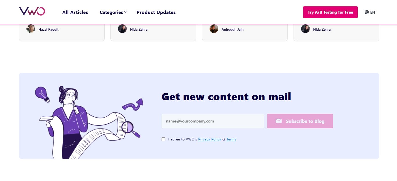
Example: VWO places a simple “Subscribe to Blog” form at the bottom of its articles, making it easy for engaged readers to sign up to get new content without breaking their reading experience.
Pop-up forms
Pop-up forms appear over the page based on user behavior: on page load, after scrolling, or when the visitor is about to exit. They grab attention instantly and work well for time-sensitive offers, discounts, or lead magnets.
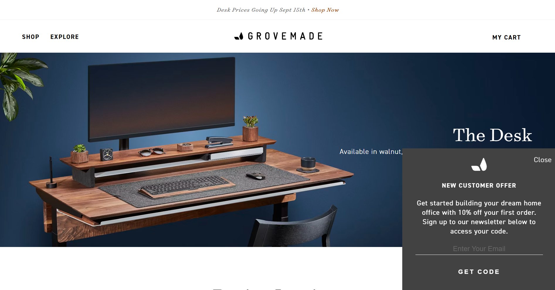
Example: Grovemade, a home office accessories brand, uses a pop-up offering “10% off your first order.” New visitors are invited to sign up for the newsletter to unlock their discount code, making the pop-up both a lead capture and a sales driver.
Slide-in forms
Slide-in forms appear from the side or bottom corner of a webpage as a visitor scrolls. They’re less disruptive than pop-ups but still attention-grabbing, making them effective for blog subscriptions, special offers, or content upgrades.
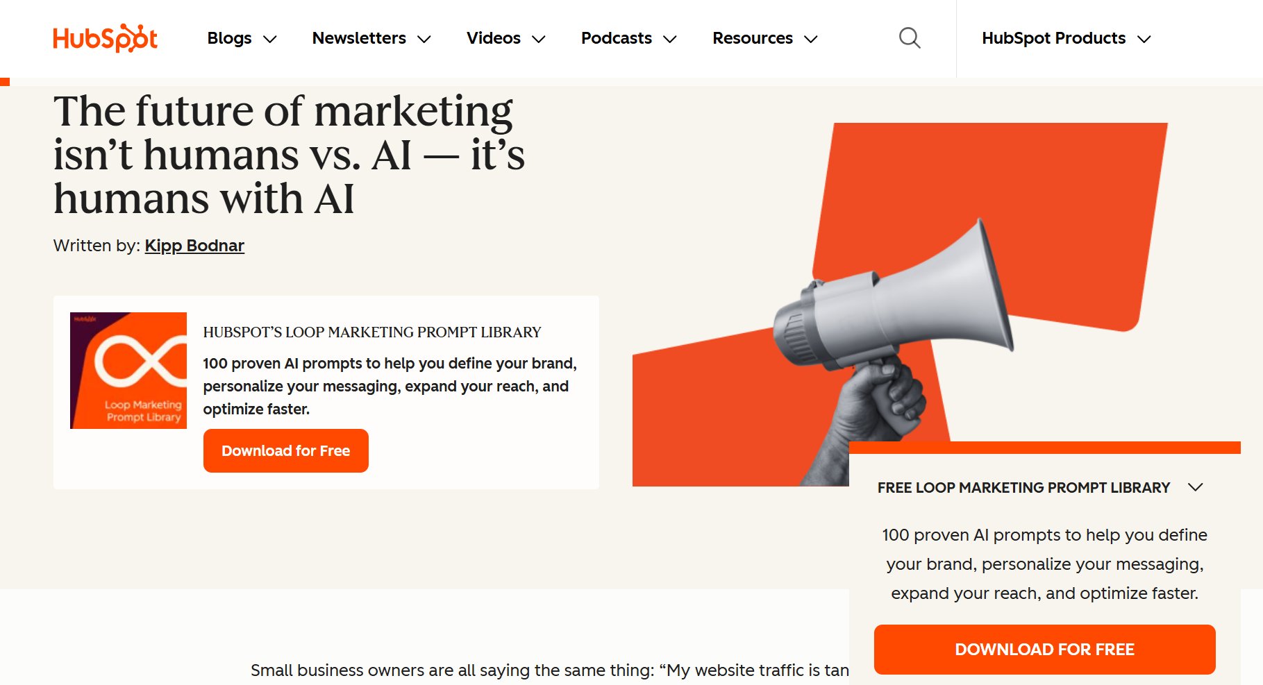
Example: HubSpot’s blog often uses slide-in forms that appear as readers scroll through an article, offering free templates or guides relevant to the topic being read. This timing ensures the form feels contextual rather than intrusive.
Sticky bar forms
Sticky bars (also called hello bars) are slim banners that sit at the top or bottom of a webpage and remain visible as visitors scroll. They work as a persistent reminder without interrupting the browsing flow, and can either collect emails directly or trigger a sign-up form when clicked.
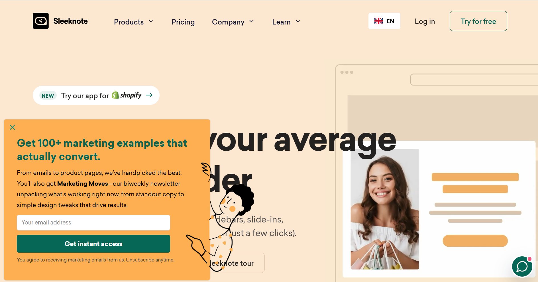
Example: On Sleeknote’s website, a green sticky bar at the bottom reads “Steal the secrets of top marketers.” When clicked, it opens a pop-up opt-in form where users can enter their email. This two-step design ensures a smooth browsing experience while still capturing leads effectively.
Exit-intent forms
Exit-intent forms appear when a visitor’s behavior signals they’re about to leave a site, like moving the cursor toward the close button. They work well to capture last-minute leads, reduce bounce rates, or offer discounts that persuade potential subscribers to stay.
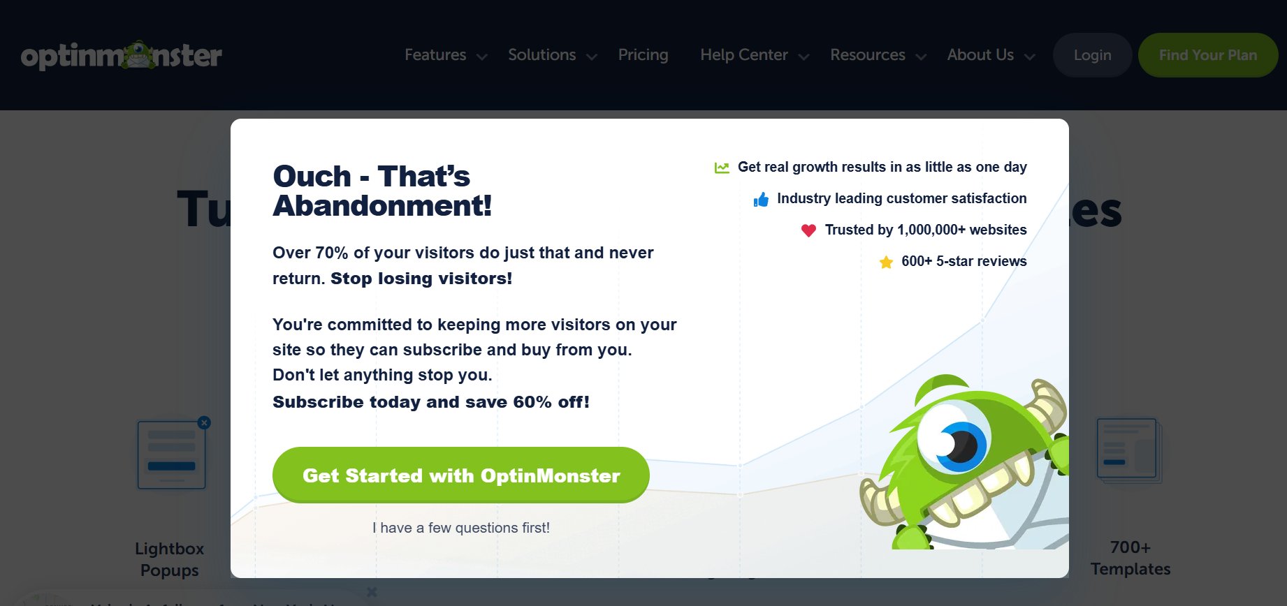
Example: OptinMonster uses exit-intent pop-ups that trigger when a visitor moves toward closing the page. With bold headlines like “Ouch – That’s Abandonment!” and offers such as “Subscribe today and save 60% off,” these forms convert the exiting visitors into subscribers or customers.
Gamified opt-in forms
Gamified opt-in forms transform sign-ups into an interactive experience, incorporating elements such as spin-to-win wheels, scratch cards, or quizzes. By making the process fun, they increase engagement and often boost conversion rates compared to standard forms.
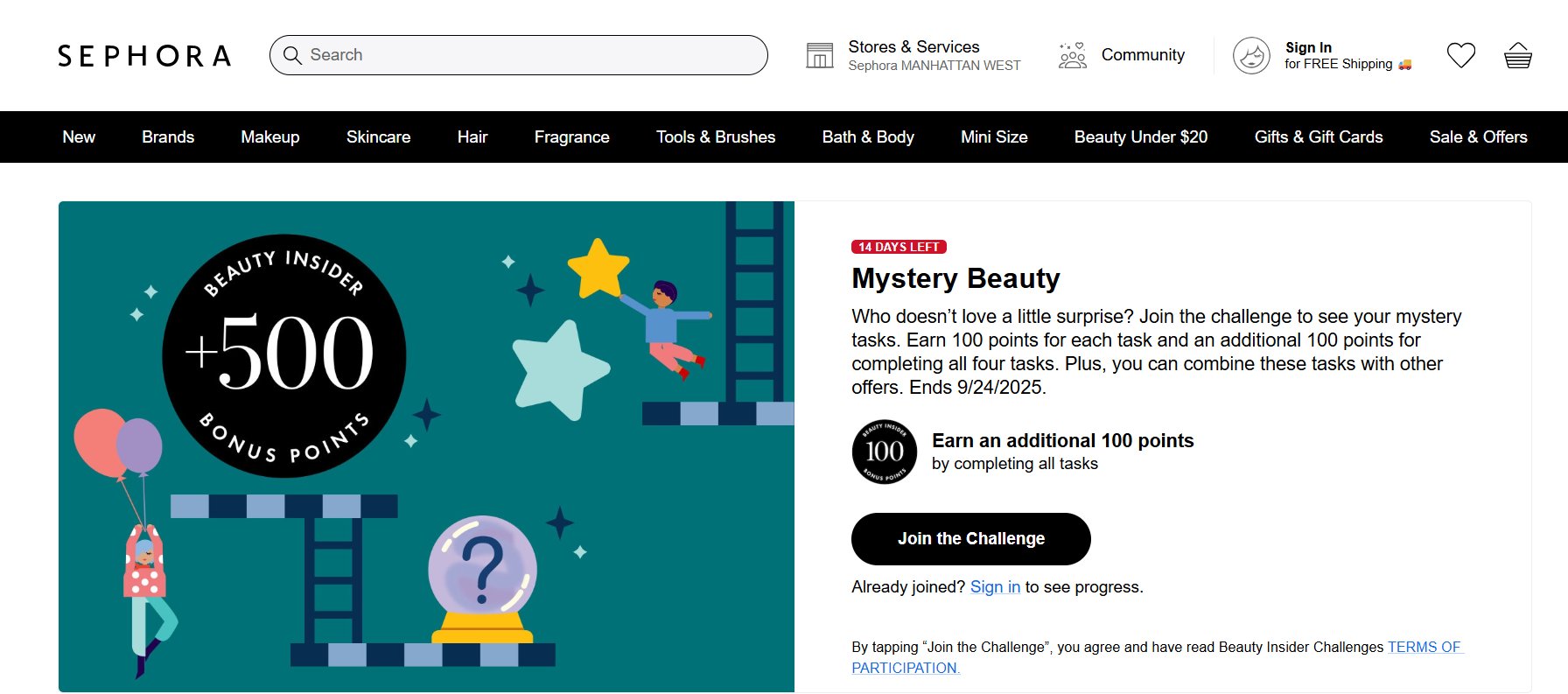
Example: Sephora’s Beauty Insider Challenge encourages users to join by completing “mystery tasks.” Each task earns bonus points, and members must sign up or log in with their email to participate. This gamified approach taps into surprise and reward, making users more motivated to engage and opt in.
Full-screen opt-in forms
Full-screen forms take over the entire browser window, blocking out distractions so visitors focus solely on the offer. Because they demand full attention, they’re best suited for high-value offers like event registrations, gated content, or major discounts.
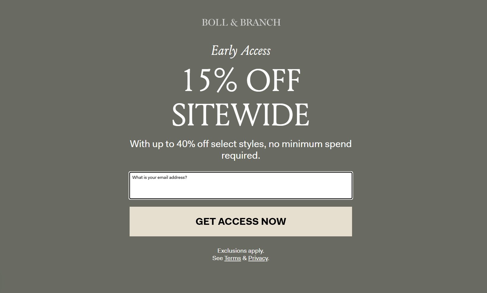
Example: Boll & Branch, the luxury bedding brand, uses a full-screen opt-in during various promotions.. Visitors see a takeover screen offering “15% off sitewide” and must enter their email to unlock early access. This immersive format maximizes visibility and conversions.
Landing page opt-in forms
Landing page opt-ins are standalone pages designed with a single purpose: capturing email addresses. Unlike inline or pop-up forms, these pages remove all distractions and focus entirely on the offer, making them effective for lead magnets, free trials, or special campaigns.
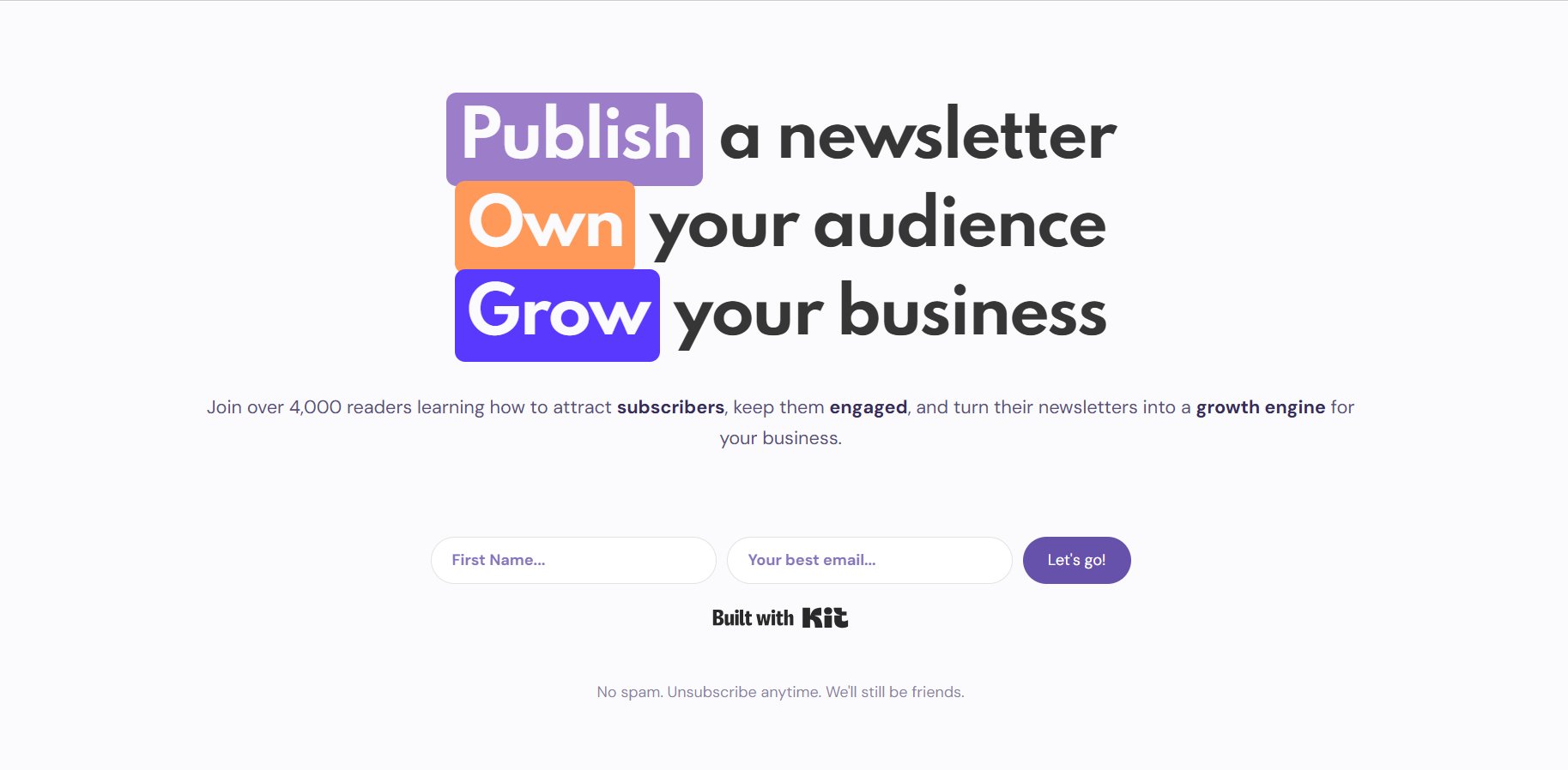
Example: Growth Currency uses a dedicated landing page inviting visitors to “Publish, Own, and Grow” their newsletter. The page highlights the value (learning how to attract subscribers and grow a business), and includes a simple form asking for a name and email, ensuring the opt-in feels direct and purposeful.
Consent-based opt-in forms
Beyond marketing, opt-in forms are equally important for ensuring consent. These forms explicitly ask visitors to agree before subscribing, making clear what they’re signing up for, how their information will be used, and often linking to a privacy policy. This transparency builds trust with potential subscribers while keeping you compliant with regulations like GDPR or CAN-SPAM.
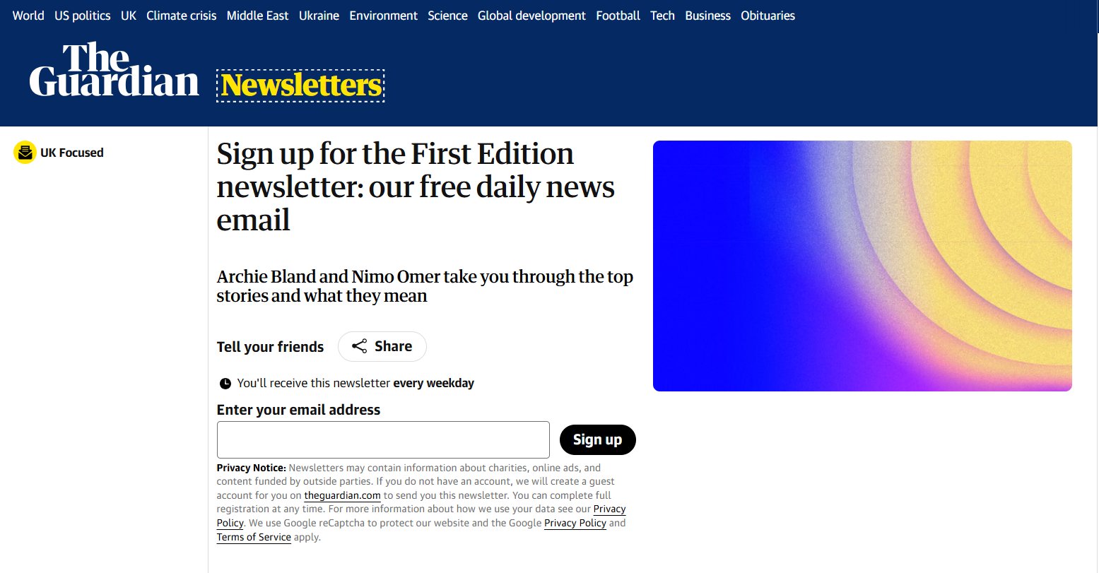
Example: The Guardian’s First Edition newsletter sign-up includes a clear privacy notice below the email field, explaining how data will be used and linking to its Privacy Policy. This keeps the opt-in process transparent for potential subscribers.
Key elements of high-performing opt-in forms
High-performing email opt-in forms share a few common traits. They’re clear, simple, and trustworthy while guiding the visitor toward action. Here are the essential elements to keep in mind:
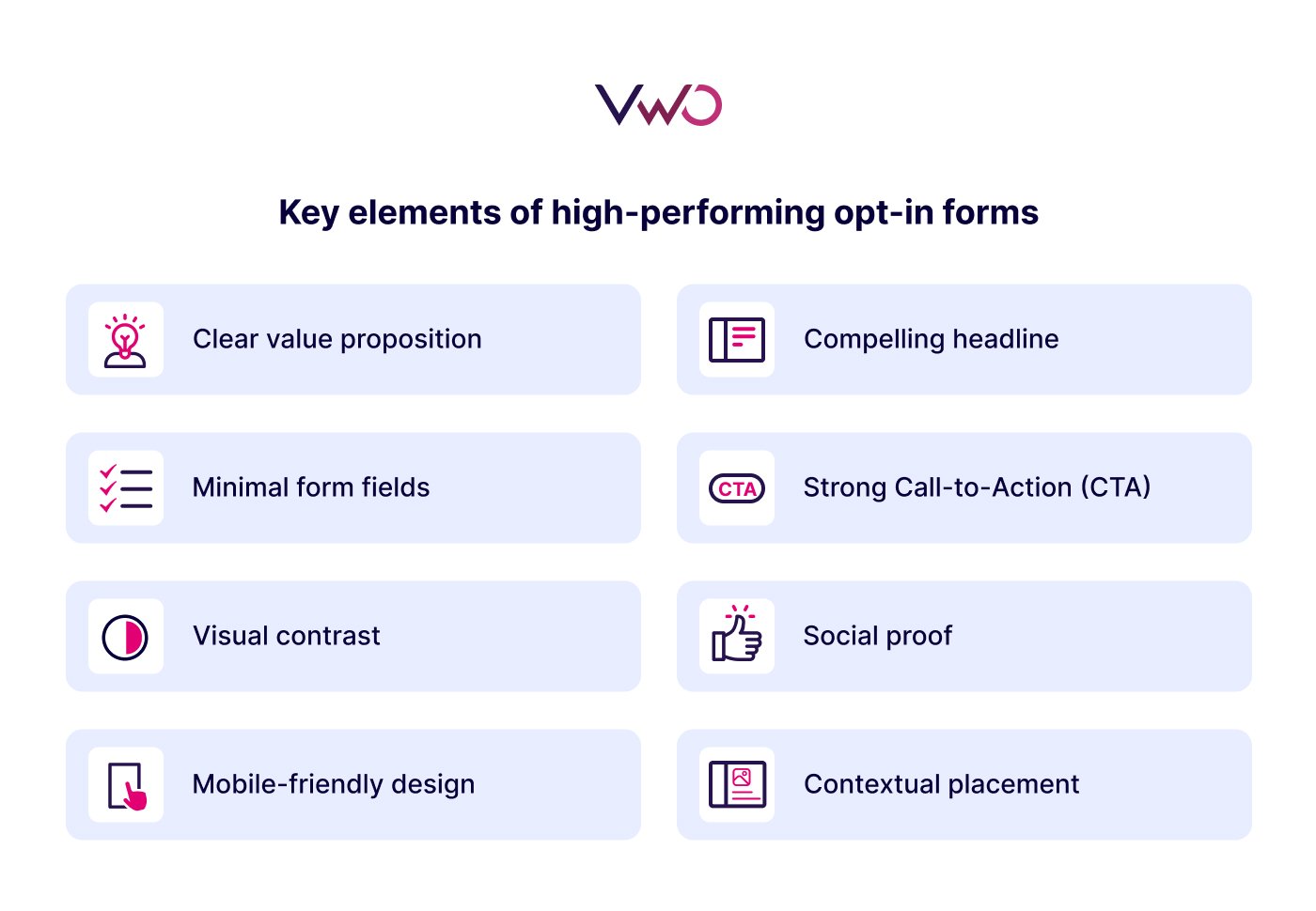
Clear value proposition
Visitors should instantly understand what they’ll gain by subscribing. Whether it’s a discount, exclusive content, or free resources, the perceived value must outweigh the “cost” of sharing their email.
Compelling headline
A strong, benefit-driven headline grabs attention and communicates the offer quickly. Phrases like “Get 15% Off Your First Order” or “Join 50,000+ Readers for Weekly Tips” set expectations right away.
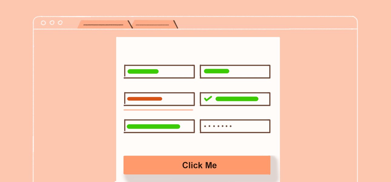
Minimal form fields
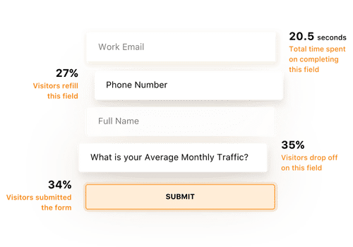
Most high-performing forms stick to just an email address, or at most, a name and email, for a frictionless experience. Too many form fields can discourage visitors from completing the email signup form.
Strong call-to-action (CTA)
Replace generic “Submit” buttons with action-oriented text like “Send Me the Guide” or “Get My Discount.” A clear call to action reinforces the benefit and nudges users toward action.
Visual contrast
A form should stand out from the page without clashing with the overall design. Using bold buttons or distinct visual elements ensures the form is noticeable while still fitting your brand identity.
Social proof
Adding credibility signals, like subscriber counts, testimonials, or “Trusted by 10,000+ customers”, can reassure visitors that signing up is worthwhile and safe.
Mobile-friendly design
With more than half of traffic coming from mobile devices, opt-in forms must resize smoothly, load fast, and keep inputs easy to tap on smaller screens.
Contextual placement
Opt-in forms perform best when they appear at the right moment—like at the end of a blog post, during checkout, or when someone scrolls halfway down a page. Placement should match user intent.
Best practices and tips for creating effective opt-in forms
Now that we’ve covered the core elements every opt-in form should include, let’s look at the strategies that determine how and when these forms work best.
- Time the form wisely: Don’t interrupt visitors immediately. Use triggers like scroll depth, time on page, or exit intent to show forms when interest is highest. Well-timed opt-ins feel like a natural next step in the customer journey, rather than an interruption.
- Match the form to the page’s intent: Context matters; offer a content upgrade in a blog post, a discount on a product page, or a waitlist on a launch page. This ensures you’re converting your website traffic with the most relevant offer possible.
- Segment new subscribers early: Add simple choices (e.g., “Are you interested in tips for beginners or advanced?”) so follow-up emails can be more relevant. This small step helps you engage your target audience effectively from the start.
- Limit distractions: Keep the surrounding design clean and make the form the focal point. Avoid clutter, competing CTAs, or unnecessary form fields that add friction to the sign-up experience.
- Offer instant gratification and reinforce trust at the close: After sign-up, provide the promised reward right away, whether that’s a discount code, PDF download, or welcome email. Use a confirmation message or thank-you page to set expectations clearly. This closes the opt-in process smoothly, builds confidence, and keeps new subscribers excited about future communication.
- Test placement and style: Inline, pop-up, slide-in, sticky bar, different formats work for different audiences. Experiment to see what resonates without overwhelming visitors.
- Privacy assurance: A short line like “No spam. Unsubscribe anytime.” can ease hesitation. When combined with clear data protection signals, it reassures visitors that their information will be handled securely and used only as promised.
How to create and embed an opt-in form on a website?
Creating an opt-in form is a simple process, but getting it right requires clarity on the tools, design, timing, and targeting. Here’s a step-by-step approach to setting one up.
Create the form
Start by choosing the type of form that fits your goal: inline, pop-up, slide-in, sticky bar, or full-screen. Keep the design simple with minimal form fields, a strong headline, and a clear call to action so potential subscribers know exactly what they’ll get.
Configure data submission
Decide what information to collect; most often, an email address, but you might also request a name or phone number if relevant. Ensure that data is stored securely, and include consent checkboxes or privacy notices to strengthen trust and meet data protection requirements.
Set up integration
Connect your email signup form to your email marketing platform or CRM so new contacts flow directly into your subscriber lists. This ensures website visitors are automatically funneled into your campaigns without manual exports.
Automate and manage subscribers
Use automation rules to send welcome emails, deliver lead magnets instantly, or segment subscribers by interest. This keeps the customer journey smooth and ensures you’re speaking to your target audience effectively.
Test and optimize
Don’t treat forms as static. Test variations in placement, copy, form length, and trigger timing to see what drives a higher average conversion rate. Measure results regularly and refine to keep improving performance.
The role of VWO in opt-in forms
As an experimentation and optimization platform, VWO helps you get the most out of your opt-in forms by ensuring the forms themselves are well-designed, well-timed, and continuously optimized.
Here’s how it supports the process:
- Create with widgets: Use the Visual Editor to build pop-ups, banners, sticky bars, or overlays that match your site’s design.
- Target precisely: Define who sees a form based on device, traffic source, page type, or visitor behavior.
- Trigger smartly: Show forms at the right moment—after a delay, at a certain scroll depth, or when exit intent is detected.
- Integrate seamlessly: Pass captured data to your email marketing platform or CRM. Depending on your stack, this may involve webhooks, API connections, or connectors like Zapier.
- Test and improve: Use VWO’s experimentation capabilities to A/B or multivariate test headlines, offers, form lengths, triggers, and placements, ensuring each iteration outperforms the last.
In short, your ESP or CRM manages subscribers and campaigns, while VWO makes sure the capture point is optimized, so more visitors convert into leads you can nurture.
Turn your opt-in forms into conversion drivers with VWO; schedule a free demo to explore how.
Frequently asked questions (FAQs)
An opt-in form is a sign-up form on a website that lets visitors share their contact details: usually an email address, in exchange for value such as a newsletter, discount, or free resource. This can be implemented as a single opt-in (where sign-ups are confirmed immediately) or a double opt-in (where users confirm via email).
A good opt-in form is clear, simple, and relevant. Keep fields minimal (just email or name + email), highlight the benefit upfront, use an action-driven CTA, and ensure the form is well-timed and mobile-friendly.
Categories: