VWO Logo
Peça Uma Demonstração
Dashboard
Follow us and stay on top of everything CRO

Como criar um heatmap no Excel? – Configure ou gere heatmaps no Excel em 4 passos simples

11 Min Read

Analistas usam heatmaps para observar a magnitude de um evento por meio de indicações visuais. Considerado uma técnica de visualização de dados, o heatmap é usado para fazer interpretações rápidas da intensidade de um evento e realizar as devidas correções de curso.

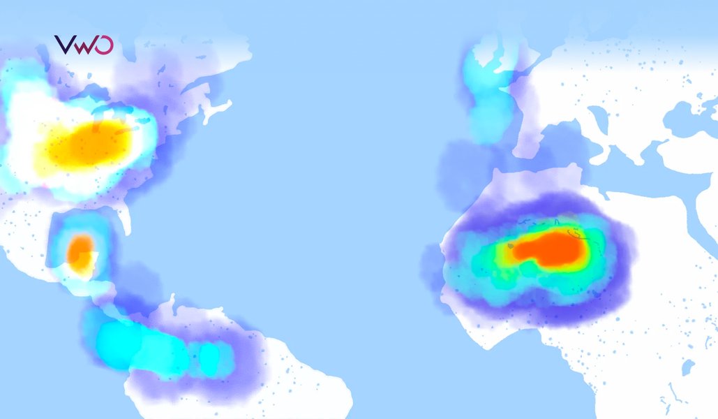
Um exemplo de heatmap conhecido é a representação visual dos casos de COVID-19 registrados globalmente. O mapa a seguir mostra a distribuição geográfica do número de casos de COVID-19 relatados a cada 100 mil habitantes ao redor do mundo. Os tons mais escuros de laranja indicam os países mais afetados, enquanto as tonalidades mais claras sinalizam o contrário.

Existem muitas maneiras eficazes de criar um heatmap, incluindo o uso de geradores gratuitos de heatmaps, como o gerador de heatmaps com IA da VWO, ou ferramentas analíticas integradas. Mas o Microsoft Excel e o Planilhas Google também são ótimas opções que você pode explorar. Vamos nos aprofundar nelas!

What is a heatmap in Excel?

A heatmap is an effective way of presenting data in applications like Excel, where data values are represented by colors, simplifying the entire data analysis process. You can notice patterns and trends at a glance, which helps drive insights and faster decisions.

The best thing about Excel is that its built-in features make heatmap creation easy. You can apply conditional formatting to data in just a few clicks, and it automatically assigns colors to the values in the cells. The user-friendly interface, preset color scales, and numerous customization options make it possible for even less technical users to create a heatmap chart in Excel.

Aprenda como criar um heatmap no Excel

Usando o Excel ou o Planilhas Google, você pode criar um heatmap ao colorir manualmente cada célula de acordo com seu respectivo valor. Outra opção é adotar uma rota mais inteligente e inserir uma fórmula/função que faça todo esse trabalho duro. Sugerimos usar o segundo método para criar um heatmap mais facilmente.

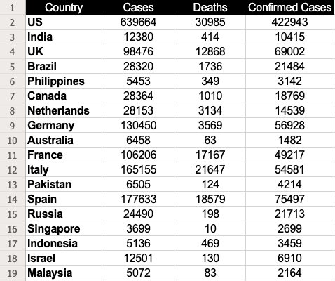
Vamos aproveitar os dados sobre os casos de COVID-19 registrados globalmente do exemplo acima para entendermos como criar um heatmap usando a função “formatação condicional”.

CountryCasesDeathsConfirmed Cases
US63966430985422943
India1238041410415
UK984761286869002
Brazil28320173621484
Philippines54533493142
Canada28364101018769
Netherlands28153313414539
Germany130450356956928
Australia6458631482
France1062061716749217
Italy1651552164754581
Pakistan65051244214
Spain1776331857975497
Russia2449019821713
Singapore3699102699
Indonesia51364693459
Israel125011306910
Malaysia5072832164

Fonte da imagem: Centro Europeu de Prevenção e Controle de Doenças

1º passo: Insira os dados

Insira os dados necessários em uma nova planilha. Neste caso, inserimos os mostrados dados acima.

How to Create A Heatmap in Excel (Image 02) - Dataset for creating heatmap in excel

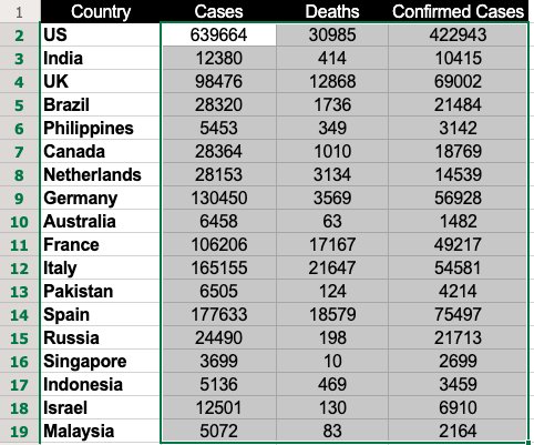
2º passo: Selecione os dados

Selecione os dados com os quais você deseja gerar o heatmap. Neste caso, fizemos uma seleção entre as células B2 e D19.

How to Create A Heatmap in Excel (Image 03) - Selecting the data in excel for creating the heatmap

Download grátis: Guia de heatmaps de sites

3º passo: Use a formatação condicional

Se estiver usando o Excel, acesse a aba “Página Inicial”, clique em “Formatação Condicional” e selecione “Escalas de Cor”. Essa funcionalidade oferece algumas opções de cor para destacar os dados.   

use conditional formatting in excel to create the heatmap

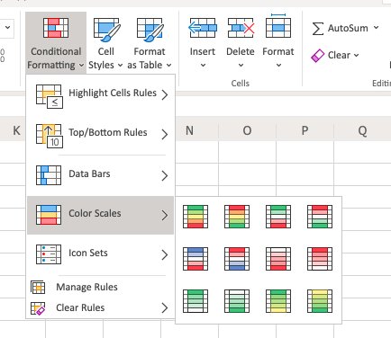
No nosso exemplo, usamos a primeira opção, que pinta de verde as células com valores altos e de vermelho aquelas com valores baixos.

Se estiver usando o Planilhas Google, clique em “Formatar” e selecione a opção “Formatação condicional”.

Create Heatmap Excel 1

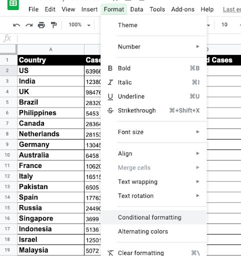
Em seguida, selecione “Escala de cores” e escolha as cores de ponto mínimo, ponto médio e ponto máximo.

Create Heatmap Excel 2

Observação: use o esquema de cores que melhor atenda às suas necessidades de interpretação de dados.

4º passo: Selecione a escala de cores

Depois de selecionar uma escala de cores, o heatmap será exibido desta forma:
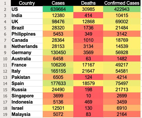
select the color scale through conditional formating to create the heatmap

Nessa escala de cores, o Planilhas Google atribuiu a cor verde às células com os valores mais altos e a cor vermelha àquelas com os menores valores. Os demais valores receberam tonalidades variadas de um gradiente entre o verde e o vermelho. Pronto, você já tem um belo heatmap para analisar a experiência dos visitantes e aumentar as conversões.

How to make a heatmap in Excel without numbers

Ideally, you should not remove the numbers, as the heatmap in Excel is based on cell values. Removing them defeats the purpose. However, you can hide the values using custom number formatting.

  1. Select your heat map.
  2. Hit Ctrl + 1 to display the Format Cells dialog box.
  3. Click Custom under Category on the Number tab.
  4. Type 3 semicolons in the Type box.
  5. Click Ok to apply the custom number format.

How to create dynamic heatmaps in Excel

When you change a cell’s value, conditional formatting immediately recalculates and adjusts accordingly. This feature enables the creation of dynamic heatmaps in Excel. Let’s explore methods for creating these dynamic visualizations. 

Making a dynamic pivot table heatmap

This is how it works: 

  1. Select any cell in your heatmap.
  2. On the Home tab, go to the Styles group.
  3. Click Conditional Formatting > Manage Rules.
  4. In the Conditional Formatting Rules Manager, select the rule and click Edit Rule.
  5. In the Edit Formatting Rule dialog box, under Apply Rule To, choose the third option: ‘All cells showing “Sum of Sales” values for “X” and “Y” parameters as shown in the boxes.
  6. Your heat map is now dynamic, and when you add new data, it will update automatically.
  7. Remember to refresh your PivotTable to see the updates.

Conditional formatting will be removed if you alter the row or column fields. For instance, if you remove the Date field and then reapply it, the conditional formatting will be lost.

Pivot table in Excel
Image source: Spreadsheeto.com
19 9
Image source: Spreadsheeto.com

Creating a dynamic heat map in Excel with scroll bar

1. Insert a scroll bar

Control your dynamic heatmap with a scroll bar using these steps:

  • Click on ‘Developer’ → ‘Controls’ → ‘Insert’ → ‘Scroll Bar’.
  • Click on the worksheet to insert the scroll bar.

2.  Format the scroll bar

  • Right-click on the scroll bar and then click on ‘Format Control’.
  • Set the minimum and the maximum values for the scroll bar.
  • Select a cell (Say Sheet1!$A$1) to link to the scroll bar value.

3.  Set the formula up

  • In cell B2, type the formula as below

=INDEX(Sheet1!$B$1:$H$13, ROW(), Sheet1!$A$1 + COLUMNS(Sheet2!$B$1:B1) – 1)

This formula dynamically retrieves data depending on the value in the linked cell of the scroll bar.

4. Adjust the scroll bar:

  • Resize and reposition the scroll bar at the bottom of the data range or wherever is most appropriate.
  • Change in the value of the scroll bar results in updating the value of the linked cell (Sheet1!$J$1). The linked cell can now change the displayed data, and hence all related visualizations and calculations, such as a heat map.

These steps enable you to interact with data dynamically in Excel—users can use a scrollbar to control the visibility of the data set or its calculations.

Creating a dynamic heatmap in Excel with checkbox

If you want to show and hide your heatmap, you can use the checkbox to decide its visibility. Keep going through these steps: 

Insert a checkbox:

  • Go to the ‘Developer’ tab.
  • Click ‘Insert’ in the Form Controls section.
  • Select ‘Checkbox (Form Control)’ and place it next to your dataset.

Link the checkbox to a cell:

  • Right-click the checkbox and select ‘Format Control’.
  • In the ‘Control’ tab, enter a cell address in the ‘Cell link’ box and click ‘OK’.

Set up conditional formatting:

  • Select your dataset.
  • Go to the ‘Home’ tab, click ‘Conditional Formatting’ → ‘Color Scales’ → ‘More Rules’.
  • Choose ‘3-Color Scale’ in ‘Format Style’.
  • Enter the following formulas in the ‘Value’ boxes:
    • Minimum: =IF($O$2=TRUE, MIN($B$3:$M$5), FALSE)
    • Midpoint: =IF($O$2=TRUE, AVERAGE($B$3:$M$5), FALSE)
    • Maximum: =IF($O$2=TRUE, MAX($B$3:$M$5), FALSE)
  • Select your desired colors and click ‘OK’.

Hide the TRUE/FALSE value:

  • Link the checkbox to a cell in an empty column.
  • Hide that column to keep the TRUE/FALSE value out of view.

Now, your heat map visibility is controlled by the checkbox.

Creating a dynamic heat map in Excel with radio button

Step 1: Insert radio  buttons

Go to developer →Insert →Form Controls→Option Button Insert the option buttons.

Step 2: Format radio buttons

a) Right-click on each option button, and below the option, click ‘Format Control’

b) Place each of the option buttons on a particular linked cell e.g., Sheet1!$K$1, so that when selecting them, the value will be updated.

Formatting the radio buttons
Image source: Nurture Tech Academy

Step 3. Set up conditional formatting

a) Highlight the data range you wish to format.

b) Access ‘Home’ → ‘Conditional Formatting’ → ‘New Rule’.

c) Opt for ‘Use a formula to determine which cells to format’.

d) Craft a formula utilizing the linked cell (e.g., to highlight the top 10 values if Sheet1!$K$1=1):=RANK.EQ(A1,$A$1:$A$10)<=10

e) Apply the desired formatting and confirm with ‘OK’.

Step 4. Apply conditional formatting

a) Select the data range you would like to highlight and apply formatting Home →Conditional Formatting →New Rule.

c) Choose ‘Use a formula to determine which cells to format’.

d) Create a formula that utilizes the linked cell, e.g. to format top 10 values if Sheet1!$K$1=1):

=RANK.EQ(A1,$A$1:$A$10)<=10

e) Select the formatting as needed and then ‘OK’.

How to create a geographic heatmap in Excel

Creating a geographic heatmap in Excel is simple. To begin, click on ‘Insert’, then ‘Maps’, and choose ‘Filled Maps’. This action will display a blank map in your spreadsheet. Allocate one column for geographic locations and another for corresponding data. Enter your locations into the worksheet to place them on the map. Alongside each location, input data that will determine the shading of each area. As you enter data, the Excel heatmap will automatically display varying shades to represent different values within each location.

ssa é apenas uma das formas de gerar um heatmap usando o Excel ou o Planilhas Google, mas você pode usar a sua criatividade como quiser. Também é possível detalhar e criar visualizações para mapeamentos de conjuntos de dados específicos. No entanto, se você planeja criar heatmaps para estudar o desempenho do seu site ou de páginas individuais, recomendamos usar ferramentas mais robustas e integradas do que o Excel, como é o caso da VWO Heatmaps. 

Pro Tip!

If you’re planning to create heatmaps to study the performance of your website or particular pages, we’d recommend you to use more robust and integrated tools than Excel, such as VWO heatmaps.

Essa solução não só ajuda você a visualizar como os visitantes interagem com o seu site, como também destaca quais elementos atraem a atenção deles ou causam distrações.

Assista ao vídeo para conhecer os recursos da VWO Heatmaps:

VWO Heatmaps | Visão geral

O gerador gratuito de heatmaps com IA da VWO possibilita prever como os visitantes interagem com a sua página. Ele permite que você avalie os gargalos a partir da experiência do usuário e tome as medidas de otimização necessárias. É possível acompanhar os passos dos visitantes nas suas páginas e analisar, de maneira granular, como eles interagem com cada elemento estático ou dinâmico. 

Pro Tip!

VWO’s free AI-powered heatmap generator allows you to predict how visitors interact with your web page.

Conclusion 

Ultimately, it boils down to choosing the heatmaps that meet your needs. If your work requires you to analyze static data patterns and trends, Excel heatmaps will suffice. However, if your business has advanced needs, you might prefer heatmaps tailored to specific industries. For understanding visitor behavior on websites, your go-to tool should be VWO Heatmaps.

Para saber mais sobre como aproveitar a VWO Heatmaps para visualizar o comportamento dos visitantes e obter insights valiosos, registre-se para participar de uma sessão de demonstração gratuita com um dos especialistas em otimização da VWO ou faça um teste grátis para experimentar a solução por conta própria e avaliar se ela atende às suas necessidades.

FAQs 

1. What is a heatmap used for?

A heatmap visualizes data through color gradients, showing the intensity of values in different areas. It helps identify patterns, trends, and areas of interest, such as user interactions on a website or data concentrations.

2. Can you make a heatmap in Excel?

Yes, you can make a heatmap chart in Excel using conditional formatting. Excel allows you to apply color gradients to cells based on their values to visualize data intensity.

3. How to make a heatmap in Excel?

Select your data range, go to the “Home” tab, click “Conditional Formatting,” then “Color Scales.” Choose a custom color scale to apply a gradient based on the values in your cells.

4. How to plot data points on a map in Excel?

Use the “Insert” tab, select “Maps,” then “Filled Map.” Add your geographic data, and Excel will generate a map with color coding based on your data values.

5. How do I export a heatmap from Excel?

Click “File,” then “Save As” or “Export,” and choose your preferred file format (e.g., PNG, PDF). Save the heatmap as an image or document for sharing or presentation.

Astha Khandelwal
Astha Khandelwal A marketing enthusiast who holds experience in creating informative content around the culture of experimentation and conversion rate optimization. She has a knack for learning and loves to explore new and innovative avenues of the industry. In the last couple of years, she has grown as a CRO enthusiast and aims to gain mastery in the field.
Share
Related content
More from VWO on Website Heatmap
10 Melhores Aplicativos de Mapa de Calor do Shopify [Com Recursos] [2024]

10 Melhores Aplicativos de Mapa de Calor do Shopify [Com Recursos] [2024]

O Shopify é uma das plataformas mais amplamente usadas para hospedar sites de comércio eletrônico.…

Read More
Shanaz Khan

Shanaz Khan

15+ Min Read
11 Melhores Ferramentas e Softwares Gratuitos de Mapa de Calor de Site [2024]

11 Melhores Ferramentas e Softwares Gratuitos de Mapa de Calor de Site [2024]

“Eu não faço pesquisa de usuários e baseio minhas estratégias em instintos” – disse nenhum…

Read More
Pratyusha Guha

Pratyusha Guha

15+ Min Read
Mapa de Calor do Google Analytics: Como Criar e Ler

Mapa de Calor do Google Analytics: Como Criar e Ler

O Google Analytics (GA) é um dos muitos serviços que o Google oferece para ajudá-lo…

Read More
Shanaz Khan

Shanaz Khan

10 Min Read

Deliver great experiences. Grow faster, starting today.

Start Free Trial Request a Demo