VWO Logo Partner Logo
Follow us and stay on top of everything CRO
Webinar

How Data Has Changed the Way We Design

Duration - 60 minutes
Speakers
Brian Massey

Brian Massey

Conversion Scientist

Shanaz Khan

Shanaz Khan

Brand Marketing

Key Takeaways

  • Utilize eye-tracking studies for your most important pages to understand where visitors are focusing their attention and to optimize the placement of key elements like call-to-action buttons.
  • Design your landing page with clarity and simplicity in mind. The main call-to-action should be clear and not compete with other elements on the page.
  • Use analytics and user intelligence tools like heat maps and scroll reports to understand user behavior on your page. This can help identify issues like scroll problems and areas of the page that are not getting enough attention.
  • Analyze click reports to understand what elements or offers on your page are most attractive to users. This can help prioritize the placement of these elements on the page.
  • Use form analysis to identify fields that are causing users to abandon the form. Consider breaking up the form into pieces or eliminating unnecessary fields to improve conversion rates.

Summary of the session

The webinar, hosted by VWO’s marketing manager, features Brian Massey, Founder of Conversion Sciences LLC and author of “Your Customer Creation Equation”. Massey, a renowned speaker and expert in digital marketing and conversion rate optimization, shares his insights on how design has fundamentally changed due to new tools and disciplines. He emphasizes the importance of updating design strategies to reduce risk in digital design. 

Using real-life examples, Massey illustrates the potential pitfalls of website redesign and the importance of testing new designs to ensure they enhance, rather than hinder, user experience and conversion rates.

Webinar Video

Webinar Deck

Top questions asked by the audience

  • Is there a framework or method that you follow to avoid cognitive bias when creating tests for your clients?

    Yes. So we use the scientific method. As I said at the beginning, the scientific method starts off with doing some research to begin to understand your ideas. And really, we work in terms of ideas, no ...t in terms of tests. So we collect every possible idea that could improve the conversion rate. And then we use these tools. We get curious. We go and look at our AdWords. We go and look at some user tests. Whatever we have, analytics is a great resource for that. And we rank the test. I mean, the ideas are based on how much evidence we see. Is it affecting a lot of traffic? Is it a really difficult test to implement, or is it an easy test to implement? Because changing headlines is a lot easier than producing video for a landing page, but those are both great ideas. But we're gonna test the headline first probably because we'll be able to get that done. So we have these ideas. We rank them, and we take those at the top. And as I said, we've designed tests that either user tests or A/B tests that prove our idea wrong. We're trying to prove ourselves wrong and get these ideas off. And if we're unable to prove it wrong, this is, you know, A/B test data is the best data you can collect. If you can't prove it wrong, then it's a winner, and we'll make it permanent on the site. And with Visual Website Optimizer, you can actually keep running that test. We call it a routing tester of personalization to 100% of the traffic while the back-end company, the back-end development team schedules that test to make it permanent on the site.
  • Are there any commonly false assumptions you find people make when redesigning or optimizing a website? And, second is, how would you approach a website if it's a long term project or partnership?

    - by Guadalupe
    Great. So, the first question is probably the best example of a few years ago when rotating carousels were all the rage. Every template produced had where you're putting multiple images and they would ... rotate. And it turns out that that's not a very good idea from a conversion standpoint. The truth is that whatever the first one was was the most impactful. And the most so the motion of those things distracted people from reading your page. So they couldn't consume the copy, and the load time for each of those images slowed your page down, which we know is, often, a negative impact on conversion rate. So that's a great example. And now people are putting videos in that area. Again, slow load times, motion, and a lot of these videos aren't even moving the value proposition forward. They're just fun, emotional, you know, stock stuff. And, it's just not a good use of that. A lot of people are using animation. So as you're scrolling down the page, things are sliding in, things are popping up, we've never tested this because we've never seen any evidence that it's helpful. So none of us whenever we say, well, maybe we should add some motion to the text. No. Add motion to those things that are most important. So if you wanna add some motion to your form, That might be a good idea because it guarantees that the visitor is going to see that you're asking them to make a choice. You wanna add some motion to the call-to-action button, those would be the proper uses. Otherwise, you're just making it cognitively harder for the brain to consume the page. Does that make sense?
  • How would you recommend testing a new design versus an old one running them on different URLs or other methods?

    It's always best to keep the URL the same. So we wanna, as much as we can, isolate variables, remove anything extra that changes. So if you can keep the URL the same, that's great. VWO has a fantastic ... facility for making changes to websites. As you saw, we changed an entire website's design, but we didn't have to change any of the URLs. So, the tools are there for you to do it. Sometimes it's easier to create another page and do an A/B test that way. And if the URL has to change, just know that it might be creating a little bit of noise or skew in your design. Try to keep them as similar as possible. It would be the best rule of thumb.
  • What is the name of the tool which you used to see all those tools that Adidas used?

    Oh, we use, either Ghostery or Wappalyzer - W a p p a l y z e r - I believe. They're snooping tools, and they literally go and look for tags that are on your competitor's pages. And I recommend you g ...o do it if you really wanna build a case for conversion optimization, go look at your competitors and see what they're doing or even take sites that your executive team loves that they would like to be more like. Go and see if they've got tools on their site because it'll show you if they've got Visual Website Optimizer on there or the heat-mapping tools that are on the market, and what kind of analytics they're using. Even if they've got it, if you come back and say, yes, this site is wonderful because these people are testing, then you've got a pretty good case for calling Conversion Sciences and buying Visual Website Optimizer.
  • How do you determine if you need a full redesign on a page versus optimizing the current page? Also, how often should you apply a full redesign on a page?

    - by David Yon
    Yeah. So there are two big things that would require a redesign where you're doing a significant change to the page. And what number one is the lack of a visual hierarchy. So when somebody comes to a ...page and they say it's cluttered, what are they really saying? What they're saying is that cognitively, it's hard to understand what's important, what's most important, and less important on the page. You're not helping them. Your layout is not helping them find their way to the primary points. You probably have a lot of pictures. They're all close together. There's not a lot of white space. So a good designer's job is to almost be a draftsman. To design a page that brings a visitor's attention to the most important things and steps them through a decision-making process. You throw everything on the page and ask the visitor to read everything, comprehend it and make a decision, well, it's not gonna happen. You will exhaust your System 2 brain. And once System 2 gets exhausted, it jumps back down to System 1. And all System 1 knows how to do is click on something at random or hit the back button - abandoned. And that's not what we want. Right? So, usually if we've got just a poor visual hierarchy, we will redesign the page. The other one is not effective value proposition communication. In general, when someone comes to your page, there's two questions you have to answer for them. Number one - are they in the right place? So this is why we demand that our landing pages keep promises made in the ad. If you say 50% off on the ad, your landing page has to say 50% off and somewhere at the top. The second thing is why should I stay here? Why should I continue to explore this business as opposed to jumping back to the search and going to the next one? And so this is about developing your value proposition. You've gotta nail it at the top, but if you get that right, you'll have people that will read and consume the page. So if you're not doing a good job of that, some that will often require a rewrite of the copy. And that generally follows with a rewrite or a redesign of the visual hierarchy to make sure that they're seeing your value proposition and just the reasons that they should be there and stay there. Does that make sense?
  • Do you have any favorite test or best test or any test that surprised you? You weren't expecting it to work, but it worked.

    Well, that's the beauty of conversion optimization as you are surprised a lot. A lot of the time, your most beloved variations don't win. And so it's a little humbling. I think I hinted at one of the ...things that we've been having a lot of success with, and that is switching from the form to more of a multi-step quiz style approach. We've seen test lists of 60%, 30%, in one case, 90%, by removing the form and asking for little bits of information at multiple steps. It kind of flies in the face of what we think will happen because every time someone has an option to click, they have an option to abandon. So we're increasing the opportunities for abandonment. But we're finding that we can use this space to really educate them on why we need this piece of information and what's gonna happen with it in each of those steps. And when you get to some of those stop fields, if you do have to ask for a phone number, then explain, like, we won't call you on this number unless there's a problem, you know with the demo that we're scheduling or something like that. You explain why you want that information and continue through. If you want, what size is your company, you know, say that we have a variety of offerings, and we wanna make sure that you get to the right person to give you a demo. So, you know, just very simple stuff. But it's handling objections that occur at each step in the form. Or if you have just one form, all those objections show up at once and you don't have any room to manage them. I think that's why this one is working very well. In general, new clients that come to us have value proposition issues. So I would recommend hiring someone outside the company to help you write your copy and really take a look at your headlines, and the subheads. The subhead's job is to get them to read the next paragraph and then nail that paragraph, and then you're gonna find people that are really beginning to understand the value of your service or product. I can't hear you now.
  • What is the best advice if there is very limited digital data to start with? That is no Google analytics data and very little SM. Imagine service with existing customers.

    Yeah. So serving existing customers is a great way to go. It gives you very qualitative data. So it helps you understand what their motivations are, what things in your value proposition you should fe ...ature first. I would start off with going to Validately. UserZoom now. UserZoom or User Testing, and have 5 or 7 people go through your site. And what these tools do is they bring a panel you can specify - what country they're in, what economic range they're in, male or female, some very broad levels. And they're getting better with their panels in terms of what you can specify. But they go through. You give them a task. So go buy this product or, go sign up for a demo. And then you watch them as they're talking out loud as they're going through the steps. You see where they're stumbling. They're gonna have plenty of moments where you'd like, "I can't believe we left that piece of information off," or "I can't believe they think that that's what that means." And that's gonna start to give you your first set of high good hypotheses. We do this on almost every client that we do because we learn a lot. Watching 5 or 7 of these, you wanna send. We typically do 3 to 4 on desktop and 3 to 4 on mobile, and watch those. It's great to take in front of your executives or, if you're an agency, to your customers and you're showing exactly where people are stumbling. It's a great way to build support for your testing program. And, so that would be a great place to start and get analytics on your site. Just do it. It's free. If you use Google Analytics, and that you wanna be collecting that data even if you're not currently doing any analysis of it. Just start collecting it.
  • Which is a book or a podcast or video that you're currently reading, watching, or listening to that you would recommend, like, a couple of these recommendations for our attendees?

    Well, the book that got me into this is called ‘Waiting for Your Cat to Bark?’ by Bryan and Jeffrey Eisenberg. I am a very big fan. So, you know, one of the challenges that we have with these bias ...es going around in our brain is really understanding how to look at numbers. So, I love Daniel Kahneman’s ‘Thinking, Fast and Slow’. It talks about how easy it is to tire out our thinking mind, such that it falls back to our reactive mind, and that causes things like abandonment. So that's one of my all time favorites. And then I've just been reading, for instance—I just finished reading, I'm forgetting the name of it—oh, ‘Numbers Don't Lie’ by Vaclav Smil. And it's just a series of essays on how he looks at the data on everything from 'What the carbon footprint of phones is?' to 'Is flying really safer than driving?' And he puts the numbers to it. So you get to exercise that part of your brain that says, "I have this data, but on this day, which of these data points can I really believe?" And so, I would strongly recommend that sort of thing. And you'll have some of your sacred beliefs reversed by that book as well.

Reading Recommendations

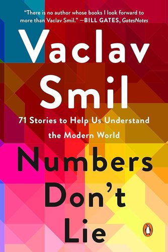
  • Numbers Don't Lie

    by Vaclav Smil

    Numbers Don't Lie is a series of essays on how the author looks at the data on everything from 'What the carbon footprint of phones is?' to 'Is flying really safer than driving?' Vaclav Smil puts the numbers to it. So you get to exercise that part of your brain that says, "I have this data, but on this day, which of these data points can I really believe?"

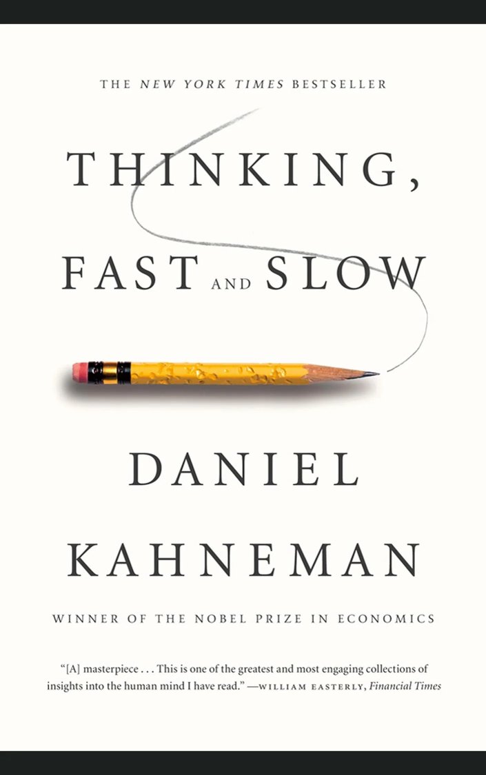
  • Thinking, Fast and Slow

    by Daniel Kahneman

    Thinking, Fast and Slow talks about how easy it is to tire out our thinking mind, such that it falls back to our reactive mind, and that causes things like abandonment.

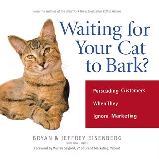
  • Waiting for Your Cat to Bark?

    by Bryan & Jeffrey Eisenberg

    Waiting for Your Cat to Bark examines how emerging media have undermined the effectiveness of prevailing mass marketing models.

Transcription

Disclaimer- Please be aware that the content below is computer-generated, so kindly disregard any potential errors or shortcomings.

Shanaz from VWO: Hey everyone, welcome to another session of VWO webinar, where experts in digital marketing, experimentation, data, and products share their trade tips and inspiring stories for you to learn from. I am Shanaz, marketing manager at VWO. For those of you who do ...
not know what VWO is, VWO is a full-funnel A/B testing, experimentation, and conversion rate optimization platform.

Today with us, we have Brian Massey. Founder of Conversion Sciences LLC, an author of the book, Your Customer Creation Equation. Founded in 2007, Conversion Sciences helps businesses transform their sites through a steady diet of visitor profiling, purposeful content, analytics, and A/B testing. Brian is the sought-after speaker presenting at IBM Inbound Elite Con, Content Marketing World, Affiliate Summit, and others.

As well as the host of the Intended Consequences podcast. Brian, if you could please turn on your camera so that the audience can see you?


Brian Massey:

Here I am.


Shanaz:

Thank you, Brian, for doing this with us. I’m sure there will be a plethora of insights to take back from the session today. Before I pass over to you, Brian, I’d like to thank everyone for tuning in for this session from all over the world. And inform you that we will be taking up questions at the end of the session. So please feel free to drop your questions at any given point during the presentation. With that, Brian, the stage is all yours.


Brian:

Alright. So you should be able to see the opening slide. So I’m gonna be talking about how design has fundamentally changed, thanks to the tools and the disciplines that we have that my company uses to optimize websites. A lot has changed, but the way we design landing pages, the way we design websites, the way we design campaigns, really hasn’t kept up. So by the time we’re done here today, I hope that you will have a firm understanding, and an urgency to begin designing in ways that essentially reduce the risk from digital design.

Okay. She said, my name is Brian Massey. My contact information is here. I don’t think I really need to expand on that fantastic introduction at all. But what I wanna do is start off with a bit of a comparison.

So back in November of 2012, this is what the website finish line looked like. Now this was a major brand online and offline for sports apparel. And on the very next day, November 19th, this is what it looked like. They had completely reimagined the site, and completely changed the brand presentation, and they were all obviously very excited about this. That this was going to fundamentally change the online fortunes of the business. Unfortunately, that isn’t what happened. And within just a few weeks, they had the sales had dropped more than $3,000,000, and this was going into the holiday season.

So what happened here? What happened was a really well-funded redesign, a smart agency, and executives who knew their customers could get all the way to launch without realizing that they were about to shoot themselves in the foot. Well, let me compare this with another business. This is Galeton.com. They sell construction, manufacturing, and essentially work apparel to consumers and other businesses.

And we’ve been working with them for a long time. We’ve been optimizing the site using Visual Website Optimizer for over 4 years with them. They knew that they needed to update the website to support larger screens and also to make this version of the site responsive. Until this point, they’d had a separate mobile site. So, we were obviously a little bit concerned that we would change everything in the design, and it would take away the wins that we had fought for over the previous 4 years.

The redesign was similar but really did open the site up. It had a better visual hierarchy. It worked better with larger and smaller screens. So what we did was we decided to test it. We implemented the entire website redesign in VWO and ran an A/B test. 

So half the traffic was seeing the original site, and half the traffic was seeing the redesigned site. We call this redesign insurance. It’s really all we wanted to do is make sure that we weren’t reducing the conversion rate by subtly changing things that made it harder for people to buy. All of the pages changed.

So the category pages were redesigned. The product pages were all redesigned. And what did we find out? Well, We don’t have to “Launch and Pray” anymore. And what we found out was our redesign actually showed us a 13% increase in revenue per visitor.

Interestingly enough, the number of transactions didn’t change, but the average order value went up. Now that’s very interesting. This was a statistically significant test, so we have high confidence in the data. This is the way design should be done. Now you don’t have to go all in and test an entire redesign to get insurance on that.

I’m gonna show you how you can step your way into design using data along the way. The thing that we’re working against here is we think certain things will work. I mean we build sites and pages very logically, but the audience really wants to find a different path. Now if we take this metaphor, we can say, well, of course.

Of course, they wanna go in a shorter direction. But as you start to understand your visitors, you realize, well, actually, maybe it’s because runners prefer to run on soft grass as opposed to hard cement. Or maybe they were taking this other path because it was shadier and they don’t wanna walk in the sun. So just assuming that the shortest path is the best path is not the best answer. We wanna do the research to find out what the true reason was for, in this case, walkers and runners to carve their own path through the trees.

Now the problem is we have three pounds of receiving biases between our ears. Our brains are designed to take shortcuts. We want to find the quickest way to process information. What this does is it allows us to rely on stereotypes. It allows us to rely on our own experiences and make decisions on what we should design, what’s good, what’s bad, and our experiences are often not the same as our visitors.

So this is why we use science. It keeps us from using these shortcuts, stereotypes, etc. Now one of the problems is that design is always very visual. It’s very sexy. Everyone’s really focused on the design.

And as a result, our data gets short shrift. So I’m gonna make the point here that you need to become an experimenter. You need to provide the data that keeps people from focusing completely on how the site looks and start looking at how visitors really want to interact with your brand, either as a landing page, the website, or even your ads. The job of an experimenter is really different from the job of a designer. 

An experimenter’s job is to take an idea. This would be a redesign idea. It could be one component that would go on a page. It can be a copy. It can be images. And then find a way to prove that that idea is wrong.

And if you can’t find data that proves your idea is wrong, then you probably have a winner there. That’s what an A/B test is. We actually are testing the null hypothesis, the opposite of what we think is gonna work, to prove that the null hypothesis is false. And, thus, all we’re left with is that the new design is probably a better design if we have a winner. Now the traditional design process looks something like this.

Just do a lot of research on the front end. You do marketing studies, you do focus groups, you do panels. You interview customers, and then you hand that information off to the design development team. And they make thousands of assumptions about how their design should meet the needs that they found in that research.

And you really don’t know how good a job they did until after launch. This is what happened at the finish line. So the blue area indicates the amount of time that you’re spending researching. The new way to design well and, of course, this tends to lean towards people looking at best practices, and all of those biases that sit in our brains. The modern way of designing and redesigning is this.

There’s a whole lot more blue here. There’s a whole lot more user intelligence analytics, market research going into the process. We start off with the creative brief and do pretty much the same sort of research we would do in the old way. But then as we go through and we talk about positioning and the copy that’s gonna hit that positioning value proposition. We can test that.

When we decide what images we want to include to support that, we can test that. We have a layout we can go through, and we can test that with user testing. So that by the time we launch, we have a very strong idea, but supported by data, that our design is going to be successful. And then we can begin optimizing to make it even better. This is the new way to design.

So what I’m gonna do is I’m gonna take us through the process of building a landing page. And I’m gonna show you at each step of the way exactly how you can collect some data that will support your design decisions, your copy decisions, your choice of images. Now when I’m talking about a landing page, I’m talking about a very specific kind of page, not just to pay for the entry page for customers. A landing page only has 2 jobs. The first job is to keep the promise that was made in a link, ad, in a social media post, or in an email. Understanding what your visitor expects when they get there is one of the powers of the landing page. If you don’t know what promise is bringing people to the page, you’re not building a landing page. You’re building something else, building a home page or an informational page.

So if you don’t know what’s bringing people, it’s not a landing page. That’s the first job of a landing page just to keep the promise. The second job of the landing page is to get the visitor to make a choice. Let them know that they are being asked to make a choice. If you’re putting anything on the landing page that doesn’t support that visitor’s choice, you’re building something else.

A lot of times, we’ll have a landing page, for instance, a webinar free report and we’ll spend a lot on the copy talking about how wonderful the products are and what they do. That’s not what this landing page is about. It’s about that piece of content. It’s about that webinar. So the only reason to put that sort of information on there is if you’re specifically trying to build credibility with the visitor.

So when we start a landing page, we wanna start with a pure solution of a web page. We like to start with the corporate template, which has all of the navigation and sidebar stuff. Now, start here. We’re gonna start with just a blank page.

And we’re gonna mix in a couple of elements. We’re gonna mix in the offer that the landing page has. Now the offer should match the promise made in the ad, link, email, etc. And we’re gonna mix in some form. Now if form is typical, one of the most common ways to take action on a digital landing page.

So when you mix these together, you get a complete landing page that has an offer. It has a form. It can let you take action. There it is. Any questions?

Well, okay, admittedly, “Submit” is not a very good offer. So we’ve got to start drilling down on how we talk about our offer. And this is the first place you’re going to be able to apply some data. Fortunately, the data that you have might already be laying around.

You don’t need to go and do a test or any of the other things that we’re gonna be looking at. A/B testing is the last thing you do. We wanna work our way towards that. So I would go to my PPC people, and I would say, ‘Hey, can you pull the ads for the last 3 months, 6 months?’ Whatever an appropriate amount of time is, begin to evaluate what words, what ads, and what offers are really doing a good job on the ad side.

And you’re gonna use your natural ability to understand data because this will not be a surprise to you, but we find, like here’s an ad with a 2.8% conversion rate. Well, that’s the best one of the group, but it’s a small sample size – only 37 clicks. So I don’t have a lot of confidence in that number.

Looking at some of these larger sample sizes though, we see there’s a 1.9% conversion rate with the 843 interactions. So I would tend to believe that this might be the best copy that we would lead with as our landing page headline as opposed to half-price dollar bills for the others. So you see how just some simple data that’s already there can really help us understand what words to use in our offers on our landing pages. I did this with email. So I publish a weekly email that has what’s new on the blog, and I was curious which of those emails and blog titles, blog topics, had the highest click rate.

So I sorted these by click rate. Went back about 6 months here. And look at this: Writing, copywriting, persuasion, value proposition, tagline, persuading people—my audience is really excited about the words that people use to convert. So we created a lead magnet that is performing very well for us, and you’re welcome to go.

I’m actually pretty proud of this particular lead magnet. Go to conversation.com/copyhacks and get yourself a copy of that. Other sources that you can use with existing data: read your product reviews, read through your live chat transcripts, and find out what the key themes are about what people are asking about. These are things that could be missing from the existing pages. Look, read your customer surveys, and your marketing studies. If you have personas, there are great ideas in all of those things that you can use to influence how you design your landing pages.

So continuing our little example of the Mint, let’s assume that the US Mint is selling dollar bills for half off. Sounds like a crazy offer, but you all have great offers. You have great products and services at the right price to save time, save money, and deliver value, and you still have trouble converting. The Mint would have the same problem. We’re gonna assume that a search ad is driving traffic to this landing page. So discounted dollar bills, 50% off new US dollars from the leading reseller, and we use that headline: “Get US dollars 50% off.”

“Click Here” – Fantastic. But clicking here doesn’t do anything for the visitor. It doesn’t do anything for your business. So maybe we should collect an email address, and then we can begin using email to market to those subscribers.

It’s the internet, though. Why don’t we go ahead and get a credit card number? Or, we can ask for a friend’s credit card number. That would probably have a really high conversion rate. Right?

Well, the problem is that when we ask for a credit card, we have to ask for a lot more stuff. We need to know how much they want. We need to know what their credit card number is as well as their name address, the CVV on the back of it, So we’re introducing contamination in our pure reaction. It’s abandonment. People will begin to abandon it because we’re asking too much personal information.

And we abandon the same symbol as the periodic table element, Argon, because when someone abandons your landing page, they are gone. So we wanna get rid of the abandonment. And this is typically where we’ll turn to customer research and our copywriter. And we say, ‘Hey, we’ve got a great offer here. Can you help us build the value with some copy?’

Maybe handle some initial objections, and a copywriter should say ‘Absolutely’. So we’ve gotta find the right mix of copy and the images that support it. As an example, here are eight headlines that all keep promises made in the ad, but they’ll convert at very different levels for your audience. Which one of these is the best?

“Double Your Money Instantly”. We saw that “50% off US Dollar Bills…” was working in our ads, but maybe something a little bit crazy would work as well. So, when we have this issue, we can turn to some user testing. So I wanna talk about what’s called a “5-second test”. The “5-second test” shows the visitor some creativity: a mockup of your landing page or page that you’re testing for 5 seconds, and then you get to ask a series of questions after that.

So you wanna experience it? Ready? Here we go. Alright. That was 5 seconds.

Now the question I would ask you is what is this company? What does this business do? Did this business seem credible to you? If you wanted to take action, what would you have clicked on? Can you remember any of the details?

And, if you do this for a series of different designs, you’ll begin to understand which one helps the visitor understand what your business is about, if it’s credible, if you’re communicating the call-to-action clearly, etc. So you can have a number of different combinations. In this case, combinations of headlines and images and you can test them ahead of time, essentially A/B testing them, but using the panel of people that are coming through the usability hub. Another great example of a test is called the click test, and this is where you put up a piece of content and you ask the visitor to click on the thing you’re trying to test. 

This company is an insurance company. They were really interested in whether or not people could find the “Roadside Assistance” button on their website. So they ran the “5-second test”. It tracks where the visitor clicks and how long it takes for the visitor on average to find that button. This was not good. 20 seconds.

That’s kind of a long time. So they redesigned the page. You can see “Roadside Assistance” here. And, you might think, are we making the same mistake the front line made, just a crazy redesign? Well, so they ran it through the click test again, and sure enough, everybody was finding it. But it only took 5 seconds.

So they slashed by a 4th the time it took to find that link. You can do the same thing to make sure that your call-to-action is being seen. So the copywriter comes back with some copy. They say, “Well, everybody knows what a dollar bill is. We don’t explain that. We just wanna build some trust around this.”

So we’re starting to get a more traditional-looking landing page, and we might wanna add some trust symbols to it: our logo, for instance, our customers, any associations you’re a member of, anything that continues to build that trust. Even the credit card symbols can build trust or essentially borrow trust from the big banks. 

Now we can invite the designer in. We’ve got the copy body. We’ve got all of these things laid out and defined, but we need to lay them out, so that we can continue testing our layout process. And the designer’s gonna come back with something like this. So, you know, the designers like to design beautiful things. We like to see beautiful things, but we’ve lost the product image. There’s no product image, and I don’t know who knows how to fill.

People are not naturally gonna be drawn to fill out teal form fields. I mean, they’re white or light gray. So this is not really accomplishing what we want, and we’ve got a little bit of that finish line thing going on here. But if we wanna give the designer some feedback, we can use something like eye tracking. You can go to a company like sticky.ai.

They will bring 25-50 or 100 people to look at your creatives, and they’ll develop a report like this where you can see where on the page people are viewing. Now this is kind of high-end. This would be for your most important pages, but it can be very effective. Comparing Lyft to Uber, which one of these pages does the best job? Well, according to an eye-tracking study, Lyft is doing a better job with their call-to-action right in the middle 83% of the visitors are seeing that as opposed to just 58% seeing Uber’s call-to-action in the lower right corner.

So this is pretty good feedback for your designer, and they may come back with something a little bit more mundane, but more effective. So we do have the product in there. We’ve got these call-to-actions. We’ve screened them back here so they don’t compete. It is completely clear that we are asking the visitors to do something.

This form really is the conversion beacon. And so, We’ve got the logo and everything there. This is why less sexy is going to be a more effective landing page. At this point, we can launch and know. We’ve done some initial research on how this page is gonna work.

We’ve collected data on our design, copy, layout, and we can launch it and know. But this is where we get to collect this amazing behavioral data. So analytics, of course, will tell us how many people are coming and how they’re converting. Fantastic. But, also, there are some tools that we can use, user intelligence tools. So heatmap reports can be really, really helpful.

Now is there anyone here who doesn’t know which of these pages has a scroll problem? If you’ve never seen a scroll report like this, I don’t have to explain it to you. These dark blue areas indicate fewer people seeing the page, and the cutoff is really high. So this page has a bit of a problem. You can go in and see what is causing the copy in this area.

What’s it about it that is causing people to drop off? They’re not seeing what they expected to see. Opposed to this one where people are scrolling all the way down to see all of those fantastic offers. And we can look at the click report. So this tells us where people are clicking on the page.

This is a resort in Hawaii. They are a golf resort. So they figured on their feet on their special page. They should put the golf stuff at the top. Well, when we go in and look at the heatmap report, we find that free breakfast is far and away the most clicked item.

It sounds strange, but Marriott has figured that out, the hotel chain Marriott offers free breakfast. And it’s one of the reasons I tend to choose Marriott. Mean, we’re talking about 19 clicks on golf versus 176 clicks on free breakfast. Maybe we shouldn’t move that one up. The same thing applies to form analysis.

We can see where the stop fields are. Which fields are people spending the most time on? Which people are abandoning the form? Which fields, and it—you know—this is gonna be things like a mobile phone number. In this case, it’s insurance information and doctor information, but you really need to understand where people are getting tripped up. Then you can have surveys where you maybe break the form up into pieces or eliminate any of those stop fields that you really don’t need.

We’re also big fans of Thank You page surveys. So when someone comes to your site and actually finishes converting. So they either sign up as a lead when they purchase, on an e-commerce site, On the thank you page or the receipt page, and ask a simple question: What almost kept you from requesting information today or what almost kept you from buying today? Now it sounds very negative, but you specifically wanna ask them, “What was it that kept you from almost keeping you from acting?” Like someone who’s been through the process, you’re asking for feedback at the end and you’re going to have a high completion rate because of something called the endowment effect. Once somebody has chosen you, bought from you, or decided to complete your form, they will endow you with a certain higher level of trust. So you get a much higher completion rate on the thank you page than you would if you had a query like, “What’s troubling you about our website?” on any of the pages before they’ve converted.

We were able to use this on a site called Automatic. This is a product that plugs into your car and connects your phone to your car’s computer so you can see how fast you’re going, how fast you’re slowing down, you know, if you’re braking too hard, if you’re accelerating too fast, if there’s a problem with the car, it will let you know what those codes are. So, Cipher is the engine light for you. It does a lot of great things to help you find the car. What we found out though was that their new Pro product was not selling well.

Everybody was choosing the Lite product. And this was the page on which we explained the difference in the features. Now, the Pro was a much better product, and it was much more profitable. So we asked them, what made you choose Lite instead of Pro if they bought that light version? And we got a lot of answers very quickly. In general, we found that, “I don’t think I need a crash alert. I have apps that track a park.

I don’t ever need it. I don’t know what live vehicle tracking means. I don’t know what event-based apps mean.” So we weren’t clearly communicating the value of this product. So we have a hypothesis here.

Can we simplify the choice? This is where a good A/B test will be very helpful. So we aren’t able to capture this data in any other way, and an A/B test is the best way to set this up. And so we took the control, which was the original list of the features, and we just simplified it down to the main things that made a difference. And sure enough, we saw a 13% increase in the conversion rate, and more people were buying the more expensive automatic pro.

This is exactly what we wanted. So, this is the beauty of A/B testing. So we’re reducing risk during design, not after launch. And Visual Website Optimizer provides the entire suite of tools that you would need to accomplish this. And as a postscript, on December 15th, the Finish Line rolled back to their original site.

They were smart enough to keep the original site on a server in case something went terribly wrong. Of course, they were like, what could go wrong, right? Well, they were able to roll it back and save Christmas for the company. But if you go back and look at their site now, it’s quite different. It’s quite different from that.

Do you think that the same thing happened, that they redesigned this and they had a disaster? I don’t think so because if you snoop on them, you see that they have heat map reporting tools on the site. They have session recording tools on the site. They have A/B testing software on the site. They have 3 kinds of analytics.

They have a tag manager. These are the signs of a mature data-driven design culture. And I suspect that this new page is probably performing very, very well for them. So my question for you is this: if you have Visual Website Optimizer, you have a whole suite of tools that allow you to plug in at almost any time, what experiment are you gonna do next, next week? What landing page are you working on that you could take a little time and put in front of a Usability Hub or a Helio to see if people are getting what you’re trying to communicate? This is a map of how we use different tools across the plane beginning at, you know, positioning and initial copy. We’re looking at Facebook ads. We’re looking at marketing automation software.

You saw my analyses of email, live chat transcripts, ratings, and reviews, doing surveys with Kaharoo or SurveyMonkey. Then as we begin to work on our copy and images and layout, we can use things like Usability Hub and Helio. When we have prototypes, we can take people through using User Testing and Validately.

But once we get to that launch phase, Visual Website Optimizers providing this rich body of user intelligence, behavioral data is just the best that we can possibly collect. And you can do this. I mean, I know you can do this because we’ve trained hundreds of people to do this. These are our customers and our partners. And you know, we’re talking about Russian literature majors, people with just high school education. All of them are able to understand the basics of the data and to use these tools to deliver designs that work, and they know it before they actually end up launching. Now when you think about the time it might take to do this sort of analysis, what you’re borrowing from is the cost and the time of launching campaign after campaign or website after website that doesn’t work.

That has a lower conversion rate that reduces your conversion rates. And we get calls all the time, “Hey. We just redesigned our site. It’s great. It’s beautiful. We love it, but conversions are down 30%.” Well, our answer is roll back to your original website. Most folks can’t do that. So you don’t wanna be back on your heels trying to optimize a site that has some things fundamentally broken.

This is the new way to design, and I hope that you have come over to my side of understanding that this is the way you should be designing your campaigns. If you are interested in a free consultation, I’m happy to take a look at your site. Go to conversionsciences.com and sign up. And, we’ll have a chat about what your optimization strategy should be and how you can begin redesigning your site using a tool like VWO over time so that you can be guaranteed that the new design is a better design from a performance standpoint. So I think we are open for questions.


Shanaz:

The first question is, is there a framework or method that you follow to avoid cognitive bias when creating tests for your clients?


Brian:

Yes. So we use the scientific method. As I said at the beginning, the scientific method starts off with doing some research to begin to understand your ideas. And really, we work in terms of ideas, not in terms of tests. So we collect every possible idea that could improve the conversion rate.

And then we use these tools. We get curious. We go and look at our AdWords. We go and look at some user tests. Whatever we have, analytics is a great resource for that.

And we rank the test. I mean, the ideas are based on how much evidence we see. Is it affecting a lot of traffic? Is it a really difficult test to implement, or is it an easy test to implement? Because changing headlines is a lot easier than producing video for a landing page, but those are both great ideas. But we’re gonna test the headline first probably because we’ll be able to get that done.

So we have these ideas. We rank them, and we take those at the top. And as I said, we’ve designed tests that either user tests or A/B tests that prove our idea wrong. We’re trying to prove ourselves wrong and get these ideas off. And if we’re unable to prove it wrong, this is, you know, A/B test data is the best data you can collect.

If you can’t prove it wrong, then it’s a winner, and we’ll make it permanent on the site. And with Visual Website Optimizer, you can actually keep running that test. We call it a routing tester of personalization to 100% of the traffic while the back-end company, the back-end development team schedules that test to make it permanent on the site.


Shanaz:

So the first question is, from Guadalupe. I hope I’m pronouncing your name right. Are there any commonly false assumptions you find people make when redesigning or optimizing a website? And, second is, how would you approach a website if it’s a long term project or partnership?


Brian:

Great. So, the first question is probably the best example of a few years ago when rotating carousels were all the rage. Every template produced had where you’re putting multiple images and they would rotate. And it turns out that that’s not a very good idea from a conversion standpoint. The truth is that whatever the first one was was the most impactful. And the most so the motion of those things distracted people from reading your page.

So they couldn’t consume the copy, and the load time for each of those images slowed your page down, which we know is, often, a negative impact on conversion rate. So that’s a great example. And now people are putting videos in that area. Again, slow load times, motion, and a lot of these videos aren’t even moving the value proposition forward. They’re just fun, emotional, you know, stock stuff.

And, it’s just not a good use of that. A lot of people are using animation. So as you’re scrolling down the page, things are sliding in, things are popping up, we’ve never tested this because we’ve never seen any evidence that it’s helpful. So none of us whenever we say, well, maybe we should add some motion to the text. No.

Add motion to those things that are most important. So if you wanna add some motion to your form, That might be a good idea because it guarantees that the visitor is going to see that you’re asking them to make a choice. You wanna add some motion to the call-to-action button, those would be the proper uses. Otherwise, you’re just making it cognitively harder for the brain to consume the page. Does that make sense?


Shanaz:

Yeah. I think I completely agree with the rotating carousel bit because we have tons of case studies on VWO’s website where people have tested against carousels and they’ve lost it. So, yep.


Brian:

Now we actually know we have a recipe for the carousel that works. We actually tested our way meticulously through what it works. And so it has to be a slow fade change. It has to be over a long time between switches. And you’ve got a test to find out which of the 2, 3, or 4 panels you’ve got is most interesting to the largest percentage of visitors and make that one first. So you can work your way towards it, but that’s a lot of work and a lot of testing that’s wasted just because carousels are fun.

I don’t know. Your other question was? Oh, sorry. Go ahead.


Shanaz:

I was just saying that there’s a pro-tip that our audience can take back. Straight from Brian’s experience box.


Brian:

Yeah, I think there’s other things you can test that would be higher on your list. If they wanna send me an email address, by the way, I’m happy to share the rank list spreadsheet that we use for all of our clients. I’m happy to do that. So, in terms of a long-term engagement, as I said, our clients work with us for 2, 3, 4 years. They don’t come to us looking for a website redesign, but we are redesigning their website.

We’re just doing it very meticulously with data. Some clients come to us, and they do want a full redesign. We still use data in making those decisions, and we use what is called forward testing. So, very much like we did with Galeton. We’ll take design ideas that we’re like, is this a good idea? Maybe we should test it on the existing site and see if it works.

And some things like changing forms into multi-step quizzes are performing really well for us on a variety of different businesses, but that’s a pretty big change. So, we always wanna make sure that we test it and then understand how many steps and what should be in each of those steps, providing a rich fertile area for ongoing testing. But I think anyone who is looking for a redesign should look at it as a long-term process. We’ve even redesigned sites one page at a time so that the homepage looks fundamentally different from the rest of the pages, but we wanted to make sure the redesigns were encouraging people to get through.

So, I think these tools lend themselves to a long-term ongoing engagement. Now, for those of you in agencies, you do a project where you redesign. It’s 4 to 12 months, you know, something like that. And then you’re done. You’re out.

Well, if you say we’re gonna do it using data, that becomes a 2-3 year engagement with that customer, not just a project. So I like the data-driven approach. One more thing too: when you design all in, you do this work for 4 months, for 6 months longer, and then you push it all out. And then if you’ve done a good job, your conversion rate goes up.

If you design stepwise, you begin to see increases in conversion rate much sooner as you test these ideas in and slowly change. So you’re beginning to make more money much sooner than the 6-12, however long it’s gonna take 12 months. It’s gonna take a full redesign and just hope that you’re not hurting more than you’re helping. So the reason I’m doing this presentation is I don’t understand why anybody would design a different way.


Shanaz:

Alright. I hope that answered your question because it definitely answered mine. So the next question is actually, it’s asking for a recommendation from you. So how would you recommend testing a new design versus an old one running them on different URLs or other methods?


Brian:

It’s always best to keep the URL the same. So we wanna, as much as we can, isolate variables, remove anything extra that changes. So if you can keep the URL the same, that’s great. VWO has a fantastic facility for making changes to websites. As you saw, we changed an entire website’s design, but we didn’t have to change any of the URLs.

So, the tools are there for you to do it. Sometimes it’s easier to create another page and do an A/B test that way. And if the URL has to change, just know that it might be creating a little bit of noise or skew in your design. Try to keep them as similar as possible. It would be the best rule of thumb.


Shanaz:

Thank you, Brian. The next question is, What is the name of the tool which you used to see all those tools that Adidas used?


Brian:

Oh, we use, either Ghostery or Wappalyzer – W a p p a l y z e r –  I believe. They’re snooping tools, and they literally go and look for tags that are on your competitor’s pages. And I recommend you go do it if you really wanna build a case for conversion optimization, go look at your competitors and see what they’re doing or even take sites that your executive team loves that they would like to be more like. Go and see if they’ve got tools on their site because it’ll show you if they’ve got Visual Website Optimizer on there or the heat-mapping tools that are on the market, and what kind of analytics they’re using. Even if they’ve got it, if you come back and say, yes, this site is wonderful because these people are testing, then you’ve got a pretty good case for calling Conversion Sciences and buying Visual Website Optimizer.


Shanaz:

Okay. So I think we have another 5 to 7 minutes. So I’ll pick up the top 3 questions here. The next question is from David Yon. How do you determine if you need a full redesign on a page versus optimizing the current page? Also, how often should you apply a full redesign on a page?


Brian:

Yeah. So there are two big things that would require a redesign where you’re doing a significant change to the page. And what number one is the lack of a visual hierarchy. So when somebody comes to a page and they say it’s cluttered, what are they really saying? What they’re saying is that cognitively, it’s hard to understand what’s important, what’s most important, and less important on the page.

You’re not helping them. Your layout is not helping them find their way to the primary points. You probably have a lot of pictures. They’re all close together. There’s not a lot of white space.

So a good designer’s job is to almost be a draftsman. To design a page that brings a visitor’s attention to the most important things and steps them through a decision-making process. You throw everything on the page and ask the visitor to read everything, comprehend it and make a decision, well, it’s not gonna happen. You will exhaust your System 2 brain. And once System 2 gets exhausted, it jumps back down to System 1. And all System 1 knows how to do is click on something at random or hit the back button – abandoned. And that’s not what we want.

Right? So, usually if we’ve got just a poor visual hierarchy, we will redesign the page. The other one is not effective value proposition communication. In general, when someone comes to your page, there’s two questions you have to answer for them. Number one – are they in the right place?

So this is why we demand that our landing pages keep promises made in the ad. If you say 50% off on the ad, your landing page has to say 50% off and somewhere at the top. The second thing is why should I stay here? Why should I continue to explore this business as opposed to jumping back to the search and going to the next one? And so this is about developing your value proposition.

You’ve gotta nail it at the top, but if you get that right, you’ll have people that will read and consume the page. So if you’re not doing a good job of that, some that will often require a rewrite of the copy. And that generally follows with a rewrite or a redesign of the visual hierarchy to make sure that they’re seeing your value proposition and just the reasons that they should be there and stay there. Does that make sense?


Shanaz:

Yeah. Completely, Brian. Thank you for answering that. So there are a lot of people asking the same questions, so I’m gonna reframe it and ask it to you. Do you have any favorite test or best test or any test that surprised you? You weren’t expecting it to work, but it worked.


Brian:

Well, that’s the beauty of conversion optimization as you are surprised a lot. A lot of the time, your most beloved variations don’t win. And so it’s a little humbling. I think I hinted at one of the things that we’ve been having a lot of success with, and that is switching from the form to more of a multi-step quiz style approach. We’ve seen test lists of 60%, 30%, in one case, 90%, by removing the form and asking for little bits of information at multiple steps.

It kind of flies in the face of what we think will happen because every time someone has an option to click, they have an option to abandon. So we’re increasing the opportunities for abandonment. But we’re finding that we can use this space to really educate them on why we need this piece of information and what’s gonna happen with it in each of those steps. And when you get to some of those stop fields, if you do have to ask for a phone number, then explain, like, we won’t call you on this number unless there’s a problem, you know with the demo that we’re scheduling or something like that. You explain why you want that information and continue through.

If you want, what size is your company, you know, say that we have a variety of offerings, and we wanna make sure that you get to the right person to give you a demo. So, you know, just very simple stuff. But it’s handling objections that occur at each step in the form. Or if you have just one form, all those objections show up at once and you don’t have any room to manage them. I think that’s why this one is working very well.

In general, new clients that come to us have value proposition issues. So I would recommend hiring someone outside the company to help you write your copy and really take a look at your headlines, and the subheads. The subhead’s job is to get them to read the next paragraph and then nail that paragraph, and then you’re gonna find people that are really beginning to understand the value of your service or product. I can’t hear you now.


Shanaz:

I’m sorry. Thank you. Thank you for answering that. So there’s one question that came in just now. So what is the best advice if there is very limited digital data to start with?

That is no Google analytics data and very little SM. Imagine service with existing customers.


Brian:

Yeah. So serving existing customers is a great way to go. It gives you very qualitative data. So it helps you understand what their motivations are, what things in your value proposition you should feature first. I would start off with going to Validately. UserZoom now. UserZoom or User Testing, and have 5 or 7 people go through your site.

And what these tools do is they bring a panel you can specify – what country they’re in, what economic range they’re in, male or female, some very broad levels. And they’re getting better with their panels in terms of what you can specify. But they go through. You give them a task. So go buy this product or, go sign up for a demo. And then you watch them as they’re talking out loud as they’re going through the steps.

You see where they’re stumbling. They’re gonna have plenty of moments where you’d like, “I can’t believe we left that piece of information off,” or “I can’t believe they think that that’s what that means.” And that’s gonna start to give you your first set of high good hypotheses. We do this on almost every client that we do because we learn a lot. Watching 5 or 7 of these, you wanna send. We typically do 3 to 4 on desktop and 3 to 4 on mobile, and watch those.

It’s great to take in front of your executives or, if you’re an agency, to your customers and you’re showing exactly where people are stumbling.

It’s a great way to build support for your testing program. And, so that would be a great place to start and get analytics on your site. Just do it. It’s free.

If you use Google Analytics, and that you wanna be collecting that data even if you’re not currently doing any analysis of it. Just start collecting it.


Shanaz:

Yep. Thanks, Brian. I’m sure that answered the question. So last question now. This is my personal favorite, and it always makes me happy to see that some attendees have also asked that.

So, which is a book or a podcast or video that you’re currently reading, watching, or listening to that you would recommend, like, a couple of these recommendations for our attendees?


Brian:

Well, the book that got me into this is called ‘Waiting for Your Cat to Bark?’ by Bryan and Jeffrey Eisenberg. I am a very big fan. So, you know, one of the challenges that we have with these biases going around in our brain is really understanding how to look at numbers. So, I love Daniel Kahneman’s ‘Thinking, Fast and Slow’. It talks about how easy it is to tire out our thinking mind, such that it falls back to our reactive mind, and that causes things like abandonment. So that’s one of my all time favorites.

And then I’ve just been reading, for instance—I just finished reading, I’m forgetting the name of it—oh, ‘Numbers Don’t Lie’ by Vaclav Smil. And it’s just a series of essays on how he looks at the data on everything from ‘What the carbon footprint of phones is?’ to ‘Is flying really safer than driving?’ And he puts the numbers to it. So you get to exercise that part of your brain that says, “I have this data, but on this day, which of these data points can I really believe?”

And so, I would strongly recommend that sort of thing. And you’ll have some of your sacred beliefs reversed by that book as well.


Shanaz:

I am definitely interested in picking up ‘Numbers Don’t Lie’ now. Yeah. I would like to read.


Brian:

The best resource in terms of training? It has to be CXL Institute. I actually do the intro to the CXL Mini degree. But just Peep and his team have gathered really the people that really know what they’re doing and know how to talk about it. So, I would recommend you go over there. And I would also check out his new service called Wynter – W y n t e r. We just started experimenting with how to test copy – user test copy.

And we like what we’re seeing. We don’t like what we’re seeing because we’re testing our own copy, and it’s very humbling. Even we have trouble struggling. We struggle with our own value position. So…


Shanaz:

Oh, I think that value proposition is always about iterating and making it as optimized as possible. Communicate really what exactly it is you are offering. So it’s always best to iterate. Keep testing and iterating to see what works best.

  • Table of content
  • Key Takeaways
  • Summary
  • Video
  • Deck
  • Questions
  • Books recommendations
  • Transcription
  • Thousands of businesses use VWO to optimize their digital experience.
VWO Logo

Sign up for a full-featured trial

Free for 30 days. No credit card required

Invalid Email

Set up your password to get started

Invalid Email
Invalid First Name
Invalid Last Name
Invalid Phone Number
Password
VWO Logo
VWO is setting up your account
We've sent a message to yourmail@domain.com with instructions to verify your account.
Can't find the mail?
Check your spam, junk or secondary inboxes.
Still can't find it? Let us know at support@vwo.com

Let's talk

Talk to a sales representative

World Wide
+1 415-349-3207
You can also email us at support@vwo.com

Get in touch

Invalid First Name
Invalid Last Name
Invalid Email
Invalid Phone Number
Invalid select enquiry
Invalid message
Thank you for writing to us!

One of our representatives will get in touch with you shortly.

Awesome! Your meeting is confirmed for at

Thank you, for sharing your details.

Hi 👋 Let's schedule your demo

To begin, tell us a bit about yourself

Invalid First Name
Invalid Last Name
Invalid Email
Invalid Phone Number

While we will deliver a demo that covers the entire VWO platform, please share a few details for us to personalize the demo for you.

Select the capabilities that you would like us to emphasise on during the demo.

Which of these sounds like you?

Please share the use cases, goals or needs that you are trying to solve.

Please provide your website URL or links to your application.

We will come prepared with a demo environment for this specific website or application.

Invalid URL
Invalid URL
, you're all set to experience the VWO demo.

I can't wait to meet you on at

Account Executive

, thank you for sharing the details. Your dedicated VWO representative, will be in touch shortly to set up a time for this demo.

We're satisfied and glad we picked VWO. We're getting the ROI from our experiments.

Christoffer Kjellberg CRO Manager

VWO has been so helpful in our optimization efforts. Testing opportunities are endless and it has allowed us to easily identify, set up, and run multiple tests at a time.

Elizabeth Levitan Digital Optimization Specialist

As the project manager for our experimentation process, I love how the functionality of VWO allows us to get up and going quickly but also gives us the flexibility to be more complex with our testing.

Tara Rowe Marketing Technology Manager

You don't need a website development background to make VWO work for you. The VWO support team is amazing

Elizabeth Romanski Consumer Marketing & Analytics Manager
Trusted by thousands of leading brands
Ubisoft Logo
eBay Logo
Payscale Logo
Super Retail Group Logo
Target Logo
Virgin Holidays Logo

Awesome! Your meeting is confirmed for at

Thank you, for sharing your details.

© 2025 Copyright Wingify. All rights reserved
| Terms | Security | Compliance | Code of Conduct | Privacy | Opt-out