
TheHOTH Tests A Sign-Up Form Using VWO To Increase Sign-ups
About TheHOTH
TheHOTH is a white label SEO service company. They provide link building services for agencies and SEO resellers. They use VWO tools for website optimization.
Goals: Increase Leads (free sign-ups)
The company took to testing in order to increase the number of account sign-ups from the home page.
Tests run
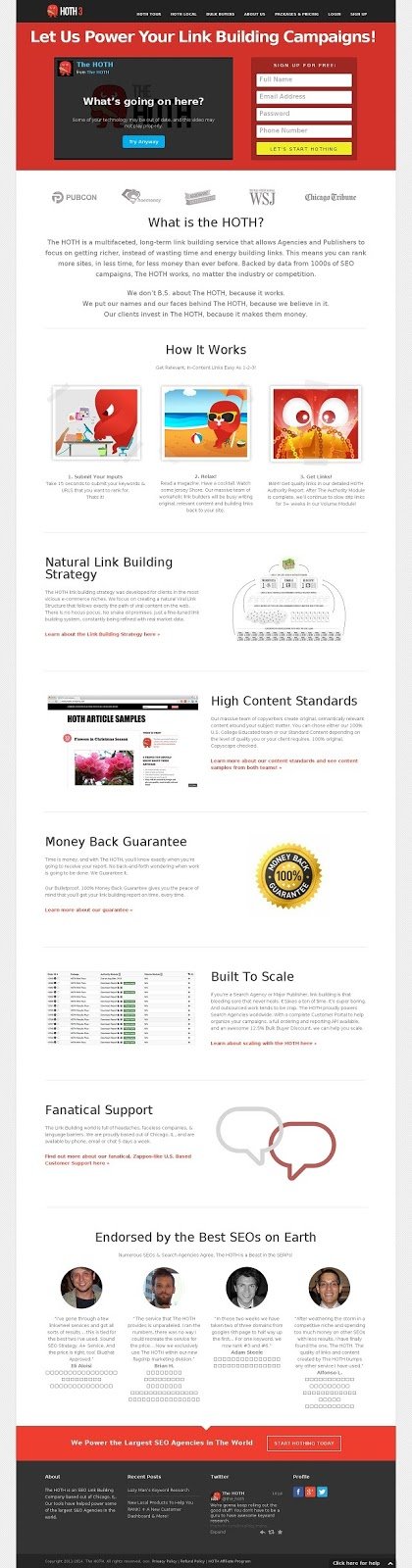
The original home page of TheHOTH website had a video and a sign-up form (above the fold), customer logos, testimonials as well as other necessary and good-to-have elements. The site was getting a decent amount of traffic on their home page, but conversions were quite low. Changes to their headline and other elements of the page did not make a significant difference.
This what the original home page looked like:
A study of their historical sign-ups revealed that most of their sign-ups came from from referrals, word-of-mouth, and direct search. This data point meant that most visitors to their website were already familiar with the brand and the company’s services. This triggered the hypothesis that that eliminating everything from the home page except the sign-up form would increase conversion of visitors to account sign-ups.
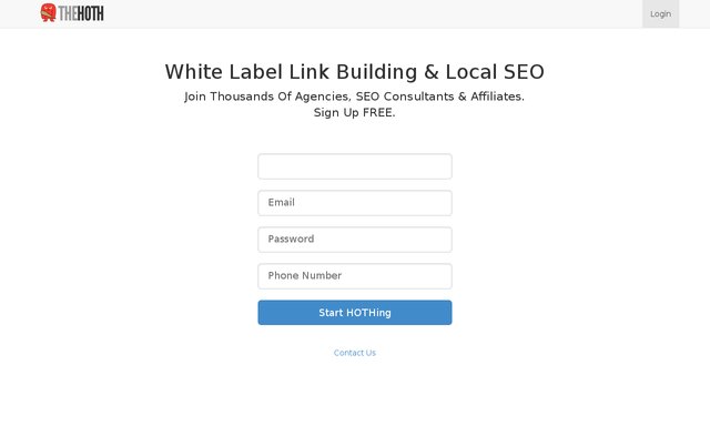
To test this hypothesis, the company created a variation page and set up a split URL test with VWO.
This is what the variation page with nothing other than the sign-up form looked:
Traffic was split across the 2 versions of the home page—the original and the minimalist home page with only the sign-up form. The test ran for 30 days and close to 3,000 visitors became a part of the test.
Result: The minimalist home page increased account sign-ups for TheHOTH from a low 1.39% to 13.13%.
Conclusion
So why did the minimalist home page work for TheHOTH?
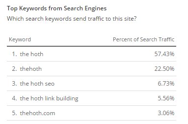
- Based on how visitors find a website, traffic to a website can be divided into 5 categories: direct, search, social, referral, and paid. In case of TheHOTH website, most visitors were from the direct or referral categories. Hence, they already had some knowledge of the company. This was also true for traffic originating from the social channels.A large portion of their search traffic also came from branded keywords (see data from Alexa below). Hence, visitors to the website already had a certain level of trust in the brand. It is thus possible that many visitors signed up for an account to learn more about the offering, as no information about the service was available on the landing page
- The clutter-free design focused solely on one aspect—signing up for an account.
- The original home page had 2 CTAs above the fold. It has also been proven in an eye-tracking study by Moz that visual media attracts attention instantly. Going by the F-shape reading pattern of web visitors, it is likely that the video took attention away from the form.
[Read this post on how you can guide visitors’ eye path to the conversion goal. - The sign-up form on the original page is in the dark shade of red and is on the top of a red background, which prevents it from getting much attention. The second CTA to sign up for an account at the end of the page also doesn’t have any contrast compared to the red tile in the background.
Read more about how color psychology affects conversions.
A minimalist home page poses challenges too:
- Quality of leads
While the number of leads is important, so too is their quality. A major challenge with having such a design is that many people who sign up to understand the product or service and may later realize that it is not a good fit for them. Or the company would need to invest time and effort in educating such “leads” about the company and its services. TheHOTH addressed this by adding more information after sign-up, reaching out to customers through phone and email, and implementing an educational auto-responder. - Additional pressure on sales
Low-quality leads put additional pressure on the sales team, which had a hard time differentiating between motivated leads willing to buy and and those who had signed up just to understand the offering and were not close to making a purchase decision. - Low trust
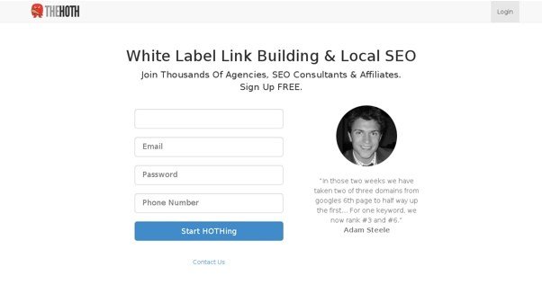
The variation page had nothing on it except the sign-up form. Visitors who did not know about the brand or were unaware of its services had no way of finding out more information. This could lead to a situation of low trust that can impede sign-ups.It would be interesting to see the results of a variation that has a testimonial along with the sign-up form on the left (something like what is shown below).

Location
Florida, US
Industry
Agency
Impact
13.13% increase in Sign-ups


