Rev Up Your SaaS Website Conversions With These Conversion Rate Optimization Tips
No matter how useful a SaaS product is, it isn’t worth much if you can’t get people to subscribe to it.
The differentiating aspect of SaaS businesses is that the product is bought and accessed online. And it’s their websites where prospects start evaluating the product, and eventually make a decision to become a customer or not.
Take into account that a significant volume of customers (unless the product is purely enterprise-focused) belong to the SMB bracket and the responsibility of a SaaS website in lead generation becomes apparent. Their conversion rate then becomes a critical factor in deciding business growth. Therein lies the need for its continuous optimization.
Download Free: Conversion Rate Optimization Guide
In this post, we bring together the essential Conversion Rate Optimization tips to get you started with optimizing your SaaS website.
Homepage
Most of the visitors arriving on a website land first on the homepage. The homepage is where visitors form an opinion about the website and the product.
The homepage is where you provide a compelling reason for visitors to understand if the product/solution is for them and move them further down the funnel.
Below are the tips to help you improve your homepage.
Keep Your Value Proposition Clear
Your SaaS homepage gives you an opportunity to position your brand/product in front of your prospects. Visitors coming onto your homepage should instantly identify the value your product offers to them.
Your homepage should highlight your product’s value proposition, clearly and succinctly.
Look at this great example from Pitch Deck:

The value proposition is crisp — boiled down to just four words — and impactful. The supporting copy, too, is short, yet elaborates the value proposition effectively.
Moreover, the homepage employs a real-life background image, providing context further. (Learn why you should test the images on your website.)
Along with a clear value proposition, the homepage prominently features a strong call-to-action (CTA), pushing visitors to try the product, now.
Employ Social Proof
Social proof puts the Bandwagon effect into practice.
Social proof has always been one of the must-have strategies in CRO. It helps convince visitors that others like them trust, use, and (at times) endorse a product.
There are different elements of social proof you can employ on your SaaS homepage.
List of Big Customers
Tell your visitors that they will be in good company if they choose your product.
Show them a list of the top brands from your customer base.
Number of Users
If the number of your users/customers is rather large, it’s a good idea to put it on your homepage.
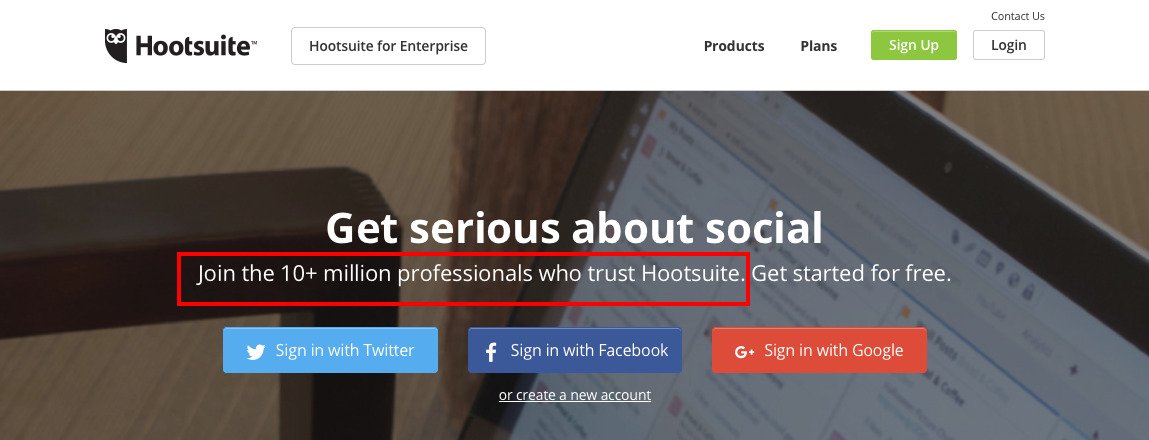
Here is Hootsuite flaunting it on its homepage:
Testimonials
Who would you rather believe: a company boasting its own product or a person that you know appreciates the product?
Most will go with the latter. They believe people like them will have an unbiased opinion about the product, and their appreciation will be genuine.
Adding testimonials from known brands/personalities to your homepage will make your offering more trustworthy.
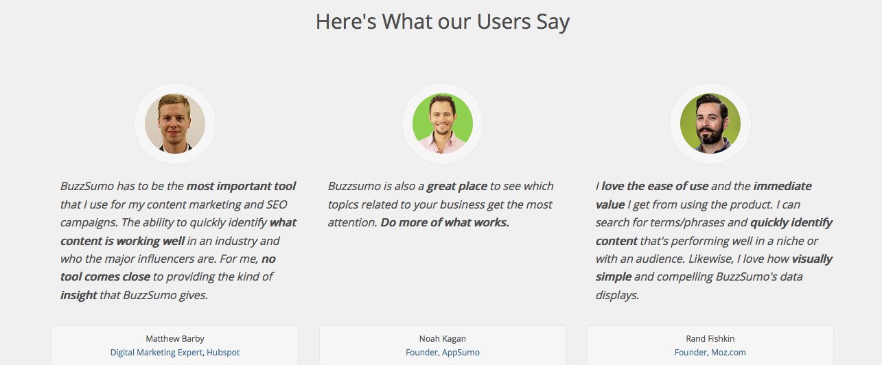
For instance, the BuzzSumo homepage features testimonials from some of the most influential people and brands from their target industry.
If you have more than a handful of testimonials that you can’t fit in your homepage, you can always have a dedicated testimonials page on your website. Here is one from OptinMonster.
Success Stories
Success stories give visitors a glimpse of real-life scenarios where a product can help them do something better. They help visitors visualize the role of the product in their own operational strategy.
Success Stories are, particularly, effective in convincing large (enterprise) prospects.
For instance, Pardot (which largely targets big enterprises) features a video success story on its page.

Make It Easy For Users to Start
A good homepage needs to be intuitive. It shouldn’t let visitors wander aimlessly, but provide them with relevant information and lead them towards a favorable action (using your product).
In other words, use CTAs. But not just any.
To make visitors flow down your funnel you need effective CTAs. Whether the CTA leads to a “Free Trial,” “Buy Now,” or “Request a Demo,” it needs to be appropriately placed on the homepage.
Check out the Shopify homepage.
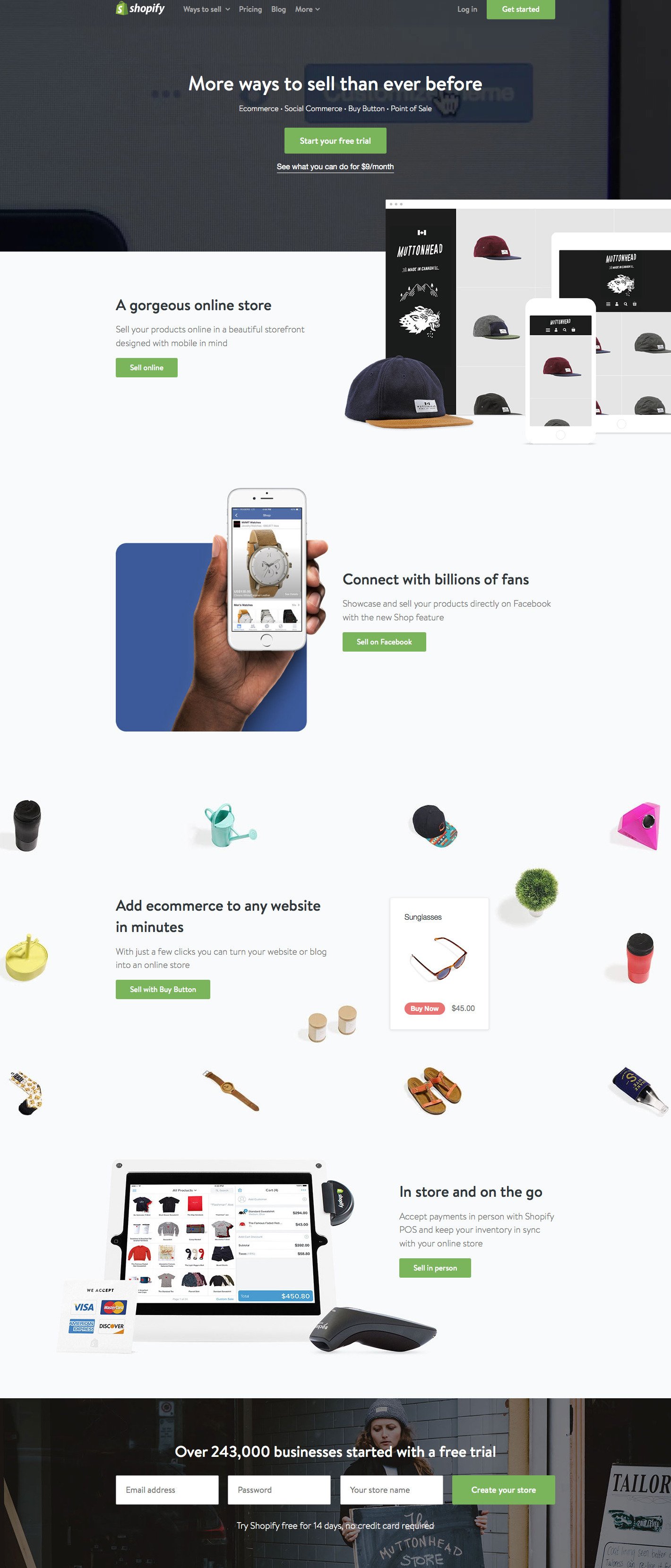
Shopify features a distinct CTA at every fold on its homepage. Each CTA button is accompanied by an actionable copy and relevant CTA text.
Caveat: You should only include CTAs when your homepage demands them. Stuffing excessive CTAs on your homepage otherwise will only lead to poor UX.
Don’t Overwhelm Your Visitors
Putting too much information on your homepage will overwhelm your visitors. Much like pouring out all about yourself on a first date.
Take a close look at your homepage, and identify sections and elements that don’t serve much purpose. “Are you featuring too much content about your product features on your homepage?” Or, “Are you using too many testimonials?” Don’t get pushy with your visitors.
This is what Wedbuddy.com, a wedding website creation tool, did. After an analysis of their homepage, the team found that the homepage carries a little too much information. Next, they reduced the homepage depth considerably by doing away with a few elements.
They created a variation of the homepage, and A/B tested it.
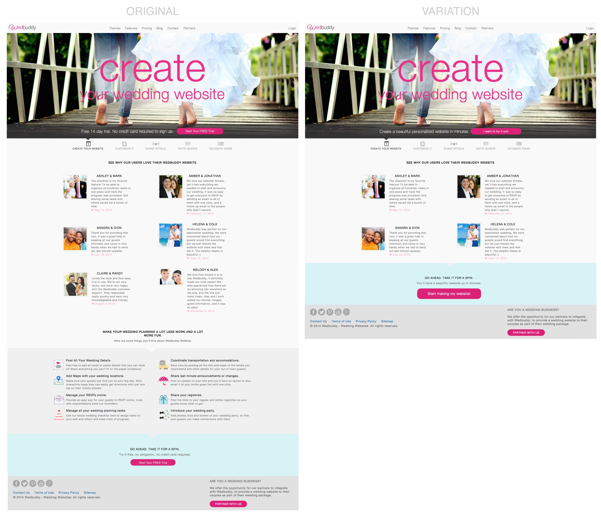
The result was a 139% increase in the CTA clicks and a staggering 73% boost in free-trial signups.
Download Free: Conversion Rate Optimization Guide
Features Page
So you’ve got a great homepage that succeeds in getting visitors interested in your product. Still, the visitors really interested in your product would like to know more about its features before taking any concrete decision.
Features page is the place where you wax lyrical about your product’s, well, features.
Give a Preview of Your Features
What’s better than reading about the features of a product?
Watching the product in action.
You can provide a glimpse of each feature of your product on the features page itself. The preview, along with a description of the feature, can help visitors know how easy to use the product is. You can offer a preview in the form of images, GIFs, or short videos.
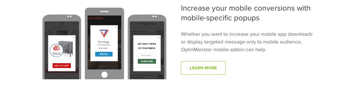
Below is a screenshot from the OptinMonster features page that shows exactly how their exit-intent pop-ups work for mobiles.
Make Your Features Benefit-Driven
Giving your visitors plain technical knowledge about your product features might prove counter-productive — even when your superiority over competitors is based on technological advancements.
You need to break down the technical jargon into simple language, illustrating the end benefits users will receive with your product features. You can then back your claims with the technical advantages your product has.
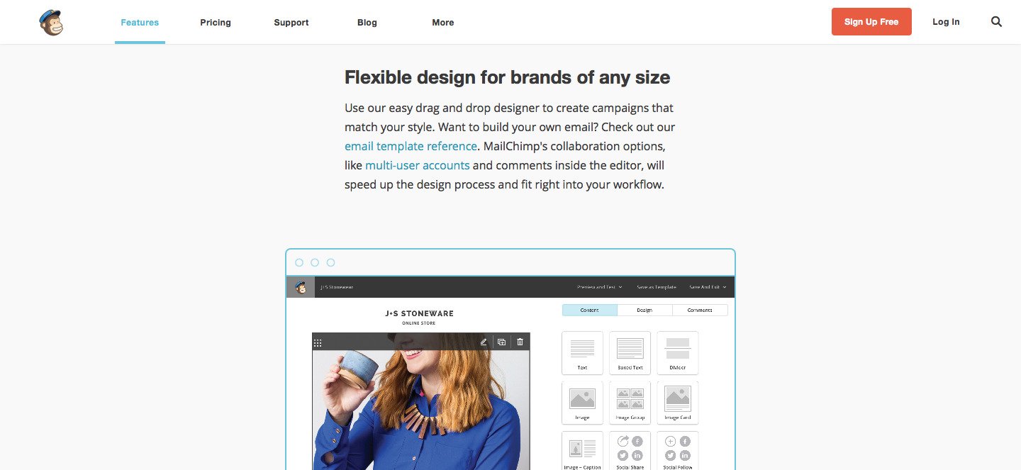
One of the best execution of this strategy is done by Mailchimp. It positions its features using benefit-driven headlines, following them with easy-to-grasp descriptions and beautiful images. Following is a screenshot from its features page.
Provide Easy Navigation
If you have a SaaS product, you’d surely like to flaunt every feature on your website. And why not? You’ve worked hard building it, in the first place.
However, you need to ensure that visitors have all the product features on top of their minds. You shouldn’t flood them with an infinitely long features page, where they can lose track of features they browsed previously.
Offer easy navigation on your features page, so that visitors can always move from one feature to another (and back).
Here are examples from the features page of Weebly:
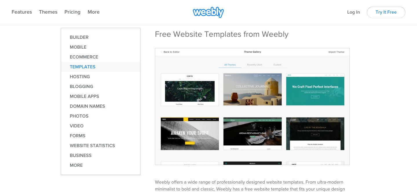
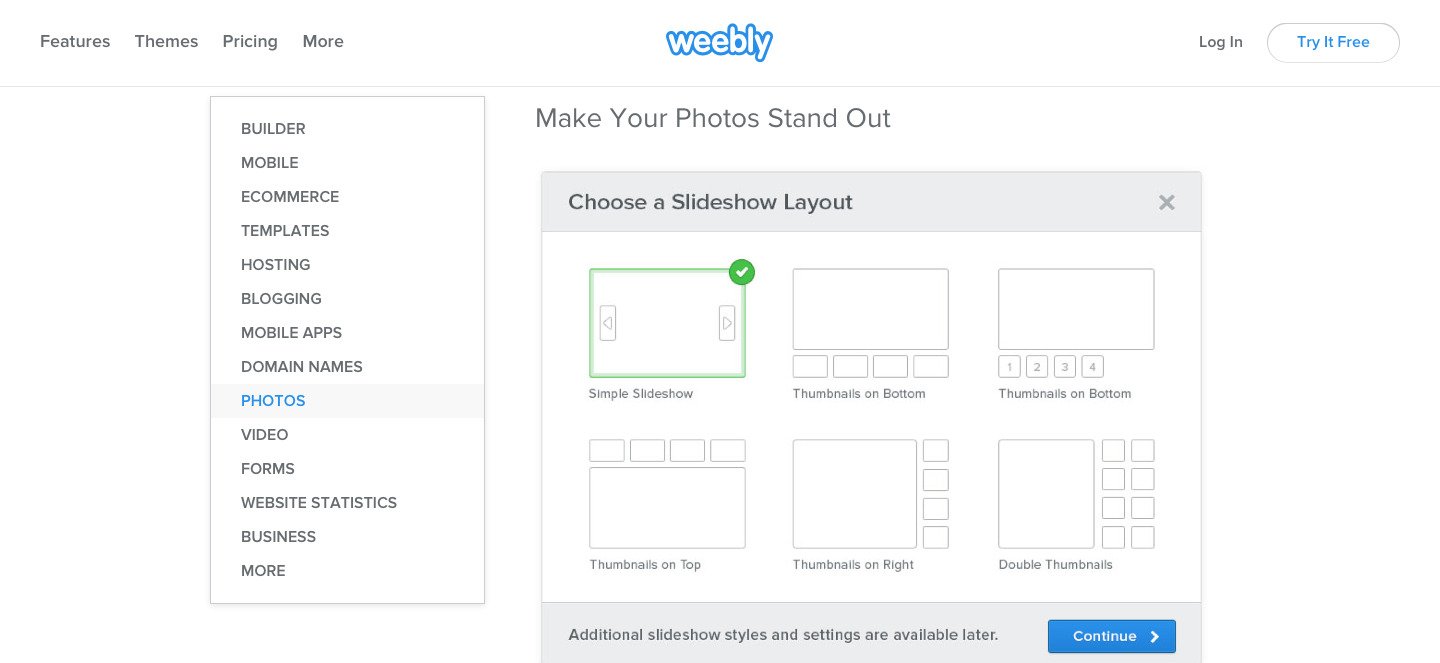
The friendly page of Weebly lets visitors discover its different product features while letting them stay at the same position on the page. The visitors can also see a consolidated list of all features, at all time — increasing the recall of those features.
Pricing Page
While the homepage and the features page play their part in influencing visitors, it’s ultimately the pricing page where prospects make the biggest decision of all – parting with money.
The below tips aim to optimize a SaaS pricing page.
Help Your Visitors Choose
Visitors coming onto your pricing page should be able to choose a purchase plan in an instant. You need to distinctly segment your pricing plans so that each visitor has only one plan fitting their needs and is clearly able to identify it.
It helps if your pricing page itself recommends the plan that is appropriate to your visitors.
For instance, Mailchimp features an interactive pricing page, which recommends visitors a pricing plan. The recommendation is based on the number of subscribers that a visitor has or expects to have.
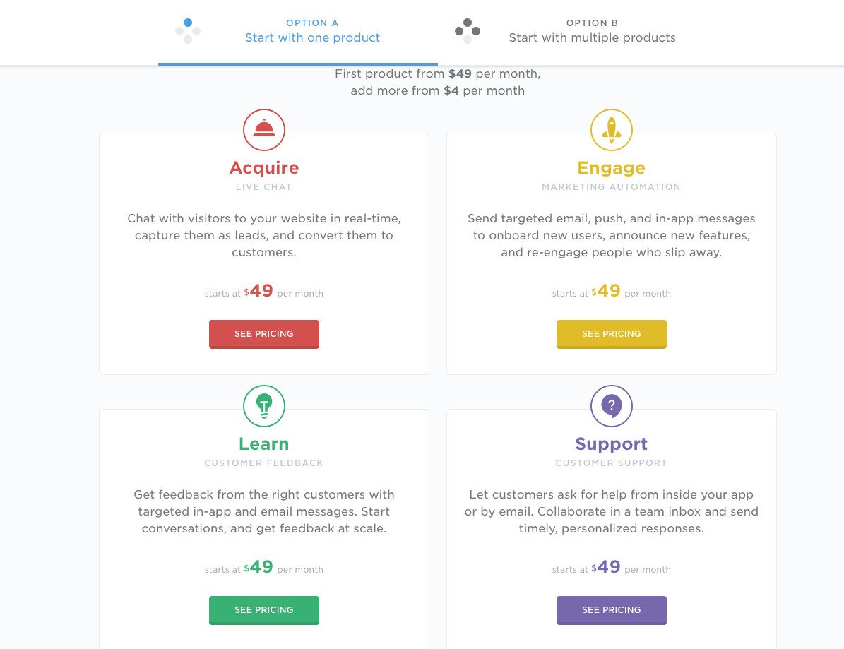
If your SaaS offering is complex, encompassing multiple products and capabilities, choosing a pricing plan won’t depend on a single metric anymore. Then, you might test offering product modules separately, along with an all-in-one offering. Intercom does it masterly:
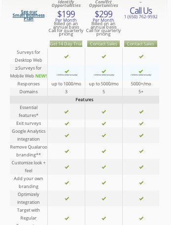
Don’t Confuse Visitors By Mentioning Tons of Features
When users compare different pricing plans for a product, they look at the features that each plan includes. Most visitors are able to zero in on a pricing plan based on a few must-have features. However, when you mention a big list of features, many of which are even common to all your pricing plans, you only confuse your users.
The PriceIntelligently’s list, “The Saddest SaaS Pricing Pages of the Year” included various SaaS pricing pages that practice this. Here’s an example from the list:
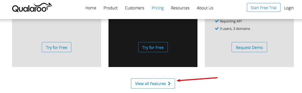
Nonetheless, there’s still a solution if you have a lot of features that you think people will consider before choosing a plan. You can list out the essential (but few) features on the pricing page, and link out to another page mentioning the full list of features. Here’s an example from Qualaroo:
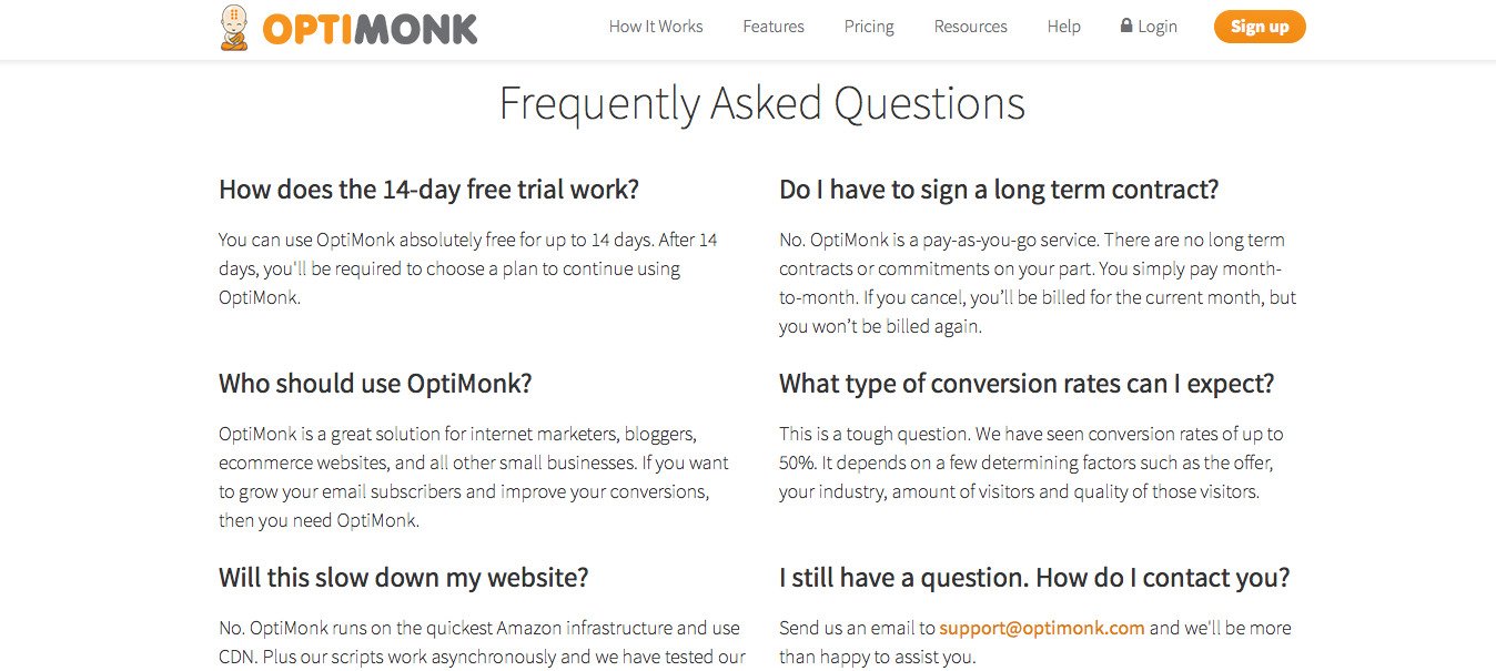
Provide FAQs
Anticipate the questions that visitors might have about your pricing plans. And answer those where they crop up. You can add a small FAQs section in your pricing page, and link to a dedicated FAQs page (if you have one).
Below is a screenshot from Optimonk’s pricing page:
Don’t Put Unnecessary Exit Doors
One of the oldest tricks in the Conversion Rate Optimization book is to minimize navigation options for visitors while they’re on transaction pages. There are various success stories that give evidence for the success of this strategy. eCommerce sites, especially, use this strategy on their checkout pages to keep users from leaving.
The pricing page is an equally critical page, where you don’t want visitors navigating away to other web pages. You can A/B test your pricing page by removing the navigation bar, and see if it actually improves your conversion rate.
We hope you found these tips helpful. If you’d like to learn more, you can watch Shanelle, Customer Acquisition Program Manager, CRO at Shopify, talk about optimizing for SaaS retention.
Your Turn Now
Did we miss out on any important CRO practice for the SaaS website? Which practice did you personally find the most fruitful? Please email your views at marketing@vwo.com. We are always looking for new insights!
Categories: